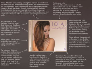
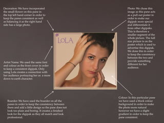
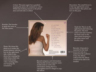
2. Photo: When we were deciding which photo to use as our front cover,
we came across this photo and instantly liked it. We liked that she was
not looking straight at the camera as she is portrayed as a vulnerable
character. This is also shown through the way in which she holds
herself, almost trying to cover and hide herself from the camera.
However, by wearing no visible clothing she is portrayed as pure and
simple alike the music video in which she is wearing a simple white
dress.
Album name: Lost Faith
We decided to use the font
Bradley for this as we wanted it
to be quite soft and not too over
the top as she is not portrayed
as a diva character wanting
lots of attention. This is
therefore simple and elegant.
For the spine we have
included the artists name;
Lola Brooks and the album
name; Lost Faith on the top
of the spine. We used the
same font for this as we did
for the writing on the front
pane ( Bradley)
Colour scheme: As mentioned
on the spine we also decided
to use a gradient for the front
cover pane in order to make it
look more natural whilst
incorporating our colours into
it.
Album spine: For the spine
we decided we wanted a
visible colour gradient from
light purple to white
The bottom of the spine
contains the record company;
LLRecords and the barcode
number from the last pane.
The font we used for this is the
same font which we used for
the back cover pane , it is
simple as it is purely giving
information.
Artist name: Lola
We wanted the artists name to be in bold
capital letters as it was also her brand name
and the way in which her fans would
recognise her. By having only Lola it
suggests she is an approachable character
and not a diva celebrity alike some artists.
Boarder: We have used a
boarder on the digipak in
order to even out the rule of
thirds as well as using it as a
guide in order to use the
space wisely and not
overcrowd it.
Decoration: We decided to add a small
flower I n the bottom right hand corner of
our digipak in order to add a little extra so it
didn’t look too plain and boring, but also
because it then matches the name of the
album in which the flower is incorporated.
3. Decoration: We have incorporated
the small flower on this pane in
the top left hand corner in order to
keep the panes consistent as well
as balancing it as the right hand
side has a large photo.
Artist Name: We used the same font
and colour as the front cover in order
to keep a consistent digipak. Only
using Lola creates a connection with
her audience portraying her as a more
down to earth character.
Boarder: We have used the boarder on all the
panes in order to keep the consistency between
them and add a little design so the pane does not
look too plain and boring. It creates a finished
look for the digipak as they all match and look
professional.
Photo: We chose this
image as this pane acts
as a pull out poster in
order to make our
digipak more special
and differentiate it
from other digipaks.
This is therefore a
smaller segment of the
whole picture. The full
size picture is on the
poster which is used to
advertise this digipak.
We done this in order
to keep the consistency
between the two and
provide something
different for her
audience.
Colour: In this particular pane
we have used a block colour
background in order to make
the photo more natural
however we have a slight
gradient in order to keep the
pane consistent.
4. Boarder: We have used the boarder in order
to keep the consistency between the panes.
They are the same colour and width
ensuring they are all the same.
Colour: We have used a
gradient on this pane in
order to ensure that all
the panes match
incorporating the same
colours.
Decoration: We have again
used the small flower as
decoration in the bottom left
corner, keeping all the panes
consistent.
CD disk: For the Cd disk
we took photos of the
ripped up cards and
letters as we thought it
would be the perfect link
between the music video
and the album. We then
decorated it by adding a
boarder around the
inside and outside of the
CD to show a clear
separation between the
disk and the case. We
keep the colour of this
boarder the same as the
main boarder in order to
keep the consistency.
Album name: We added the
album name to the disk
using the same font as the
front cover (Bradley) and
including the small flower
in-between. The position of
the album name makes it
appear to be on the papers
which are on the disk.
5. Colour: This pane again has a gradient
keeping the panes all consistent in colour.
Whilst also looking natural so the photo
does not look fake or edited.
Boarder: The boarder
is again the same as
the other panes.
Photo: We chose this
photo as it creates the
perfect balance with the
text on the right hand
side, whilst it also
shows her wearing the
white dress which she
wore in the music
video, creating links
and keeping the
consistency.
Decoration: The small flower is
in the top right hand corner,
used to balance thee photo and
text on this pane
Track list: This is on the
right hand side balancing
the photo. The font
colour and style matches
the fonts used on the
other panes keeping to
the same colour and
Bradley font.
Record company and information:
This has the record company name
(LLRecords) as well as the
information stating that it is
copyrighted and it is illegal to copy
this album.
Barcode: A barcode is
essential for the back
cover as it acts as a
method for the audience
to buy the album,
without this the album
would not be able to be
retailed.