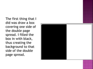
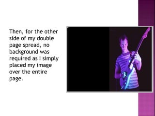
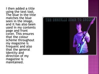
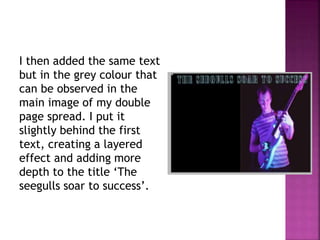
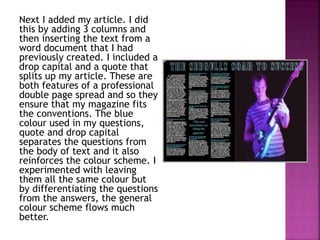
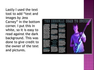
(with screengrabs)
The first thing that I
did was draw a box
covering one side of
the double page
spread. I filled the
box in with black,
thus creating the
background to that
side of the double
page spread.
Then, for the other
side of my double
page spread, no
background was
required as I simply
placed my image
over the entire
page.
I then added a title
using the text tool.
The blue in the title
matches the blue
seen in the image,
and it has also been
used in my contents
page and front
cover. This ensures
that the colour
scheme throughout
my magazine is
frequent and also
that the general
identity and
direction of my
magazine is
maintained.
I then added the same text
but in the grey colour that
can be observed in the
main image of my double
page spread. I put it
slightly behind the first
text, creating a layered
effect and adding more
depth to the title ‘The
seegulls soar to success’.
Next I added my article. I did
this by adding 3 columns and
then inserting the text from a
word document that I had
previously created. I included a
drop capital and a quote that
splits up my article. These are
both features of a professional
double page spread and so they
ensure that my magazine fits
the conventions. The blue
colour used in my questions,
quote and drop capital
separates the questions from
the body of text and it also
reinforces the colour scheme. I
experimented with leaving
them all the same colour but
by differentiating the questions
from the answers, the general
colour scheme flows much
better.
Lastly I used the text
tool to add “text and
images by Jess
Carney” in the bottom
corner. I put this in
white, so it is easy to
read against the dark
background. This was
done to give credit to
the owner of the text
and pictures.
Double page spread production

Double page spread production

  • 1.
  • 2.
    The first thingthat I did was draw a box covering one side of the double page spread. I filled the box in with black, thus creating the background to that side of the double page spread.
  • 3.
    Then, for theother side of my double page spread, no background was required as I simply placed my image over the entire page.
  • 4.
    I then addeda title using the text tool. The blue in the title matches the blue seen in the image, and it has also been used in my contents page and front cover. This ensures that the colour scheme throughout my magazine is frequent and also that the general identity and direction of my magazine is maintained.
  • 5.
    I then addedthe same text but in the grey colour that can be observed in the main image of my double page spread. I put it slightly behind the first text, creating a layered effect and adding more depth to the title ‘The seegulls soar to success’.
  • 6.
    Next I addedmy article. I did this by adding 3 columns and then inserting the text from a word document that I had previously created. I included a drop capital and a quote that splits up my article. These are both features of a professional double page spread and so they ensure that my magazine fits the conventions. The blue colour used in my questions, quote and drop capital separates the questions from the body of text and it also reinforces the colour scheme. I experimented with leaving them all the same colour but by differentiating the questions from the answers, the general colour scheme flows much better.
  • 7.
    Lastly I usedthe text tool to add “text and images by Jess Carney” in the bottom corner. I put this in white, so it is easy to read against the dark background. This was done to give credit to the owner of the text and pictures.