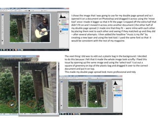
1. I chose the image that I was going to use for my double page spread and so I
opened it on a document on Photoshop and dragged it across using the ‘move
tool’ once I made it bigger so that it fit the page I cropped off the extra half that
didn’t fit on and I moved it across onto another document ( the other half of
my double page spread.) I made sire that they fit – were inline with each other
by placing them next to each other and seeing if they matched up and they did
– after several attempts. I then added the headline “music is my life” by
creating a new layer and using the text tool. I used the same font so that it
would be consistent with the rest of my magazine.
The next thing I did was to edit out a plastic bag in the background. I decided
to do this because I felt that it made the whole image look scruffy. I fixed this
issue by opening up the same image and using the ‘select tool’ I cut out a
square of greenery on top of the plastic bag and dragged it over to the correct
document and put it on top.
This made my double page spread look more professional and tidy.
2. The next thing I did was make my image brighter as I felt that it
was a bit dark. I did this by clicking on image, then adjustments
and then curve. This came up.
This allowed my too change the amount of light and where is came
from/ the angle it came from. This allowed me to tern my dull dark
image into a bright image. By making it brighter it made the mood of
my image happier and less serious. I then did the same to the other
half of my double page spread.
I then merged the layers of the background and the extra box of
greenery so that it would be easier to change if I ever needed to. It also
made making my image brighter easier as the first tie I did it without
the layers being merged there was a dark square where I had edited it
in that stood out even more than the rest of the image.
3. I inserted the text using the text tool and kept the font
consistent. I did a larger first letter than the rest of my
article as this was common while doing research of other
double page spreads.
I also made my headline and larger and added ‘Charmaine’
in large font to grab readers attention.
4. Second draft and feedback – Nicole Manley:
I like how your image runs
across the two pages.
However it is hard to read
the article because of the
dark background colours.
Also you can see that you
have tried to cover
something up in the
middle of the left page on
the greenery.