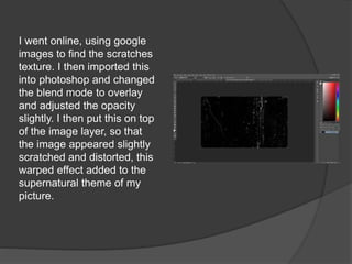
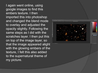
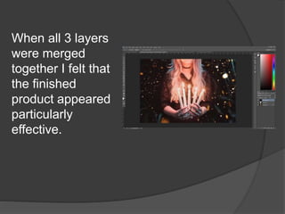
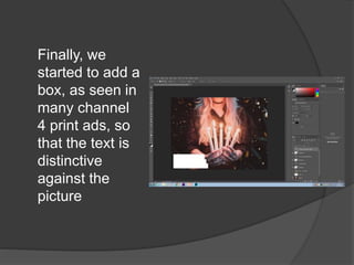
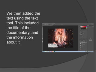
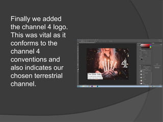
Editing my print advert
First I uploaded the original photo
into lightroom and graded it. I
also altered the brightness and
contrast very slightly so that the
picture appeared darker, and
further tied to the supernatural. I
then exported the image into
photoshop so that I could further
edit it.
I went online, using google
images to find the scratches
texture. I then imported this
into photoshop and changed
the blend mode to overlay
and adjusted the opacity
slightly. I then put this on top
of the image layer, so that
the image appeared slightly
scratched and distorted, this
warped effect added to the
supernatural theme of my
picture.
I again went online, using
google images to find this
embers texture. I then
imported this into photoshop
and changed the blend mode
to overlay and adjusted the
opacity slightly. Following the
same steps as I did with the
scratches layer. I then put this
on top of the image layer, so
that the image appeared alight
with the glowing embers of the
texture, I felt this also added
to the supernatural theme of
my picture.
When all 3 layers
were merged
together I felt that
the finished
product appeared
particularly
effective.
Finally, we
started to add a
box, as seen in
many channel
4 print ads, so
that the text is
distinctive
against the
picture
We then added the
text using the text
tool. This included
the title of the
documentary, and
the information
about it
Finally we added
the channel 4 logo.
This was vital as it
conforms to the
channel 4
conventions and
also indicates our
chosen terrestrial
channel.

EDITING MY PRINT ADVERT

  • 1.
  • 2.
    First I uploadedthe original photo into lightroom and graded it. I also altered the brightness and contrast very slightly so that the picture appeared darker, and further tied to the supernatural. I then exported the image into photoshop so that I could further edit it.
  • 3.
    I went online,using google images to find the scratches texture. I then imported this into photoshop and changed the blend mode to overlay and adjusted the opacity slightly. I then put this on top of the image layer, so that the image appeared slightly scratched and distorted, this warped effect added to the supernatural theme of my picture.
  • 4.
    I again wentonline, using google images to find this embers texture. I then imported this into photoshop and changed the blend mode to overlay and adjusted the opacity slightly. Following the same steps as I did with the scratches layer. I then put this on top of the image layer, so that the image appeared alight with the glowing embers of the texture, I felt this also added to the supernatural theme of my picture.
  • 5.
    When all 3layers were merged together I felt that the finished product appeared particularly effective.
  • 6.
    Finally, we started toadd a box, as seen in many channel 4 print ads, so that the text is distinctive against the picture
  • 7.
    We then addedthe text using the text tool. This included the title of the documentary, and the information about it
  • 8.
    Finally we added thechannel 4 logo. This was vital as it conforms to the channel 4 conventions and also indicates our chosen terrestrial channel.