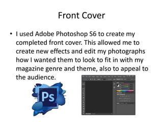
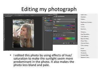
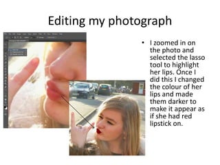
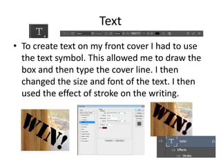
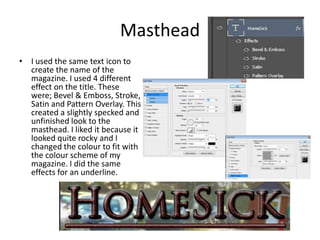
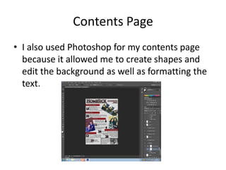
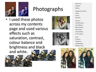
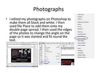
What have you learnt
about Technologies?
Front Cover
β€’ I used Adobe Photoshop S6 to create my
completed front cover. This allowed me to
create new effects and edit my photographs
how I wanted them to look to fit in with my
magazine genre and theme, also to appeal to
the audience.
Editing my photograph

β€’ I edited this photo by using effects of hue/
saturation to make the sunlight seem more
predominant in the photo. It also makes the
photo less bland and pale.
Editing my photograph
β€’ I zoomed in on
the photo and
selected the lasso
tool to highlight
her lips. Once I
did this I changed
the colour of her
lips and made
them darker to
make it appear as
if she had red
lipstick on.
Text
β€’ To create text on my front cover I had to use
the text symbol. This allowed me to draw the
box and then type the cover line. I then
changed the size and font of the text. I then
used the effect of stroke on the writing.
Masthead
β€’ I used the same text icon to
create the name of the
magazine. I used 4 different
effect on the title. These
were; Bevel & Emboss, Stroke,
Satin and Pattern Overlay. This
created a slightly specked and
unfinished look to the
masthead. I liked it because it
looked quite rocky and I
changed the colour to fit with
the colour scheme of my
magazine. I did the same
effects for an underline.
Contents Page
β€’ I also used Photoshop for my contents page
because it allowed me to create shapes and
edit the background as well as formatting the
text.
Photographs
β€’ I used these photos
across my contents
page and used various
effects such as
saturation, contrast,
colour balance and
brightness and black
and white.
Shapes and added effects
β€’ I used rectangular shapes to highlight the
titles of the different sections between the
magazine on the contents page. I also used
the background effect of pattern overlay to
create the speckled background.
Double Page Spread
β€’ I used InDesign to create my Double Page
Spread as it has better use of text effects as
opposed to effects on the look of the page.
Text
β€’ I added the text to the document to start with.
I formatted the text to go into different boxes
and carry on through each one in order. I also
included columns on the text for the article.
Background
β€’ I drew a normal rectangle on
the background of the
document and changed the
colour to black, I then sent it
to back on the options and
then arrange. This meant it
was behind the text so It
could still be readable. I then
made the writing white and
red so it matched the colours
of the front cover and
contents page.
Photographs
β€’ I edited my photographs on Photoshop to
make them all black and white. I then
used file Place to add them onto my
double page spread. I then used the edges
of the photos to change the angle on the
page so it was slanted and fit round the
text.
Overall
β€’ I used Photoshop and InDesign to create my three
documents; front cover, contents page and double
page spread.
β€’ Photoshop: I found this very easy to use and would find
out how to use the different effect which I wanted. I
found it easy to edit and move the objects and layers. I
learnt how to create effects that I wanted on my front
cover mostly.
β€’ InDesign: I learnt how to edit the text and spread it out
and format it into columns. This was easy and simple
but I struggled with some of the editing aspects of the
photos and any other changes I wished to make.

Evaluation - Question 6

  • 1.
    What have youlearnt about Technologies?
  • 2.
    Front Cover β€’ Iused Adobe Photoshop S6 to create my completed front cover. This allowed me to create new effects and edit my photographs how I wanted them to look to fit in with my magazine genre and theme, also to appeal to the audience.
  • 3.
    Editing my photograph β€’I edited this photo by using effects of hue/ saturation to make the sunlight seem more predominant in the photo. It also makes the photo less bland and pale.
  • 4.
    Editing my photograph β€’I zoomed in on the photo and selected the lasso tool to highlight her lips. Once I did this I changed the colour of her lips and made them darker to make it appear as if she had red lipstick on.
  • 5.
    Text β€’ To createtext on my front cover I had to use the text symbol. This allowed me to draw the box and then type the cover line. I then changed the size and font of the text. I then used the effect of stroke on the writing.
  • 6.
    Masthead β€’ I usedthe same text icon to create the name of the magazine. I used 4 different effect on the title. These were; Bevel & Emboss, Stroke, Satin and Pattern Overlay. This created a slightly specked and unfinished look to the masthead. I liked it because it looked quite rocky and I changed the colour to fit with the colour scheme of my magazine. I did the same effects for an underline.
  • 7.
    Contents Page β€’ Ialso used Photoshop for my contents page because it allowed me to create shapes and edit the background as well as formatting the text.
  • 8.
    Photographs β€’ I usedthese photos across my contents page and used various effects such as saturation, contrast, colour balance and brightness and black and white.
  • 9.
    Shapes and addedeffects β€’ I used rectangular shapes to highlight the titles of the different sections between the magazine on the contents page. I also used the background effect of pattern overlay to create the speckled background.
  • 10.
    Double Page Spread β€’I used InDesign to create my Double Page Spread as it has better use of text effects as opposed to effects on the look of the page.
  • 11.
    Text β€’ I addedthe text to the document to start with. I formatted the text to go into different boxes and carry on through each one in order. I also included columns on the text for the article.
  • 12.
    Background β€’ I drewa normal rectangle on the background of the document and changed the colour to black, I then sent it to back on the options and then arrange. This meant it was behind the text so It could still be readable. I then made the writing white and red so it matched the colours of the front cover and contents page.
  • 13.
    Photographs β€’ I editedmy photographs on Photoshop to make them all black and white. I then used file Place to add them onto my double page spread. I then used the edges of the photos to change the angle on the page so it was slanted and fit round the text.
  • 14.
    Overall β€’ I usedPhotoshop and InDesign to create my three documents; front cover, contents page and double page spread. β€’ Photoshop: I found this very easy to use and would find out how to use the different effect which I wanted. I found it easy to edit and move the objects and layers. I learnt how to create effects that I wanted on my front cover mostly. β€’ InDesign: I learnt how to edit the text and spread it out and format it into columns. This was easy and simple but I struggled with some of the editing aspects of the photos and any other changes I wished to make.