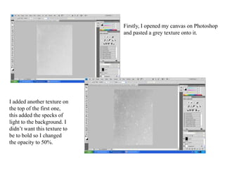
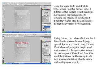
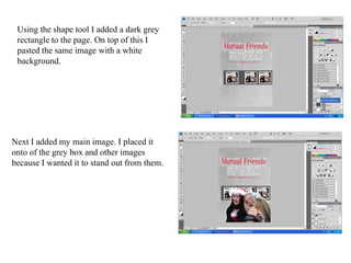
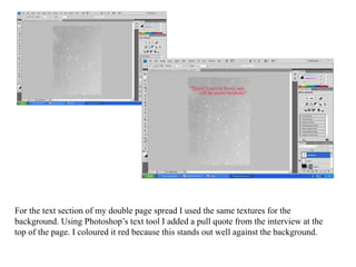
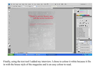
Double Page Spread
Firstly, I opened my canvas on Photoshop and pasted a grey texture onto it. I added another texture on the top of the first one, this added the specks of light to the background. I didn’t want this texture to be to bold so I changed the opacity to 50%.
Using the shape tool I added white boxes where I wanted the text to be. I did this so that the text would stand out more against the background. By lowering the opacity on the shapes it meant they weren’t too bold and didn’t distract the eye from the background.Using dafont.com I chose the fonts that I liked for the text on the double page spread. I print screened it, pasted it into Photoshop and, using the magic wand tool, coloured it the appropriate colours for my magazine. Once I had done this I used the text tool on Photoshop to add text underneath stating who the article and photography were by.
Using the shape tool I added a dark grey rectangle to the page. On top of this I pasted the same image with a white background. Next I added my main image. I placed it onto of the grey box and other images because I wanted it to stand out from them.
For the text section of my double page spread I used the same textures for the background. Using Photoshop’s text tool I added a pull quote from the interview at the top of the page. I coloured it red because this stands out well against the background.
Finally, using the text tool I added my interview. I chose to colour it white because it fits in with the house style of the magazine and is an easy colour to read.

Dps

  • 1.
  • 2.
    Firstly, I openedmy canvas on Photoshop and pasted a grey texture onto it. I added another texture on the top of the first one, this added the specks of light to the background. I didn’t want this texture to be to bold so I changed the opacity to 50%.
  • 3.
    Using the shapetool I added white boxes where I wanted the text to be. I did this so that the text would stand out more against the background. By lowering the opacity on the shapes it meant they weren’t too bold and didn’t distract the eye from the background.Using dafont.com I chose the fonts that I liked for the text on the double page spread. I print screened it, pasted it into Photoshop and, using the magic wand tool, coloured it the appropriate colours for my magazine. Once I had done this I used the text tool on Photoshop to add text underneath stating who the article and photography were by.
  • 4.
    Using the shapetool I added a dark grey rectangle to the page. On top of this I pasted the same image with a white background. Next I added my main image. I placed it onto of the grey box and other images because I wanted it to stand out from them.
  • 5.
    For the textsection of my double page spread I used the same textures for the background. Using Photoshop’s text tool I added a pull quote from the interview at the top of the page. I coloured it red because this stands out well against the background.
  • 6.
    Finally, using thetext tool I added my interview. I chose to colour it white because it fits in with the house style of the magazine and is an easy colour to read.