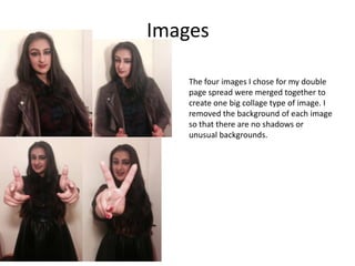
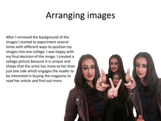
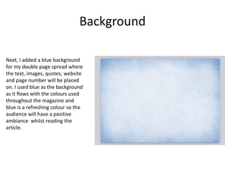
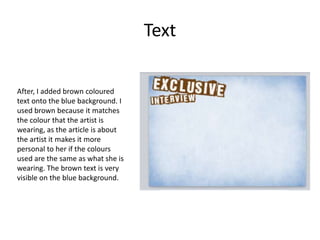
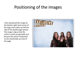
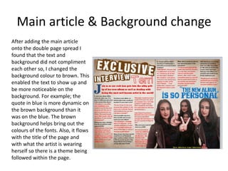
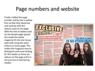
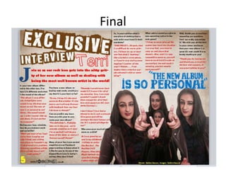
Eye of the Storm: Emergency Planning for Archives--2013AAOadvisor
Emergency Planning and Response for Archives. An Archives Association of Ontario presentation by the Archives Advisor. Presented at Municipal Archives Interest Group meeting October 2013.
2. Images
The four images I chose for my double
page spread were merged together to
create one big collage type of image. I
removed the background of each image
so that there are no shadows or
unusual backgrounds.
3. Arranging images
After I removed the background of the
images I started to experiment several
times with different ways to position my
images into one collage. I was happy with
my final decision of the image. I created a
collage picture because it is unique and
shows that the artist has more to her than
just one side which engages the reader to
be interested in buying the magazine to
read her article and find out more.
4. Background
Next, I added a blue background
for my double page spread where
the text, images, quotes, website
and page number will be placed
on. I used blue as the background
as it flows with the colours used
throughout the magazine and
blue is a refreshing colour so the
audience will have a positive
ambiance whilst reading the
article.
5. Text
After, I added brown coloured
text onto the blue background. I
used brown because it matches
the colour that the artist is
wearing, as the article is about
the artist it makes it more
personal to her if the colours
used are the same as what she is
wearing. The brown text is very
visible on the blue background.
6. Positioning of the images
I then positioned the image on
the bottom right hand corner of
the page and it takes up half the
side of the double page spread.
The image is big so that the
article is easily recognisable and
because the artist is important
so she should take up most of
the page.
7. Main article & Background change
After adding the main article
onto the double page spread I
found that the text and
background did not compliment
each other so, I changed the
background colour to brown. This
enabled the text to show up and
be more noticeable on the
background. For example; the
quote in blue is more dynamic on
the brown background than it
was on the blue. The brown
background helps bring out the
colours of the fonts. Also, it flows
with the title of the page and
with what the artist is wearing
herself so there is a theme being
followed within the page.
8. Page numbers and website
Finally I added the page
number and by line in yellow
font so that they stand out
and contrast with the
colours used on the page.
With the hint of yellow used
on the double page spread
this made the whole
magazine fit into one house
style with using the same
colours on every page. This
makes the magazine easy to
distinguish and more striking
for the reader as there are
colours on the page and it is
not just one or two boring
shades.