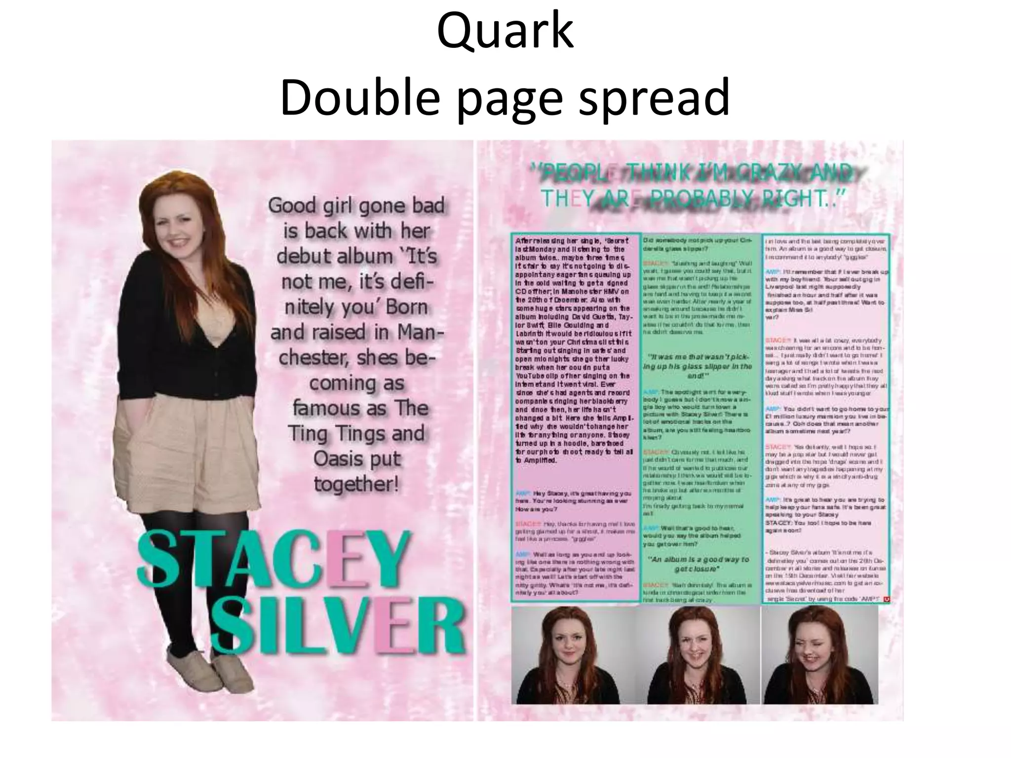
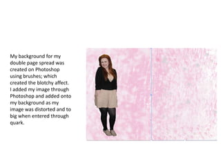
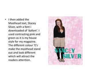
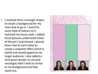
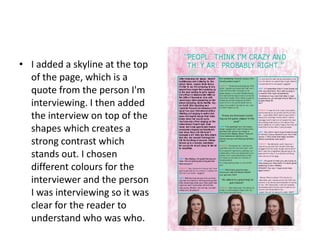
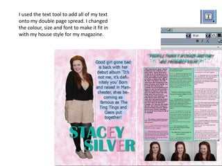
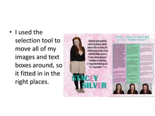
Quark
Double page spread
My background for my
double page spread was
created on Photoshop
using brushes; which
created the blotchy affect.
I added my image through
Photoshop and added onto
my background as my
image was distorted and to
big when entered through
quark.
• I then added the
  Masthead text, Stacey
  Silver, with a font i
  downloaded of ‘dafont’. I
  used contrasting pink and
  green as it is my house
  style for my magazine.
  The different colour ‘E’s
  make the masthead stand
  out and look different
  which will attract the
  readers attention.
• I inserted three rectangle shapes
  to create a background for my
  main text to go in. I used the
  same style of colours so it
  matched my house style. I added
  three pictures underneath these
  of the girl I interviewed. I placed
  them next to each other to
  create a snapshot effect which is
  stylish and would appeal to my
  target audience. I also added a
  mint green border so my pink
  rectangles didn’t look to similar
  to my background and they
  stood out.
• I added a skyline at the top
  of the page, which is a
  quote from the person I'm
  interviewing. I then added
  the interview on top of the
  shapes which creates a
  strong contrast which
  stands out. I chosen
  different colours for the
  interviewer and the person
  I was interviewing so it was
  clear for the reader to
  understand who was who.
I used the text tool to add all of my text
onto my double page spread. I changed
the colour, size and font to make it fit in
with my house style for my magazine.
• I used the
  selection tool to
  move all of my
  images and text
  boxes around, so
  it fitted in in the
  right places.

Quark screen shots

  • 1.
  • 2.
    My background formy double page spread was created on Photoshop using brushes; which created the blotchy affect. I added my image through Photoshop and added onto my background as my image was distorted and to big when entered through quark.
  • 3.
    • I thenadded the Masthead text, Stacey Silver, with a font i downloaded of ‘dafont’. I used contrasting pink and green as it is my house style for my magazine. The different colour ‘E’s make the masthead stand out and look different which will attract the readers attention.
  • 4.
    • I insertedthree rectangle shapes to create a background for my main text to go in. I used the same style of colours so it matched my house style. I added three pictures underneath these of the girl I interviewed. I placed them next to each other to create a snapshot effect which is stylish and would appeal to my target audience. I also added a mint green border so my pink rectangles didn’t look to similar to my background and they stood out.
  • 5.
    • I addeda skyline at the top of the page, which is a quote from the person I'm interviewing. I then added the interview on top of the shapes which creates a strong contrast which stands out. I chosen different colours for the interviewer and the person I was interviewing so it was clear for the reader to understand who was who.
  • 6.
    I used thetext tool to add all of my text onto my double page spread. I changed the colour, size and font to make it fit in with my house style for my magazine.
  • 7.
    • I usedthe selection tool to move all of my images and text boxes around, so it fitted in in the right places.