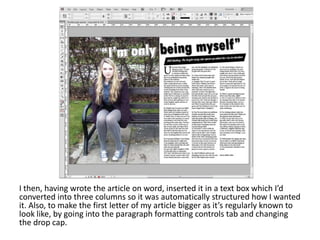
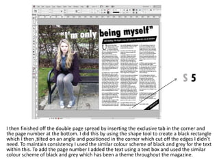
Double page spread screenshots

          Zareen Malik
Firstly I inserted the main image I was going to use on double page spread
after altering it to fit the style I was looking for which was to look unique and
striking making the colours appear strong and powerful. I positioned the
image on the left hand side to give it some structure so my text would go on
the right hand side.
Then I added the article headline across both the left and right hand sides of the double
page spread. I did this in Photoshop by creating text and adding a white drop shadow to
it. Also, by making half of the text white and half in black allows it to stand out across
the page and to emphasise it above the part of the image. Then I imported it into
InDesign and made it tilted on an angle to make it look slightly different and help it fit in
better across both pages. Also, it gives it a more edgy look.
I then added the brief article description. I did this by adding a black rectangle
box using the shape tool and added white text to it. To keep it looking
consistent, I made the rectangle box and the text tilted like the article headline
to maintain the edgy, slightly different look which allowed it to fit in better on
the page. I positioned this under the article headline to give brief insight into
what the article is about.
I then, having wrote the article on word, inserted it in a text box which I’d
converted into three columns so it was automatically structured how I wanted
it. Also, to make the first letter of my article bigger as it’s regularly known to
look like, by going into the paragraph formatting controls tab and changing
the drop cap.
I then finished off the double page spread by inserting the exclusive tab in the corner and
the page number at the bottom. I did this by using the shape tool to create a black rectangle
which I then ,tilted on an angle and positioned in the corner which cut off the edges I didn’t
need. To maintain consistency I used the similar colour scheme of black and grey for the text
within this. To add the page number I added the text using a text box and used the similar
colour scheme of black and grey which has been a theme throughout the magazine.

Double page spread screenshots

  • 1.
    Double page spreadscreenshots Zareen Malik
  • 2.
    Firstly I insertedthe main image I was going to use on double page spread after altering it to fit the style I was looking for which was to look unique and striking making the colours appear strong and powerful. I positioned the image on the left hand side to give it some structure so my text would go on the right hand side.
  • 3.
    Then I addedthe article headline across both the left and right hand sides of the double page spread. I did this in Photoshop by creating text and adding a white drop shadow to it. Also, by making half of the text white and half in black allows it to stand out across the page and to emphasise it above the part of the image. Then I imported it into InDesign and made it tilted on an angle to make it look slightly different and help it fit in better across both pages. Also, it gives it a more edgy look.
  • 4.
    I then addedthe brief article description. I did this by adding a black rectangle box using the shape tool and added white text to it. To keep it looking consistent, I made the rectangle box and the text tilted like the article headline to maintain the edgy, slightly different look which allowed it to fit in better on the page. I positioned this under the article headline to give brief insight into what the article is about.
  • 5.
    I then, havingwrote the article on word, inserted it in a text box which I’d converted into three columns so it was automatically structured how I wanted it. Also, to make the first letter of my article bigger as it’s regularly known to look like, by going into the paragraph formatting controls tab and changing the drop cap.
  • 6.
    I then finishedoff the double page spread by inserting the exclusive tab in the corner and the page number at the bottom. I did this by using the shape tool to create a black rectangle which I then ,tilted on an angle and positioned in the corner which cut off the edges I didn’t need. To maintain consistency I used the similar colour scheme of black and grey for the text within this. To add the page number I added the text using a text box and used the similar colour scheme of black and grey which has been a theme throughout the magazine.