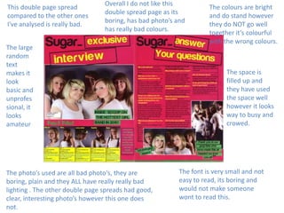
Things you should think about!
•
•
•
•
•
•
•
•
•
•
•

You must consider…
Basic layout – can you see a ‘grid’?
Column width and positioning
Font and type size
Use of space
Colours
Use of images
Page numbers
Branding
Captions
How image and text are integrated
The colour is boring but somehow it goes with the
text and the picture so in a way the colour is good
however if you wanted it to be more eye catching
then you would add bright colours so people
would be drawn to it.

In this double page
spread, I like the
photo as it is very
clear and a great
picture however
some people may
say it is a bit boring
as it does not have
much colour,
brightness.

This text in this double
page spread is good as
it is clear and easy to
read and is in a nice
format and in the right
place, the way the
writing is laid out is
nice as it is neat and
goes with the picture
and the colour.

Over all I like this double page spread as it is
clear, nicely laid out, and has a very nice and
clear picture to go with it all. Maybe could be
a bit more colourful if you wanted it to be
more eye catching.
The Mast head on this double page spread is much more interesting than the other
one, this one is bigger, interesting and fun!
It is eye catching where as the other one way not.
I like this mast heading on this one as it is big and loud, all this makes it more fun
and interesting to read.

The use of space is
good there is not
loads of left over
room and space has
been filled up nicely.

The text, the text is not very
big and bold in this double
page spread so it may be hard
to read or not very appealing
to read.
Maybe if the text was a little
bigger so people could read it
easier that would be better.

All the
colours go
together and
it looks good

This double page spread is very
different in many ways, for example
the picture is of a person not a
landscape and is a bright red colour
not all a dull brownie colour.
This double page spread
compared to the other ones
I've analysed is really bad.

Overall I do not like this
double spread page as its
boring, has bad photo’s and
has really bad colours.

The large
random
text
makes it
look
basic and
unprofes
sional, it
looks
amateur

The photo’s used are all bad photo's, they are
boring, plain and they ALL have really really bad
lighting . The other double page spreads had good,
clear, interesting photo’s however this one does
not.

The colours are bright
and do stand however
they do NOT go well
together it’s colourful
with the wrong colours.

The space is
filled up and
they have used
the space well
however it looks
way to busy and
crowed.

The font is very small and not
easy to read, its boring and
would not make someone
wont to read this.

Becky double page spread magazine analysis

  • 2.
    Things you shouldthink about! • • • • • • • • • • • You must consider… Basic layout – can you see a ‘grid’? Column width and positioning Font and type size Use of space Colours Use of images Page numbers Branding Captions How image and text are integrated
  • 3.
    The colour isboring but somehow it goes with the text and the picture so in a way the colour is good however if you wanted it to be more eye catching then you would add bright colours so people would be drawn to it. In this double page spread, I like the photo as it is very clear and a great picture however some people may say it is a bit boring as it does not have much colour, brightness. This text in this double page spread is good as it is clear and easy to read and is in a nice format and in the right place, the way the writing is laid out is nice as it is neat and goes with the picture and the colour. Over all I like this double page spread as it is clear, nicely laid out, and has a very nice and clear picture to go with it all. Maybe could be a bit more colourful if you wanted it to be more eye catching.
  • 4.
    The Mast headon this double page spread is much more interesting than the other one, this one is bigger, interesting and fun! It is eye catching where as the other one way not. I like this mast heading on this one as it is big and loud, all this makes it more fun and interesting to read. The use of space is good there is not loads of left over room and space has been filled up nicely. The text, the text is not very big and bold in this double page spread so it may be hard to read or not very appealing to read. Maybe if the text was a little bigger so people could read it easier that would be better. All the colours go together and it looks good This double page spread is very different in many ways, for example the picture is of a person not a landscape and is a bright red colour not all a dull brownie colour.
  • 5.
    This double pagespread compared to the other ones I've analysed is really bad. Overall I do not like this double spread page as its boring, has bad photo’s and has really bad colours. The large random text makes it look basic and unprofes sional, it looks amateur The photo’s used are all bad photo's, they are boring, plain and they ALL have really really bad lighting . The other double page spreads had good, clear, interesting photo’s however this one does not. The colours are bright and do stand however they do NOT go well together it’s colourful with the wrong colours. The space is filled up and they have used the space well however it looks way to busy and crowed. The font is very small and not easy to read, its boring and would not make someone wont to read this.