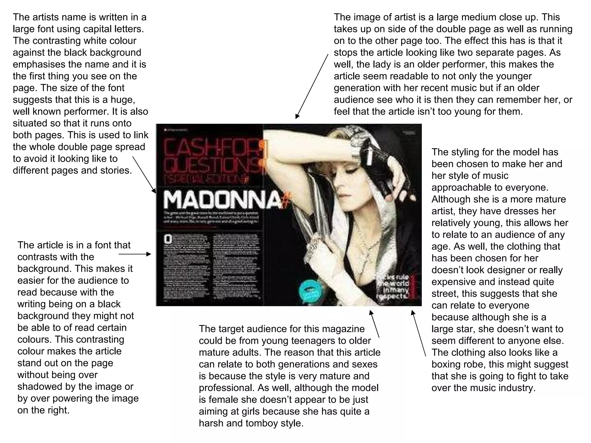
The artists name is written in a large font using capital letters. The contrasting white colour against the black background emphasises the name and it is the first thing you see on the page. The size of the font suggests that this is a huge, well known performer. It is also situated so that it runs onto both pages. This is used to link the whole double page spread to avoid it looking like to different pages and stories. The image of artist is a large medium close up. This takes up on side of the double page as well as running on to the other page too. The effect this has is that it stops the article looking like two separate pages. As well, the lady is an older performer, this makes the article seem readable to not only the younger generation with her recent music but if an older audience see who it is then they can remember her, or feel that the article isn’t too young for them. The article is in a font that contrasts with the background. This makes it easier for the audience to read because with the writing being on a black background they might not be able to of read certain colours. This contrasting colour makes the article stand out on the page without being over shadowed by the image or by over powering the image on the right. The target audience for this magazine could be from young teenagers to older mature adults. The reason that this article can relate to both generations and sexes is because the style is very mature and professional. As well, although the model is female she doesn’t appear to be just aiming at girls because she has quite a harsh and tomboy style. The styling for the model has been chosen to make her and her style of music approachable to everyone. Although she is a more mature artist, they have dresses her relatively young, this allows her to relate to an audience of any age. As well, the clothing that has been chosen for her doesn’t look designer or really expensive and instead quite street, this suggests that she can relate to everyone because although she is a large star, she doesn’t want to seem different to anyone else. The clothing also looks like a boxing robe, this might suggest that she is going to fight to take over the music industry.
The photo on the left hand side is a medium close up shot of the artist. It is in black and white this gives the page a professional  and photograph a very serious and professional look, suggesting that the magazine takes their interviews very serious. As well, they have chosen to make the photo fill one side of the double page spread, this portrays that the person being interviewed is important enough for a whole page to be dedicated for the photo. The colour scheme for this article is red, white and black. With the majority of the both pages being mainly black and white, the large red ‘L’ contrasts with the background immediately grabbing the readers attention. This is a good effect to have because the ‘L’ is the first initial of the artists first name, this shows that this article is all about this person and they want to acknowledge this. In the right hand corner is the artists name. Due to this being pushed away in the corner and not spread out in a large font across the photo or two pages, suggests that this artist is already well known and that the magazine don’t feel the need to advertise who the artist is. Instead they are confidently quiet about the star they have interviewed in their magazine. The article has been written in three columns that fill one of the two pages. This effect looks very professional. The target audience for this double page spread could be both young and old audiences. This impression is given because she is a young artist that teenagers or young adults could relate to in age. On the other hand, due to the pages appear professional and the use of three colours, gives this a mature look instead of  an article you would see in a teenage magazine.
The colours scheme is black, white and orange. The use of the bold orange on both pages links them together and stops the article looking like to separate stories. Also, it contrasts against the plain black and white colours making the article become very eye-catching. The brightness of the colour also gives the article a youthful look that might interest a younger audience. As well, it stops the article from look boring and makes it more interesting to read. The image is a medium shot of the band. The image has taken up on of the two pages. They are styled very casual and look just like normal working men. This allows the audience to relate to this article because they can see that although these are a well known band, they are just like everybody else. As well, they are staring into the lens, this to audience will seem like they are looking at them. There facial expressions are very serious this might suggest that they take their music very seriously. The target audience for this would be adults over 25 years of age. You get this impression because they are a mature band that will have had fans from when they started that perhaps are a similar age now. Also, they suggest having a more male because they appear very serious and are dressed very manly. Another reason to suggest this is that they don’t look like a pop boy band, that want girls to love them. One of the main features on the double page spread is the large quote that over-laps the photo. The colour of the photo contrasts from the dark picture, this effect makes the writing clear and stand out, the white and orange also link with the other page. Another effect that has been used within the quote is that within the white writing, they have their name in orange, this shows that the band want to make an impact and they also want to be different to other bands.  This article has been written in columns that take up the right side to the double page spread. This gives the pages a professional appearance and makes the article easier to read.

Analysis double page spread

  • 1.
    The artists nameis written in a large font using capital letters. The contrasting white colour against the black background emphasises the name and it is the first thing you see on the page. The size of the font suggests that this is a huge, well known performer. It is also situated so that it runs onto both pages. This is used to link the whole double page spread to avoid it looking like to different pages and stories. The image of artist is a large medium close up. This takes up on side of the double page as well as running on to the other page too. The effect this has is that it stops the article looking like two separate pages. As well, the lady is an older performer, this makes the article seem readable to not only the younger generation with her recent music but if an older audience see who it is then they can remember her, or feel that the article isn’t too young for them. The article is in a font that contrasts with the background. This makes it easier for the audience to read because with the writing being on a black background they might not be able to of read certain colours. This contrasting colour makes the article stand out on the page without being over shadowed by the image or by over powering the image on the right. The target audience for this magazine could be from young teenagers to older mature adults. The reason that this article can relate to both generations and sexes is because the style is very mature and professional. As well, although the model is female she doesn’t appear to be just aiming at girls because she has quite a harsh and tomboy style. The styling for the model has been chosen to make her and her style of music approachable to everyone. Although she is a more mature artist, they have dresses her relatively young, this allows her to relate to an audience of any age. As well, the clothing that has been chosen for her doesn’t look designer or really expensive and instead quite street, this suggests that she can relate to everyone because although she is a large star, she doesn’t want to seem different to anyone else. The clothing also looks like a boxing robe, this might suggest that she is going to fight to take over the music industry.
  • 2.
    The photo onthe left hand side is a medium close up shot of the artist. It is in black and white this gives the page a professional and photograph a very serious and professional look, suggesting that the magazine takes their interviews very serious. As well, they have chosen to make the photo fill one side of the double page spread, this portrays that the person being interviewed is important enough for a whole page to be dedicated for the photo. The colour scheme for this article is red, white and black. With the majority of the both pages being mainly black and white, the large red ‘L’ contrasts with the background immediately grabbing the readers attention. This is a good effect to have because the ‘L’ is the first initial of the artists first name, this shows that this article is all about this person and they want to acknowledge this. In the right hand corner is the artists name. Due to this being pushed away in the corner and not spread out in a large font across the photo or two pages, suggests that this artist is already well known and that the magazine don’t feel the need to advertise who the artist is. Instead they are confidently quiet about the star they have interviewed in their magazine. The article has been written in three columns that fill one of the two pages. This effect looks very professional. The target audience for this double page spread could be both young and old audiences. This impression is given because she is a young artist that teenagers or young adults could relate to in age. On the other hand, due to the pages appear professional and the use of three colours, gives this a mature look instead of an article you would see in a teenage magazine.
  • 3.
    The colours schemeis black, white and orange. The use of the bold orange on both pages links them together and stops the article looking like to separate stories. Also, it contrasts against the plain black and white colours making the article become very eye-catching. The brightness of the colour also gives the article a youthful look that might interest a younger audience. As well, it stops the article from look boring and makes it more interesting to read. The image is a medium shot of the band. The image has taken up on of the two pages. They are styled very casual and look just like normal working men. This allows the audience to relate to this article because they can see that although these are a well known band, they are just like everybody else. As well, they are staring into the lens, this to audience will seem like they are looking at them. There facial expressions are very serious this might suggest that they take their music very seriously. The target audience for this would be adults over 25 years of age. You get this impression because they are a mature band that will have had fans from when they started that perhaps are a similar age now. Also, they suggest having a more male because they appear very serious and are dressed very manly. Another reason to suggest this is that they don’t look like a pop boy band, that want girls to love them. One of the main features on the double page spread is the large quote that over-laps the photo. The colour of the photo contrasts from the dark picture, this effect makes the writing clear and stand out, the white and orange also link with the other page. Another effect that has been used within the quote is that within the white writing, they have their name in orange, this shows that the band want to make an impact and they also want to be different to other bands. This article has been written in columns that take up the right side to the double page spread. This gives the pages a professional appearance and makes the article easier to read.