
Recommended
More Related Content
What's hot
What's hot (20)
Viewers also liked
Viewers also liked (12)
Similar to Dizzee rascal front cover etc
Similar to Dizzee rascal front cover etc (20)
Recently uploaded
Recently uploaded (20)
Dizzee rascal front cover etc
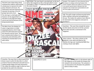
- 1. The front cover shows dizzy rascal showing direct address while pulling a funky pose to represent his wild party character and music. His enthusiastic look well represents the character he portrays in his UK garage type party music. The shot type is a full body shot however can be argued that’s it’s a mid-shot as only half of his body can be seen kind of because of him being kneeled down. The Main-Cover line displays his name is huge letters in a bold typography fashion which helps match the wild enthusiasm of both the character and his music. The text is slanted which allows it to looks funky and wild along with it matching his kneeled down arms wide stance. MASTHEAD- The mast head is very bold and on the top left on the magazine as this is the spot which is most noticeable in shops. It is bold and red which matches the covers linessss Barcode – The barcode is in the bottom right on the magazine as this avoids the hotspot and instead in the terminal area. The customer is not interested in this therefore the publisher wants to keep in away. Coverlines – The cover lines include the names of other bands and artists to let the customer know what and who is mentioned in the magazine. Coverline- The cover line is a direct quote from dizzee rascal in which he describes in a short sentence how his enthusiasm and wild music is making people happy and enjoy themselves. This makes the audience eager to find out more of what he has said in his interview. Puff- The puff is bright red featuring bold white letters making it attractive and appealing to the eye. This makes the audience more likely to be interested in the magazines and want to purchase it. Strapline- The strapline isn’t very attractive hence the reason it is always at the top however this certain strapline allows the audience to know that it is an autumn special which indicates that this magazine may include more special features and has more pages and exclusives Colour scheme – The colour scheme on the magazine is red, white and black as the matches the logo and masthead of NME thus creating a house style effect. Layout/Mise en scene -
- 2. Genre – The genre of the magazine is an array of music sub genres including, hip-hop, rock and RnB. Cover lines – The cover lines are in white bold letters and are featured on the right hand side of the page. The cover lines also have a newspaper look to them making them appear in a slight vintage fashion. Masthead – The masthead on magazine is on large impact letters with a white outline to match the rest of the contents page. The masthead as a paper overlay look to it to match the rest of the contents page also giving it a newspaper looks. Shot type – The shot type featured is a medium long shot and appears to be quite old looking whether or not this has had a filter placed on this. Columns have been used along side the main image on the left hand side. In this column is an index telling the reader where everything in magazine is. Target Audience – The target audience for this magazine is those of a younger age as the magazine usually features the younger artists which would be more appealing to a younger generation. Also the ethnicity would be varied as NME could feature many different genres. Date/issue number – The date is issued on the top right of the magazine and is fairly big but not enough to distract from the main image. Also the issue number has not been shown on the contents page as this is a typical feature of the front cover. Page numbers – Page numbers have been used but only in the index part of the contents page. Mise en scene – Mise en scene has been thought about Wiseley in the magazine in order to structure the layout perfectly. For example in the bottom right of the magazine is an advertisement to subscribe to NME magazine which has purposely been put there so when the reader gets to the bottom of the contents page it will make the contemplate to buy the magazine. Also cover lines have been swept to the side in order to leave space for the main image and make the magazine looks neat and appealing. The index is also swept to the left to be a appealing but also makes it easier to navigate. Everything surrounds the main image to focus on it. Making everything look neat the way they have is a part of the NME house style and also the use of the colour red to match the masthead and represent the brand by use of colours. The main heading on this page is obviously Contents as this is just the page telling the reader what is featuring in the magazine. Sub headings on the contents page are featured underneath the cover lines to tell you a little more about what the colour line is talking about for example news then under would be news on what celebrity and also the page next to it. The main image is a medium long shot which appears to look vintage therefore the rest of the magazine also matches this. There is main article on the contents page which talks about a special feature of this magazine giving a tease at it then telling the user to go to the specific page. The language used is somewhat formal however someone's can be seen as informal when talking about gossip to do with celebrities. Borders have been used around the image in order to give it an old effect like an old book for example thus matching the rest of the magazine.