
Recommended
More Related Content
What's hot
What's hot (19)
Viewers also liked
Viewers also liked (20)
Similar to Analysis of student digipaks
Similar to Analysis of student digipaks (20)
More from keshaathakrar
Recently uploaded
Recently uploaded (20)
Analysis of student digipaks
- 1. Analysis of Student Digipaks By Keshaa Thakrar
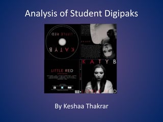
- 2. The entirety of the digipak follows the colour scheme of red black and white, these classic colours easily compliment each other and create effect to consumers by standing out yet can still appear subtle when softened. We see this here in the soft picture of the main artist, contrasting to the linear gradient of red text fading into white. This pulls focus to the artist with dark makeup displaying the edgy side to the artist, building up the branding ethos for the singer. The text used is a simple yet effective and bold choice, putting most of the focal point to the image rather than to the text. Moreover the gradual fade from red to white makes the cover look less harsh than it would if it were all red and more eye catching than if it were all white We can see that the lighting is placed in front of the model to illuminate the face and provide contrast from the blacked out background. This gives and ‘infinite’ look which draws readers into this image and subsequently the digipak.
- 3. Here we can see that this follows the colour scheme again of white black and red, on the thank you page, red is used as an accent colour to distinguish away from the rest of the white text and remain consistency by pulling the digipak together. Also it indicates to audience members the soul purpose of the music video, to promote the artist. The text on the CD and colour formatting is the same as the front cover which helps to remain professionalism and house style of the product. The black and white image of the main artist provides an almost ghostly look to the digipak, merging with the text beside it. The facial expression of a subtle pout creates a sad and sombre feel to the digipak, perhaps hinting audience members to the type of music involved in the cd. Moreover the eye glance to the side makes the artist appear as shy revoking any traits of anger within her music as she is not looking directly into the camera. This may appeal to the target audience of whom enjoy more sad tones in songs.
- 4. Again the colours distinguish from the dark background, the red dividers between each song are in red tying the whole back cover together in a simple yet effective way, the same font style is used again to remain consistent. Advertising the artists social media platforms helps to brand the singer and promote her music further, as well as giving fans another base to connect with the artist. Displaying this on the back of a digipak makes it easy for audience members to be aware and access these websites. There is no main image on this page which is effective as in this case it may be apparent that ‘less is more’ as to have another large image on here may seem too graphical and over powering. The simplistic text is bold on its own accord. I believe that the linear gradient effect is a great idea as it is easy to create yet looks appealing and stands out upon normal text