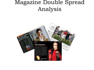
SlideShare a Scribd company logo
Magazine Double Spread
Analysis
What is a double spread page?
• Double Page Spread refers to two pages that
are treated as one, with images or text
extended across the binding . I would be
analyzing three double spread pages for my
media assignment .
Double Spread #1
Header
Drop cap
By line
Article Title
Main
Image
(Indirect
mode)
Footer
(Magazine
name and
page
number)
Standfirst
General
Analysis
This double spread image is possessed by ‘Harper’s bazaar magazine’ which is
a women’s fashion magazine that began in 1867.This double spread is
dominated by only one image which dominates the page to a great extent.
The article is written in black letters against a white background. It was
very appropriate to have a white background as the main Image is very
colorful and lively. The colours would not have been popped very well and
looked that attractive on a dark coloured background. The neutral colour
scheme of the article and the background contributed towards making the
image look very eye pleasing. The image takes up a whole page and a
great proportion of the other page with text thus abiding by the concept
of double spread sheets .The article of these double spread sheets is
divided into different categories which can be demonstrated by the
subheadings before every paragraph showing that the article focuses on
particular aspects rather than one single topic. There is a lot of uniformity
as the writer has not used different colours for the header and footers
also. This double spread does not possess any pull quote as it does not
focus on only one particular subject.
Article Title
The article title of this
double spread is written in a
very simple way using the
neutral colour blank. The
article title also does not
have a large font size like
the articles of majority of
the double spreads do .The
title is written in an elegant
way
Main Image
Since this double spread possesses only one
image, it gets categorized as the main image
.The image can be claimed as a medium long
shot as it portrays the subject from head to toe
and we can see the surroundings. The image is
taken on a field near an enormous resident
type building . The image is a landscape and
comprises of seven subjects. The image is an
indirect shot as the subject(the ladies) are not
looking into the camera which enables them to
not look into the reader’s eye. The subject fails
to establish a friendly and manipulative bond
with the reader even though one model (the
one in the red shirt ) is partially looking At the
camera. The image shows a number of models
who are walking towards a particular location.
The ladies in the image are dressed in a highly
fashionable way.However,their facial
expressions are very solemn as none of the
ladies are smiling.
Drop Cap
Like every drop cap, the article of this double spread has a bigger
sized and bold coloured drop cap. The drop cap of the article in this
magazine is in serifs and gives a formal and sophisticated look.The
letter of the dropcap, however, has a thin starting line and some
proportions of the letter are bold.
Standfirst
Unlike many double spreads, the stand first of this double
spread is quite detailed and elaborate. Many articles have
standfirst of one line. The size of the letters of the standfirst is
small and it is written in a different font which gives a very
pleasing look to the double spread.
Header
The denotations about the header is that it is written on the
extreme top and on the extreme right. It is written in bold, black
and in capital. Like every other page od the magazine, the header
of this double spread is the same.
Double Spread #2
Celebrity
Name
Drop
Cap
Main
Image
By Line
Standfirst
Content
box
General Analysis
This double spread is from a music magazine. We can
see that the article title is a pull quote. Unlike many
double spreads, this is not dominated by too many
pictures. There are only two images on the double
spread. The colour palette of these double spread
sheets comprises of the colours white and black.
However the use of the colour orange before the title
and the dropcap and brightness. The colour scheme is
extremely consistent throughout these double spreads
The image of the violinist is appearing on the page
with the text hence showing some connectivity
between the two pages proving that it is a double
spread. The text of the article is divided among three
columns which gives a tidy and nice look.
Article Title
The article title is written boldly in white and it is situated at the
corner on the extreme right . Although unlike many article
titles this one is not written in capital letters yet the letters
stand out in white against the black background. Since the
article title is a pull quote, the apostrophe marks also makes
the title stand out and makes it more prominent. The name
of the violinist has been highlighted in a bright orange colour
making it stand out more as a celebrity . Despite being in the
corner, the highlight on the celebrity's name is a great
method of appeal. The dullness of the colour white is
compensated by the brightness of the orange highlight
Standfirst
The standfirst of this article is giving a glimpse of
what the entire article is about. The standfirst is not
written boldly in capital letters. The standfirst
suggests that the article is emphasizing on the fact
that having a great violin is not the only instrument
for great fiddling and great fiddling demands more
than that. This standfirst says a lot in a little
regarding the article.
By Line
The byline is written in a quite smaller font size
and capital letters. In my opinion, it is essential
to have a by line as those individuals involved
in making the double spread should be given
the credibility and the recognition for being
Indulged in that particular category.The by line
is written in the same colour as the stand first
right below the article title demonstrating
connectivity. Usually double spreads have
bylines at the end of the article but this one has
it right after the article title
Main Image
The main image comprises of only one subject. The image
seems like a mid close up shot as we can see the subject
from the head to the lower chest and the surroundings at
the back can be seen as well. It is a direct mode shot as
the subject is looking into the camera building a good
connection with the reader The shot seems to be taken
at a lounge and we can see violins at the back showing
that the subject is passionate about violins to such an
extent that he is surrounded by violins .The subject is
wearing a white dress shirt along with a brown checked
coat which gives a semi formal .The subject which is the
violinist have quite serious facial expressions which can
connote that he highly passionate and focused about his
career. Having a blur picture of violins in the background
and the subject being dressed in one of the shades of
brown colour makes a good contrast. Having a pull quote
on the main image is a great contribution towards having
the reader’s interest grabbed towards the article in the
double spread. For eg;-If the magazine holder is not fond
of reading but just skimming through the magazine the
pull quote on the main image of this double could
manipulate the reader and tempt them and create
suspense about something highly interesting in the article
hence convincing them to read it
Secondary Image
The subject of the secondary subject is a violin. The picture is a
full shot as it demonstrates the violin fully. We can see a
reflection of the backside of the violin which indicates that it
is taken near a mirror. Having the image of the violin further
indicates that the article features a violinist. The small image
can make the article interesting for the reader.
Drop Cap
The letter ‘I’ that is written boldly in orange is
known as the drop cap. Though it is a part of
the article, the colour ,boldness and its size
completely differs from those of the rest of the
alphabets of the article. The reason behind
this is to indicate that this is the point from
where the article originates. In my opinion,
this is a quite creative technique making it
convenient for the reader to acknowledge the
starting point of the article of a double spread
which is highly dominated by text. Having
orange as the drop cap colour was quite
appropriate as it is extremely bright and dark.
It is also An attractive colour resulting in
convenient visibility. Having dull colours like
baby pink, yellow, blue etc would not have
given such an eye catching effect like the
orange drop cap
Content box
The content box gives a very good edge to the
double spread. The content box is located on
the extreme right on the main image. The
content box is the resume of the violinist on
whom the article is based. It is portrayed as a
page torn from a notebook and it is likely to
fascinate the audience. The details in the
content box are totally different from those in
the article. The use of a different colour for
the heading makes it easier for the audience
to see what details does the content box
contain. The years are also written in 0range
which further assists in categorizing.
Pull Quotes
These pull quotes are taken from the article which grip the
reader’s attention. Pull Quote give a great edge to double
spread pages and increases the attractiveness of an article
.Bold pull quotes create suspense and desire about
acknowledging what is in the article
The orange box indicates the end of the
article. Having the final stop as the same
colour as the drop cap is quite co
ordinative.The box would indicate that
any text written after it is not a part of
the article
Double Spread#3
Main
Image
Article
title
Standfirst
Drop
Cap
Secondary
Image
Pull
Quote
Footer
(magazine name
and page number)
Content
box
Header
General Analysis
This double spread Is taken from a music magazine called heavy
metal magazine. The colour palette of this double spread
consists of black , white and red and this is a very powerful
colour scheme. The three colours complement one another in
an extraordinarily amazing way. The article of this double
spread looks incomplete without a byline. This double spread
is not dominated by a lot of images but has one main image
that takes up a great proportion of the sheet and a very small
image. Both the images of these double spreads have the
same subject. This double spread also possesses a barcode
which is rare. The article is written in two equal columns with
white which is conveniently readable. The ratio of the image
on this double spread is higher than that of the text. The
article of this double spread starts from the corner on the
extreme right and does not circulate around the image or the
quote.
Article title
This double spread has a two word article
title which sums up that the article is about
classical singing. Though the title is not in
capital letters, it still stands out because of
the use of white colour against the black
background.
standfirst
This double spread has a two line standfirst which gives an
extremely brief idea about a number of characteristics of Tara
Turunen.The word Heavy is written in capital letters which
means that the writer. The use of the colour ‘red’ for the
standfirst as it excites the reader’s emotions and further
convinces to read and acknowledge more details. It invokes
enthusiasm and desire to read the article.
DropCap
The drop cap is orange colored
which shows great co ordination
between with the color of the
subject of the main image. The
shade of the color of the drop cap
is that one of the orange used in
fire. At times, the emoticon o fire is
used to indicate seductiveness. It
shows connectivity with the model
of the main image as she is also
dressed up in a very sexy way and
her facial expressions are portrayed
in a way as if she is trying to attract
the audience by her intoxicatingly
seductive expressions. Hence, the
colour of the drop cap mentally
prepares the reader for such an
image.
Main ImageThis main Image is very empowering. It comprises of only one subject that is a
lady. The image is a mid close up as it tightly frames the subject from the head to
the lower chest and the subject takes up the entire page. The image not only
bleeds over the entire page but also takes up as proportion of the page with the
text thus abiding by the concept of a double spread to a great extent . It is a
direct shot as the way the lady is looking enables her to establish eye contact
with the audience. The subject is dressed in a black shirt and she is wearing a
number of necklaces. The black shirt makes her look quite semi formal. However,
the use of the red fur which the lady is wearing breaks the semi formal look. The
red fur greatly contributes towards withdrawing the audience's attention. For
e.g.;-The audience would not have been attracted and the double spread would
have a very bad and disrupting view because of the black shirt which is the same
colour as the background..Just like most of the singers and musicians, the singer
here is wearing a lot of necklaces which gives her a rock star oriented look. Since
red colour is meant to attract attention, it would intrigue the reader to have a
look. The reader could be flipping pages but he/she might consider checking
where the shade of red is coming from thus being ,manipulated about the
article. Having the image of Taruja Tarunen is a good reason for individuals such
as her fans to read about her. The image is an essential factor as it is giving an
idea about the celebrity featured in the article, However, the facial expressions
of the lady are a little unpleasant. The way she is looking seems as if she is
infuriated or is warning about something. We can see that little pop of red on
her right eye which creates suspense in the audience’s mind that is the subject
so intensely infuriated. The subject is not wearing a lot of makeup.Eg;-The colour
of her lipstick is not dark or red in connection with the colour scheme as it would
have created a very hard look.
Secondary Image
The secondary image of this double spread is a
direct shot as it enables the establishment of
connectivity between the reader and the
subject of the image. The image is a close up
shot as it does not give an idea about the
surroundings and it does not have any head
room. The subject’s face is partially painted
with yellow giving a very pale look. The girl’s
hair also looks a little untidy and the facial
expressions are in a way that they can neither
be claimed to be delighted nor gloomy. The
way the lady is portrayed in the image
indicates that she has a carefree look. The
pops of the yellow colour make the picture
look a little bright thus withdrawing the
reader’s attention. The subject of this image
looks rather very simple and we can see that
neither has she applied any makeup nor is she
wearing any jewellery.
Pull Quote
The pull quote of this double spread is situated on the extreme bottom. Double
Spreads usually have pull quotes on the top and they are written in a way that the
article circulates around them. This pull quote is written In a quite simple font and
written in straight lines.However,the use of asterisks indicates that this pull quote
possesses a word categorized under foul language which is which two of it’s letter are
not demonstrated. Not only is this pull quote attracting the reader but also breaking
the long blocks of text. Like every pull quote, the pull quote of this double spread is
sized larger than the body text
Footer
The magazine name is written as the header in white. This footer
has a bigger font unlike the footers of majority. The letter ‘A’ has
been omitted from the magazine name which connotes that Heavy
Metal is a well known and famous magazine and it’s name can be
recognized even if as letter is omitted from one of the alphabets.
The use of the red triangle with the white font brings about some
diversity. Using only white for the footer would have made it look
boring.
Content Box
The content box Is located right next to the main image
which gives an insight about something that is linked to the
article title but has no connectivity with the article itself.
This content box focuses on what of the accomplishments
of the female classical singer on whom the article is based.
Unlike many content boxes, this one also possesses a small
image and a description regarding that accomplishment of
the singer. The colorful image in the content box breaks the
colour scheme of red black and white and brings some
diversity and liveliness to the double spread
Header
The header of this double spread consists of three words that are
written in different lines.' Rock is written in red which indicates that a
lot of emphasis is being given to this quality. Since it is describing about
the chick, this characteristic is made prominent by the use of a
different eye catching colour .
Articles have a fully coloured square box
at the end which indicate the end of the
article. However this article has a an
orange coloured bold ’H’ which is a great
and unique innovation signifying the
magazine where the article belongs

More Related Content

What's hot

Analysis of other double page spreads
Analysis of other double page spreadsAnalysis of other double page spreads
Analysis of other double page spreads
lucyl0u
 
Music Magazine - Textual Analysis
Music Magazine - Textual AnalysisMusic Magazine - Textual Analysis
Music Magazine - Textual Analysis
Eliza09ec
 
Evaluation 1- In what ways does your media product use, develop or challenge ...
Evaluation 1- In what ways does your media product use, develop or challenge ...Evaluation 1- In what ways does your media product use, develop or challenge ...
Evaluation 1- In what ways does your media product use, develop or challenge ...
Daisy Birchall
 
Magazine codes and connections for double page spread
Magazine codes and connections for double page spreadMagazine codes and connections for double page spread
Magazine codes and connections for double page spread
Lara Berndes
 
NME Cover Analysis
NME Cover AnalysisNME Cover Analysis
NME Cover AnalysisLukaMedia
 
second assessment
second assessmentsecond assessment
second assessment
Lukeforster1801
 
Samantha etridge music magazine front cover analysis
Samantha etridge music magazine front cover analysisSamantha etridge music magazine front cover analysis
Samantha etridge music magazine front cover analysisbir
 
Magazine Analysis
Magazine AnalysisMagazine Analysis
Magazine Analysisasmediae13
 
Textual analysis
Textual analysisTextual analysis
Textual analysisJwbread
 
Magazine Textual Analysis
Magazine Textual AnalysisMagazine Textual Analysis
Magazine Textual AnalysisJwbread
 
Music Magazine Analysis
Music Magazine AnalysisMusic Magazine Analysis
Music Magazine Analysis
liamsacko
 
Magazine analysis
Magazine analysisMagazine analysis
Magazine analysis
eleanorbarter
 
NME Cover Analysis
NME Cover AnalysisNME Cover Analysis
NME Cover AnalysisLukaMedia
 
NME Cover Analysis
NME Cover AnalysisNME Cover Analysis
NME Cover AnalysisLukaMedia
 

What's hot (18)

Analysis of other double page spreads
Analysis of other double page spreadsAnalysis of other double page spreads
Analysis of other double page spreads
 
Music Magazine - Textual Analysis
Music Magazine - Textual AnalysisMusic Magazine - Textual Analysis
Music Magazine - Textual Analysis
 
Evaluation 1- In what ways does your media product use, develop or challenge ...
Evaluation 1- In what ways does your media product use, develop or challenge ...Evaluation 1- In what ways does your media product use, develop or challenge ...
Evaluation 1- In what ways does your media product use, develop or challenge ...
 
Magazine codes and connections for double page spread
Magazine codes and connections for double page spreadMagazine codes and connections for double page spread
Magazine codes and connections for double page spread
 
F:\Magazine Radials
F:\Magazine RadialsF:\Magazine Radials
F:\Magazine Radials
 
Media front cover
Media front coverMedia front cover
Media front cover
 
NME Cover Analysis
NME Cover AnalysisNME Cover Analysis
NME Cover Analysis
 
Existing products
Existing productsExisting products
Existing products
 
second assessment
second assessmentsecond assessment
second assessment
 
Samantha etridge music magazine front cover analysis
Samantha etridge music magazine front cover analysisSamantha etridge music magazine front cover analysis
Samantha etridge music magazine front cover analysis
 
Magazine Analysis
Magazine AnalysisMagazine Analysis
Magazine Analysis
 
Textual analysis
Textual analysisTextual analysis
Textual analysis
 
Magazine Textual Analysis
Magazine Textual AnalysisMagazine Textual Analysis
Magazine Textual Analysis
 
Music Magazine Analysis
Music Magazine AnalysisMusic Magazine Analysis
Music Magazine Analysis
 
Magazine analysis
Magazine analysisMagazine analysis
Magazine analysis
 
NME Cover Analysis
NME Cover AnalysisNME Cover Analysis
NME Cover Analysis
 
NME Cover Analysis
NME Cover AnalysisNME Cover Analysis
NME Cover Analysis
 
Media Front Cover Analysis
Media Front Cover Analysis Media Front Cover Analysis
Media Front Cover Analysis
 

Viewers also liked

Music video analysis (1)
Music video analysis (1)Music video analysis (1)
Music video analysis (1)
louisahill99
 
Music album mood board
Music album mood boardMusic album mood board
Music album mood board
louisahill99
 
Presentation on Football Magazine (Golazo)
Presentation on Football Magazine (Golazo)Presentation on Football Magazine (Golazo)
Presentation on Football Magazine (Golazo)
Jamie Mellors
 
digipak anlysis
digipak anlysis digipak anlysis
digipak anlysis
louisahill99
 
Magazine double page spread analysis
Magazine double page spread analysisMagazine double page spread analysis
Magazine double page spread analysismattmosey1
 
Double page spread analysis
Double page spread analysisDouble page spread analysis
Double page spread analysis
keshaathakrar
 
Double spread magazine analysis number
Double spread magazine analysis numberDouble spread magazine analysis number
Double spread magazine analysis number
Maria Sheikh
 
Q magazine front cover analysis
Q magazine front cover analysisQ magazine front cover analysis
Q magazine front cover analysisasmediac12
 
Analysis of magazine double page spreads
Analysis of magazine double page spreadsAnalysis of magazine double page spreads
Analysis of magazine double page spreadssarah123ashcroft
 
Magazine Double Page Spread Analysis
Magazine Double Page Spread AnalysisMagazine Double Page Spread Analysis
Magazine Double Page Spread Analysis
SuzyQuinn13
 
Becky double page spread magazine analysis
Becky double page spread  magazine analysisBecky double page spread  magazine analysis
Becky double page spread magazine analysisCharis Creber
 
Double page spread analysis
Double page spread analysisDouble page spread analysis
Double page spread analysisramsz001
 
Media magazine cover, contents, double page spread analysis- complete, addi...
Media  magazine cover, contents, double page spread analysis-  complete, addi...Media  magazine cover, contents, double page spread analysis-  complete, addi...
Media magazine cover, contents, double page spread analysis- complete, addi...Heather Hutchinson
 

Viewers also liked (13)

Music video analysis (1)
Music video analysis (1)Music video analysis (1)
Music video analysis (1)
 
Music album mood board
Music album mood boardMusic album mood board
Music album mood board
 
Presentation on Football Magazine (Golazo)
Presentation on Football Magazine (Golazo)Presentation on Football Magazine (Golazo)
Presentation on Football Magazine (Golazo)
 
digipak anlysis
digipak anlysis digipak anlysis
digipak anlysis
 
Magazine double page spread analysis
Magazine double page spread analysisMagazine double page spread analysis
Magazine double page spread analysis
 
Double page spread analysis
Double page spread analysisDouble page spread analysis
Double page spread analysis
 
Double spread magazine analysis number
Double spread magazine analysis numberDouble spread magazine analysis number
Double spread magazine analysis number
 
Q magazine front cover analysis
Q magazine front cover analysisQ magazine front cover analysis
Q magazine front cover analysis
 
Analysis of magazine double page spreads
Analysis of magazine double page spreadsAnalysis of magazine double page spreads
Analysis of magazine double page spreads
 
Magazine Double Page Spread Analysis
Magazine Double Page Spread AnalysisMagazine Double Page Spread Analysis
Magazine Double Page Spread Analysis
 
Becky double page spread magazine analysis
Becky double page spread  magazine analysisBecky double page spread  magazine analysis
Becky double page spread magazine analysis
 
Double page spread analysis
Double page spread analysisDouble page spread analysis
Double page spread analysis
 
Media magazine cover, contents, double page spread analysis- complete, addi...
Media  magazine cover, contents, double page spread analysis-  complete, addi...Media  magazine cover, contents, double page spread analysis-  complete, addi...
Media magazine cover, contents, double page spread analysis- complete, addi...
 

Similar to Magazine double spread analysis muskaaaannnnnnnn media work

Untitled presentation
Untitled presentationUntitled presentation
Untitled presentation
baninadeem
 
Untitled presentation
Untitled presentationUntitled presentation
Untitled presentation
baninadeem
 
Doublepage 110303030414-phpapp02
Doublepage 110303030414-phpapp02Doublepage 110303030414-phpapp02
Doublepage 110303030414-phpapp02Longmark12
 
Music magazine Analysis
Music magazine Analysis Music magazine Analysis
Music magazine Analysis
izzyrowland
 
Task 3b
Task 3bTask 3b
Task 3b
asmediad14
 
Content page analysis by muskaan (3)media work
Content page analysis by muskaan (3)media workContent page analysis by muskaan (3)media work
Content page analysis by muskaan (3)media work
baninadeem
 
Magazine analysis
Magazine analysisMagazine analysis
Magazine analysis
kellyhockaday
 
Analysis of cover, contents page + double page spread
Analysis of cover, contents page + double page spread Analysis of cover, contents page + double page spread
Analysis of cover, contents page + double page spread
EDavoile13
 
Music magazine analysis
Music magazine analysisMusic magazine analysis
Music magazine analysisEloise Clark
 
Double page spread
Double page spreadDouble page spread
Double page spread
Jasmine Changnai
 
Music magazine analysis
Music magazine analysisMusic magazine analysis
Music magazine analysis
Eloise Clark
 
Double page spread deconstructions!
Double page spread deconstructions! Double page spread deconstructions!
Double page spread deconstructions!
HollyAnderson5
 
Double page spread analysis
Double page spread analysis Double page spread analysis
Double page spread analysis
mollymediablog
 
Double Page Spread
Double Page SpreadDouble Page Spread
Double Page Spreadkerrymay
 
Double Page Spread
Double Page SpreadDouble Page Spread
Double Page Spreadkerrymay
 
Analysis of double page spreads
Analysis of double page spreadsAnalysis of double page spreads
Analysis of double page spreadsleahdouglas98
 
Xxl double
Xxl doubleXxl double
Xxl double
asmediae15
 

Similar to Magazine double spread analysis muskaaaannnnnnnn media work (20)

Untitled presentation
Untitled presentationUntitled presentation
Untitled presentation
 
Untitled presentation
Untitled presentationUntitled presentation
Untitled presentation
 
Untitled presentation
Untitled presentationUntitled presentation
Untitled presentation
 
Doublepage 110303030414-phpapp02
Doublepage 110303030414-phpapp02Doublepage 110303030414-phpapp02
Doublepage 110303030414-phpapp02
 
Music magazine Analysis
Music magazine Analysis Music magazine Analysis
Music magazine Analysis
 
Task 3b
Task 3bTask 3b
Task 3b
 
Content page analysis by muskaan (3)media work
Content page analysis by muskaan (3)media workContent page analysis by muskaan (3)media work
Content page analysis by muskaan (3)media work
 
Magazine analysis
Magazine analysisMagazine analysis
Magazine analysis
 
Analysis of cover, contents page + double page spread
Analysis of cover, contents page + double page spread Analysis of cover, contents page + double page spread
Analysis of cover, contents page + double page spread
 
Music magazine analysis
Music magazine analysisMusic magazine analysis
Music magazine analysis
 
Double page spread
Double page spreadDouble page spread
Double page spread
 
Music magazine analysis
Music magazine analysisMusic magazine analysis
Music magazine analysis
 
Double Page
Double PageDouble Page
Double Page
 
Double page spread deconstructions!
Double page spread deconstructions! Double page spread deconstructions!
Double page spread deconstructions!
 
Double page spread analysis
Double page spread analysis Double page spread analysis
Double page spread analysis
 
Music magazine
Music magazineMusic magazine
Music magazine
 
Double Page Spread
Double Page SpreadDouble Page Spread
Double Page Spread
 
Double Page Spread
Double Page SpreadDouble Page Spread
Double Page Spread
 
Analysis of double page spreads
Analysis of double page spreadsAnalysis of double page spreads
Analysis of double page spreads
 
Xxl double
Xxl doubleXxl double
Xxl double
 

More from Mahnoor Tariq

Pre production props
Pre production propsPre production props
Pre production props
Mahnoor Tariq
 
Critcal reflective 1
Critcal reflective 1Critcal reflective 1
Critcal reflective 1
Mahnoor Tariq
 
Critcal reflective
Critcal reflectiveCritcal reflective
Critcal reflective
Mahnoor Tariq
 
Final content page analysis
Final content page analysisFinal content page analysis
Final content page analysis
Mahnoor Tariq
 
Final magazine cover analysis
Final magazine cover analysisFinal magazine cover analysis
Final magazine cover analysis
Mahnoor Tariq
 
Content page analysis by mahnoor tariq
Content page analysis by mahnoor tariqContent page analysis by mahnoor tariq
Content page analysis by mahnoor tariq
Mahnoor Tariq
 
Textual analysis of magazines
Textual analysis of magazinesTextual analysis of magazines
Textual analysis of magazines
Mahnoor Tariq
 

More from Mahnoor Tariq (7)

Pre production props
Pre production propsPre production props
Pre production props
 
Critcal reflective 1
Critcal reflective 1Critcal reflective 1
Critcal reflective 1
 
Critcal reflective
Critcal reflectiveCritcal reflective
Critcal reflective
 
Final content page analysis
Final content page analysisFinal content page analysis
Final content page analysis
 
Final magazine cover analysis
Final magazine cover analysisFinal magazine cover analysis
Final magazine cover analysis
 
Content page analysis by mahnoor tariq
Content page analysis by mahnoor tariqContent page analysis by mahnoor tariq
Content page analysis by mahnoor tariq
 
Textual analysis of magazines
Textual analysis of magazinesTextual analysis of magazines
Textual analysis of magazines
 

Recently uploaded

Overview on Edible Vaccine: Pros & Cons with Mechanism
Overview on Edible Vaccine: Pros & Cons with MechanismOverview on Edible Vaccine: Pros & Cons with Mechanism
Overview on Edible Vaccine: Pros & Cons with Mechanism
DeeptiGupta154
 
Welcome to TechSoup New Member Orientation and Q&A (May 2024).pdf
Welcome to TechSoup   New Member Orientation and Q&A (May 2024).pdfWelcome to TechSoup   New Member Orientation and Q&A (May 2024).pdf
Welcome to TechSoup New Member Orientation and Q&A (May 2024).pdf
TechSoup
 
Palestine last event orientationfvgnh .pptx
Palestine last event orientationfvgnh .pptxPalestine last event orientationfvgnh .pptx
Palestine last event orientationfvgnh .pptx
RaedMohamed3
 
TESDA TM1 REVIEWER FOR NATIONAL ASSESSMENT WRITTEN AND ORAL QUESTIONS WITH A...
TESDA TM1 REVIEWER  FOR NATIONAL ASSESSMENT WRITTEN AND ORAL QUESTIONS WITH A...TESDA TM1 REVIEWER  FOR NATIONAL ASSESSMENT WRITTEN AND ORAL QUESTIONS WITH A...
TESDA TM1 REVIEWER FOR NATIONAL ASSESSMENT WRITTEN AND ORAL QUESTIONS WITH A...
EugeneSaldivar
 
Digital Tools and AI for Teaching Learning and Research
Digital Tools and AI for Teaching Learning and ResearchDigital Tools and AI for Teaching Learning and Research
Digital Tools and AI for Teaching Learning and Research
Vikramjit Singh
 
Mule 4.6 & Java 17 Upgrade | MuleSoft Mysore Meetup #46
Mule 4.6 & Java 17 Upgrade | MuleSoft Mysore Meetup #46Mule 4.6 & Java 17 Upgrade | MuleSoft Mysore Meetup #46
Mule 4.6 & Java 17 Upgrade | MuleSoft Mysore Meetup #46
MysoreMuleSoftMeetup
 
The Roman Empire A Historical Colossus.pdf
The Roman Empire A Historical Colossus.pdfThe Roman Empire A Historical Colossus.pdf
The Roman Empire A Historical Colossus.pdf
kaushalkr1407
 
Template Jadual Bertugas Kelas (Boleh Edit)
Template Jadual Bertugas Kelas (Boleh Edit)Template Jadual Bertugas Kelas (Boleh Edit)
Template Jadual Bertugas Kelas (Boleh Edit)
rosedainty
 
Thesis Statement for students diagnonsed withADHD.ppt
Thesis Statement for students diagnonsed withADHD.pptThesis Statement for students diagnonsed withADHD.ppt
Thesis Statement for students diagnonsed withADHD.ppt
EverAndrsGuerraGuerr
 
Operation Blue Star - Saka Neela Tara
Operation Blue Star   -  Saka Neela TaraOperation Blue Star   -  Saka Neela Tara
Operation Blue Star - Saka Neela Tara
Balvir Singh
 
aaaaaaaaaaaaaaaaaaaaaaaaaaaaaaaaaaaaaaaaa
aaaaaaaaaaaaaaaaaaaaaaaaaaaaaaaaaaaaaaaaaaaaaaaaaaaaaaaaaaaaaaaaaaaaaaaaaaaaaaaaaa
aaaaaaaaaaaaaaaaaaaaaaaaaaaaaaaaaaaaaaaaa
siemaillard
 
ESC Beyond Borders _From EU to You_ InfoPack general.pdf
ESC Beyond Borders _From EU to You_ InfoPack general.pdfESC Beyond Borders _From EU to You_ InfoPack general.pdf
ESC Beyond Borders _From EU to You_ InfoPack general.pdf
Fundacja Rozwoju Społeczeństwa Przedsiębiorczego
 
The geography of Taylor Swift - some ideas
The geography of Taylor Swift - some ideasThe geography of Taylor Swift - some ideas
The geography of Taylor Swift - some ideas
GeoBlogs
 
Cambridge International AS A Level Biology Coursebook - EBook (MaryFosbery J...
Cambridge International AS  A Level Biology Coursebook - EBook (MaryFosbery J...Cambridge International AS  A Level Biology Coursebook - EBook (MaryFosbery J...
Cambridge International AS A Level Biology Coursebook - EBook (MaryFosbery J...
AzmatAli747758
 
Additional Benefits for Employee Website.pdf
Additional Benefits for Employee Website.pdfAdditional Benefits for Employee Website.pdf
Additional Benefits for Employee Website.pdf
joachimlavalley1
 
How to Create Map Views in the Odoo 17 ERP
How to Create Map Views in the Odoo 17 ERPHow to Create Map Views in the Odoo 17 ERP
How to Create Map Views in the Odoo 17 ERP
Celine George
 
Fish and Chips - have they had their chips
Fish and Chips - have they had their chipsFish and Chips - have they had their chips
Fish and Chips - have they had their chips
GeoBlogs
 
Model Attribute Check Company Auto Property
Model Attribute  Check Company Auto PropertyModel Attribute  Check Company Auto Property
Model Attribute Check Company Auto Property
Celine George
 
1.4 modern child centered education - mahatma gandhi-2.pptx
1.4 modern child centered education - mahatma gandhi-2.pptx1.4 modern child centered education - mahatma gandhi-2.pptx
1.4 modern child centered education - mahatma gandhi-2.pptx
JosvitaDsouza2
 
Students, digital devices and success - Andreas Schleicher - 27 May 2024..pptx
Students, digital devices and success - Andreas Schleicher - 27 May 2024..pptxStudents, digital devices and success - Andreas Schleicher - 27 May 2024..pptx
Students, digital devices and success - Andreas Schleicher - 27 May 2024..pptx
EduSkills OECD
 

Recently uploaded (20)

Overview on Edible Vaccine: Pros & Cons with Mechanism
Overview on Edible Vaccine: Pros & Cons with MechanismOverview on Edible Vaccine: Pros & Cons with Mechanism
Overview on Edible Vaccine: Pros & Cons with Mechanism
 
Welcome to TechSoup New Member Orientation and Q&A (May 2024).pdf
Welcome to TechSoup   New Member Orientation and Q&A (May 2024).pdfWelcome to TechSoup   New Member Orientation and Q&A (May 2024).pdf
Welcome to TechSoup New Member Orientation and Q&A (May 2024).pdf
 
Palestine last event orientationfvgnh .pptx
Palestine last event orientationfvgnh .pptxPalestine last event orientationfvgnh .pptx
Palestine last event orientationfvgnh .pptx
 
TESDA TM1 REVIEWER FOR NATIONAL ASSESSMENT WRITTEN AND ORAL QUESTIONS WITH A...
TESDA TM1 REVIEWER  FOR NATIONAL ASSESSMENT WRITTEN AND ORAL QUESTIONS WITH A...TESDA TM1 REVIEWER  FOR NATIONAL ASSESSMENT WRITTEN AND ORAL QUESTIONS WITH A...
TESDA TM1 REVIEWER FOR NATIONAL ASSESSMENT WRITTEN AND ORAL QUESTIONS WITH A...
 
Digital Tools and AI for Teaching Learning and Research
Digital Tools and AI for Teaching Learning and ResearchDigital Tools and AI for Teaching Learning and Research
Digital Tools and AI for Teaching Learning and Research
 
Mule 4.6 & Java 17 Upgrade | MuleSoft Mysore Meetup #46
Mule 4.6 & Java 17 Upgrade | MuleSoft Mysore Meetup #46Mule 4.6 & Java 17 Upgrade | MuleSoft Mysore Meetup #46
Mule 4.6 & Java 17 Upgrade | MuleSoft Mysore Meetup #46
 
The Roman Empire A Historical Colossus.pdf
The Roman Empire A Historical Colossus.pdfThe Roman Empire A Historical Colossus.pdf
The Roman Empire A Historical Colossus.pdf
 
Template Jadual Bertugas Kelas (Boleh Edit)
Template Jadual Bertugas Kelas (Boleh Edit)Template Jadual Bertugas Kelas (Boleh Edit)
Template Jadual Bertugas Kelas (Boleh Edit)
 
Thesis Statement for students diagnonsed withADHD.ppt
Thesis Statement for students diagnonsed withADHD.pptThesis Statement for students diagnonsed withADHD.ppt
Thesis Statement for students diagnonsed withADHD.ppt
 
Operation Blue Star - Saka Neela Tara
Operation Blue Star   -  Saka Neela TaraOperation Blue Star   -  Saka Neela Tara
Operation Blue Star - Saka Neela Tara
 
aaaaaaaaaaaaaaaaaaaaaaaaaaaaaaaaaaaaaaaaa
aaaaaaaaaaaaaaaaaaaaaaaaaaaaaaaaaaaaaaaaaaaaaaaaaaaaaaaaaaaaaaaaaaaaaaaaaaaaaaaaaa
aaaaaaaaaaaaaaaaaaaaaaaaaaaaaaaaaaaaaaaaa
 
ESC Beyond Borders _From EU to You_ InfoPack general.pdf
ESC Beyond Borders _From EU to You_ InfoPack general.pdfESC Beyond Borders _From EU to You_ InfoPack general.pdf
ESC Beyond Borders _From EU to You_ InfoPack general.pdf
 
The geography of Taylor Swift - some ideas
The geography of Taylor Swift - some ideasThe geography of Taylor Swift - some ideas
The geography of Taylor Swift - some ideas
 
Cambridge International AS A Level Biology Coursebook - EBook (MaryFosbery J...
Cambridge International AS  A Level Biology Coursebook - EBook (MaryFosbery J...Cambridge International AS  A Level Biology Coursebook - EBook (MaryFosbery J...
Cambridge International AS A Level Biology Coursebook - EBook (MaryFosbery J...
 
Additional Benefits for Employee Website.pdf
Additional Benefits for Employee Website.pdfAdditional Benefits for Employee Website.pdf
Additional Benefits for Employee Website.pdf
 
How to Create Map Views in the Odoo 17 ERP
How to Create Map Views in the Odoo 17 ERPHow to Create Map Views in the Odoo 17 ERP
How to Create Map Views in the Odoo 17 ERP
 
Fish and Chips - have they had their chips
Fish and Chips - have they had their chipsFish and Chips - have they had their chips
Fish and Chips - have they had their chips
 
Model Attribute Check Company Auto Property
Model Attribute  Check Company Auto PropertyModel Attribute  Check Company Auto Property
Model Attribute Check Company Auto Property
 
1.4 modern child centered education - mahatma gandhi-2.pptx
1.4 modern child centered education - mahatma gandhi-2.pptx1.4 modern child centered education - mahatma gandhi-2.pptx
1.4 modern child centered education - mahatma gandhi-2.pptx
 
Students, digital devices and success - Andreas Schleicher - 27 May 2024..pptx
Students, digital devices and success - Andreas Schleicher - 27 May 2024..pptxStudents, digital devices and success - Andreas Schleicher - 27 May 2024..pptx
Students, digital devices and success - Andreas Schleicher - 27 May 2024..pptx
 

Magazine double spread analysis muskaaaannnnnnnn media work

  • 2. What is a double spread page? • Double Page Spread refers to two pages that are treated as one, with images or text extended across the binding . I would be analyzing three double spread pages for my media assignment .
  • 3. Double Spread #1 Header Drop cap By line Article Title Main Image (Indirect mode) Footer (Magazine name and page number) Standfirst
  • 4. General Analysis This double spread image is possessed by ‘Harper’s bazaar magazine’ which is a women’s fashion magazine that began in 1867.This double spread is dominated by only one image which dominates the page to a great extent. The article is written in black letters against a white background. It was very appropriate to have a white background as the main Image is very colorful and lively. The colours would not have been popped very well and looked that attractive on a dark coloured background. The neutral colour scheme of the article and the background contributed towards making the image look very eye pleasing. The image takes up a whole page and a great proportion of the other page with text thus abiding by the concept of double spread sheets .The article of these double spread sheets is divided into different categories which can be demonstrated by the subheadings before every paragraph showing that the article focuses on particular aspects rather than one single topic. There is a lot of uniformity as the writer has not used different colours for the header and footers also. This double spread does not possess any pull quote as it does not focus on only one particular subject.
  • 5. Article Title The article title of this double spread is written in a very simple way using the neutral colour blank. The article title also does not have a large font size like the articles of majority of the double spreads do .The title is written in an elegant way
  • 6. Main Image Since this double spread possesses only one image, it gets categorized as the main image .The image can be claimed as a medium long shot as it portrays the subject from head to toe and we can see the surroundings. The image is taken on a field near an enormous resident type building . The image is a landscape and comprises of seven subjects. The image is an indirect shot as the subject(the ladies) are not looking into the camera which enables them to not look into the reader’s eye. The subject fails to establish a friendly and manipulative bond with the reader even though one model (the one in the red shirt ) is partially looking At the camera. The image shows a number of models who are walking towards a particular location. The ladies in the image are dressed in a highly fashionable way.However,their facial expressions are very solemn as none of the ladies are smiling.
  • 7. Drop Cap Like every drop cap, the article of this double spread has a bigger sized and bold coloured drop cap. The drop cap of the article in this magazine is in serifs and gives a formal and sophisticated look.The letter of the dropcap, however, has a thin starting line and some proportions of the letter are bold.
  • 8. Standfirst Unlike many double spreads, the stand first of this double spread is quite detailed and elaborate. Many articles have standfirst of one line. The size of the letters of the standfirst is small and it is written in a different font which gives a very pleasing look to the double spread.
  • 9. Header The denotations about the header is that it is written on the extreme top and on the extreme right. It is written in bold, black and in capital. Like every other page od the magazine, the header of this double spread is the same.
  • 11. General Analysis This double spread is from a music magazine. We can see that the article title is a pull quote. Unlike many double spreads, this is not dominated by too many pictures. There are only two images on the double spread. The colour palette of these double spread sheets comprises of the colours white and black. However the use of the colour orange before the title and the dropcap and brightness. The colour scheme is extremely consistent throughout these double spreads The image of the violinist is appearing on the page with the text hence showing some connectivity between the two pages proving that it is a double spread. The text of the article is divided among three columns which gives a tidy and nice look.
  • 12. Article Title The article title is written boldly in white and it is situated at the corner on the extreme right . Although unlike many article titles this one is not written in capital letters yet the letters stand out in white against the black background. Since the article title is a pull quote, the apostrophe marks also makes the title stand out and makes it more prominent. The name of the violinist has been highlighted in a bright orange colour making it stand out more as a celebrity . Despite being in the corner, the highlight on the celebrity's name is a great method of appeal. The dullness of the colour white is compensated by the brightness of the orange highlight
  • 13. Standfirst The standfirst of this article is giving a glimpse of what the entire article is about. The standfirst is not written boldly in capital letters. The standfirst suggests that the article is emphasizing on the fact that having a great violin is not the only instrument for great fiddling and great fiddling demands more than that. This standfirst says a lot in a little regarding the article.
  • 14. By Line The byline is written in a quite smaller font size and capital letters. In my opinion, it is essential to have a by line as those individuals involved in making the double spread should be given the credibility and the recognition for being Indulged in that particular category.The by line is written in the same colour as the stand first right below the article title demonstrating connectivity. Usually double spreads have bylines at the end of the article but this one has it right after the article title
  • 15. Main Image The main image comprises of only one subject. The image seems like a mid close up shot as we can see the subject from the head to the lower chest and the surroundings at the back can be seen as well. It is a direct mode shot as the subject is looking into the camera building a good connection with the reader The shot seems to be taken at a lounge and we can see violins at the back showing that the subject is passionate about violins to such an extent that he is surrounded by violins .The subject is wearing a white dress shirt along with a brown checked coat which gives a semi formal .The subject which is the violinist have quite serious facial expressions which can connote that he highly passionate and focused about his career. Having a blur picture of violins in the background and the subject being dressed in one of the shades of brown colour makes a good contrast. Having a pull quote on the main image is a great contribution towards having the reader’s interest grabbed towards the article in the double spread. For eg;-If the magazine holder is not fond of reading but just skimming through the magazine the pull quote on the main image of this double could manipulate the reader and tempt them and create suspense about something highly interesting in the article hence convincing them to read it
  • 16. Secondary Image The subject of the secondary subject is a violin. The picture is a full shot as it demonstrates the violin fully. We can see a reflection of the backside of the violin which indicates that it is taken near a mirror. Having the image of the violin further indicates that the article features a violinist. The small image can make the article interesting for the reader.
  • 17. Drop Cap The letter ‘I’ that is written boldly in orange is known as the drop cap. Though it is a part of the article, the colour ,boldness and its size completely differs from those of the rest of the alphabets of the article. The reason behind this is to indicate that this is the point from where the article originates. In my opinion, this is a quite creative technique making it convenient for the reader to acknowledge the starting point of the article of a double spread which is highly dominated by text. Having orange as the drop cap colour was quite appropriate as it is extremely bright and dark. It is also An attractive colour resulting in convenient visibility. Having dull colours like baby pink, yellow, blue etc would not have given such an eye catching effect like the orange drop cap
  • 18. Content box The content box gives a very good edge to the double spread. The content box is located on the extreme right on the main image. The content box is the resume of the violinist on whom the article is based. It is portrayed as a page torn from a notebook and it is likely to fascinate the audience. The details in the content box are totally different from those in the article. The use of a different colour for the heading makes it easier for the audience to see what details does the content box contain. The years are also written in 0range which further assists in categorizing.
  • 19. Pull Quotes These pull quotes are taken from the article which grip the reader’s attention. Pull Quote give a great edge to double spread pages and increases the attractiveness of an article .Bold pull quotes create suspense and desire about acknowledging what is in the article
  • 20. The orange box indicates the end of the article. Having the final stop as the same colour as the drop cap is quite co ordinative.The box would indicate that any text written after it is not a part of the article
  • 22. General Analysis This double spread Is taken from a music magazine called heavy metal magazine. The colour palette of this double spread consists of black , white and red and this is a very powerful colour scheme. The three colours complement one another in an extraordinarily amazing way. The article of this double spread looks incomplete without a byline. This double spread is not dominated by a lot of images but has one main image that takes up a great proportion of the sheet and a very small image. Both the images of these double spreads have the same subject. This double spread also possesses a barcode which is rare. The article is written in two equal columns with white which is conveniently readable. The ratio of the image on this double spread is higher than that of the text. The article of this double spread starts from the corner on the extreme right and does not circulate around the image or the quote.
  • 23. Article title This double spread has a two word article title which sums up that the article is about classical singing. Though the title is not in capital letters, it still stands out because of the use of white colour against the black background.
  • 24. standfirst This double spread has a two line standfirst which gives an extremely brief idea about a number of characteristics of Tara Turunen.The word Heavy is written in capital letters which means that the writer. The use of the colour ‘red’ for the standfirst as it excites the reader’s emotions and further convinces to read and acknowledge more details. It invokes enthusiasm and desire to read the article.
  • 25. DropCap The drop cap is orange colored which shows great co ordination between with the color of the subject of the main image. The shade of the color of the drop cap is that one of the orange used in fire. At times, the emoticon o fire is used to indicate seductiveness. It shows connectivity with the model of the main image as she is also dressed up in a very sexy way and her facial expressions are portrayed in a way as if she is trying to attract the audience by her intoxicatingly seductive expressions. Hence, the colour of the drop cap mentally prepares the reader for such an image.
  • 26. Main ImageThis main Image is very empowering. It comprises of only one subject that is a lady. The image is a mid close up as it tightly frames the subject from the head to the lower chest and the subject takes up the entire page. The image not only bleeds over the entire page but also takes up as proportion of the page with the text thus abiding by the concept of a double spread to a great extent . It is a direct shot as the way the lady is looking enables her to establish eye contact with the audience. The subject is dressed in a black shirt and she is wearing a number of necklaces. The black shirt makes her look quite semi formal. However, the use of the red fur which the lady is wearing breaks the semi formal look. The red fur greatly contributes towards withdrawing the audience's attention. For e.g.;-The audience would not have been attracted and the double spread would have a very bad and disrupting view because of the black shirt which is the same colour as the background..Just like most of the singers and musicians, the singer here is wearing a lot of necklaces which gives her a rock star oriented look. Since red colour is meant to attract attention, it would intrigue the reader to have a look. The reader could be flipping pages but he/she might consider checking where the shade of red is coming from thus being ,manipulated about the article. Having the image of Taruja Tarunen is a good reason for individuals such as her fans to read about her. The image is an essential factor as it is giving an idea about the celebrity featured in the article, However, the facial expressions of the lady are a little unpleasant. The way she is looking seems as if she is infuriated or is warning about something. We can see that little pop of red on her right eye which creates suspense in the audience’s mind that is the subject so intensely infuriated. The subject is not wearing a lot of makeup.Eg;-The colour of her lipstick is not dark or red in connection with the colour scheme as it would have created a very hard look.
  • 27. Secondary Image The secondary image of this double spread is a direct shot as it enables the establishment of connectivity between the reader and the subject of the image. The image is a close up shot as it does not give an idea about the surroundings and it does not have any head room. The subject’s face is partially painted with yellow giving a very pale look. The girl’s hair also looks a little untidy and the facial expressions are in a way that they can neither be claimed to be delighted nor gloomy. The way the lady is portrayed in the image indicates that she has a carefree look. The pops of the yellow colour make the picture look a little bright thus withdrawing the reader’s attention. The subject of this image looks rather very simple and we can see that neither has she applied any makeup nor is she wearing any jewellery.
  • 28. Pull Quote The pull quote of this double spread is situated on the extreme bottom. Double Spreads usually have pull quotes on the top and they are written in a way that the article circulates around them. This pull quote is written In a quite simple font and written in straight lines.However,the use of asterisks indicates that this pull quote possesses a word categorized under foul language which is which two of it’s letter are not demonstrated. Not only is this pull quote attracting the reader but also breaking the long blocks of text. Like every pull quote, the pull quote of this double spread is sized larger than the body text
  • 29. Footer The magazine name is written as the header in white. This footer has a bigger font unlike the footers of majority. The letter ‘A’ has been omitted from the magazine name which connotes that Heavy Metal is a well known and famous magazine and it’s name can be recognized even if as letter is omitted from one of the alphabets. The use of the red triangle with the white font brings about some diversity. Using only white for the footer would have made it look boring.
  • 30. Content Box The content box Is located right next to the main image which gives an insight about something that is linked to the article title but has no connectivity with the article itself. This content box focuses on what of the accomplishments of the female classical singer on whom the article is based. Unlike many content boxes, this one also possesses a small image and a description regarding that accomplishment of the singer. The colorful image in the content box breaks the colour scheme of red black and white and brings some diversity and liveliness to the double spread
  • 31. Header The header of this double spread consists of three words that are written in different lines.' Rock is written in red which indicates that a lot of emphasis is being given to this quality. Since it is describing about the chick, this characteristic is made prominent by the use of a different eye catching colour .
  • 32. Articles have a fully coloured square box at the end which indicate the end of the article. However this article has a an orange coloured bold ’H’ which is a great and unique innovation signifying the magazine where the article belongs