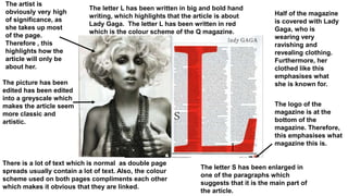
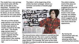
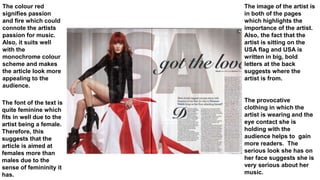
The artist is
obviously very high
of significance, as
she takes up most
of the page.
Therefore , this
highlights how the
article will only be
about her.
The picture has been
edited has been edited
into a greyscale which
makes the article seem
more classic and
artistic.
The logo of the
magazine is at the
bottom of the
magazine. Therefore,
this emphasises what
magazine this is.
Half of the magazine
is covered with Lady
Gaga, who is
wearing very
ravishing and
revealing clothing.
Furthermore, her
clothed like this
emphasises what
she is known for.
The letter L has been written in big and bold hand
writing, which highlights that the article is about
Lady Gaga. The letter L has been written in red
which is the colour scheme of the Q magazine.
The letter S has been enlarged in
one of the paragraphs which
suggests that it is the main part of
the article.
There is a lot of text which is normal as double page
spreads usually contain a lot of text. Also, the colour
scheme used on both pages compliments each other
which makes it obvious that they are linked.
The model has a very grungy
look which suits with the
title, as the title is very
disjointed. Therefore, this
emphasises what type of
music genre the article will
be about, as we can clearly
see that it is not a pop article
but could be an rock article.
The set up of the double
page spread is not one that
is commonly used as the
double page spread is
mostly covered by the title
and artist. The double
page spread doesn’t
contain that much text
which suggests that the
target audience of the
article doesn’t like reading
much and is of a young
age.
The artist is taking
most of the place on
the article which
suggests that she if of
high significance.
The artist is well
known in the music
industry, her clothes
are quite minimalist
which suggests she is
someone who doesn’t
care much about her
appearance.
The monochrome colour scheme is something that
fits well with the red. The red is used to highlight
the important parts of the key parts of the double
page spread. For example, the name of the artist
Lily Allen is written in red to let the audience know
By having the
monochrome with red,
it is aesthetically
pleasing rather than
something that clashes.
The letter L at the beginning of the
article has been enlarged which is a
common convention of double page
spreads.
The colour red
signifies passion
and fire which could
connote the artists
passion for music.
Also, it suits well
with the
monochrome colour
scheme and makes
the article look more
appealing to the
audience.
The image of the artist is
in both of the pages
which highlights the
importance of the artist.
Also, the fact that the
artist is sitting on the
USA flag and USA is
written in big, bold
letters at the back
suggests where the
artist is from.
The provocative
clothing in which the
artist is wearing and the
eye contact she is
holding with the
audience helps to gain
more readers. The
serious look she has on
her face suggests she is
very serious about her
music.
The font of the text is
quite feminine which
fits in well due to the
artist being a female.
Therefore, this
suggests that the
article is aimed at
females more than
males due to the
sense of femininity it
has.

Double+page+spread

  • 1.
    The artist is obviouslyvery high of significance, as she takes up most of the page. Therefore , this highlights how the article will only be about her. The picture has been edited has been edited into a greyscale which makes the article seem more classic and artistic. The logo of the magazine is at the bottom of the magazine. Therefore, this emphasises what magazine this is. Half of the magazine is covered with Lady Gaga, who is wearing very ravishing and revealing clothing. Furthermore, her clothed like this emphasises what she is known for. The letter L has been written in big and bold hand writing, which highlights that the article is about Lady Gaga. The letter L has been written in red which is the colour scheme of the Q magazine. The letter S has been enlarged in one of the paragraphs which suggests that it is the main part of the article. There is a lot of text which is normal as double page spreads usually contain a lot of text. Also, the colour scheme used on both pages compliments each other which makes it obvious that they are linked.
  • 2.
    The model hasa very grungy look which suits with the title, as the title is very disjointed. Therefore, this emphasises what type of music genre the article will be about, as we can clearly see that it is not a pop article but could be an rock article. The set up of the double page spread is not one that is commonly used as the double page spread is mostly covered by the title and artist. The double page spread doesn’t contain that much text which suggests that the target audience of the article doesn’t like reading much and is of a young age. The artist is taking most of the place on the article which suggests that she if of high significance. The artist is well known in the music industry, her clothes are quite minimalist which suggests she is someone who doesn’t care much about her appearance. The monochrome colour scheme is something that fits well with the red. The red is used to highlight the important parts of the key parts of the double page spread. For example, the name of the artist Lily Allen is written in red to let the audience know By having the monochrome with red, it is aesthetically pleasing rather than something that clashes. The letter L at the beginning of the article has been enlarged which is a common convention of double page spreads.
  • 3.
    The colour red signifiespassion and fire which could connote the artists passion for music. Also, it suits well with the monochrome colour scheme and makes the article look more appealing to the audience. The image of the artist is in both of the pages which highlights the importance of the artist. Also, the fact that the artist is sitting on the USA flag and USA is written in big, bold letters at the back suggests where the artist is from. The provocative clothing in which the artist is wearing and the eye contact she is holding with the audience helps to gain more readers. The serious look she has on her face suggests she is very serious about her music. The font of the text is quite feminine which fits in well due to the artist being a female. Therefore, this suggests that the article is aimed at females more than males due to the sense of femininity it has.