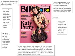
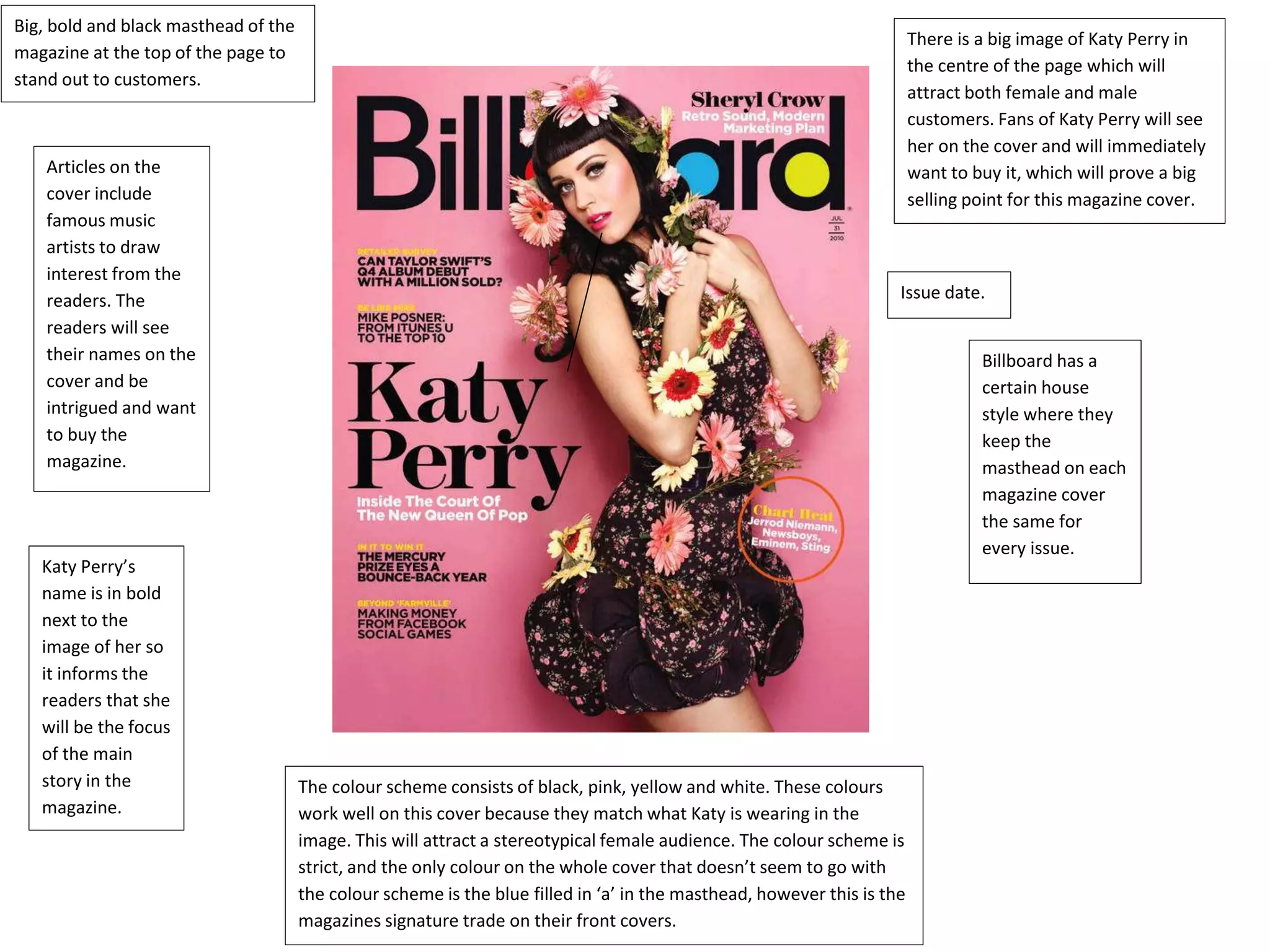
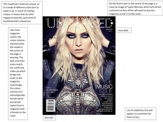
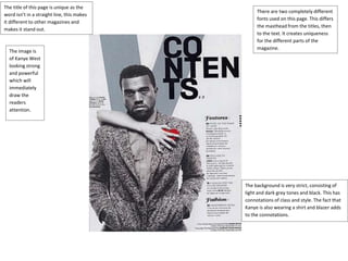
The document describes several magazine covers and pages, analyzing aspects like layout, images, fonts, and color schemes. Key points covered include:
- Cover images of celebrities like Katy Perry and Taylor Momsen are used to attract buyers who are fans.
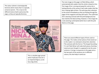
- Color schemes usually match the clothing of cover models to look cohesive and appeal to expected audiences, like pink tones for magazines aimed at women.
- Mastheads, fonts, and placement of information are designed to stand out and guide the reader around the page easily.
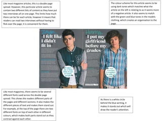
- Double page spreads are used for major articles but can limit individual article length. Layout, images, and fonts are varied within pages to direct attention.