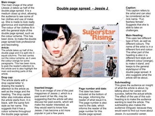
Double Page Spread Research
By Sana Gillani
Masthead:
The masthead uses the main
colour red with purple. It's also in
a large font, taking a lot of space
on the first page. The layout of the
word 'secrets' clearly follows up
the house-style of this magazine.
This masthead is also the name of
one of the band's song

Kerrang magazine (double page spread)

Colour scheme:
The colours purple, red,
black and white have been
used through out this
double page spread. The
colour red stands out very
well on the black
background. The colour
red is also used throughout
the article, this makes it
easier for the reader to
read the article and it does
not confuse the reader with
lots of other colours used.
It keeps to the colour
scheme.
Inserted images:
These images are of the band members by
themselves. They are in black and white, which
give an edgy look to the band. Also, these
separate images of them, clearly show their
attitudes to their music to the target audience in a
good way. Also, these images are in black and
white, because when the reader turns over to this
page, their attention will be toward the main
image, which is the main focus point of this
double page spread and so they are not
distracted by the other images used in the article.

Article:
The article is laid out in
neat columns, making it
easier for the reader to
follow along. There are two
columns of text on the first
page, with only one
column of text on the other
page.
Sub-heading:
This subheading is brief
introduction to what the
article will be about. It has
been added, to interest the
reader and wanting them
to read the full article.
Interview:
This interview uses the
image of one of the band
members, making it clear
of who their interview is
about. Also, it uses a pull
quote, which stands out,
this is so the audience feel
enticed and eager to read
more about the artist's
interview.

Main image:
This is a long shot of the band. The image is placed in the middle of the
double page, suggesting that most of the article will be about them. The
main band member, is standing in front with the other band members
standing behind him. This suggests that he is the main band member, as he
looks controlling and dominating. This is also shown through the colour of
his clothes, red and purple, which again suggests that he is dominating over
the other band members. These colours have also been used for the
masthead. Also, the colours red and purple fit in with the colour scheme of
the magazine. This image also helps the reader to understand the band as
being quite quirky and rocky.
Rolling Stone magazine (double page spread)
Main Heading:
The heading is in big and
bold font, which stands our
on the double page
spread. It is printed in a
simple serif font, to make
the double page spread
appear sophisticated. Also,
the use of the thin letters
further relate to the
femininity of her
personality. 'Adele' is
printed in a bigger font
than the other words of the
heading. This has been
done to make it crystal
clear to the audience that
the article will be all about
Adele
Sub-heading:
This links to the main
heading, giving a short
introduction of what the
article will be about. This
has been added, so it
makes the target audience
read the full article.

Black and white:
The black and white
effect throughout the
double page shows
that it is aimed at a
more mature
audience.

Article:
This article uses sophisticated language. For example, in
the pull quote “For Adele, the sessions were cartharmatic”,
the word “cartharmatic” suggests that the double page
spread is aimed at a more mature and educated audience.
The article uses a very formal tone. This is because it gives
background information at the start of paragraphs. The
quotes that are used in this article are from people Adele
has worked with. Which means, that do not allow the
audience to connect with Adele, which may reveal that
Adele is a very private person and likes to keep her self
distant from the public-eye.

Main Image:
The black and white effect
makes the artist – Adele –
stand out and she comes
across as a strong and
independent women. This is
indicated through lack of colour
and no text around Adele. The
image also takes up most of the
double page. This suggests that
she is the main focus of the
double page. It is a close up
(head to shoulder) image of
Adele, allowing us to clearly see
her facial expression, make-up
and hair, which helps us to
understand that she is very
feminine. Also, the shadow
gives her a more formal and
mature appearance. The image
also suggests that she is a hard
working artist who has a
passion for music. The black
and white effect also may
suggests that she creates
music with meaning.
Main Image:
The main image of the
artist – Lady Gaga –
takes up one side of the
page. This has been
done to suggest that she
is the main focus of the
double page and that the
article will be about Lady
Gaga. Also, it's a sexual
image of the artist, as
she is covering her
breasts with jewellery.
This relates with the use
of red, which connotes
love or sex.
Colour Scheme:
From looking at this double
page spread, the reader is
able to see the colours used
which are, red, black and
white. All three of these
colours work together really
well. The colour red is also
the house-style of Q
magazines, and so the
primary colour scheme has
been used on every page to
relate back to the magazine's
brand.

Q Magazine (double page spread)

Masthead:
This mast head is of the
name of the artist. It is not
in bold or in a big font. This
is because the image
they've used of the artist
speaks for itself. And it's
also not in a big font,
because they don't want
the reader to get distracted
from the main focus of this
double page, which is the
image and the article.
However, the masthead
connotes simplicity and
also gives it a more
fashionable look to the
font.

Large 'L' :
This is over-layed on top o
the article. It stands for the
beginning of the artist's
name 'Lady Gaga'. This is
so the audience are
immediately made aware
that the article will be all
about Lady Gaga.

Main Article/drop cap:
The drop capital is in a much bigger font than the rest of the article and it is in bold. This
has been done to make the article appealing to its target audience. The article has been
typed in a very simple serif font. This suggests that people who are more knowledgeable
will be willing to read the article. The article has also been laid out in a way, so that it will
not distract the reader from anything else. Also, the article has been clearly paragraphed
with lots of quotations from the artist. The use of quotations is effective, because it makes
the reader wanting to read the full article. The article is set out in columns, this has been
done to subconciously make the audience feel as though they have read quicker in a short
amount of time. The columns also makes the article come across as shorter and
achievable to read to its target audience.
Main image:
The main image of the artist
(Jessie J) takes up half of the
double page spread. It is a
medium close up shot, allowing
the audience to see some of
her clothes and use of make
up. She is made to look really
glamorous and sophisticated.
The colour of her clothes fit in
with the general style of the
double page spread, such as
the colour scheme. This has
been done, to make the double
page spread look professional
and fascinating.

Double page spread - Jessie J

Main Heading:
This uses two different
type of font, as well as
different colours. The
name of the artist is in a
different font and colour.
The other part of the
heading is also in a
different font style and
different colour (orange),
to make it stand, and
keeps to the general
style/layout of the
double page spread. It
also suggests what the
article will be about.

Article:
The article takes up half of the
double page and it is split into 3
equal columns. The text carries
out the colour scheme, as it uses
the colour orange for some
paragraphs. This has been done,
to grab the reader's attention to
the article and to also highlight the
main and exciting parts of the
article.

Drop cap:
The article starts with a
drop capital letter 's',
drawing the reader's
attention to the article as
well as the image and the
heading. The drop capital
letter also indicates where
the article starts from. It in
black, with the same font
style as her name. This
suggests that it has a
colour scheme throughout
the double page spread.

Inserted Image:
This is an image of one of the past
magazines of Jessie J, which is a
past event of her life, may be
suggesting that the article will also
discuss her past events, which will
make the reader interested, as
they would want to know how
Jessie J has become a lot more
popular in just a few years

Caption:
This caption refers to
the artist and can also
be considered as her
nick name. “Fun
fearless female”.
Suggests that she is
able to take on
challenges.

Page number and date:
The date has been
included at the bottom of
the page, informing the
reader of what issue it is.
The page number is also
next to the date, which
informs the reader of the
page number for this
double page spread.

Sub-heading:
This gives the audience an insight
of what the article is about, by
talking about her career and
success, before the actual article.
The effect of the use of this subheading is to make the audience
wanting to read the article. The
subheading also makes the
audience intrigued, because they
would want to find out more about
Jessie J's successful career.

Dps research

  • 1.
    Double Page SpreadResearch By Sana Gillani
  • 2.
    Masthead: The masthead usesthe main colour red with purple. It's also in a large font, taking a lot of space on the first page. The layout of the word 'secrets' clearly follows up the house-style of this magazine. This masthead is also the name of one of the band's song Kerrang magazine (double page spread) Colour scheme: The colours purple, red, black and white have been used through out this double page spread. The colour red stands out very well on the black background. The colour red is also used throughout the article, this makes it easier for the reader to read the article and it does not confuse the reader with lots of other colours used. It keeps to the colour scheme. Inserted images: These images are of the band members by themselves. They are in black and white, which give an edgy look to the band. Also, these separate images of them, clearly show their attitudes to their music to the target audience in a good way. Also, these images are in black and white, because when the reader turns over to this page, their attention will be toward the main image, which is the main focus point of this double page spread and so they are not distracted by the other images used in the article. Article: The article is laid out in neat columns, making it easier for the reader to follow along. There are two columns of text on the first page, with only one column of text on the other page. Sub-heading: This subheading is brief introduction to what the article will be about. It has been added, to interest the reader and wanting them to read the full article. Interview: This interview uses the image of one of the band members, making it clear of who their interview is about. Also, it uses a pull quote, which stands out, this is so the audience feel enticed and eager to read more about the artist's interview. Main image: This is a long shot of the band. The image is placed in the middle of the double page, suggesting that most of the article will be about them. The main band member, is standing in front with the other band members standing behind him. This suggests that he is the main band member, as he looks controlling and dominating. This is also shown through the colour of his clothes, red and purple, which again suggests that he is dominating over the other band members. These colours have also been used for the masthead. Also, the colours red and purple fit in with the colour scheme of the magazine. This image also helps the reader to understand the band as being quite quirky and rocky.
  • 3.
    Rolling Stone magazine(double page spread) Main Heading: The heading is in big and bold font, which stands our on the double page spread. It is printed in a simple serif font, to make the double page spread appear sophisticated. Also, the use of the thin letters further relate to the femininity of her personality. 'Adele' is printed in a bigger font than the other words of the heading. This has been done to make it crystal clear to the audience that the article will be all about Adele Sub-heading: This links to the main heading, giving a short introduction of what the article will be about. This has been added, so it makes the target audience read the full article. Black and white: The black and white effect throughout the double page shows that it is aimed at a more mature audience. Article: This article uses sophisticated language. For example, in the pull quote “For Adele, the sessions were cartharmatic”, the word “cartharmatic” suggests that the double page spread is aimed at a more mature and educated audience. The article uses a very formal tone. This is because it gives background information at the start of paragraphs. The quotes that are used in this article are from people Adele has worked with. Which means, that do not allow the audience to connect with Adele, which may reveal that Adele is a very private person and likes to keep her self distant from the public-eye. Main Image: The black and white effect makes the artist – Adele – stand out and she comes across as a strong and independent women. This is indicated through lack of colour and no text around Adele. The image also takes up most of the double page. This suggests that she is the main focus of the double page. It is a close up (head to shoulder) image of Adele, allowing us to clearly see her facial expression, make-up and hair, which helps us to understand that she is very feminine. Also, the shadow gives her a more formal and mature appearance. The image also suggests that she is a hard working artist who has a passion for music. The black and white effect also may suggests that she creates music with meaning.
  • 4.
    Main Image: The mainimage of the artist – Lady Gaga – takes up one side of the page. This has been done to suggest that she is the main focus of the double page and that the article will be about Lady Gaga. Also, it's a sexual image of the artist, as she is covering her breasts with jewellery. This relates with the use of red, which connotes love or sex. Colour Scheme: From looking at this double page spread, the reader is able to see the colours used which are, red, black and white. All three of these colours work together really well. The colour red is also the house-style of Q magazines, and so the primary colour scheme has been used on every page to relate back to the magazine's brand. Q Magazine (double page spread) Masthead: This mast head is of the name of the artist. It is not in bold or in a big font. This is because the image they've used of the artist speaks for itself. And it's also not in a big font, because they don't want the reader to get distracted from the main focus of this double page, which is the image and the article. However, the masthead connotes simplicity and also gives it a more fashionable look to the font. Large 'L' : This is over-layed on top o the article. It stands for the beginning of the artist's name 'Lady Gaga'. This is so the audience are immediately made aware that the article will be all about Lady Gaga. Main Article/drop cap: The drop capital is in a much bigger font than the rest of the article and it is in bold. This has been done to make the article appealing to its target audience. The article has been typed in a very simple serif font. This suggests that people who are more knowledgeable will be willing to read the article. The article has also been laid out in a way, so that it will not distract the reader from anything else. Also, the article has been clearly paragraphed with lots of quotations from the artist. The use of quotations is effective, because it makes the reader wanting to read the full article. The article is set out in columns, this has been done to subconciously make the audience feel as though they have read quicker in a short amount of time. The columns also makes the article come across as shorter and achievable to read to its target audience.
  • 5.
    Main image: The mainimage of the artist (Jessie J) takes up half of the double page spread. It is a medium close up shot, allowing the audience to see some of her clothes and use of make up. She is made to look really glamorous and sophisticated. The colour of her clothes fit in with the general style of the double page spread, such as the colour scheme. This has been done, to make the double page spread look professional and fascinating. Double page spread - Jessie J Main Heading: This uses two different type of font, as well as different colours. The name of the artist is in a different font and colour. The other part of the heading is also in a different font style and different colour (orange), to make it stand, and keeps to the general style/layout of the double page spread. It also suggests what the article will be about. Article: The article takes up half of the double page and it is split into 3 equal columns. The text carries out the colour scheme, as it uses the colour orange for some paragraphs. This has been done, to grab the reader's attention to the article and to also highlight the main and exciting parts of the article. Drop cap: The article starts with a drop capital letter 's', drawing the reader's attention to the article as well as the image and the heading. The drop capital letter also indicates where the article starts from. It in black, with the same font style as her name. This suggests that it has a colour scheme throughout the double page spread. Inserted Image: This is an image of one of the past magazines of Jessie J, which is a past event of her life, may be suggesting that the article will also discuss her past events, which will make the reader interested, as they would want to know how Jessie J has become a lot more popular in just a few years Caption: This caption refers to the artist and can also be considered as her nick name. “Fun fearless female”. Suggests that she is able to take on challenges. Page number and date: The date has been included at the bottom of the page, informing the reader of what issue it is. The page number is also next to the date, which informs the reader of the page number for this double page spread. Sub-heading: This gives the audience an insight of what the article is about, by talking about her career and success, before the actual article. The effect of the use of this subheading is to make the audience wanting to read the article. The subheading also makes the audience intrigued, because they would want to find out more about Jessie J's successful career.
  • 6.
    Main image: The mainimage of the artist (Jessie J) takes up half of the double page spread. It is a medium close up shot, allowing the audience to see some of her clothes and use of make up. She is made to look really glamorous and sophisticated. The colour of her clothes fit in with the general style of the double page spread, such as the colour scheme. This has been done, to make the double page spread look professional and fascinating. Double page spread - Jessie J Main Heading: This uses two different type of font, as well as different colours. The name of the artist is in a different font and colour. The other part of the heading is also in a different font style and different colour (orange), to make it stand, and keeps to the general style/layout of the double page spread. It also suggests what the article will be about. Article: The article takes up half of the double page and it is split into 3 equal columns. The text carries out the colour scheme, as it uses the colour orange for some paragraphs. This has been done, to grab the reader's attention to the article and to also highlight the main and exciting parts of the article. Drop cap: The article starts with a drop capital letter 's', drawing the reader's attention to the article as well as the image and the heading. The drop capital letter also indicates where the article starts from. It in black, with the same font style as her name. This suggests that it has a colour scheme throughout the double page spread. Inserted Image: This is an image of one of the past magazines of Jessie J, which is a past event of her life, may be suggesting that the article will also discuss her past events, which will make the reader interested, as they would want to know how Jessie J has become a lot more popular in just a few years Caption: This caption refers to the artist and can also be considered as her nick name. “Fun fearless female”. Suggests that she is able to take on challenges. Page number and date: The date has been included at the bottom of the page, informing the reader of what issue it is. The page number is also next to the date, which informs the reader of the page number for this double page spread. Sub-heading: This gives the audience an insight of what the article is about, by talking about her career and success, before the actual article. The effect of the use of this subheading is to make the audience wanting to read the article. The subheading also makes the audience intrigued, because they would want to find out more about Jessie J's successful career.