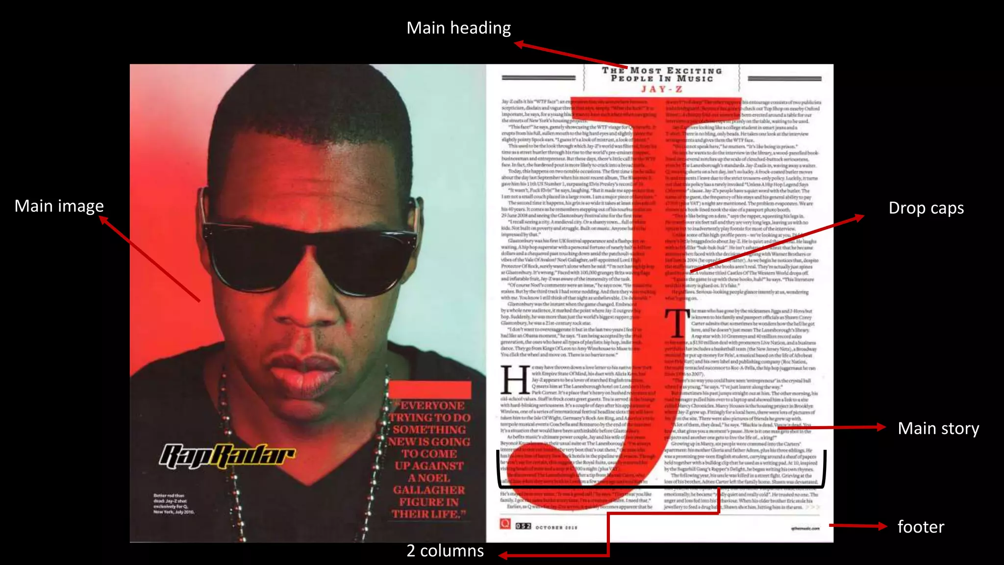
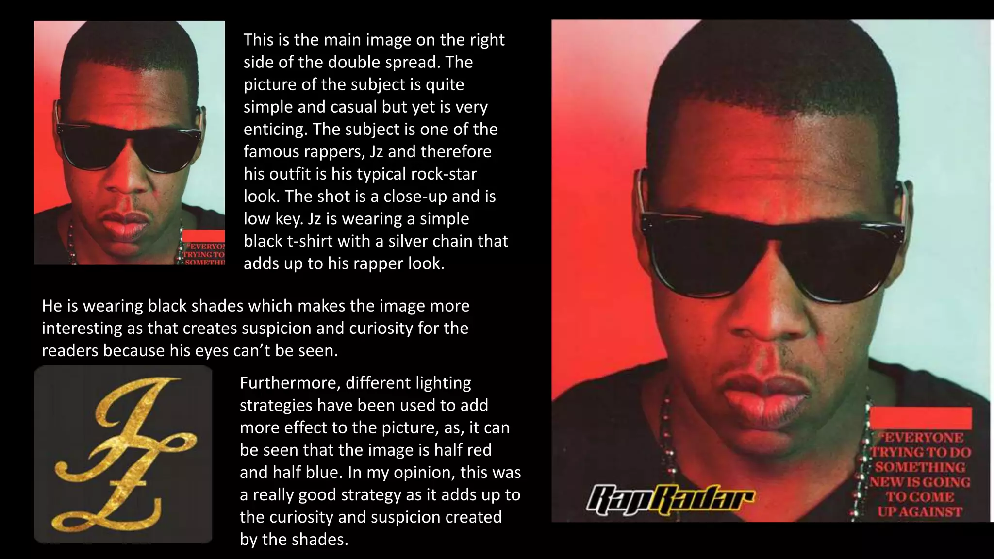
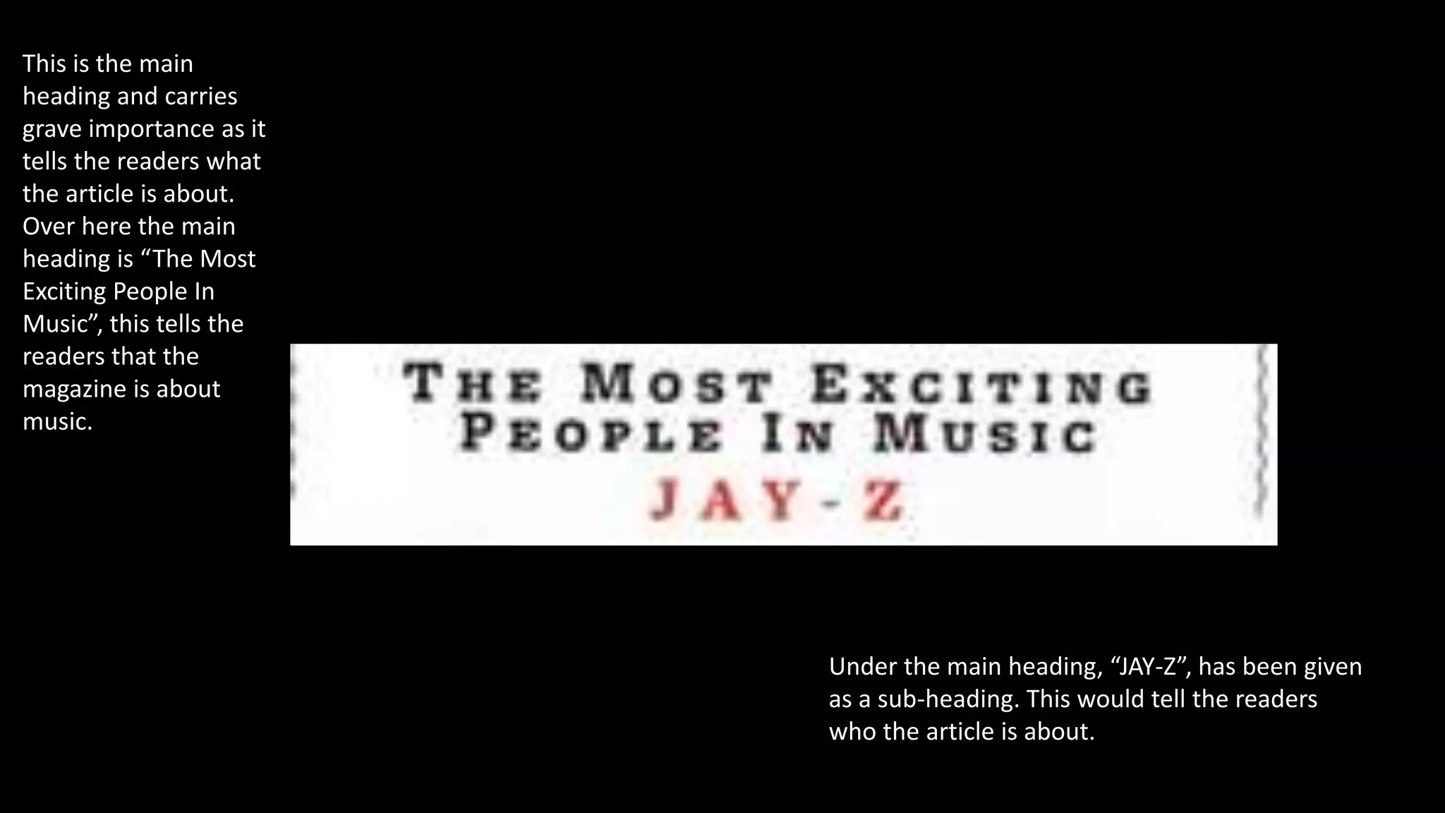
Double Spread Magazine
Analysis Number#1
Main heading
Drop caps
Main story
Main image
footer
2 columns
This is the main image on the right
side of the double spread. The
picture of the subject is quite
simple and casual but yet is very
enticing. The subject is one of the
famous rappers, Jz and therefore
his outfit is his typical rock-star
look. The shot is a close-up and is
low key. Jz is wearing a simple
black t-shirt with a silver chain that
adds up to his rapper look.
He is wearing black shades which makes the image more
interesting as that creates suspicion and curiosity for the
readers because his eyes can’t be seen.
Furthermore, different lighting
strategies have been used to add
more effect to the picture, as, it can
be seen that the image is half red
and half blue. In my opinion, this was
a really good strategy as it adds up to
the curiosity and suspicion created
by the shades.
This is the main
heading and carries
grave importance as it
tells the readers what
the article is about.
Over here the main
heading is “The Most
Exciting People In
Music”, this tells the
readers that the
magazine is about
music.
Under the main heading, “JAY-Z”, has been given
as a sub-heading. This would tell the readers
who the article is about.
The bold letters used here are called the drop
caps. It is the first letter of a paragraph that is
enlarged so that the reader can easily detect
where the article is starting from. It is in a different
font from the rest of the article and is at times, in
a different color but is the same as the masthead.
As it can be seen that the main
heading of the article is in
black and red. So therefore a
combination of red and black
is used, this shows that the
drop caps demands the same
attention. The heading or the
sub-heading “JAY-Z” is written
in red and therefore so is the
drop caps “J”. This makes the
article more strong as the
entire article is based on JAY-
Z.

Double spread magazine analysis number

  • 1.
  • 2.
    Main heading Drop caps Mainstory Main image footer 2 columns
  • 3.
    This is themain image on the right side of the double spread. The picture of the subject is quite simple and casual but yet is very enticing. The subject is one of the famous rappers, Jz and therefore his outfit is his typical rock-star look. The shot is a close-up and is low key. Jz is wearing a simple black t-shirt with a silver chain that adds up to his rapper look. He is wearing black shades which makes the image more interesting as that creates suspicion and curiosity for the readers because his eyes can’t be seen. Furthermore, different lighting strategies have been used to add more effect to the picture, as, it can be seen that the image is half red and half blue. In my opinion, this was a really good strategy as it adds up to the curiosity and suspicion created by the shades.
  • 4.
    This is themain heading and carries grave importance as it tells the readers what the article is about. Over here the main heading is “The Most Exciting People In Music”, this tells the readers that the magazine is about music. Under the main heading, “JAY-Z”, has been given as a sub-heading. This would tell the readers who the article is about.
  • 5.
    The bold lettersused here are called the drop caps. It is the first letter of a paragraph that is enlarged so that the reader can easily detect where the article is starting from. It is in a different font from the rest of the article and is at times, in a different color but is the same as the masthead. As it can be seen that the main heading of the article is in black and red. So therefore a combination of red and black is used, this shows that the drop caps demands the same attention. The heading or the sub-heading “JAY-Z” is written in red and therefore so is the drop caps “J”. This makes the article more strong as the entire article is based on JAY- Z.