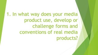
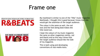
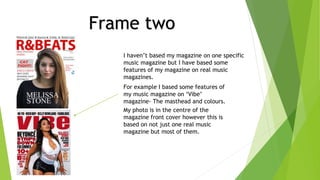
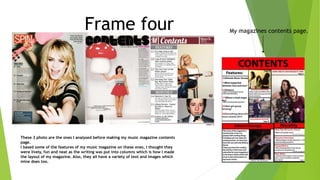
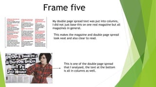
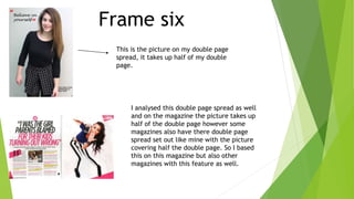
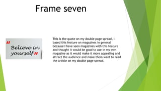
1. In what way does your media
product use, develop or
challenge forms and
conventions of real media
products?
My masthead is similar to one of the ‘Vibe’ music magazine
Mastheads. I thought this is good because I know that this
would get the attention of the target audience.
The colour is the same as well, the red
text and the font being bold makes the
title stand out.
I kept the colours of my music magazine
the same as other magazines (white, red
and black) and so this way I know that
the target audience should like the look
of my magazine.
This is both using and developing
conventions of real media texts.
Frame one
Frame two
I haven’t based my magazine on one specific
music magazine but I have based some
features of my magazine on real music
magazines.
For example I based some features of
my music magazine on ‘Vibe’
magazine- The masthead and colours.
My photo is in the centre of the
magazine front cover however this is
based on not just one real music
magazine but most of them.
Frame three
The ‘Melissa Stone’ text is kind of based upon
Billboard magazine because the magazine has
big, bold, white writing at the bottom of the
magazine. It is large so it makes the text stand
out clearer than the other text on the
magazine which is a smaller size font.
The text is at the bottom centre of the
page and so this makes it stand out more
as well as this it is on a black background
which is Hannah’s top.
Frame four
These 3 photo are the ones I analysed before making my music magazine contents
page.
I based some of the features of my music magazine on these ones, I thought they
were lively, fun and neat as the writing was put into columns which is how I made
the layout of my magazine. Also, they all have a variety of text and images which
mine does too.
My magazines contents page.
Frame five
My double page spread text was put into columns,
I did not just base this on one real magazine but all
magazines in general.
This makes the magazine and double page spread
look neat and also clear to read.
This is one of the double page spread
that I analysed, the text at the bottom
is all in columns as well.
Frame six
This is the picture on my double page
spread, it takes up half of my double
page.
I analysed this double page spread as well
and on the magazine the picture takes up
half of the double page however some
magazines also have there double page
spread set out like mine with the picture
covering half the double page. So I based
this on this magazine but also other
magazines with this feature as well.
Frame seven
This is the quote on my double page spread, I
based this feature on magazines in general
because I have seen magazines with this feature
and thought it would be good to use in my own
magazine as it would make it more appealing and
attract the audience and make them want to read
the article on my double page spread.
Frame Eight
Most music magazines have a title and
heading for the double page spread and
it is bold and a big sized font. I made my
text black which makes it stand out and
attract the eye of the reader.
I also have a heading which has a black
box and this makes it separate from the
title and other text. Also the writing is
in white which is opposite to the black
and so makes it stand out as well.

Evaluation question 1 nicole

  • 1.
    1. In whatway does your media product use, develop or challenge forms and conventions of real media products?
  • 2.
    My masthead issimilar to one of the ‘Vibe’ music magazine Mastheads. I thought this is good because I know that this would get the attention of the target audience. The colour is the same as well, the red text and the font being bold makes the title stand out. I kept the colours of my music magazine the same as other magazines (white, red and black) and so this way I know that the target audience should like the look of my magazine. This is both using and developing conventions of real media texts. Frame one
  • 3.
    Frame two I haven’tbased my magazine on one specific music magazine but I have based some features of my magazine on real music magazines. For example I based some features of my music magazine on ‘Vibe’ magazine- The masthead and colours. My photo is in the centre of the magazine front cover however this is based on not just one real music magazine but most of them.
  • 4.
    Frame three The ‘MelissaStone’ text is kind of based upon Billboard magazine because the magazine has big, bold, white writing at the bottom of the magazine. It is large so it makes the text stand out clearer than the other text on the magazine which is a smaller size font. The text is at the bottom centre of the page and so this makes it stand out more as well as this it is on a black background which is Hannah’s top.
  • 5.
    Frame four These 3photo are the ones I analysed before making my music magazine contents page. I based some of the features of my music magazine on these ones, I thought they were lively, fun and neat as the writing was put into columns which is how I made the layout of my magazine. Also, they all have a variety of text and images which mine does too. My magazines contents page.
  • 6.
    Frame five My doublepage spread text was put into columns, I did not just base this on one real magazine but all magazines in general. This makes the magazine and double page spread look neat and also clear to read. This is one of the double page spread that I analysed, the text at the bottom is all in columns as well.
  • 7.
    Frame six This isthe picture on my double page spread, it takes up half of my double page. I analysed this double page spread as well and on the magazine the picture takes up half of the double page however some magazines also have there double page spread set out like mine with the picture covering half the double page. So I based this on this magazine but also other magazines with this feature as well.
  • 8.
    Frame seven This isthe quote on my double page spread, I based this feature on magazines in general because I have seen magazines with this feature and thought it would be good to use in my own magazine as it would make it more appealing and attract the audience and make them want to read the article on my double page spread.
  • 9.
    Frame Eight Most musicmagazines have a title and heading for the double page spread and it is bold and a big sized font. I made my text black which makes it stand out and attract the eye of the reader. I also have a heading which has a black box and this makes it separate from the title and other text. Also the writing is in white which is opposite to the black and so makes it stand out as well.