A presentation given at the Minnesota Magazine & Publications Association. 4 of 4. See also Magazine Cover Design, Magazine Design System, and Web Magazine Design.
We at KS Designers constitutes the professional designers and writes to worked out with the most innovative and creative ideas to formulate the concept of the perfect magazine. That meets your all necessities. Our professionals are trained to handle adverse situations and deliver under pressure in short time frames.
A presentation given at the Minnesota Magazine & Publications Association. 2 of 4. See also Magazine Cover Design, Web Magazine Design, and Magazine Design Troubleshooting.
7 Digital Photography Concepts You Have To knowYang Ao Wei 楊翱維
Photography, or rather, digital photography seems to have become a way of life.
Today, about 2 billion photos are uploaded every day to various sites like Flickers, Facebook, Instagram, and many others.
Imagine that - 2 billion uploads on a daily basis! Wow!
What if you know that you can start shooting photos or selfies that are really appealing to the eyes, and you can do just that without having necessarily to buy or use any of the expensive cameras and equipment?
Well, here’s the good news! The truth is you can!
In this deck, you will learn about the most basic (which is also most important) concepts of digital photography.
Once you begin to grasp these fundamental ideas, you can really start getting creative on improving the aesthetics of your photos (while your friends can start marveling over what they see.)
With the popularity of responsive design, it seems like the process and tools that have been used in the past are certainly not ideal for the present. So what is the best solution?
Lets explore the available options and discuss how we communicate with our client as well as our developers in this ever changing world of web design.
1. Jade Ashworth
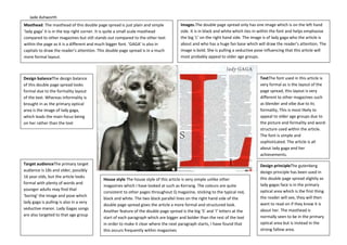
Design balanceThe design balance
of this double page spread looks
formal due to the formality layout
of the text. Whereas informality is
brought in as the primary optical
area is the image of lady gaga,
which leads the main focus being
on her rather than the text
Masthead. The masthead of this double page spread is just plain and simple
‘lady gaga’ it is in the top right corner. It is quite a small scale masthead
compared to other magazines but still stands out compared to the other text
within the page as it is a different and much bigger font. ‘GAGA’ is also in
capitals to draw the reader’s attention. This double page spread is in a much
more formal layout.
Images.The double page spread only has one image which is on the left hand
side. It is in black and white which ties in within the font and helps emphasise
the big ‘L’ on the right hand side. The image is of lady gaga who the article is
about and who has a huge fan base which will draw the reader’s attention. The
image is bold. She is pulling a seductive pose influencing that this article will
most probably appeal to older age groups.
TextThe font used in this article is
very formal as is the layout of the
page spread, this layout is very
different to other magazines such
as blender and vibe due to its
formality, This is most likely to
appeal to older age groups due to
the picture and formality and word-
structure used within the article.
The font is simple and
sophisticated. The article is all
about lady gaga and her
achievements.
Design principleThe gutenberg
design principle has been used in
this double page spread slightly as
lady gagas face is in the primary
optical area which is the first thing
the reader will see, they will then
want to read on if they know it is
about her. The masthead is
normally seen to be in the primary
optical area but is instead in the
strong fallow area.
Target audienceThe primary target
audience is 18s and older, possibly
16 year olds, but the article looks
formal with plenty of words and
younger adults may find that
‘boring’ the image and pose which
lady gaga is pulling is also in a very
seductive manor. Lady Gagas songs
are also targeted to that age group
House style The house style of this article is very simple unlike other
magazines which I have looked at such as Kerrang. The colours are quite
consistent to other pages throughout Q magazine, sticking to the typical red,
black and white. The two black parallel lines on the right hand side of the
double page spread gives the article a more formal and structured look.
Another feature of the double page spread is the big ‘S’ and ‘I’ letters at the
start of each paragraph which are bigger and bolder than the rest of the text
in order to make it clear where the next paragraph starts, I have found that
this occurs frequently within magazines
2. Jade Ashworth
Masthead. The masthead of this double page spread is eye-catching, it is a mixture
of bold and fancy font which contrast together. The masthead reads ‘The gospel
according to niiminaj’ it is in the top left corner. It is quite a large scale masthead
similar to Q magazine, Her name is in bold font to stand out and whereas the
writing above has a script format. The masthead is in the primary optical view
Images.The double page spread only has one image similar to Qs double page
spread of lady gaga, the image is on the middle and right hand side. It consists
of nickiminaj, who the article is about, wearing a unique, zebra print outfit
which contrasts against the pink background and influences that shes fun and
crazy as is the page. Her pink lipstick also matches the background. The image
is unique therefore entices the reader.
TextThe font used in this article is not
formal, its very different compared to the
previous magazine from Q in which I
analysed as the text is split up in different
sections around the outside of the image.
They also each talk about a different thing
(still relating it to nickiminaj) Due to the
text layout and the slogans and words
used this article will probably be targeted
towards a young teenage audience.
Certain quotes have been highlighted and
placed as a heading.
The font is simple and sophisticated. The
article is all about Nicki minaj and ‘the
gospel’.one quote which has been taken
out has been highlighted pink (darker than
the background colour pink) which
suggest that is important. This is to attract
the reader’s attention. The quotes which
are in bold are usually the most
interesting and most ‘exclusive’ things to
read about. There is also not too much
text within this page therefore teenagers
and young adults will want to read it
specifically if they are nickiminajfans.
Design principleThe gutenberg design
principle has been used in this double
page spread slightly due to the fact the
masthead is directly in the primary
optical area which means it is the first
thing people may see. Nicki minajs’ head
is also in the strong fallow area. The
writing is plotted around the outside of
her.
Target audienceThe primary target
audience is most probably young
teenagers, much more demographic and
most probably girls due to the femininity
of the emphasized colour of pink. Nicki
minajs’ album is also called pink Friday
which ties in with the theme.
House style The house style of this article is very vibrant and looks fun and
exciting. The bright colour schemes and bold imagery used influences how
vibrant it is.NME doesn’t normally show mainstream artists like nickiminaj.
The main colours of this article are pink, black and white
Another feature of the double page spread is the big lettering at the
beginning of the article along with the bold headings to make it clear where
the next paragraph starts,as well as the fact it makes it look more interesting
I have found that this occurs frequently within magazines. The pink gives the
double page spread an extremely girly and feminine feel which would attract
younger girls who are interested in music.
Design balance The design balance of
this double page spread looks very
informal as although the text is in
columns and structured,the double page
spread looks fun and exciting and is full
of bright colours. It is indeed structured,
but there is no balance, the image is
positioned on the right side of the
double page spread, edging to the
middle.