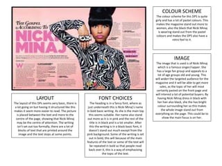
The DPS uses a dark colour scheme of red and black to match the topic of discussing Jay-Z, who is often seen wearing red. The mysterious image takes up half the page and shows Jay-Z covering his eyes with sunglasses. The basic fonts are not very attractive but suit the intended audience of Jay-Z fans. The layout places most of the text in two columns on the right side with the image on the left, including text overlaying the image to advertise the topic.
APTGROUP Pavia corsi di formazione Servizi Antincendio Salute e sicurezza neg...APT Group
APT Group nasce negli anni 80 e cresce come soggetto specializzato nel settore della formazione antincendio.
L’esperienza maturata negli anni a contatto con le diverse realtà lavorative pubbliche e private ha consentito di incrementare i servizi offerti dal gruppo. Oltre a poter offrire consulenza specializzata per la messa in sicurezza di ambienti di lavoro, l’azienda è in grado, oggi, di prestare assistenza tecnico-specialistica per le attività di installazione e/o implementazione di impianti antincendio, nonché per quelle manutentive (a carattere sia ordinario che straordinario) di presidi per la sicurezza e di dispositivi di protezione individuale.
Nel 2013 le società del Gruppo Apt si sono costituite in Rete d’Impresa per venire incontro all’esigenza dei Clienti di affidarsi ad un’“unica soluzione” per le molteplici e differenti problematiche del settore.
Présentation médiathèque Livron décembre 2015 - BagadeyNathalie Barlet
Présentation donnée à la médiathèque de Livron-sur-Drôme en décembre 2015 à l'occasion de la sortie de Kassandra et la Grèce des légendes par Nathalie Bagadey
Expert Accessory Dwelling Unit (ADU) Drafting ServicesResDraft
Whether you’re looking to create a guest house, a rental unit, or a private retreat, our experienced team will design a space that complements your existing home and maximizes your investment. We provide personalized, comprehensive expert accessory dwelling unit (ADU)drafting solutions tailored to your needs, ensuring a seamless process from concept to completion.
Top 5 Indian Style Modular Kitchen DesignsFinzo Kitchens
Get the perfect modular kitchen in Gurgaon at Finzo! We offer high-quality, custom-designed kitchens at the best prices. Wardrobes and home & office furniture are also available. Free consultation! Best Quality Luxury Modular kitchen in Gurgaon available at best price. All types of Modular Kitchens are available U Shaped Modular kitchens, L Shaped Modular Kitchen, G Shaped Modular Kitchens, Inline Modular Kitchens and Italian Modular Kitchen.
You could be a professional graphic designer and still make mistakes. There is always the possibility of human error. On the other hand if you’re not a designer, the chances of making some common graphic design mistakes are even higher. Because you don’t know what you don’t know. That’s where this blog comes in. To make your job easier and help you create better designs, we have put together a list of common graphic design mistakes that you need to avoid.
Hello everyone! I am thrilled to present my latest portfolio on LinkedIn, marking the culmination of my architectural journey thus far. Over the span of five years, I've been fortunate to acquire a wealth of knowledge under the guidance of esteemed professors and industry mentors. From rigorous academic pursuits to practical engagements, each experience has contributed to my growth and refinement as an architecture student. This portfolio not only showcases my projects but also underscores my attention to detail and to innovative architecture as a profession.
White wonder, Work developed by Eva TschoppMansi Shah
White Wonder by Eva Tschopp
A tale about our culture around the use of fertilizers and pesticides visiting small farms around Ahmedabad in Matar and Shilaj.
1. COLOUR SCHEME
The colour scheme for this DPS is quite
girly and has a lot of pastel colours. This
makes the magazine stand out more to
women, also the black that Nicki Minaj
is wearing stand out from the pastel
colours and makes the DPS also have a
retro feel to it.
IMAGE
The image that is used is of Nicki Minaj
which is a famous singer/rapper. She
has a large fan group and appeals to a
lot of age groups old and young. This
will widen the targeted audience for the
magazine and it will be able to get more
sales, as the topic of her will most
certainly pasted on the front page and
will interest a lot of potential buyers. By
having Nicki Minaj dress in black with
her hair also black, she the has bright
colour surrounding her so this makes
the whole image stand out from
everything on the page. This could be to
show the main focus is on her.
LAYOUT
The layout of this DPs seems very basic, there is
a lot going on but having it structured like this
makes it seem more easier to read. The picture
is placed between the text and more to the
centre of the page, showing that Nicki Minaj
may be the centre of attention. The writing
isn’t set out too formally, there are a lot of
blocks of text that are printed around the
image and the text stops at some points.
FONT CHOICES
The heading is in a fancy font, where as
just underneath this is Nicki Minaj’s name
in bold basic writing. As she is the main top
this seems suitable. Her name also stand
out more as it is in pink and the rest of the
title is in black and is a lot smaller. After
this the writing is in a black basic font, it
doesn’t stand out much except from the
pink background. Some of the writing is set
out in bold, this will because of the main
features of the text or some of the text will
be repeated in bold so that people read
back over it, this is a way of emphasising
the topic of the text.
2. COLOUR SCHEME
The colour scheme is quite dark but has
some pink writing within the text so
therefore it seems as though its
audience is more focused on a more
female audience. The dark colour and
the colours the woman is dressed in are
also quite dark. This makes the audience
see a quite gothic image and imagine
the topic do be a quite dark and ruthless
topic. As if she doesn’t care much about
what is about to be said and how herself
is shown within the media.
IMAGE
The image that is used is of Lilly Alan.
She is a famous singer and di songs that
were focused more on the younger
generations. She has black hair and her
eye make up is dark and rough. Her
clothes make her seem quite indie and
but altogether it makes her seem as
though she is quite gothic in her look.
The way she is posed makes her seem
quite upfront and confident with
herself, she doesn’t really care about
what people think of her and expresses
herself through looks and with attitude.
FONT CHOICES
The main heading is in a font that has put
the letters all different sizes, it’s a basic
font and is in bold but by making them all
different sizes, it makes the DPS look more
confident and stands out, its more
expressive. It also makes the text seem as
though its being shouted without any care
about what is being said, this makes this
seem more real by capitalising the letters
and putting speech marks at either side of
text. The rest of the text is in a basic font
and is structures into four clumps. Some
odd words have been put into pink and
enlarged. This may be to emphasise what
the writer is trying to get across.
LAYOUT
The structure of the magazine is set out
formally but my the use of the main heading
and the image it makes it seem more careless
and fun. With the image taking up the right side
of the page and the heading taking up the
majority of the left side there is little room for
the text but by structuring it into four clumps it
has made it easier to get more writing into it.
The heading is set out overlapping the right
side of the page also. The layout of the page is
being structured to the topic it seems. Quite
recklessly.
3. COLOUR SCHEME
In this DPS the colour scheme is quite dark and is more
based on ‘indie’ type colours and. This colour scheme is
very basic and is printed on a white background. There
isn’t much to say about the colour scheme although by
doing it this way they have makes the text and the image
stand out a lot more to the audience and I think that they
may have though that that is the main thing they want to
get across to the audience.
IMAGE
The image is of a male character, this is a close up shot
and the character is really showing much emotion. His
face seems quite dark and tired. I think they have done
the image like this to reflect what they may be talking
about, basing this on the title of the DPS. I also think the
image is done like this and they aren’t trying much
because this doesn’t seem like the type of magazine that
has a target audience for children and maybe even young
teens so they wouldn’t need to emphasis any emotion
such as excitement, happiness etc. it is also quite a basic
image that fits the layout and colour scheme of the rest of
the page.
FONT CHOICES
All the fonts in this DPS are very basic,
the title is in bold and all the writing is
in black expect from some words that
are placed in the title. The heading is
set out from a normal title. Such as the
words are in different sizes, even the
letters and also they are in different
colours. I think this is to make the title
look less basic because the page is
quite dull so by doing this they are able
to fill up the page in a more exciting
page.
LAYOUT
The layout is very basic. The image
takes up exactly half of the left hand
side of the page. Then the right
hand side of the page is taken up by
the heading and the text. There is a
sub heading just above the text
written across the page clearing
setting the heading and the text
apart. The text is set out into four
coloumns.
4. COLOUR SCHEME
The colour scheme is red and black. There is white and
slight hint of yellow within the page but this is a page
mainly based within the colours red and black. This is
done because the topic discussion is on Jay-Z and he is
seen particularly with the colour red.
IMAGE
The image is of Jay-Z who is a famous singer/rapper
and the image is a close up shot of him. He has no
expression and is covering his eyes with glasses. By
doing this he seems mysterious to the reader. The
lighting on the image is half red and half white, he is
seen around the colour red a lot so this draws you to
the page more as you can tell that the page will know a
lot about him. By making him look more mysterious it
makes the reader more interested in reading about
him and the topic that is advertised. This creates more
interest in the magazine therefore creating more
potential future buyers. The image also has text on it
selling the topic to the audience.
FONT CHOICES
The fonts are nearly all the same
and are extremely basic and aren’t
very attractive to a young reader or
to anyone that isn’t interested in
the singer/rapper. Therefore this
shows that the magazine would not
be for anyone that isn’t a fan of Jay-
Z. he has a large fan base so making
the magazine about him and similar
artist such as him makes the
magazine more attractive to that
certain audience.
LAYOUT
the layout is very basic except from the text that is placed
over the image and also the large ‘J’ that is placed in the
middle of the text which seems to be a title for the DPS.
The text is laid out over the whole right side of the page
with the image on the left side. The text is in two
columns and there is a large sum of writing for a reader
to get through. I think for a magazine this may be a bit
too much although if it was a magazine that is based on
him and others like him and has little other topics then
this should be deemed okay. Also this will have been
made very basic so that the text is read and there isn’t
very much that is distracting the reader.