3. Denotation &
Connotation
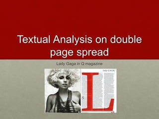
• This double page spread is from Q magazine and has the
artist Lady Gaga on and the three main colours used are red,
white and black. The main image of Lady gaga, she has a
direct mode of address, messy bob, heavy make-up and is
wearing a large necklace which is covering up her breasts
along with her hands. The colour scheme is conventional in
this magazine as red connotes danger, to stop and love, it’s
also a eye-catching colour which stands out, black also
connotes danger and evil whereas white connotes purity and
innocence these colours contrast well together making the
article stand out. The main image gives off an vintage theme
by the editing of the image and her make-up is very heavy
which connotes that she is dangerous and powerful. The L
going across the page is conventional to Q magazine as it’s
like their logo and the L obviously stands for Lady Gaga.
4. • This double page spread is based on Lady Gaga that is obvious as the
main image of her takes up the whole of the left page this is conventional
in all magazines. This image is in black and white that connotes that they
could of wanted to give the image a more vintage look it also works well
with the lighting making the contrast of the image look better. She has a
direct mode of address in the image and she has a seductive look on her
face the fact that she is topless also gives off an idea that she is trying to
get male attention. She has a chain as a necklace that’s covering her
breasts to connote mystery; this goes well with Gaga, as she is known for
her outrageous and crazy dress sense. Her hair is short and all over the
place like “bed head” which links with her seductive look and mysterious
topless look. The lighting on her face and above the breasts draws the
audience attention to look there first and it also makes her bones stand
out more by how they have edited shadows, for example on her cheek
bones they have put a shadow under the lighting giving her sharp face
features which is seen as beautiful in the media.
Page one
5. • They have used rule of thirds on the image as her eyes are the
first thing the audience looks at, at the top then her necklace
and shoulders then her breasts this gives the image a more
interesting and visually appealing layout.
• This shot is a medium to close up shot and the camera angle is
a low shot looking up at Lady Gaga, all of her is in focus and
there is letters in the background that are out of focus.
• Lady Gaga will bring a wider range of audience to the
magazine because of this article, as people who like her music
will buy the magazine, she also appeals to equal amount of
gender and a wide age range of people who like her.
Page one
6. • The article has two drop capitals which connotes there is a new paragraph
this stands out as they are a much larger font than the rest of the text on
the page they are used so that the reader will look there first and read the
line and know what the two most important paragraphs are about.
• There is a L that goes across the whole page and also goes over the text,
it is bright red, serif font and the first letter of Lady Gagas name, this is like
the logo of Q magazine which makes it professional as they are showing
their brand identity through out the magazine.
• In the top right third corner there is the title that says “Lady GAGA” this
shows who the article is about, GAGA is also written in capitals so it
stands out more so maybe GAGA is how she is mostly known as by her
fans and the logo is also in serif which is used in all the important text in
the magazine.
Page two
7. • The layout of the magazine is set into columns, which make it easier for
the audience to read by doing this it also makes the magazine look more
professional, the text is black and sans serif that makes it easier for the
audience to read especially on the white background. They have used the
Z pattern by starting at Lady Gagas face to her name on the other page,
down to her breasts then to the L.
• Between the columns there are gutters to separate the text making it
easier to read and more professional as the text isn’t all squished together.
• On the bottom right third of the page Q has their logo inside which will be
on every page, this makes the magazine look more professional and
allows the audience to recognize that the article is theirs.
• There is white space around the text that’s mostly around the edge of the
page which makes the text easier to read and the layout more professional
as the text doesn't’t look like its slipping off the page.
Page two
8. Preferred reading
• The ideology behind this magazine is that they
wanted the audience to see Lady Gaga in a different
light, To the public Gaga is seen as a pop star singer
but this magazine isn’t focused on that genre and is
for more serious music listeners which is why they
have tried to make her look more classy but sexy
and the article more about her music and not just
about her crazy style. The target audience is
focused on 16-25 year olds, mainly for females and
serious music listeners.