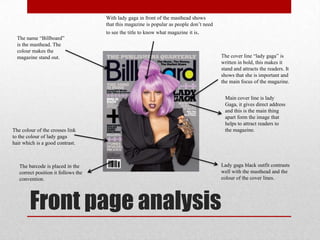
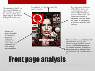
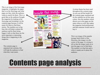
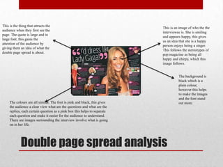
Research into similar
products
Front page analysis
With lady gaga in front of the masthead shows
that this magazine is popular as people don‟t need
to see the title to know what magazine it is.
The cover line “lady gaga” is
written in bold, this makes it
stand and attracts the readers. It
shows that she is important and
the main focus of the magazine.
Main cover line is lady
Gaga, it gives direct address
and this is the main thing
apart form the image that
helps to attract readers to
the magazine.
Lady gaga black outfit contrasts
well with the masthead and the
colour of the cover lines.
The barcode is placed in the
correct position it follows the
convention.
The colour of the crosses link
to the colour of lady gaga
hair which is a good contrast.
The name “Billboard”
is the masthead. The
colour makes the
magazine stand out.
Front page analysis
The masthead is large and
clear to understand, this
usually attracts the audience
especially if the masthead is
catchy or easy to understand.
The colour is pink which is
feminine so this represents
that this magazine is aimed
at females mostly.
This is the main image on
the magazine, this tells us
that this magazine will
focus on her mainly. She is
giving the audience direct
eye contact in order to help
the audience buy the
magazine.
This border at the bottom is very large
and it helps to cover the magazine
more than making it have empty
space. In the border it contains images
of popular musicians in the forms of
posters, this helps to attract people to
buy the magazine especially if it has
one of the audience members favourite
musicians. The number 7 is in big font
and is in the colour black, this helps to
attract people to the number 7 and it
appears that this is a once in a life time
opportunity. The barcode is on the side
of the images of the posters, which
this is easy for the person that is going
to scan the magazine to find.
The colour theme appears to
be similar as the top border
is the same colour as the
bottom border, so the people
that are creating this
magazine have spent
delicate time by making sure
the colours all go together
well. All the text is aligned,
it is clear and easy to
understand.
This is the logo from which the company that has
produced this magazine. BBC is widely known
media company that has been around for decades.
Front page analysis
This magazine is called Q it is
in the corner of the page so it
helps to attract the audience.
The colour is red this shows
danger and gives the audience
this magazine is a bit rocky.
The person on the front cover
is Cheryl Cole, she is a pop
singer. It appears as it has
been raining and her lips are
the colour red that is the same
colour as the masthead, it
appears she is the only person
you can see on this magazine
so this shows are us that she is
important.
The word „rocks‟ is in capital letters and
appears that it is shouting to the
audience trying to grab their attention
that this is very interesting magazine.
The colour is red which is the same as
the masthead and the colour of Cheryl
Cole lips so this tells us that this links to
her.
The heading is way of trying to catch the
audience attention.
All the text is
aligned this makes
the magazine to
appear as a
professional
magazine, each
cover line has been
separated so we
know that they
don‟t link together.
Contents page analysis
This contents page is from the music
magazine Vibe, the image on the
contents page is of Eminem and he is
the main image so this shows that this
magazine will mainly focus on him. He
is dressed in formal clothes and it
appears has he is fading into the
background.
The information of the contents page is
very bare and it appears that this
magazine is suitable for older teenagers
or adults. All the text is aligned and the
colours are very simple and plain
which is white and yellow so it is easy
for the audience to read and find out
what they are looking for . In my
opinion I don‟t like this contents page
as it looks very boring and doesn‟t
appear to be entertaining, this would
also make me not want to read the rest
of the magazine.
In the left hand corner
is the name of the
magazine „Vibe‟ this
helps people to know
that these magazines
link together if people
had to guess what front
and contents look alike.
Contents page analysis
A colour theme has been used
throughout this contents page.
As you can tell the border for
the contents page masthead and
for the subtitles are all the same
colour. Also the numbers which
directs you to the pages are the
same colour as well, this makes
the magazine look professional
and that someone would want to
buy it.
This is an image of the front page
magazine, it highlights the pages
that is on the front page and what
pages are they when the audience
wants to search for them. This is a
good idea as the audience brought
the magazine by looking at the
front page and including it in the
contents page because it will be
easier for them to find these
stories. The numbers are in big
font, this will help to attract the
audience and by them being
bigger it tells us that these are the
most important or interesting
things that is happening in the
magazine.
This is an image of the popular
teenage band which is One
Direction, this image is in the
corner of the page, it is trying to
tell us that the image wants us to
turn the page over to find them.
The number is in big font and is
white it stands out to attract the
audience.
The contents page is
separated into sections, this
will help the audience to find
what they want easier.
Contents page analysis
It has the masthead of the magazine and the word contents to tell the audience what page this is. The
word is in capital letters to shout to the audience that this is the contents page and you should look at it.
This is an image of Lana Del Rey,
this image was taken so that it
doesn‟t show the whole face but
enough for the audience to know
who it is. Also on the side of her
face is blood, this gives the
audience a feeling of what could
be happening to her and make
them more intrigued, so the page
number is in big font for them to
turn to that page first.
There are other images of
different bands which the
audience can turn to
The text is all aligned and
the page numbers are easily
for the audience to find. The
colour of the boxes are red
which shows this magazine
has good colour
coordination.
This sub heading
tells the audience
what is featured in
this magazine.
Double page spread analysis
This is the thing that attracts the
audience when they first see the
page. The quote is large and in
large font, this gains the
attention of the audience by
giving them an idea of what the
double page spread is about.
This is an image of who the the
interviewee is. She is smiling
and appears happy, this gives
us an idea that she is a happy
person enjoys being a singer.
This follows the stereotypes of
pop magazine as being all
happy and chirpy, which this
image follows.
The colours are all similar. The font is pink and black, this gives
the audience a clear view what are the questions and what are the
replies, each certain question as a pink box this helps to separate
each question and make it easier for the audience to understand.
There are images surrounding the interview involve what is going
on in her life.
The background is
black which is a
plain colour,
however this helps
to make the images
and the font stand
out more.
Double page spread analysis
This is an image of the
interviewee for the double page
spread. She appears to be smiling
so this give us an idea that this
could be a pop magazine.
The name of the singer is in big front
and the colour matches her hair. Around
her name is flowers, daisy represent
peace and a childlike image as children
mostly girls are known for playing with
daisy's as a child, so she could be a
singer for young girls and be a role
model towards them.
The interview is in two long
columns, this appears very boring
and simple as in my opinion I
wouldn‟t want to read it as it
would have been better is the
interview was spread out more.
The colour of the font links to the
daisy and white is the colour of
purity.
The background colour
blends in very well
with the double page
spread, it also helps to
make the magazine
look very nice.
Double page spread analysis
This is an image of Lady
Gaga, it is a medium close
up and the image is in
black and white.
The letter „L‟ is the main thing
that‟s stands out on this double
page spread, the colour is red
and the rest of this page is
black and white, also red
represents the colour of danger
or seduction. The letter „L‟
must stand for her name Lady
Gaga this represents that she
stands out as a person, also that
everyone else is the same
except from her.
In the top right corner is the
name of the person who this
double page spread is about,
this gives readers who don‟t
know who she is some
knowledge of her.
The interview appears to be
very close together and
appears very boring and
long to read. So in my
opinion for them to improve
their double page spread
they could paragraph it and
change the font as it is all
the same and they could also
add some colour to it.

Research into roducts

  • 1.
  • 2.
    Front page analysis Withlady gaga in front of the masthead shows that this magazine is popular as people don‟t need to see the title to know what magazine it is. The cover line “lady gaga” is written in bold, this makes it stand and attracts the readers. It shows that she is important and the main focus of the magazine. Main cover line is lady Gaga, it gives direct address and this is the main thing apart form the image that helps to attract readers to the magazine. Lady gaga black outfit contrasts well with the masthead and the colour of the cover lines. The barcode is placed in the correct position it follows the convention. The colour of the crosses link to the colour of lady gaga hair which is a good contrast. The name “Billboard” is the masthead. The colour makes the magazine stand out.
  • 3.
    Front page analysis Themasthead is large and clear to understand, this usually attracts the audience especially if the masthead is catchy or easy to understand. The colour is pink which is feminine so this represents that this magazine is aimed at females mostly. This is the main image on the magazine, this tells us that this magazine will focus on her mainly. She is giving the audience direct eye contact in order to help the audience buy the magazine. This border at the bottom is very large and it helps to cover the magazine more than making it have empty space. In the border it contains images of popular musicians in the forms of posters, this helps to attract people to buy the magazine especially if it has one of the audience members favourite musicians. The number 7 is in big font and is in the colour black, this helps to attract people to the number 7 and it appears that this is a once in a life time opportunity. The barcode is on the side of the images of the posters, which this is easy for the person that is going to scan the magazine to find. The colour theme appears to be similar as the top border is the same colour as the bottom border, so the people that are creating this magazine have spent delicate time by making sure the colours all go together well. All the text is aligned, it is clear and easy to understand. This is the logo from which the company that has produced this magazine. BBC is widely known media company that has been around for decades.
  • 4.
    Front page analysis Thismagazine is called Q it is in the corner of the page so it helps to attract the audience. The colour is red this shows danger and gives the audience this magazine is a bit rocky. The person on the front cover is Cheryl Cole, she is a pop singer. It appears as it has been raining and her lips are the colour red that is the same colour as the masthead, it appears she is the only person you can see on this magazine so this shows are us that she is important. The word „rocks‟ is in capital letters and appears that it is shouting to the audience trying to grab their attention that this is very interesting magazine. The colour is red which is the same as the masthead and the colour of Cheryl Cole lips so this tells us that this links to her. The heading is way of trying to catch the audience attention. All the text is aligned this makes the magazine to appear as a professional magazine, each cover line has been separated so we know that they don‟t link together.
  • 5.
    Contents page analysis Thiscontents page is from the music magazine Vibe, the image on the contents page is of Eminem and he is the main image so this shows that this magazine will mainly focus on him. He is dressed in formal clothes and it appears has he is fading into the background. The information of the contents page is very bare and it appears that this magazine is suitable for older teenagers or adults. All the text is aligned and the colours are very simple and plain which is white and yellow so it is easy for the audience to read and find out what they are looking for . In my opinion I don‟t like this contents page as it looks very boring and doesn‟t appear to be entertaining, this would also make me not want to read the rest of the magazine. In the left hand corner is the name of the magazine „Vibe‟ this helps people to know that these magazines link together if people had to guess what front and contents look alike.
  • 6.
    Contents page analysis Acolour theme has been used throughout this contents page. As you can tell the border for the contents page masthead and for the subtitles are all the same colour. Also the numbers which directs you to the pages are the same colour as well, this makes the magazine look professional and that someone would want to buy it. This is an image of the front page magazine, it highlights the pages that is on the front page and what pages are they when the audience wants to search for them. This is a good idea as the audience brought the magazine by looking at the front page and including it in the contents page because it will be easier for them to find these stories. The numbers are in big font, this will help to attract the audience and by them being bigger it tells us that these are the most important or interesting things that is happening in the magazine. This is an image of the popular teenage band which is One Direction, this image is in the corner of the page, it is trying to tell us that the image wants us to turn the page over to find them. The number is in big font and is white it stands out to attract the audience. The contents page is separated into sections, this will help the audience to find what they want easier.
  • 7.
    Contents page analysis Ithas the masthead of the magazine and the word contents to tell the audience what page this is. The word is in capital letters to shout to the audience that this is the contents page and you should look at it. This is an image of Lana Del Rey, this image was taken so that it doesn‟t show the whole face but enough for the audience to know who it is. Also on the side of her face is blood, this gives the audience a feeling of what could be happening to her and make them more intrigued, so the page number is in big font for them to turn to that page first. There are other images of different bands which the audience can turn to The text is all aligned and the page numbers are easily for the audience to find. The colour of the boxes are red which shows this magazine has good colour coordination. This sub heading tells the audience what is featured in this magazine.
  • 8.
    Double page spreadanalysis This is the thing that attracts the audience when they first see the page. The quote is large and in large font, this gains the attention of the audience by giving them an idea of what the double page spread is about. This is an image of who the the interviewee is. She is smiling and appears happy, this gives us an idea that she is a happy person enjoys being a singer. This follows the stereotypes of pop magazine as being all happy and chirpy, which this image follows. The colours are all similar. The font is pink and black, this gives the audience a clear view what are the questions and what are the replies, each certain question as a pink box this helps to separate each question and make it easier for the audience to understand. There are images surrounding the interview involve what is going on in her life. The background is black which is a plain colour, however this helps to make the images and the font stand out more.
  • 9.
    Double page spreadanalysis This is an image of the interviewee for the double page spread. She appears to be smiling so this give us an idea that this could be a pop magazine. The name of the singer is in big front and the colour matches her hair. Around her name is flowers, daisy represent peace and a childlike image as children mostly girls are known for playing with daisy's as a child, so she could be a singer for young girls and be a role model towards them. The interview is in two long columns, this appears very boring and simple as in my opinion I wouldn‟t want to read it as it would have been better is the interview was spread out more. The colour of the font links to the daisy and white is the colour of purity. The background colour blends in very well with the double page spread, it also helps to make the magazine look very nice.
  • 10.
    Double page spreadanalysis This is an image of Lady Gaga, it is a medium close up and the image is in black and white. The letter „L‟ is the main thing that‟s stands out on this double page spread, the colour is red and the rest of this page is black and white, also red represents the colour of danger or seduction. The letter „L‟ must stand for her name Lady Gaga this represents that she stands out as a person, also that everyone else is the same except from her. In the top right corner is the name of the person who this double page spread is about, this gives readers who don‟t know who she is some knowledge of her. The interview appears to be very close together and appears very boring and long to read. So in my opinion for them to improve their double page spread they could paragraph it and change the font as it is all the same and they could also add some colour to it.