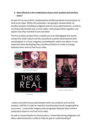
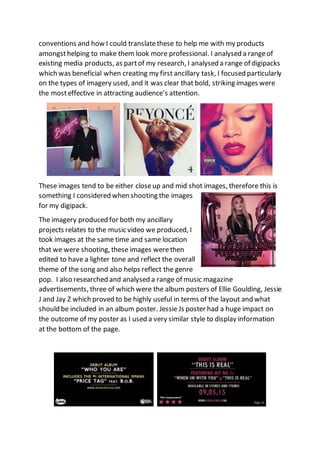
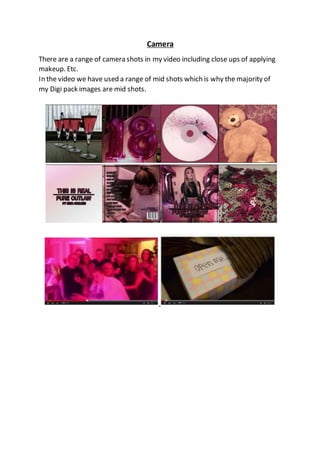
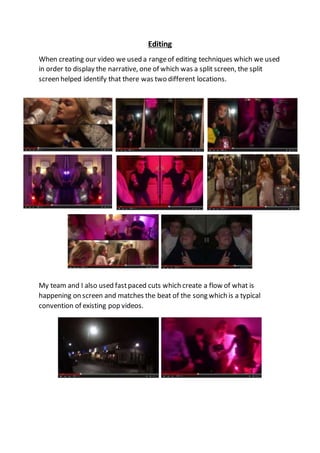
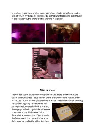
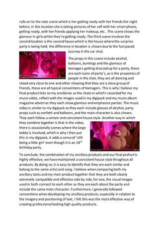
The student created two ancillary products - a CD digipack and music advertisement poster - to accompany their final music video project. They took care to establish a consistent style across all three products using similar imagery, color scheme, fonts, and layouts. This was done to clearly link the products together and make the artist and album easily recognizable. Both ancillary products effectively promoted the music and tied into themes and scenes from the music video through the use of matching photos from the shoot. The combination of products together formed a cohesive package that portrayed the narrative of the song.
Sociocosmos empowers you to go trendy on social media with a few clicks..pdf
Evaluation Question 2
1. 2. How effective is the combinationof your main product and ancillary
texts?
As part of my coursework, I produced two ancillary products to accompany my
final music video. Within this evaluation I am going to compareboth my
ancillary projects including my digipack and my music advertisement, as well as
my final productwhich was a music video, I will comparethem together and
explain how they’relinked to one and other.
The first ancillary product that I created was an 8 sided digipak that would
contain the artist’s albumand the second was a poster advertisement that
would appear in a music magazine, promoting the artists new album. It was
important when developing these ancillary products to create a synergy
between them and my final music video.
I used a consistenthousestyle between both my ancillaries and my final
product, I did this in order to makethe overall producteasily recognisableto
consumers. I used similar imagery and iconography between them which is
particularly shown in my final music video.
As well as researching for my final product, I researched existing digipacks and
album advertisements in order to help me gain an understanding of
Ancillary 1 (CD Digipack)
Ancillary 2 (album advert)
Final product
2. conventions and how I could translatethese to help me with my products
amongsthelping to make them look more professional. I analysed a rangeof
existing media products, as partof my research, I analysed a range of digipacks
which was beneficial when creating my first ancillary task, I focused particularly
on the types of imagery used, and it was clear that bold, striking images were
the mosteffective in attracting audience’s attention.
These images tend to be either closeup and mid shot images, therefore this is
something I considered when shooting the images
for my digipack.
The imagery produced for both my ancillary
projects relates to the music video we produced, I
took images at the same time and same location
that we were shooting, these images werethen
edited to have a lighter tone and reflect the overall
theme of the song and also helps reflect the genre
pop. I also researched and analysed a range of music magazine
advertisements, three of which were the album posters of Ellie Goulding, Jessie
J and Jay Z which proved to be highly useful in terms of the layout and what
should be included in an album poster. Jessie Js poster had a huge impact on
the outcome of my poster as I used a very similar style to display information
at the bottom of the page.
3. After analysing previous advertisements it was clear to me that the
information included within an album advertisement should be minimal and
simplistic. I also noticed that the most important pieces of information were a
larger sizeor bolded to the extent that they stood out amongstthe other
pieces of information, For example the album name and the release date
tended to be much larger than information such as the name of record label. In
terms of the layout for my ancillary tasks, the main reason for creating both
the digipack and the album advertisement is to promote both the artistand
the album. Many artists usethis method of advertisements because it allows
them to promote themselves to their intended target audience. For both my
poster and digipack I havedecided to use the same images of the main
character within my final product, which links them all in together, she is the
artist of the album. I did this as I found that it enabled them to link together
extremely well.
I generally followed conventions in order to make the productappear as
realistic as possible. For the album poster, I decided to make the text large and
easy to read whilst standing out, The text is more or less all in the centre and
has the website and twitter address in the top right hand corner. The album
cover is similar to my music advertisement, which is purposely donein order
for the audience to be able to identify it when in a storeas the exact same
picture and font is used. For both of them, the posistioning of the text was
fairly basic in order to make the text stand out. On the front of my digi pack,
the artistname is slightly smaller than the album name. It was importantthat
the overalllayout of my difipack was similar to the album advertisment so that
the audience could recogniseit easily which is why I used the same style for
both of them, to maintain a consistanthousestyle.I also used the same image
on both of them so that it was easy for the audience to recognmise that it was
the samealbum, many artists use this method including katy perry, Ellie
goulding and Jessie J.
4. I therefore used this apporach to combine both of my ancillaries together
5. The font was also exactly the sameon each ancillary however the layout was
different. The font on the music magazinehad a black box around it to add
more depth to the product and was in a line, whereas the font on the album
was more spaced out, similar to the opening title of the music video, although
they were all very similar. this was effective as it meant that the text is
instantly recognised and the audience will know that theyre all related. When
creating my digipack I decided to chooseseveralimages for all of the panels
which would create a flow of props and things which are included in my final
product. As well as keeping the style of the image I used consistent, as I added
a tint of pink to each one to fit in with the genre of pop, this kept the colour
scheme consistentas the colour pink was highlighted frequently in the music
video.
Like most digipaks i researched, I posistioned the tracklisting for the album on
the back page of the digipack in a vertical column, as I felt
this was the most effective way of positioning the text.
When creating my music video I made sureto include an
extremely wide rangeof different shottypes and editing
techniques, these varied shots and editing techniques
would hopefully portray the narrativewe wanted when
making the video more interesting to watch.
The Digi pack also includes a range of different shotangles, which I believe
makes it more interesting and gives it a dynamic view, as opposed to a Digi
pack which would consistof a range of mid shots. As the video is about a
surpriseparty, wedecided to use2 different houses as locations, along with
the journey between the two, this shown the difference in houses to show that
they went fromone house wherethey got ready, into the housewhere the
party is situated. This combines with my cd Digi pack as the frontand back
cover are each a differentlocation fromtwo different scenes. The cross cuts
between the two, whilst contrasting with the beat of the song, made the video
exciting and interesting. We tried to create the video in a very real senseas the
video is targeted to teenagers, and they tend to stereotypically drink and
party. We’re able to see how girls get ready including the appliance of makeup
and taking pictures of themselves, etc.
6. Camera
There are a range of camera shots in my video including close ups of applying
makeup. Etc.
In the video we have used a range of mid shots which is why the majority of
my Digi pack images are mid shots.
7. Editing
When creating our video we used a rangeof editing techniques which we used
in order to display the narrative, one of which was a split screen, the split
screen helped identify that there was two different locations.
My team and I also used fastpaced cuts which create a flow of what is
happening on screen and matches the beat of the song which is a typical
convention of existing pop videos.
8. We also made the clips repeat to fit with the beat and the lyric of the song
Another effect we added was a reverseeffect which we created a split screen
on
9. In the final music video we haveused some blur effects, as well as a strobe
light effect. In my digipack, I have used a slightblur effect on the background
of the back cover, this therefore ties the two in together.
Mise en scene
The mise en scene of the video helps identify that there are two locations
within the music video I have created which are two different houses, in the
firsthouse shown, itis the presenttime, in which the main character is closing
her curtains, lighting some candles and
getting in bed, whereshe finds a present,
these props help distinguish the difference
in location to the third scene. This is
shown in the video as one of the props in
the firstscene is that the main character
clicks a phoneto play the video, this then
10. rolls on to the next scene which is her getting ready with her friends the night
before, in this location she is taking pictures of her self with her smartphone,
getting ready, with her friends applying her makeup, etc.. This sceneshows the
glamour in girls whilst they’regetting ready. The third scene involves the
second location is the second housewhich is the house wherethe surprise
party is being held; the difference in location is shown dueto the fastpaced
journey in the car shot.
The props in this scene include alcohol,
balloons, buntings and the glamour of
teenagers getting dressed up for a party, these
are each icons of party’s, as is the proxemics of
people in the shot, they are all dancing and
stood very close to one and other showing that they are a close group of
friends, these are all typical conventions of teenagers. This is why I believe my
final productlinks to my ancillaries as the shots in which I recorded for my
music video, reflect with the images used in my digipack and my music album
magazine advertas they each show glamour and emphasise parties. The music
video is similar to my digipack as they each include glasses of alcohol, party
props such as confetti and balloons, and the main character is also shown.
They each follow a certain and consistenthousestyle. Another way in which
they combine together is that in the video,
there is occasionally scenes where the large
teddy is involved, which is why I then put
this in my digipack, it adds a senseof ‘still
being a little girl’ even though it is an 18th
birthday party.
To conclude, the combination of my ancillary products and our final profuctis
highly effective, we havemaintained a consistenthouse stylethroghout all
products. By doing so, it is easy to identify that they are each similar and
belong to the same artistand song. I believe when comparing both my
ancillary tasks and my main producttogether that they are both clearly
extremely compatible and effective side by side, for one, the visual images
used in both connect to each other as they are each about the party and
include the same main character. Furthermore, I generally followed
conventions when developing my ancillary products, especially in relation to
the imagery and positioning of text, I felt this was the mosteffective way of
creating professional looking high quality products.