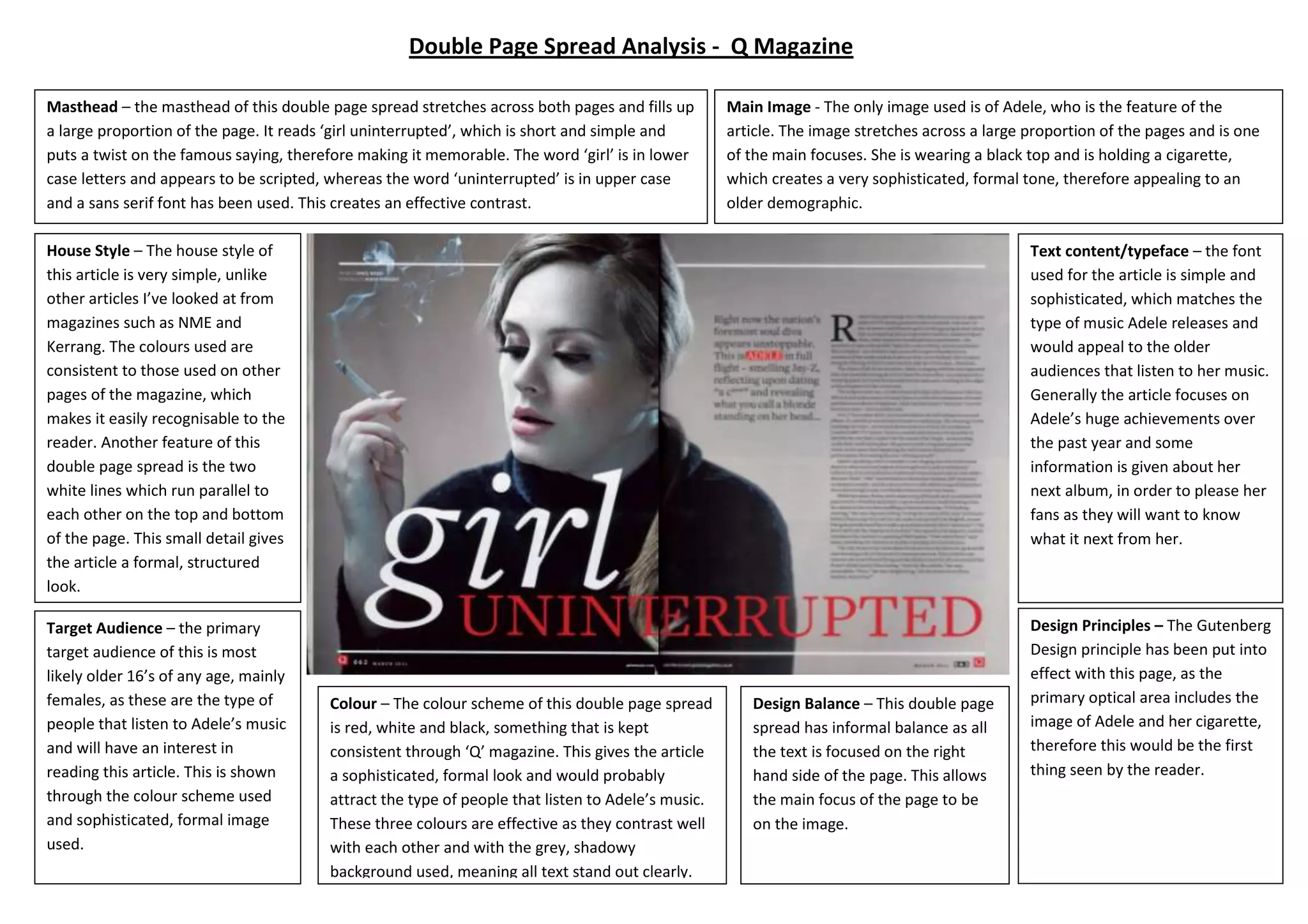
Text content/typeface – the font
used for the article is simple and
sophisticated, which matches the
type of music Adele releases and
would appeal to the older
audiences that listen to her music.
Generally the article focuses on
Adele’s huge achievements over
the past year and some
information is given about her
next album, in order to please her
fans as they will want to know
what it next from her.
House Style – The house style of
this article is very simple, unlike
other articles I’ve looked at from
magazines such as NME and
Kerrang. The colours used are
consistent to those used on other
pages of the magazine, which
makes it easily recognisable to the
reader. Another feature of this
double page spread is the two
white lines which run parallel to
each other on the top and bottom
of the page. This small detail gives
the article a formal, structured
look.
Design Principles – The Gutenberg
Design principle has been put into
effect with this page, as the
primary optical area includes the
image of Adele and her cigarette,
therefore this would be the first
thing seen by the reader.
Design Balance – This double page
spread has informal balance as all
the text is focused on the right
hand side of the page. This allows
the main focus of the page to be
on the image.
Colour – The colour scheme of this double page spread
is red, white and black, something that is kept
consistent through ‘Q’ magazine. This gives the article
a sophisticated, formal look and would probably
attract the type of people that listen to Adele’s music.
These three colours are effective as they contrast well
with each other and with the grey, shadowy
background used, meaning all text stand out clearly.
Main Image - The only image used is of Adele, who is the feature of the
article. The image stretches across a large proportion of the pages and is one
of the main focuses. She is wearing a black top and is holding a cigarette,
which creates a very sophisticated, formal tone, therefore appealing to an
older demographic.
Target Audience – the primary
target audience of this is most
likely older 16’s of any age, mainly
females, as these are the type of
people that listen to Adele’s music
and will have an interest in
reading this article. This is shown
through the colour scheme used
and sophisticated, formal image
used.
Masthead – the masthead of this double page spread stretches across both pages and fills up
a large proportion of the page. It reads ‘girl uninterrupted’, which is short and simple and
puts a twist on the famous saying, therefore making it memorable. The word ‘girl’ is in lower
case letters and appears to be scripted, whereas the word ‘uninterrupted’ is in upper case
and a sans serif font has been used. This creates an effective contrast.
Double Page Spread Analysis - Q Magazine
Design Balance– the design
balance of this double page spread
is informal, in order to give it an
exciting, fun look. Even though the
text is structured effectively, there
is no balance in it and the image is
positioned to the right hand side.
House Style – The overall look of this
double page spread is vibrant and
exciting; this is created by the bold
image used and bright colour
schemes. This spread is taken from
NME magazine which is not usually
known for featuring such mainstream,
pop artists, therefore the style of this
article is slightly different from others
I have seen from NME magazine.
Another feature of this spread is that
the first letter of the article is much
bigger and bold than the rest, in order
to make it clear where it starts, this is
something I have found is common
with magazine articles.
Design Principles
The Gutenberg design principle
has been applied to this double
page spread as the masthead is
in the top left hand corner,
meaning it is in the primary
optical area. This means it is the
first thin the reader sees, and
they can instantly know who the
article is about.
Text content/typeface – the
layout of the text is different
compared to the ‘Q’ magazine
article, as it is split up into
different sections, each
discussing a different topic. This
is most likely to appeal to a
younger age range, as they will
not want to read large amounts
of text. Certain quotes have
been pulled out of the article,
and put in a bigger font and also
highlighted in a dark pink; this is
to attract readers as they are
usually the most ‘exclusive’ part
of the interview.
Colour – The main colours used on this page are pink,
black and white. The pink gives the page an extremely
girly and feminine look which would attract young
girls, who are interested in her music and fits with the
‘pop’ genre of music. The black and pink contrast well
with each other and allow the text to stand out easily.
Main Image - Similar to the ‘Q’ double page spread only one image is used. A bold,
fun image has been included, which clearly represents the ‘pop’ genre of music being
featured. The artist is wearing vibrant pink lipstick which compliments the pink
background colour. The artist is wearing bold, unique costume jewellery highlights the
exciting, fun tone of the page. The image also has direct mode of address, which
would entice the reader and creates a unique photo.
Target Audience – the main audience
of this double page spread is very
different from the audience of the ‘Q’
magazine. This article is aimed at a
much younger demographic and
mainly girls, as these are the type of
people that would listen to Nicki
Minaj.
Masthead – The masthead of this page is ‘The Gospel According to Nicki Minaj’, it is a
very large masthead and covers a large proportion of the page. Similar to the
masthead from ‘Q’ this has two contrasting fonts, in order to make it stand out to the
reader. The artists name is in a simple, bold font, which is a pink, whereas the lettering
above it has a script font which looks to be handwritten.
Double Page Spread Analysis - NME Magazine

Double page spreads for analysis

  • 1.
    Text content/typeface –the font used for the article is simple and sophisticated, which matches the type of music Adele releases and would appeal to the older audiences that listen to her music. Generally the article focuses on Adele’s huge achievements over the past year and some information is given about her next album, in order to please her fans as they will want to know what it next from her. House Style – The house style of this article is very simple, unlike other articles I’ve looked at from magazines such as NME and Kerrang. The colours used are consistent to those used on other pages of the magazine, which makes it easily recognisable to the reader. Another feature of this double page spread is the two white lines which run parallel to each other on the top and bottom of the page. This small detail gives the article a formal, structured look. Design Principles – The Gutenberg Design principle has been put into effect with this page, as the primary optical area includes the image of Adele and her cigarette, therefore this would be the first thing seen by the reader. Design Balance – This double page spread has informal balance as all the text is focused on the right hand side of the page. This allows the main focus of the page to be on the image. Colour – The colour scheme of this double page spread is red, white and black, something that is kept consistent through ‘Q’ magazine. This gives the article a sophisticated, formal look and would probably attract the type of people that listen to Adele’s music. These three colours are effective as they contrast well with each other and with the grey, shadowy background used, meaning all text stand out clearly. Main Image - The only image used is of Adele, who is the feature of the article. The image stretches across a large proportion of the pages and is one of the main focuses. She is wearing a black top and is holding a cigarette, which creates a very sophisticated, formal tone, therefore appealing to an older demographic. Target Audience – the primary target audience of this is most likely older 16’s of any age, mainly females, as these are the type of people that listen to Adele’s music and will have an interest in reading this article. This is shown through the colour scheme used and sophisticated, formal image used. Masthead – the masthead of this double page spread stretches across both pages and fills up a large proportion of the page. It reads ‘girl uninterrupted’, which is short and simple and puts a twist on the famous saying, therefore making it memorable. The word ‘girl’ is in lower case letters and appears to be scripted, whereas the word ‘uninterrupted’ is in upper case and a sans serif font has been used. This creates an effective contrast. Double Page Spread Analysis - Q Magazine
  • 2.
    Design Balance– thedesign balance of this double page spread is informal, in order to give it an exciting, fun look. Even though the text is structured effectively, there is no balance in it and the image is positioned to the right hand side. House Style – The overall look of this double page spread is vibrant and exciting; this is created by the bold image used and bright colour schemes. This spread is taken from NME magazine which is not usually known for featuring such mainstream, pop artists, therefore the style of this article is slightly different from others I have seen from NME magazine. Another feature of this spread is that the first letter of the article is much bigger and bold than the rest, in order to make it clear where it starts, this is something I have found is common with magazine articles. Design Principles The Gutenberg design principle has been applied to this double page spread as the masthead is in the top left hand corner, meaning it is in the primary optical area. This means it is the first thin the reader sees, and they can instantly know who the article is about. Text content/typeface – the layout of the text is different compared to the ‘Q’ magazine article, as it is split up into different sections, each discussing a different topic. This is most likely to appeal to a younger age range, as they will not want to read large amounts of text. Certain quotes have been pulled out of the article, and put in a bigger font and also highlighted in a dark pink; this is to attract readers as they are usually the most ‘exclusive’ part of the interview. Colour – The main colours used on this page are pink, black and white. The pink gives the page an extremely girly and feminine look which would attract young girls, who are interested in her music and fits with the ‘pop’ genre of music. The black and pink contrast well with each other and allow the text to stand out easily. Main Image - Similar to the ‘Q’ double page spread only one image is used. A bold, fun image has been included, which clearly represents the ‘pop’ genre of music being featured. The artist is wearing vibrant pink lipstick which compliments the pink background colour. The artist is wearing bold, unique costume jewellery highlights the exciting, fun tone of the page. The image also has direct mode of address, which would entice the reader and creates a unique photo. Target Audience – the main audience of this double page spread is very different from the audience of the ‘Q’ magazine. This article is aimed at a much younger demographic and mainly girls, as these are the type of people that would listen to Nicki Minaj. Masthead – The masthead of this page is ‘The Gospel According to Nicki Minaj’, it is a very large masthead and covers a large proportion of the page. Similar to the masthead from ‘Q’ this has two contrasting fonts, in order to make it stand out to the reader. The artists name is in a simple, bold font, which is a pink, whereas the lettering above it has a script font which looks to be handwritten. Double Page Spread Analysis - NME Magazine