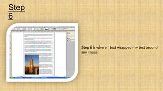
Page layout and Design
By Edward Gill
Step
1
In this step I created three columns that
would split up my text that I inserted later on.
Step
2
In step two you can see that I inserted a grid
which is 3by 3. I did this so that I could break
my page up, resulting in my work becoming
more organised. I made sure that when
inserting my grid I clicked “fit to margins” so
that my guides would be even within my
workspace.
Step
3
In this step I inserted a frame for where my
image would be placed.
Step
4
In this step I inserted my image of the Empire
State Building into the rectangular frame that
is on the design. I did this by originally starting
off in Photoshop, where I made sure the size
of the image would be the same size of the
picture frame on my design page. I then
placed the image into in-design.
Step
5
For step 5 I collected some random text of the
Internet and placed it within the text box on
my design page. As you can see in the image
to the left, the text goes over the image I
inserted earlier.
Step
6
Step 6 is where I text wrapped my text around
my image.
Step
7
For step 7 I inserted a drop capital, this was
because it is a useful tool to draw the eye to
the start of the text
Step
8
In this step I inserted a frame for where the
title will be positioned.
Step
9
For this step I chose a font for my title and
inserted the words into the frame I already
placed.
Step
10
Step 10 is my finished overall design and
layout I created.
Final layout
and design

Page layout and design

  • 1.
    Page layout andDesign By Edward Gill
  • 2.
    Step 1 In this stepI created three columns that would split up my text that I inserted later on.
  • 3.
    Step 2 In step twoyou can see that I inserted a grid which is 3by 3. I did this so that I could break my page up, resulting in my work becoming more organised. I made sure that when inserting my grid I clicked “fit to margins” so that my guides would be even within my workspace.
  • 4.
    Step 3 In this stepI inserted a frame for where my image would be placed.
  • 5.
    Step 4 In this stepI inserted my image of the Empire State Building into the rectangular frame that is on the design. I did this by originally starting off in Photoshop, where I made sure the size of the image would be the same size of the picture frame on my design page. I then placed the image into in-design.
  • 6.
    Step 5 For step 5I collected some random text of the Internet and placed it within the text box on my design page. As you can see in the image to the left, the text goes over the image I inserted earlier.
  • 7.
    Step 6 Step 6 iswhere I text wrapped my text around my image.
  • 8.
    Step 7 For step 7I inserted a drop capital, this was because it is a useful tool to draw the eye to the start of the text
  • 9.
    Step 8 In this stepI inserted a frame for where the title will be positioned.
  • 10.
    Step 9 For this stepI chose a font for my title and inserted the words into the frame I already placed.
  • 11.
    Step 10 Step 10 ismy finished overall design and layout I created.
  • 12.