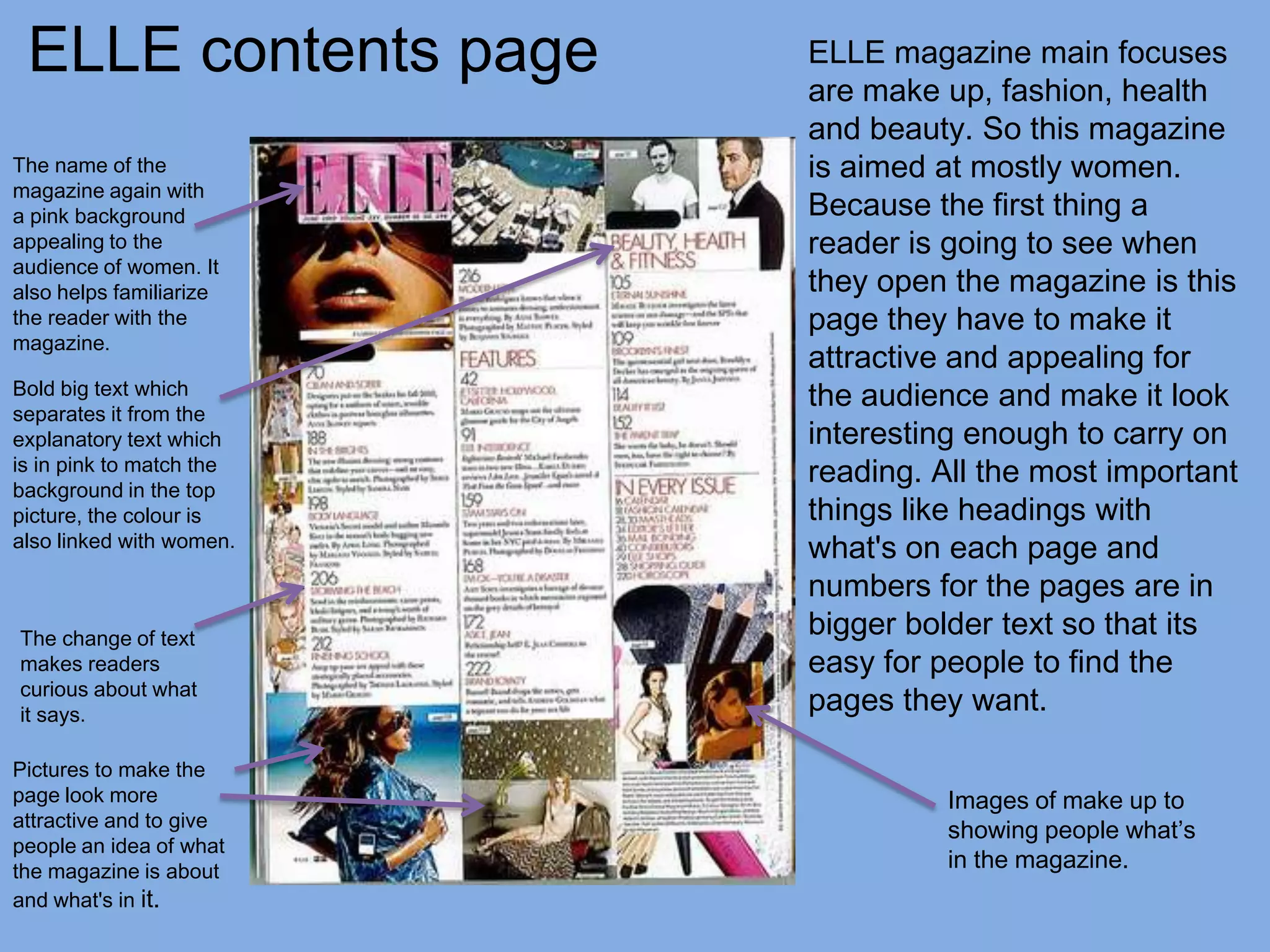
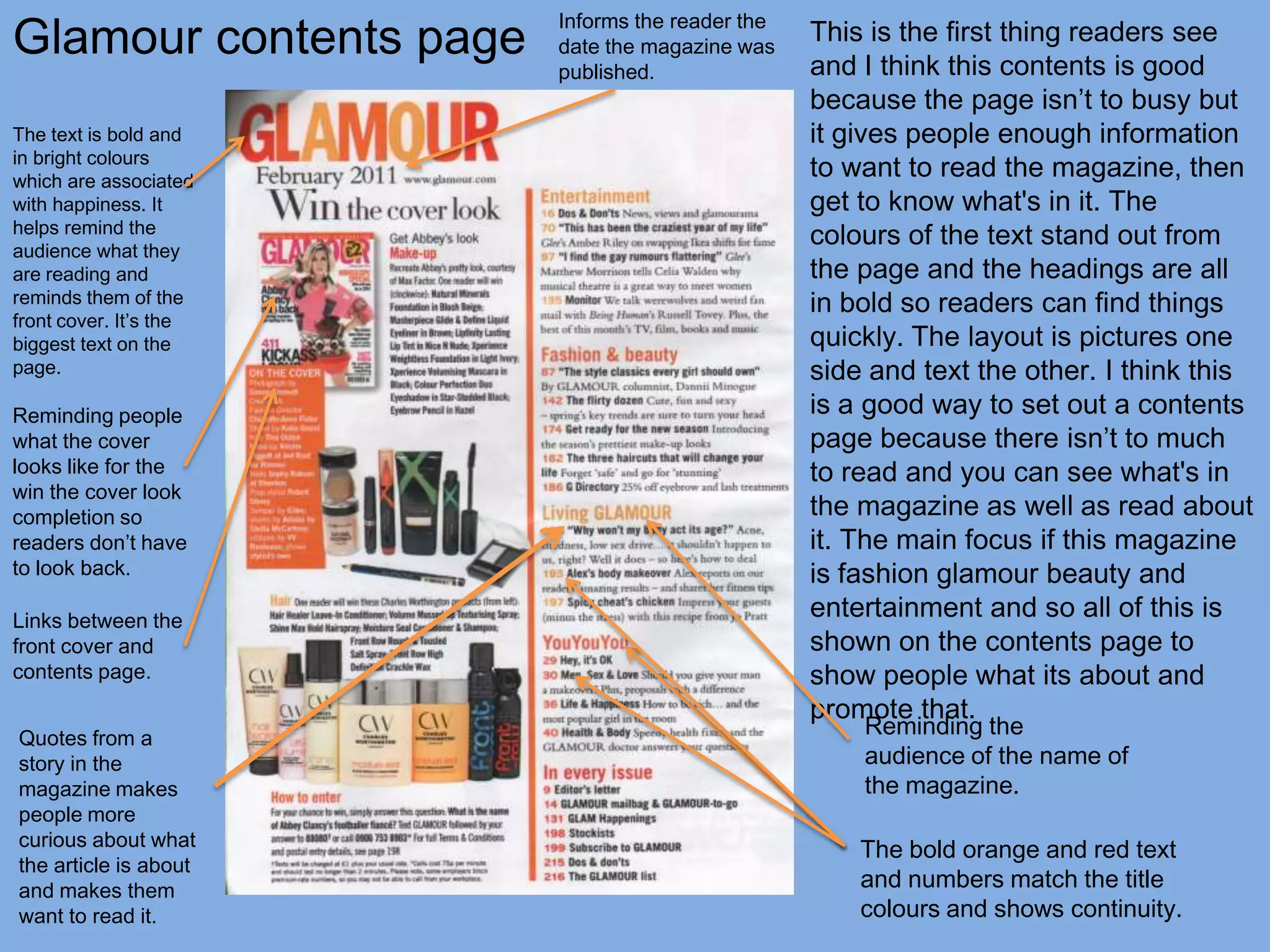
Contents page and double
  page spread analysis
ELLE contents page       ELLE magazine main focuses
                          are make up, fashion, health
                          and beauty. So this magazine
The name of the           is aimed at mostly women.
magazine again with
a pink background         Because the first thing a
appealing to the          reader is going to see when
audience of women. It
also helps familiarize    they open the magazine is this
the reader with the       page they have to make it
magazine.
                          attractive and appealing for
Bold big text which
separates it from the
                          the audience and make it look
explanatory text which    interesting enough to carry on
is in pink to match the
background in the top
                          reading. All the most important
picture, the colour is    things like headings with
also linked with women.   what's on each page and
                          numbers for the pages are in
The change of text
                          bigger bolder text so that its
makes readers             easy for people to find the
curious about what
it says.
                          pages they want.

Pictures to make the
page look more                      Images of make up to
attractive and to give
                                    showing people what’s
people an idea of what
the magazine is about               in the magazine.
and what's in it.
Glamour contents page
                        Informs the reader the
                        date the magazine was
                                                 This is the first thing readers see
                        published.               and I think this contents is good
                                                 because the page isn’t to busy but
The text is bold and                             it gives people enough information
in bright colours
which are associated
                                                 to want to read the magazine, then
with happiness. It                               get to know what's in it. The
helps remind the
audience what they
                                                 colours of the text stand out from
are reading and                                  the page and the headings are all
reminds them of the                              in bold so readers can find things
front cover. It’s the
biggest text on the                              quickly. The layout is pictures one
page.                                            side and text the other. I think this
Reminding people                                 is a good way to set out a contents
what the cover                                   page because there isn’t to much
looks like for the                               to read and you can see what's in
win the cover look
completion so                                    the magazine as well as read about
readers don’t have                               it. The main focus if this magazine
to look back.                                    is fashion glamour beauty and
Links between the
                                                 entertainment and so all of this is
front cover and                                  shown on the contents page to
contents page.                                   show people what its about and
                                                 promote that.
Quotes from a
                                                     Reminding the
story in the                                         audience of the name of
magazine makes                                       the magazine.
people more
curious about what
                                                     The bold orange and red text
the article is about
and makes them                                       and numbers match the title
want to read it.                                     colours and shows continuity.
Comparisons
Both magazines have a mix of pictures and text on
their’ contents pages and show the name of the
magazine again to remind people what they are
reading. The subheadings and numbers on both
contents pages are bold and in a different colour to
the descriptive text because it makes them stand
out. I think both magazine contents pages look
attractive and aim for the right audience with the
colours orange and pink they have used. The main
focuses of both magazines are written on the
contents page on both magazines to remind people
what's in the magazine and what its about inside.
Both show pictures of make-up and fashion because
women are the aim for both magazines. However on
ELLE there is a few men on the page to attract the
female audience and make them more interested.
Then on glamour hey use a competition to get
people more interested. All the text is in columns on
both pages
Elle double page
spread page spread the
With a double
pages always join together
somehow with text or an image
going across both pages right in the
middle of the two. On the his
double page spread the image that
looks like glitter is what joins the two
pages together because its on both
the left and right page. There isn’t
much text on this spread its more
about the images. The title is big
                                           content of the page. The name of the magazine is on the left
and stands out so people know
                                           hand page which again is reminding readers what magazine
what the pages are about without
                                           it is all the time. This kind of spread appeals to the readers
having to have loads of text.
                                           of Elle because its about fashion, glamour and celebrities.
Because the pages are about the
                                           There is a picture or a pattern covering both pages so that
year of the dress I think this is why
                                           the pages look fuller than they actually are this is because of
more images are used than text,
                                           the lack of text that patters have been used. The font is
because people want to see it
                                           black for all the text so that is stands out against the white
rather than read about it. Images
                                           background and readers can see straight away what this
are an attractor to readers because
                                           page is about. There is a little sub heading below the title
they are easy to look at. The
                                           explaining more about the page. The splash of colour and
background of the page is plain
                                           glitter on the page relates to the double page spread
white so that the dresses can stand
                                           because of the bright and glamorous dresses on the page.
out because that is what this spread
                                           This isn’t a typical double page spread just about one person
is all about, the background
                                           or an artist but it’s the same style.
Glamour double page spread
This double page spread is filled with a picture of the celebrity Kelly Osborne, its an interview
with her and just so everyone knows it is she is shown over both pages. Most double pages
spreads are laid out like this so that it becomes one big page which is something different to look
at and might make people stop and look. The text is written bog and in a bright bold colour this is
so that people will attracted to the interview after seeing the picture of her. The first thing readers
look at is who the article is about and the pictures of the person. This is why they are the most
dominant things on the magazine pages. The title and sub text on the left hand side are both on
a slant just to make the page look a bit different. This article is about the fashion side of Kelly and
the sub text explains exactly what the whole interview is about with credit to the writer. The text
below the title is in black because its will be the last thing people look at when they come to
actually start to read the interview. The main text is in pink which is the colour women are
associated with, and because the magazine is about glamour and the interview is about Kelly’s
fashion it works and links with the magazine.

Contents Page and Double Page Spread

  • 1.
    Contents page anddouble page spread analysis
  • 2.
    ELLE contents page ELLE magazine main focuses are make up, fashion, health and beauty. So this magazine The name of the is aimed at mostly women. magazine again with a pink background Because the first thing a appealing to the reader is going to see when audience of women. It also helps familiarize they open the magazine is this the reader with the page they have to make it magazine. attractive and appealing for Bold big text which separates it from the the audience and make it look explanatory text which interesting enough to carry on is in pink to match the background in the top reading. All the most important picture, the colour is things like headings with also linked with women. what's on each page and numbers for the pages are in The change of text bigger bolder text so that its makes readers easy for people to find the curious about what it says. pages they want. Pictures to make the page look more Images of make up to attractive and to give showing people what’s people an idea of what the magazine is about in the magazine. and what's in it.
  • 3.
    Glamour contents page Informs the reader the date the magazine was This is the first thing readers see published. and I think this contents is good because the page isn’t to busy but The text is bold and it gives people enough information in bright colours which are associated to want to read the magazine, then with happiness. It get to know what's in it. The helps remind the audience what they colours of the text stand out from are reading and the page and the headings are all reminds them of the in bold so readers can find things front cover. It’s the biggest text on the quickly. The layout is pictures one page. side and text the other. I think this Reminding people is a good way to set out a contents what the cover page because there isn’t to much looks like for the to read and you can see what's in win the cover look completion so the magazine as well as read about readers don’t have it. The main focus if this magazine to look back. is fashion glamour beauty and Links between the entertainment and so all of this is front cover and shown on the contents page to contents page. show people what its about and promote that. Quotes from a Reminding the story in the audience of the name of magazine makes the magazine. people more curious about what The bold orange and red text the article is about and makes them and numbers match the title want to read it. colours and shows continuity.
  • 4.
    Comparisons Both magazines havea mix of pictures and text on their’ contents pages and show the name of the magazine again to remind people what they are reading. The subheadings and numbers on both contents pages are bold and in a different colour to the descriptive text because it makes them stand out. I think both magazine contents pages look attractive and aim for the right audience with the colours orange and pink they have used. The main focuses of both magazines are written on the contents page on both magazines to remind people what's in the magazine and what its about inside. Both show pictures of make-up and fashion because women are the aim for both magazines. However on ELLE there is a few men on the page to attract the female audience and make them more interested. Then on glamour hey use a competition to get people more interested. All the text is in columns on both pages
  • 5.
    Elle double page spreadpage spread the With a double pages always join together somehow with text or an image going across both pages right in the middle of the two. On the his double page spread the image that looks like glitter is what joins the two pages together because its on both the left and right page. There isn’t much text on this spread its more about the images. The title is big content of the page. The name of the magazine is on the left and stands out so people know hand page which again is reminding readers what magazine what the pages are about without it is all the time. This kind of spread appeals to the readers having to have loads of text. of Elle because its about fashion, glamour and celebrities. Because the pages are about the There is a picture or a pattern covering both pages so that year of the dress I think this is why the pages look fuller than they actually are this is because of more images are used than text, the lack of text that patters have been used. The font is because people want to see it black for all the text so that is stands out against the white rather than read about it. Images background and readers can see straight away what this are an attractor to readers because page is about. There is a little sub heading below the title they are easy to look at. The explaining more about the page. The splash of colour and background of the page is plain glitter on the page relates to the double page spread white so that the dresses can stand because of the bright and glamorous dresses on the page. out because that is what this spread This isn’t a typical double page spread just about one person is all about, the background or an artist but it’s the same style.
  • 6.
    Glamour double pagespread This double page spread is filled with a picture of the celebrity Kelly Osborne, its an interview with her and just so everyone knows it is she is shown over both pages. Most double pages spreads are laid out like this so that it becomes one big page which is something different to look at and might make people stop and look. The text is written bog and in a bright bold colour this is so that people will attracted to the interview after seeing the picture of her. The first thing readers look at is who the article is about and the pictures of the person. This is why they are the most dominant things on the magazine pages. The title and sub text on the left hand side are both on a slant just to make the page look a bit different. This article is about the fashion side of Kelly and the sub text explains exactly what the whole interview is about with credit to the writer. The text below the title is in black because its will be the last thing people look at when they come to actually start to read the interview. The main text is in pink which is the colour women are associated with, and because the magazine is about glamour and the interview is about Kelly’s fashion it works and links with the magazine.