Downloaded 182 times
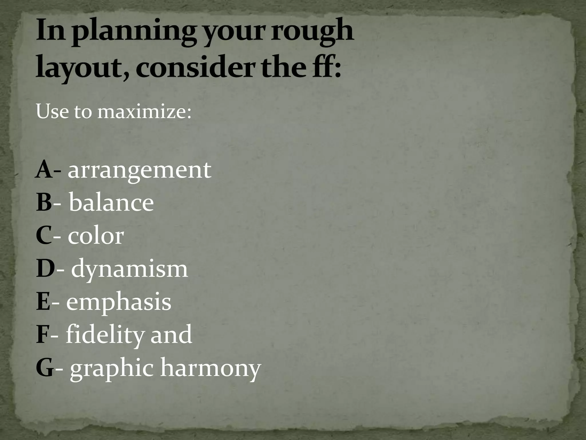
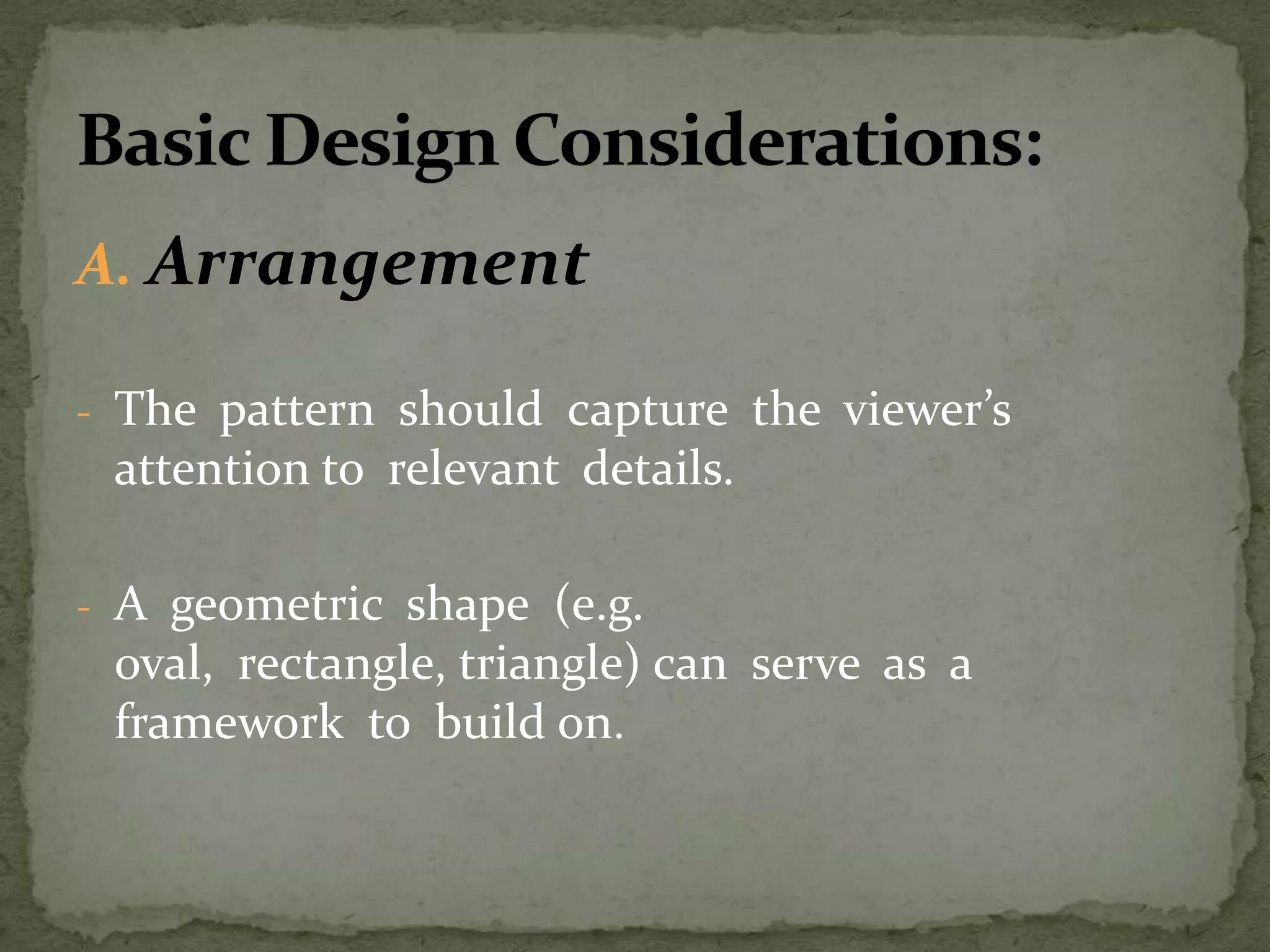
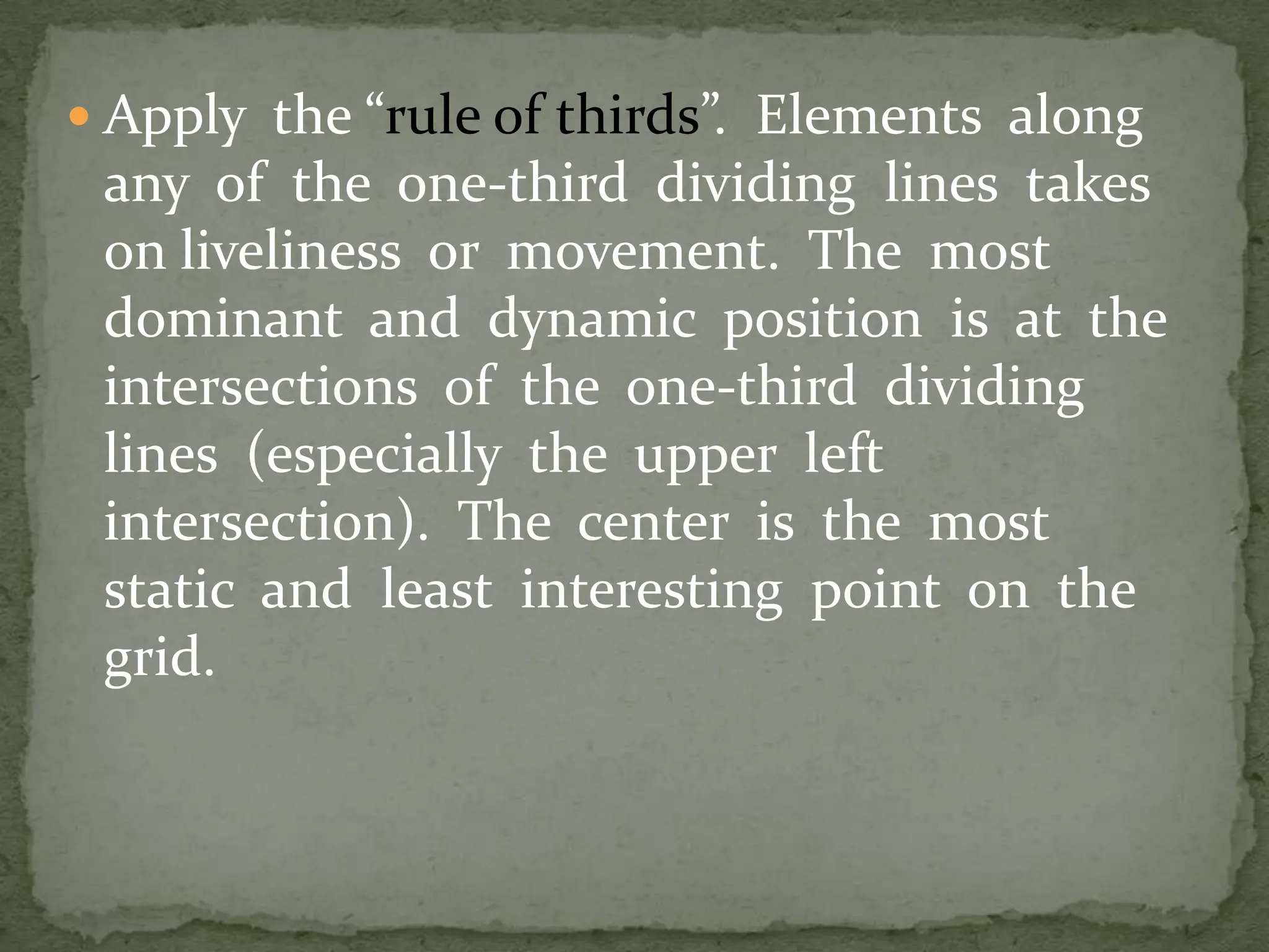
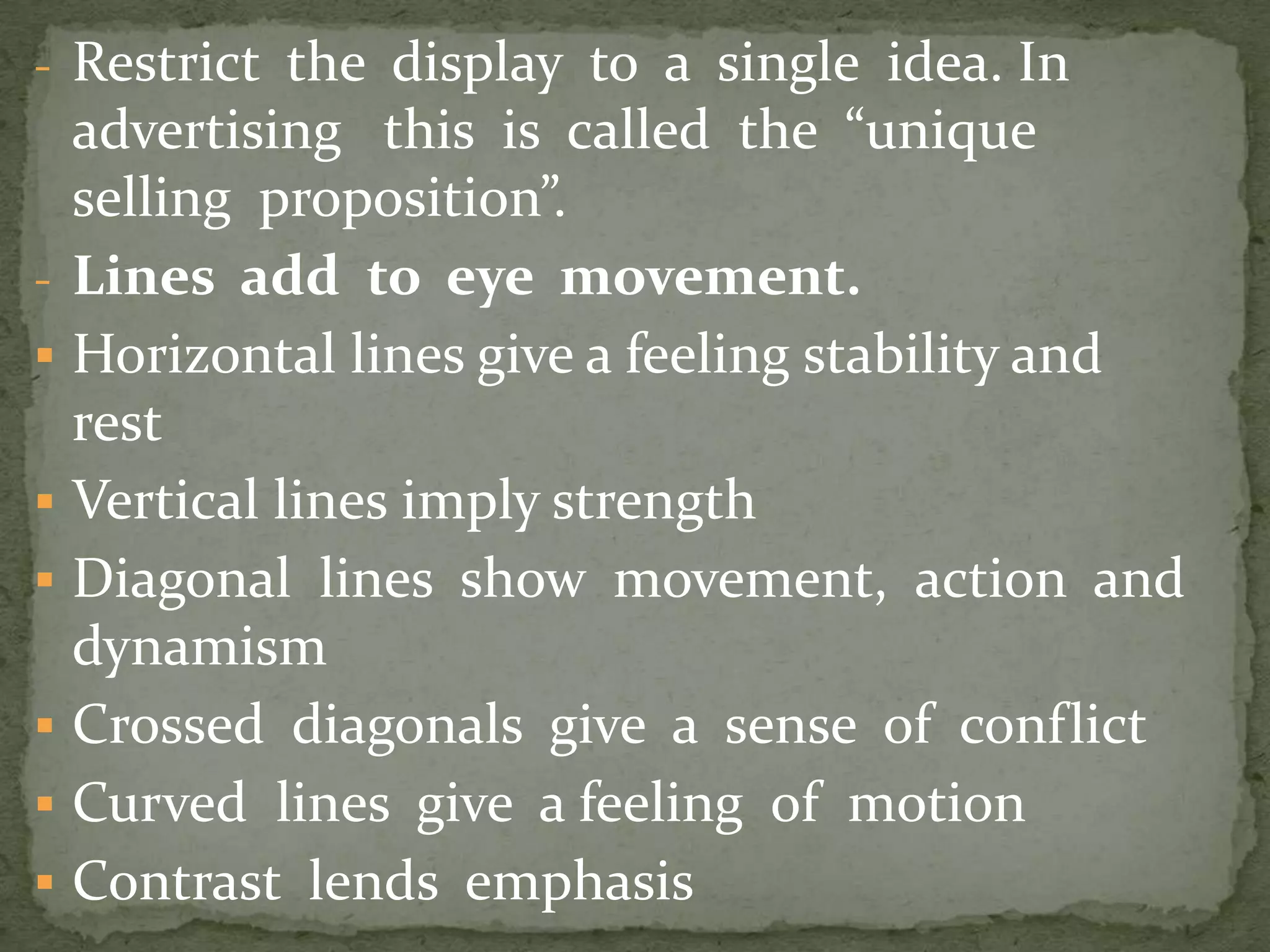
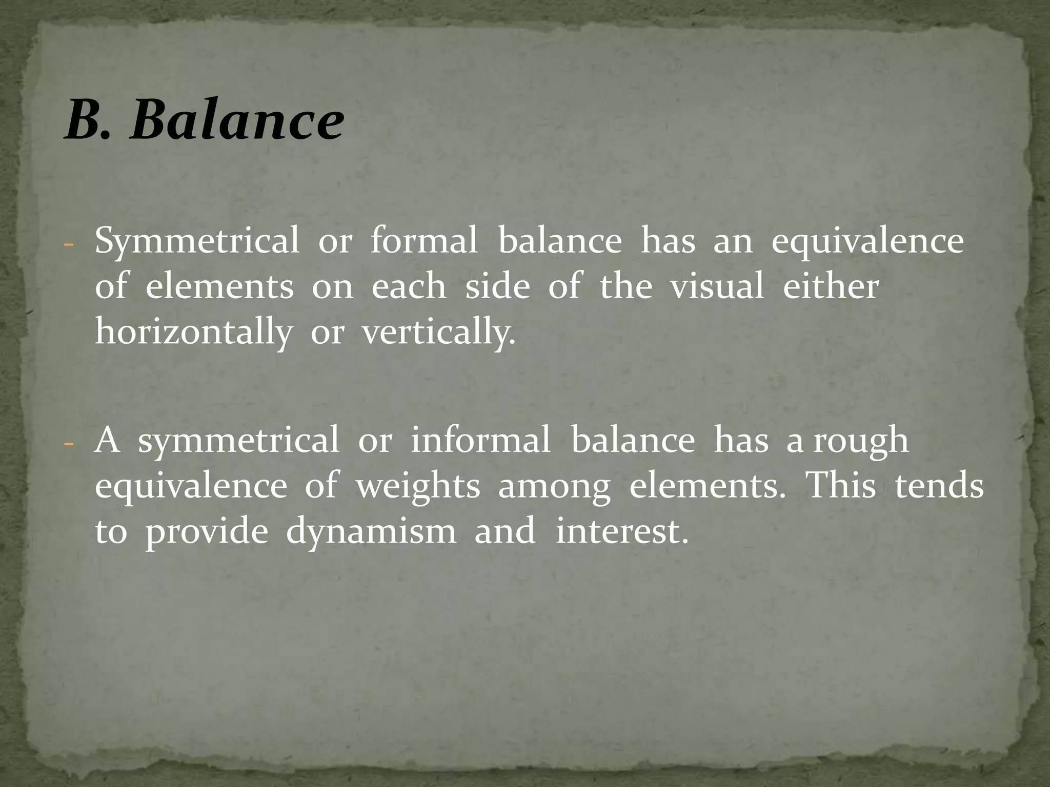
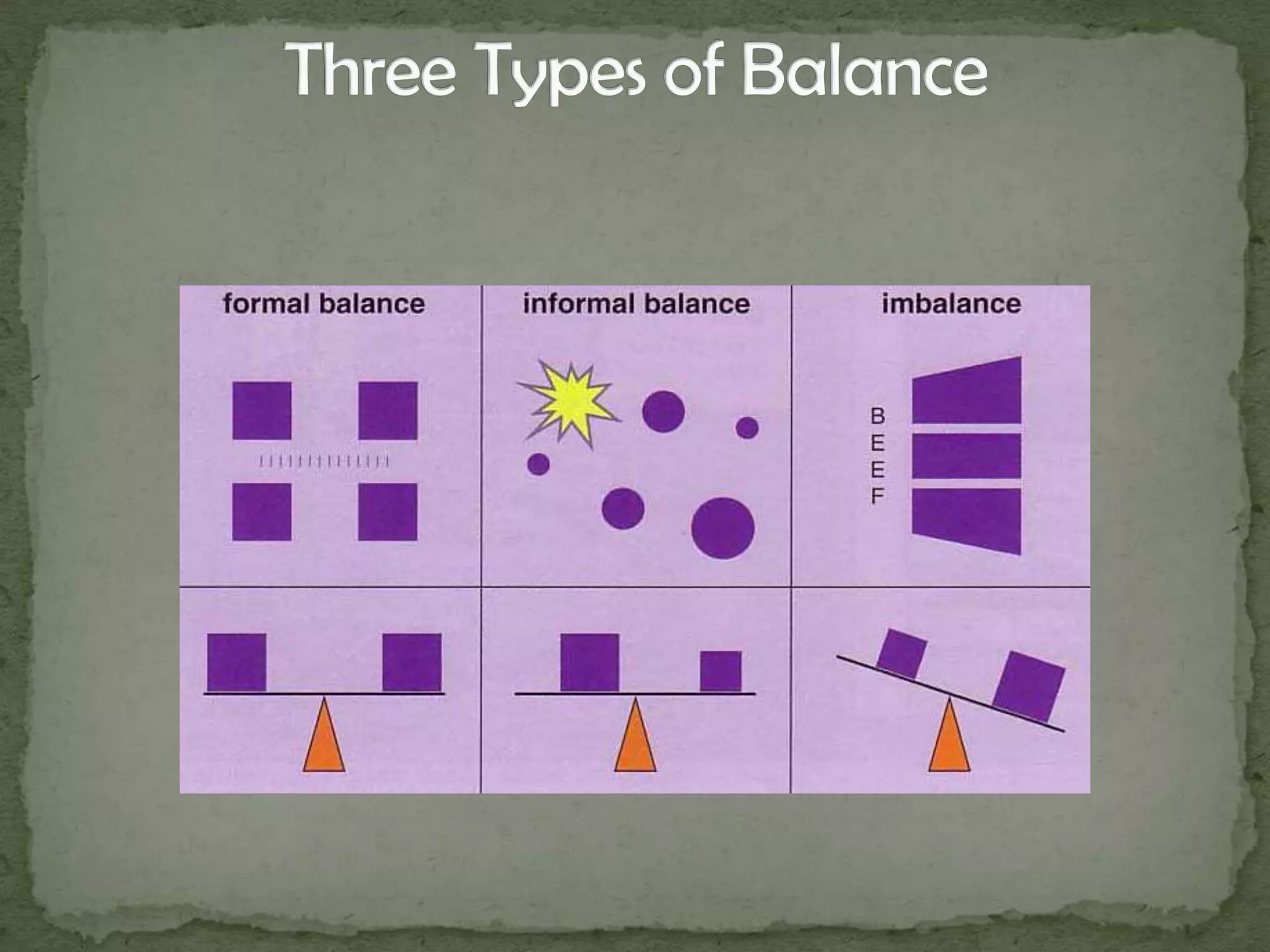
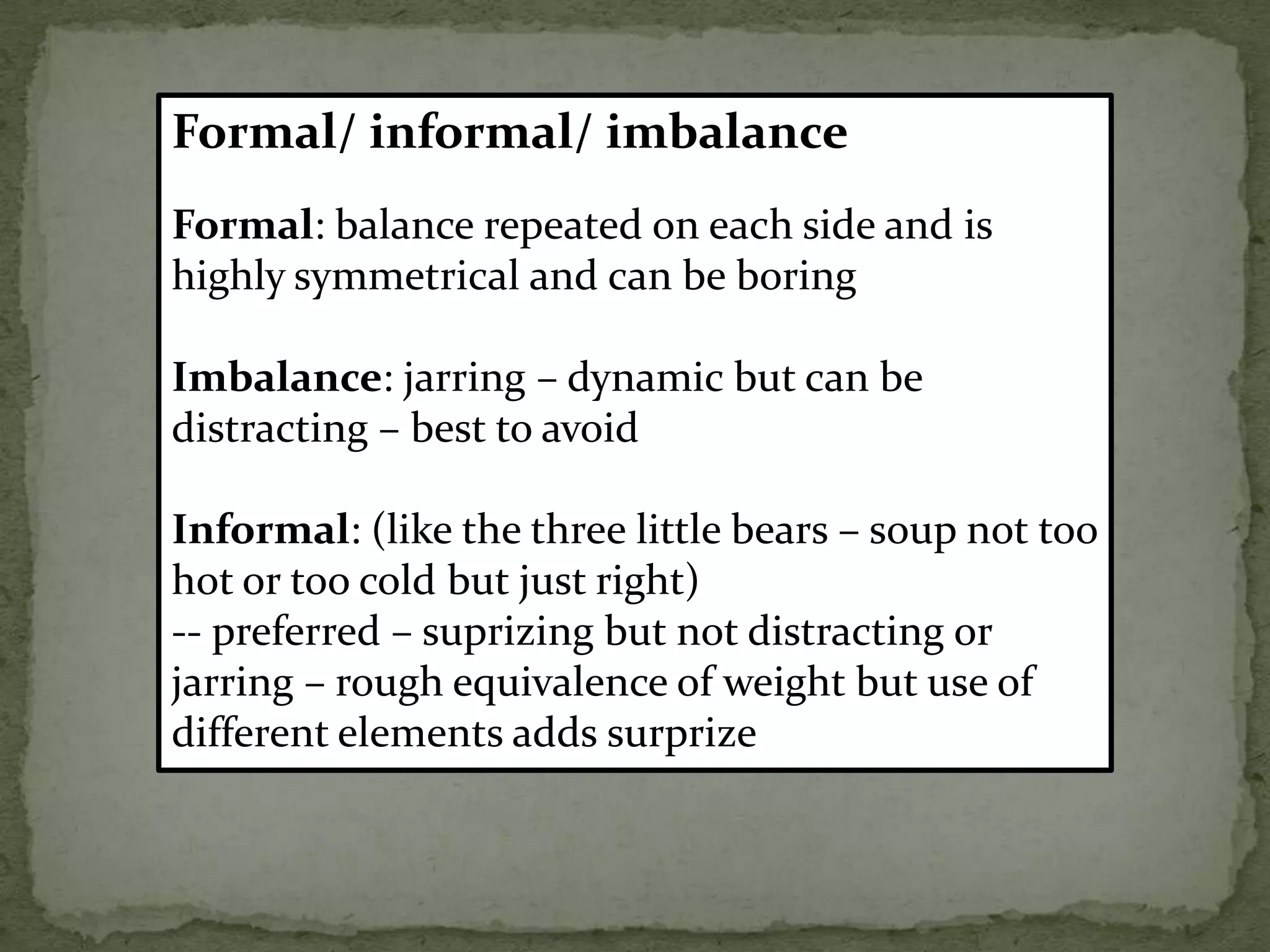
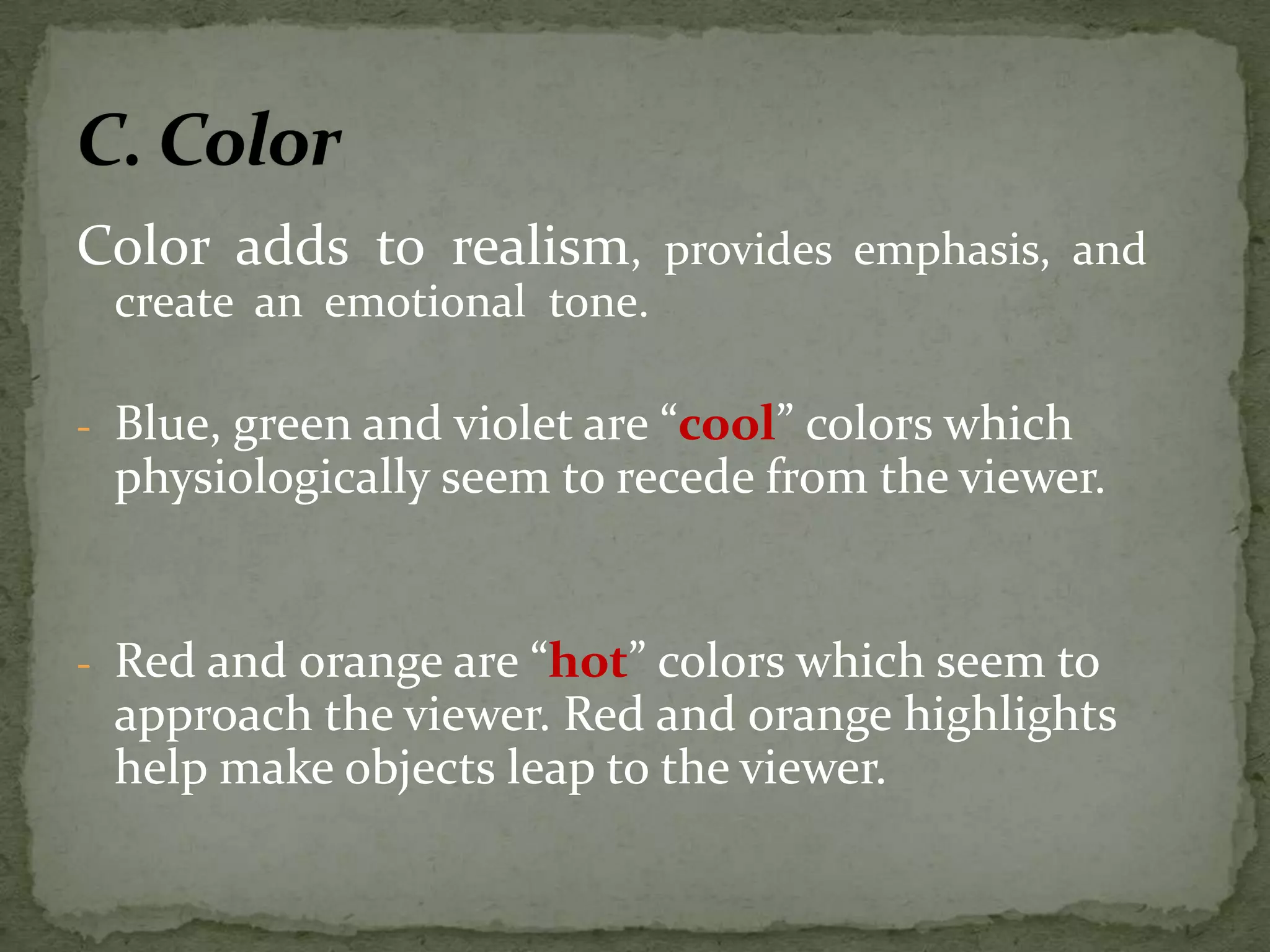
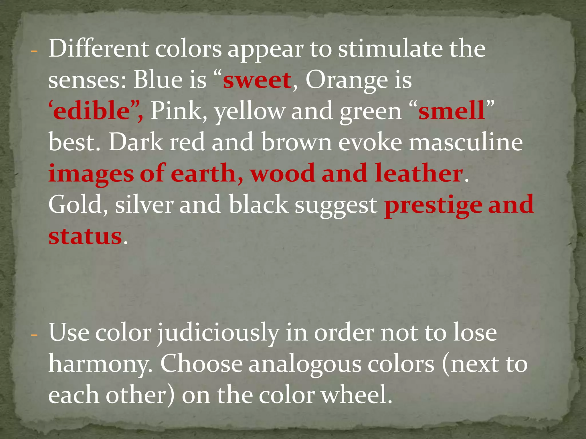
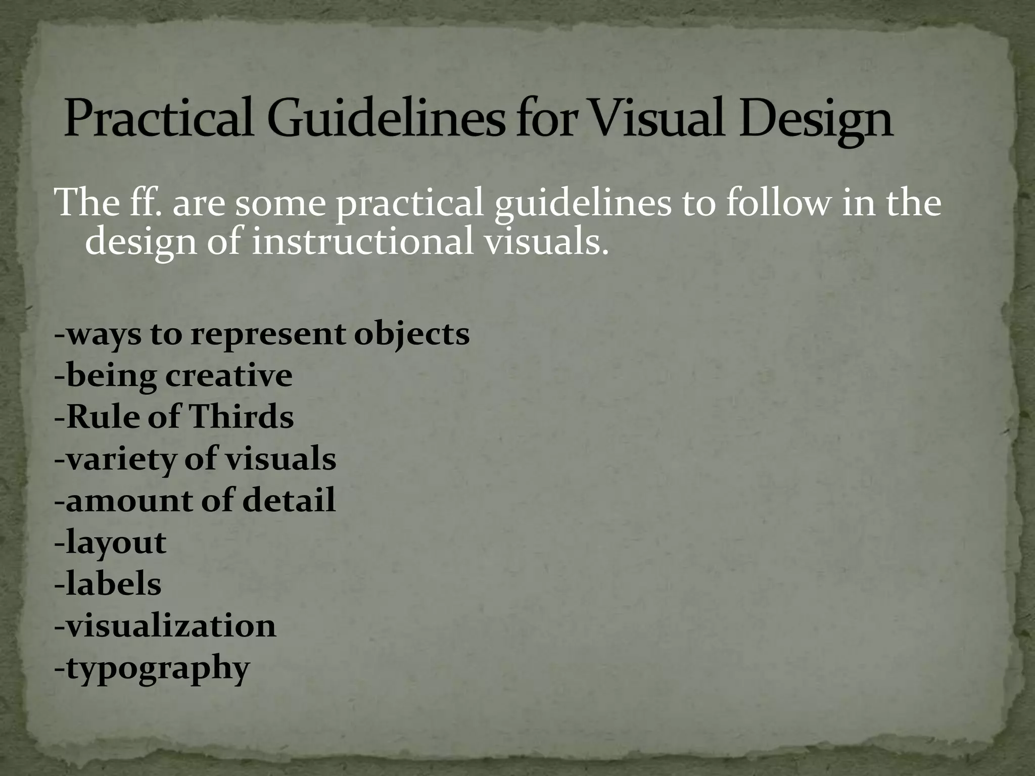
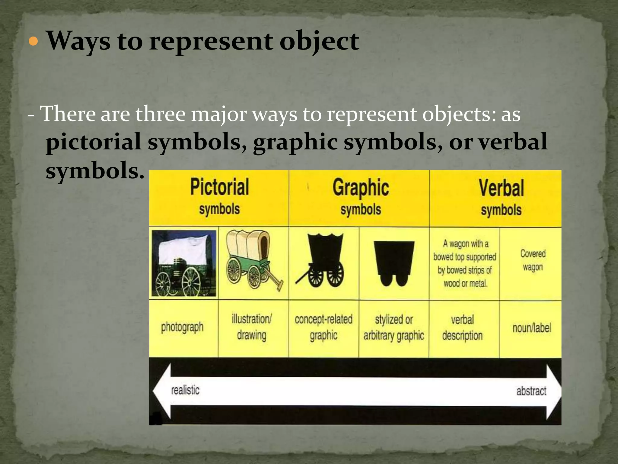
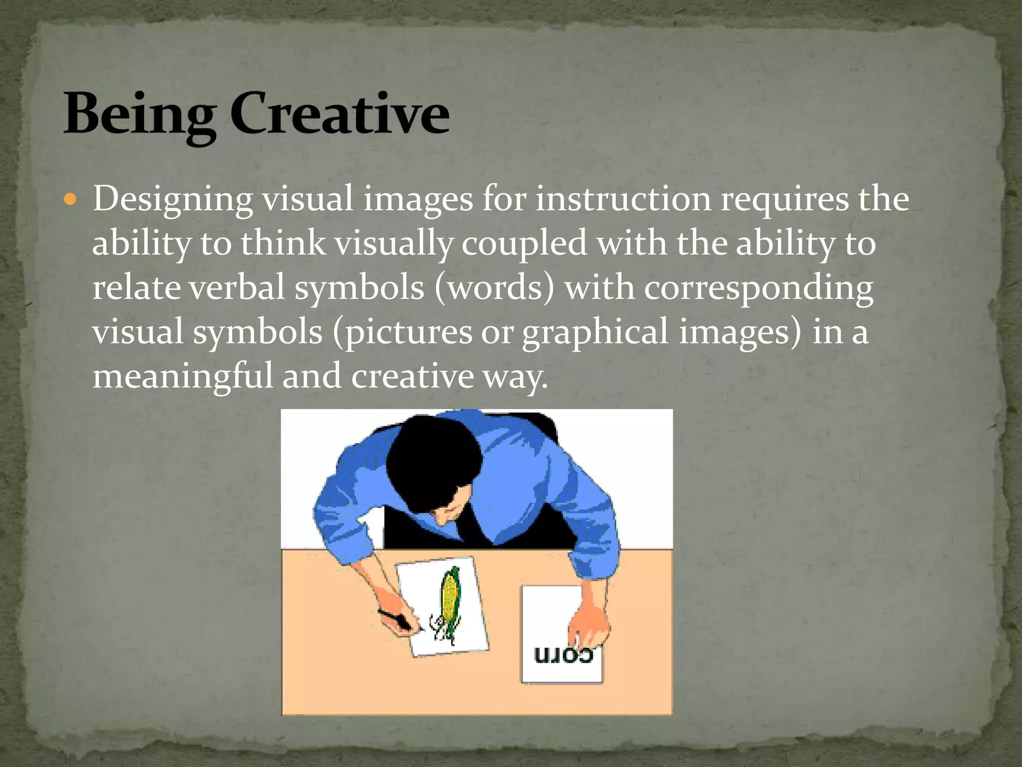
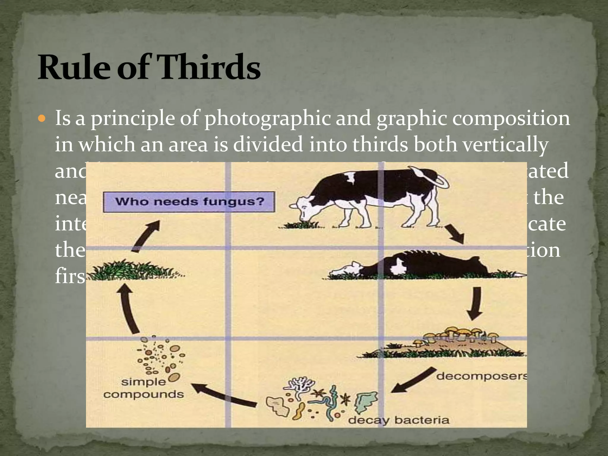
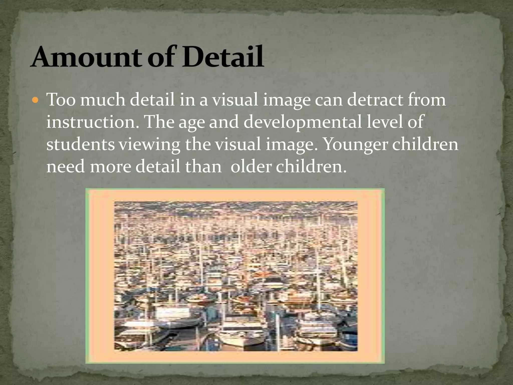
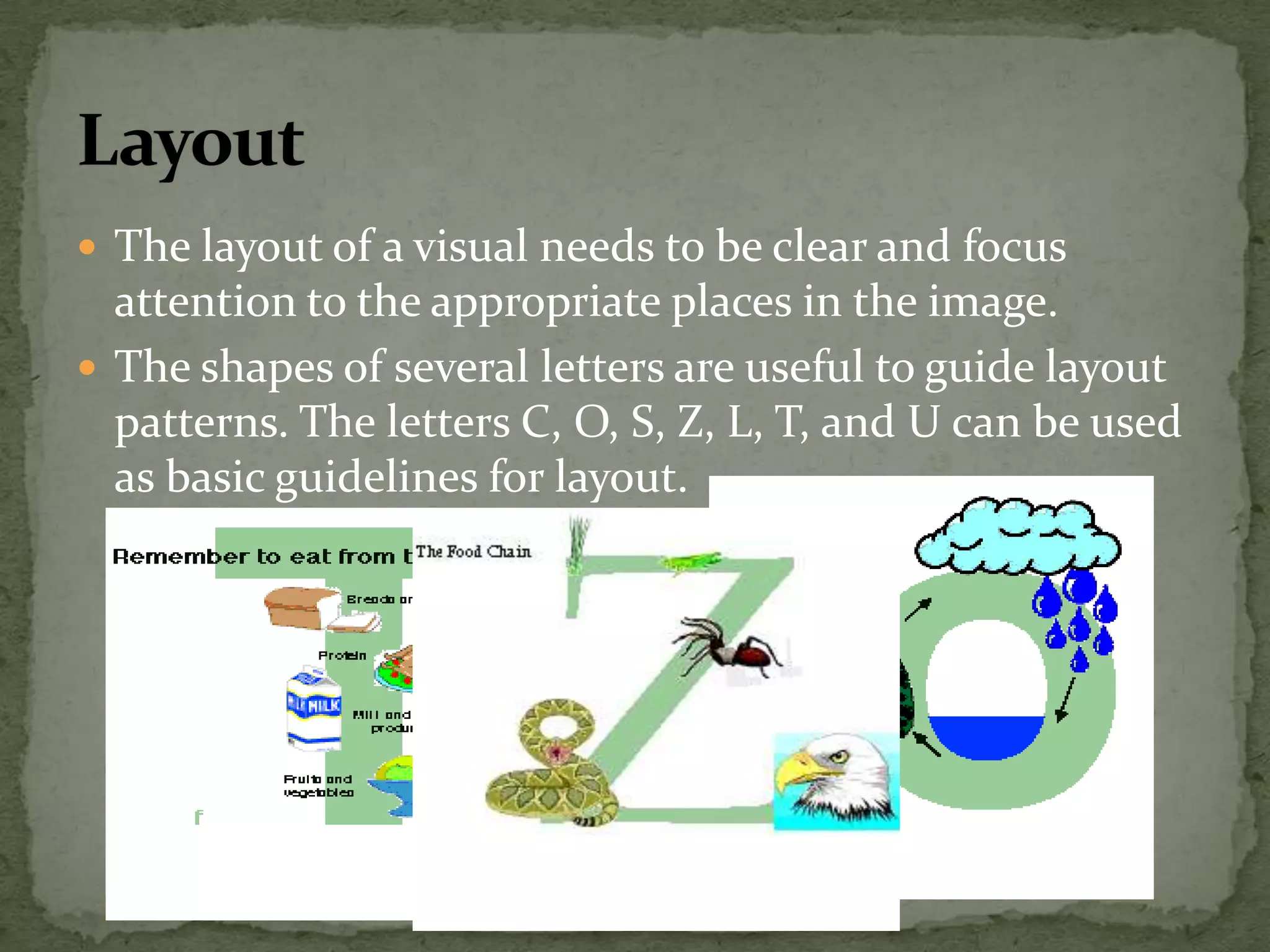
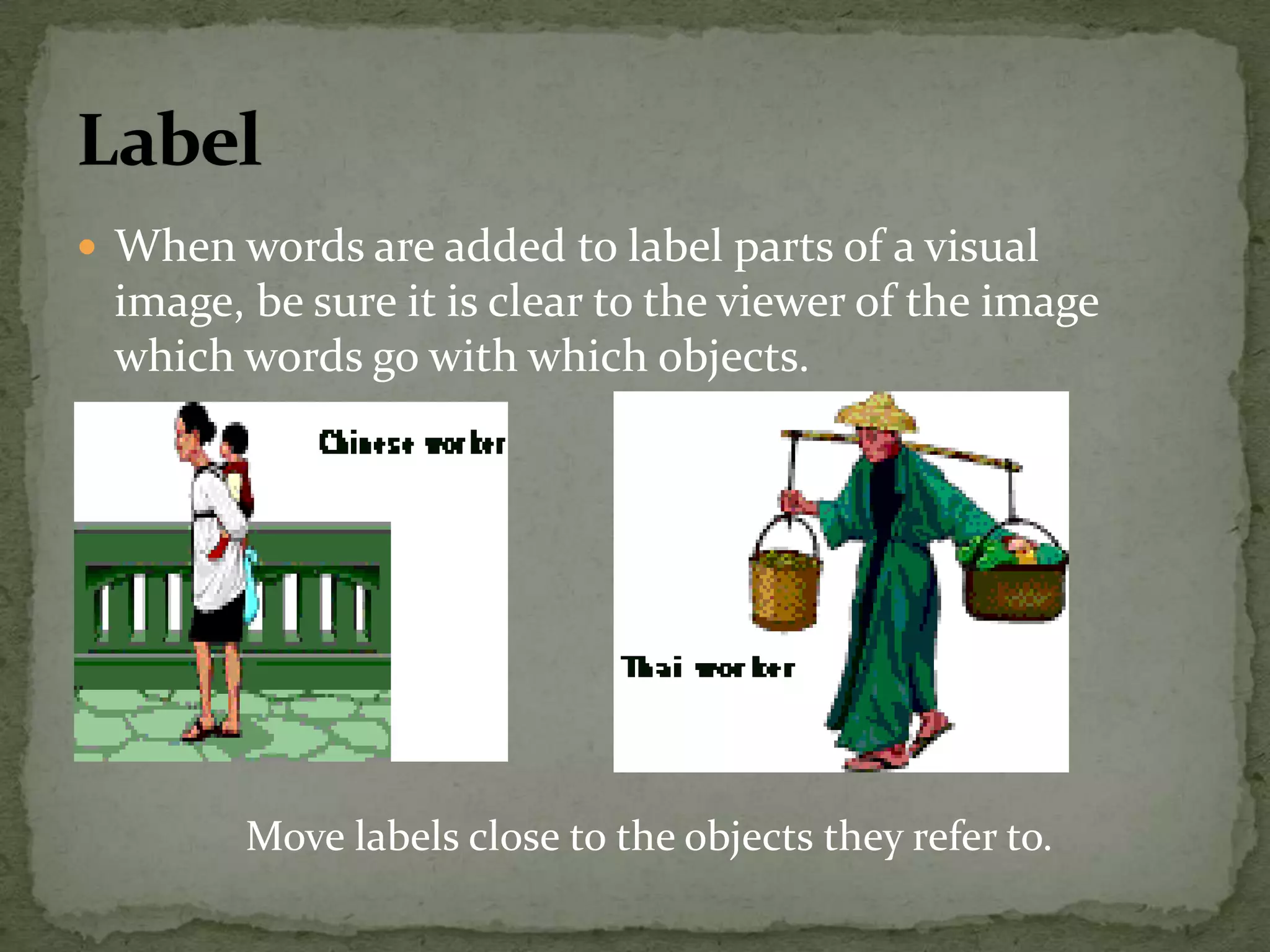
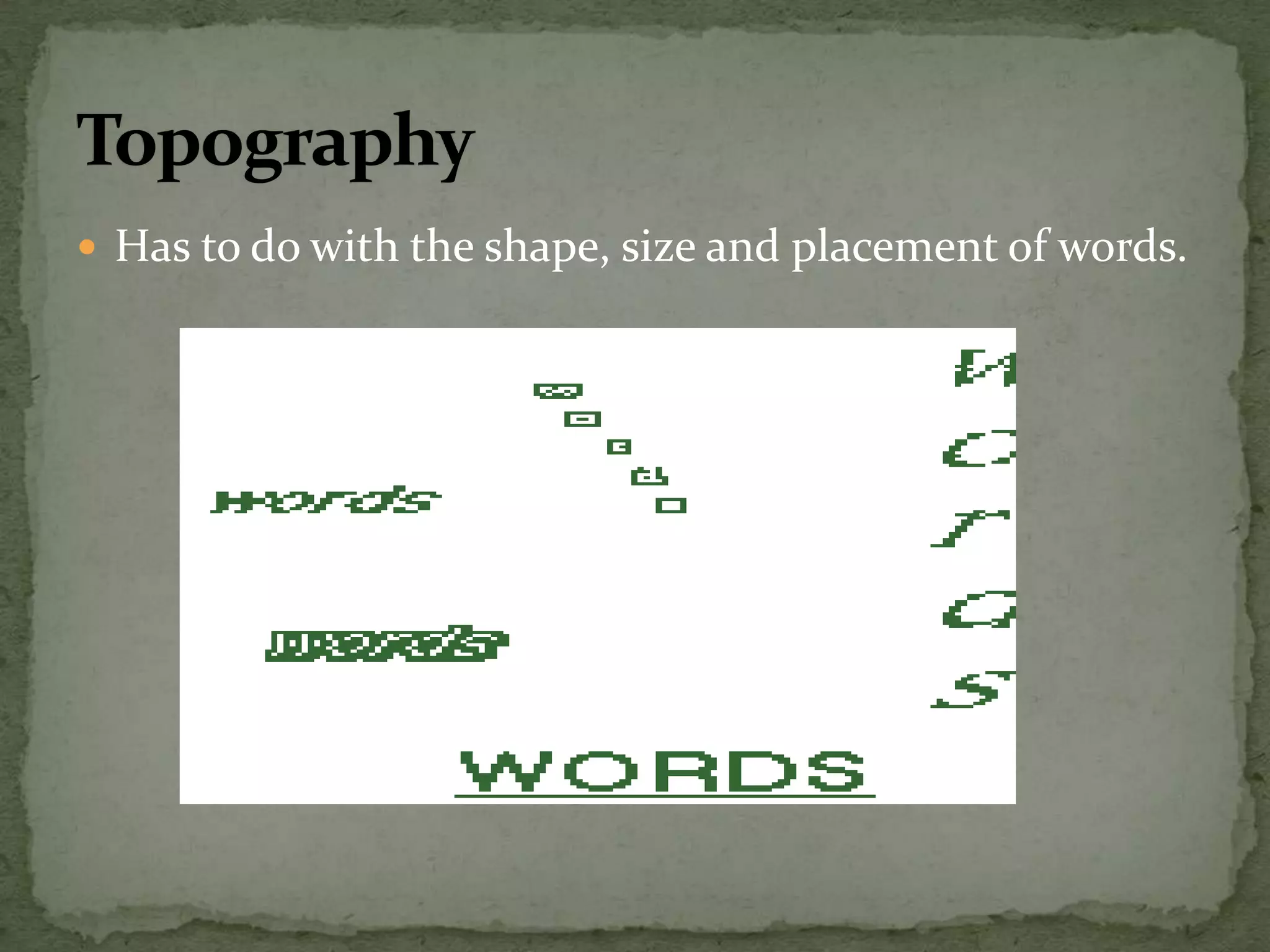
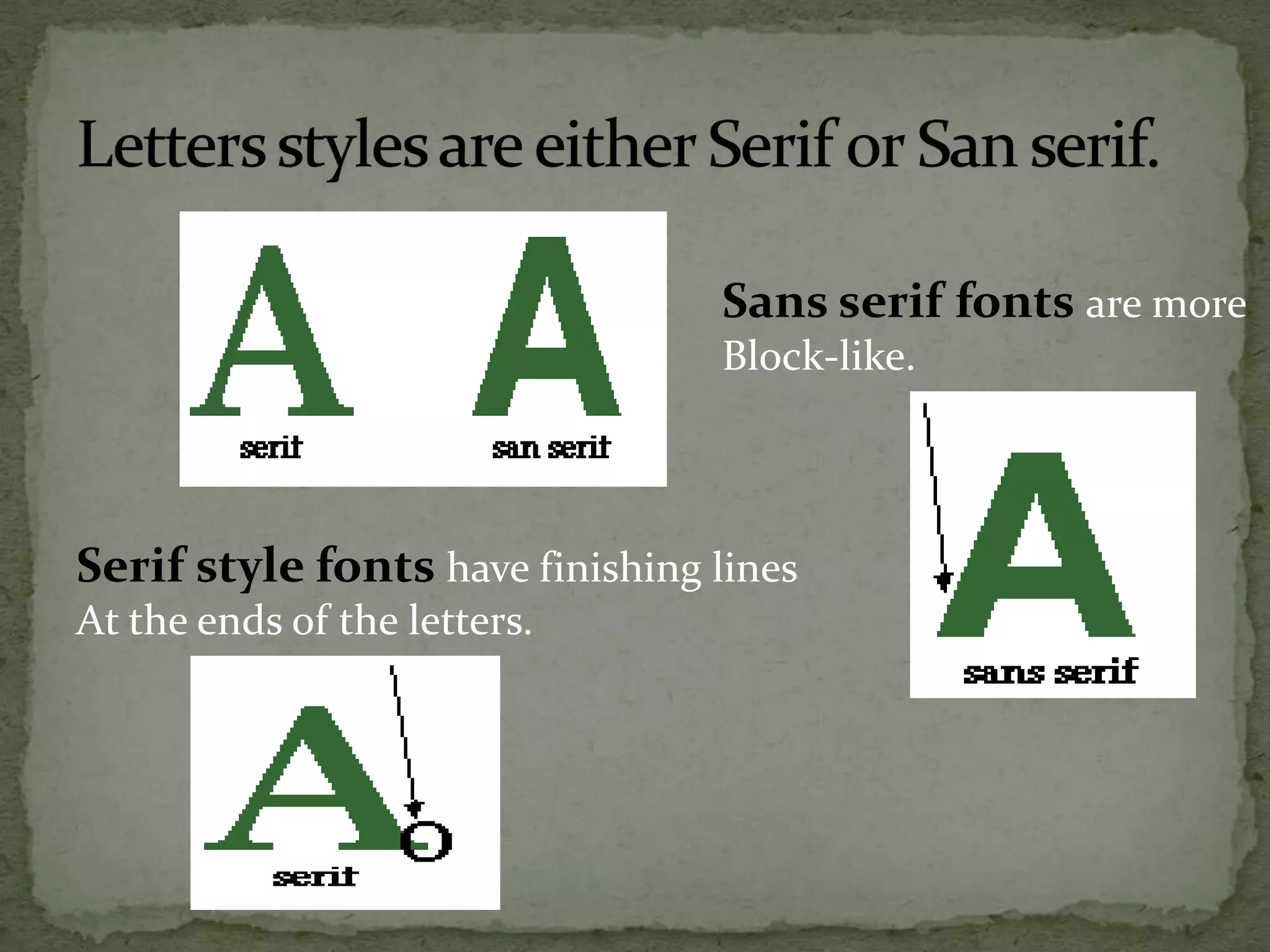

The document provides guidelines for designing effective visuals such as charts, posters, and graphics. It recommends doing a preliminary sketch or "blueprint" to lay out the design before adding artistic details. Key aspects to maximize include arrangement of elements, balance, color, dynamism, emphasis, and graphic harmony. The Rule of Thirds and use of lines, shapes, contrasting colors, clear labeling, effective typography, and appropriate level of detail are emphasized. The overall message is that visual design requires creative and strategic use of visual elements and symbols to clearly convey information to viewers.

![[EDUCATIONAL TECHNOLOGY 2] Audio media](https://cdn.slidesharecdn.com/ss_thumbnails/audiomedia-150130044555-conversion-gate01-thumbnail.jpg?width=640&height=640&fit=bounds)


