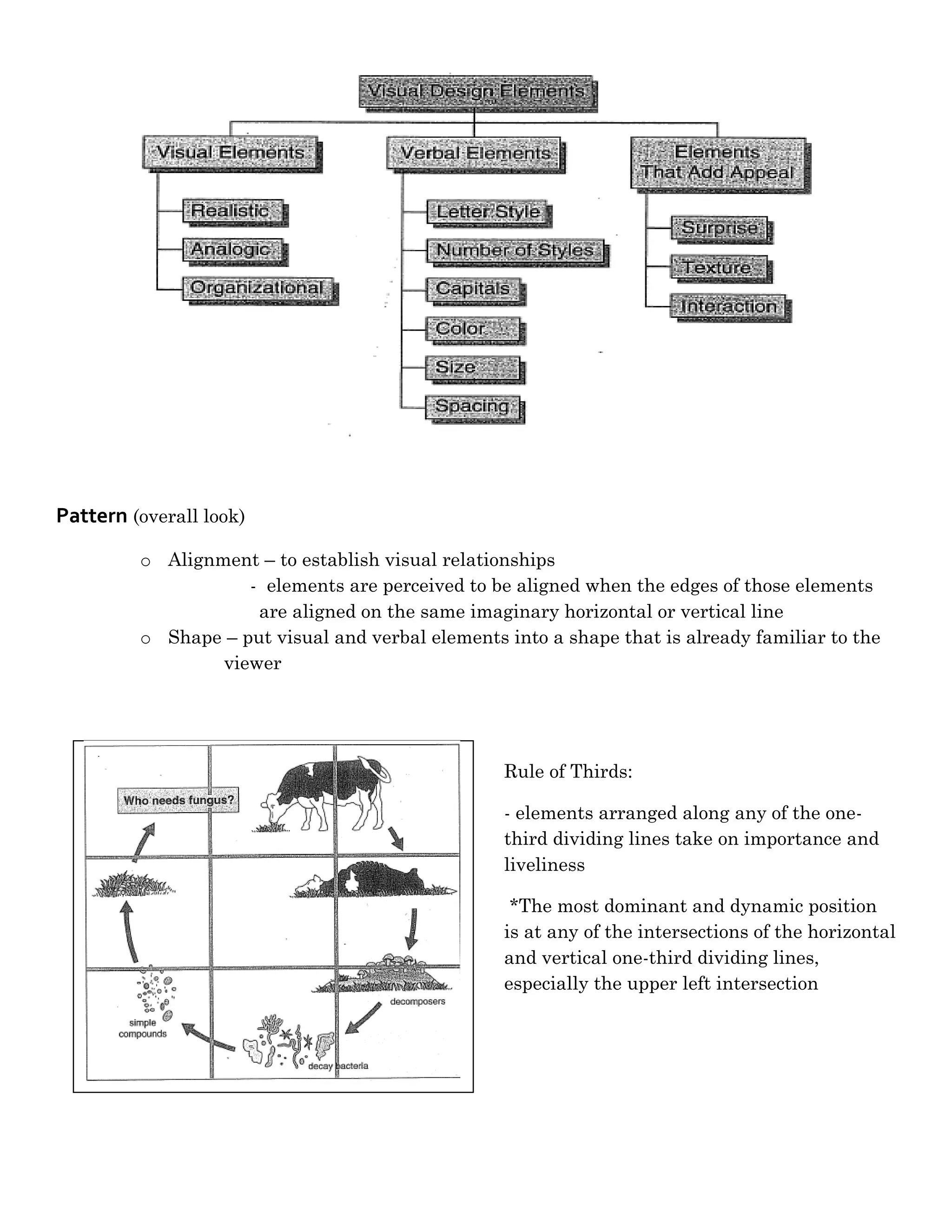
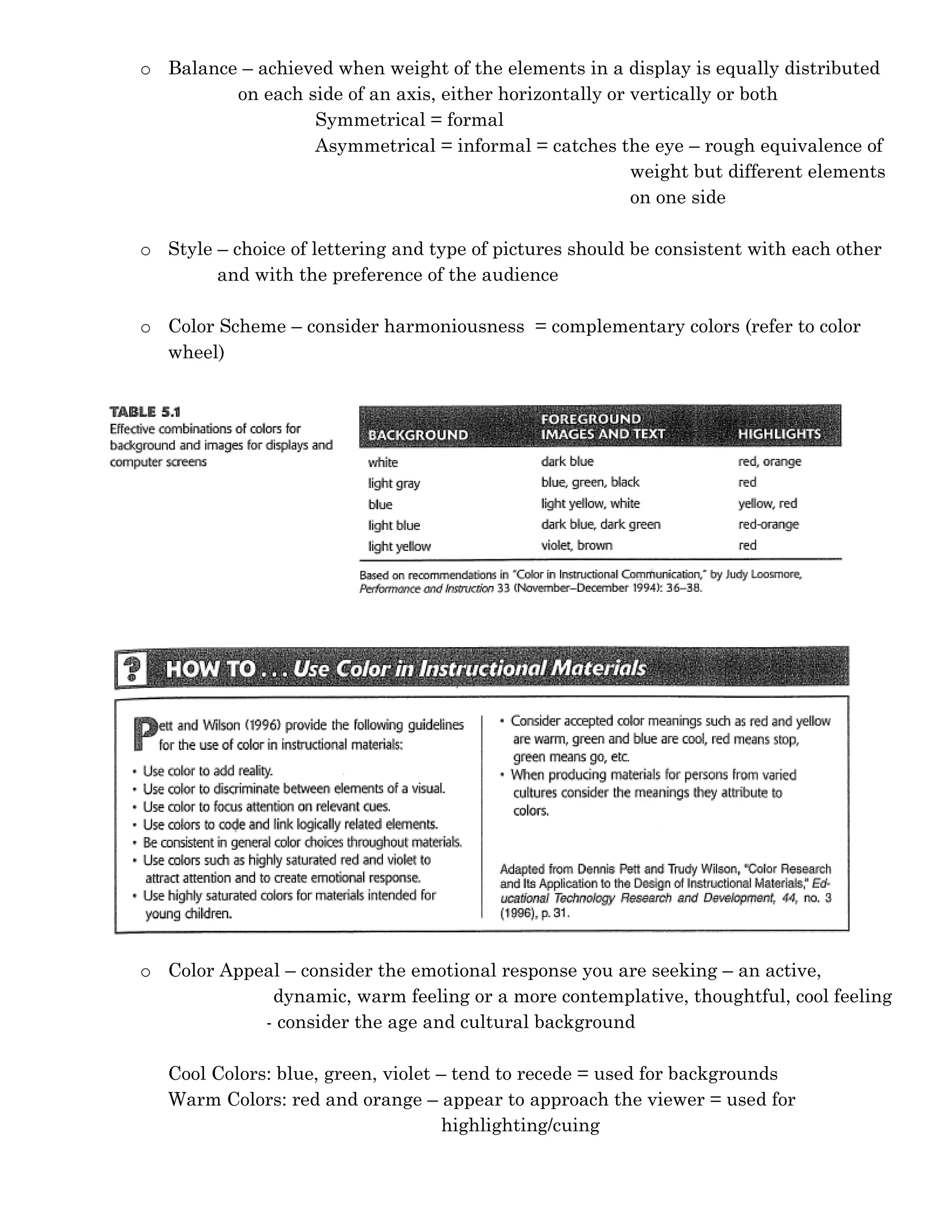
Visual Principles
(Heinich, R; Molenda, M; Russell, JD; & Smaldino, SE. (2002). Instructional Media and Technologies for Learning. 7th ed. New Jersey:
    Prentice-Hall.)


Role of Visuals in Instruction:
    -   Provide a concrete referent for ideas
    -   Serve a more easily remembered link to the original idea
    -   Can motivate learners by attracting their attention, holding their attention, and
        generating emotional responses
    -   Can simplify information that is difficult to understand
    -   Serve as an organizing function by illustrating relationships among elements (i.e.
        flowchart or timeline)
    -   Provide a redundant channel – they present information in a different modality


Goals of Visual Design:

    -   Ensure legibility
             o Remove as many obstacles as possible that might impede transmission of your
               message.
    -   Reduce the effort required to interpret the message
             o Convey message in a way that viewers expend little effort making sense out of what
               they are seeing and are free to use most their mental effort for understanding the
               message itself.
    -   Increase viewer’s active engagement with the message
             o Make your design as appealing as possible – to get viewers’ attention and to entice
               them into thinking about your message
    -   Focus attention on the most important part of the message
             o Direct the attention of your viewers to the most important parts of your message


Process of Visual Design
    1. Elements : Selecting and assembling the verbal/visual elements to incorporated into the
       display
    2. Pattern: Choosing an underlying pattern for the elements of the display
    3. Arrangement: Arranging the individual elements within the underlying pattern
    4. Check decisions against the goals.
    5. Revise as needed.
Elements:
  -   In selecting or producing the pictorial and text elements, base your choices on achieving
      the visual design goals.
  -   Includes: visual, verbal, elements that add appeal
         o Visual Elements – type depends on the learning task
                 Realistic
                 Analogic – implies similarity
                 Organizational – include flowcharts, graphs, maps, etc.

         o Verbal Elements
               Letter Style – should be consistent and should harmonize with the visual
                             elements
               Number of Lettering Styles
                     – no more than two different type of styles and should harmonize with
                    each other
                    - limit number of variations (e.g. bold, italic, underline, size changes) to a
                    maximum of four
                    Ex. Two different type sizes + italics + underlining
                         Three different type sizes + bold
               Capitals
                    - use lowercase letters, adding capitals only where normally required
                    - short headlines may appear in all capitals
                    - phrases of more than 3 words and full sentences should follow the rule of
                    lowercase lettering
               Color of Lettering
                    - color of lettering should contrast with the background color
               Size of Lettering
                 - displays (bulletin boards/posters) are meant to be viewed at a distance of 30
                 or 40 ft or more
                 - Common Rule of Thumb: lowercase letters = ½ inch high for each 10 ft
                                                           distance
               Spacing
                  Spacing Between Letters
                    - should appear even to the eye (optical spacing)

                    Spacing Between Lines
                     - vertical space between lines should be slightly less than the average
                     height of the lowercase letter

         o Elements that Add Appeal
               Surprise
               Texture
               Interaction
Pattern (overall look)
         o Alignment – to establish visual relationships
                    - elements are perceived to be aligned when the edges of those elements
                     are aligned on the same imaginary horizontal or vertical line
         o Shape – put visual and verbal elements into a shape that is already familiar to the
                 viewer


                                                  Rule of Thirds:

                                                  - elements arranged along any of the one-
                                                  third dividing lines take on importance and
                                                  liveliness

                                                   *The most dominant and dynamic position
                                                  is at any of the intersections of the horizontal
                                                  and vertical one-third dividing lines,
                                                  especially the upper left intersection
o Balance – achieved when weight of the elements in a display is equally distributed
         on each side of an axis, either horizontally or vertically or both
                  Symmetrical = formal
                  Asymmetrical = informal = catches the eye – rough equivalence of
                                                         weight but different elements
                                                         on one side

o Style – choice of lettering and type of pictures should be consistent with each other
        and with the preference of the audience

o Color Scheme – consider harmoniousness = complementary colors (refer to color
  wheel)


o Color Appeal – consider the emotional response you are seeking – an active,
             dynamic, warm feeling or a more contemplative, thoughtful, cool feeling
            - consider the age and cultural background

   Cool Colors: blue, green, violet – tend to recede = used for backgrounds
   Warm Colors: red and orange – appear to approach the viewer = used for
                                     highlighting/cuing
Arrangement
       o Proximity – put related elements close together and move unrelated elements apart

       o Directionals – directs attention (e.g. arrow, bold key words, bullets, colors)

       o Figure-Ground Contrast – dark figures show up best on light grounds and light
                            figures show up best on dark grounds

       o Consistency – be consistent in your arrangement of elements (placement, color, and
         text treatment)
                     - enhanced when similar elements are placed in similar locations, same
                    text treatments are used for headlines, and same color scheme are used
                    throughout the series of displays

Visual design

  • 1.
    Visual Principles (Heinich, R;Molenda, M; Russell, JD; & Smaldino, SE. (2002). Instructional Media and Technologies for Learning. 7th ed. New Jersey: Prentice-Hall.) Role of Visuals in Instruction: - Provide a concrete referent for ideas - Serve a more easily remembered link to the original idea - Can motivate learners by attracting their attention, holding their attention, and generating emotional responses - Can simplify information that is difficult to understand - Serve as an organizing function by illustrating relationships among elements (i.e. flowchart or timeline) - Provide a redundant channel – they present information in a different modality Goals of Visual Design: - Ensure legibility o Remove as many obstacles as possible that might impede transmission of your message. - Reduce the effort required to interpret the message o Convey message in a way that viewers expend little effort making sense out of what they are seeing and are free to use most their mental effort for understanding the message itself. - Increase viewer’s active engagement with the message o Make your design as appealing as possible – to get viewers’ attention and to entice them into thinking about your message - Focus attention on the most important part of the message o Direct the attention of your viewers to the most important parts of your message Process of Visual Design 1. Elements : Selecting and assembling the verbal/visual elements to incorporated into the display 2. Pattern: Choosing an underlying pattern for the elements of the display 3. Arrangement: Arranging the individual elements within the underlying pattern 4. Check decisions against the goals. 5. Revise as needed.
  • 2.
    Elements: - In selecting or producing the pictorial and text elements, base your choices on achieving the visual design goals. - Includes: visual, verbal, elements that add appeal o Visual Elements – type depends on the learning task  Realistic  Analogic – implies similarity  Organizational – include flowcharts, graphs, maps, etc. o Verbal Elements  Letter Style – should be consistent and should harmonize with the visual elements  Number of Lettering Styles – no more than two different type of styles and should harmonize with each other - limit number of variations (e.g. bold, italic, underline, size changes) to a maximum of four Ex. Two different type sizes + italics + underlining Three different type sizes + bold  Capitals - use lowercase letters, adding capitals only where normally required - short headlines may appear in all capitals - phrases of more than 3 words and full sentences should follow the rule of lowercase lettering  Color of Lettering - color of lettering should contrast with the background color  Size of Lettering - displays (bulletin boards/posters) are meant to be viewed at a distance of 30 or 40 ft or more - Common Rule of Thumb: lowercase letters = ½ inch high for each 10 ft distance  Spacing  Spacing Between Letters - should appear even to the eye (optical spacing)  Spacing Between Lines - vertical space between lines should be slightly less than the average height of the lowercase letter o Elements that Add Appeal  Surprise  Texture  Interaction
  • 3.
    Pattern (overall look) o Alignment – to establish visual relationships - elements are perceived to be aligned when the edges of those elements are aligned on the same imaginary horizontal or vertical line o Shape – put visual and verbal elements into a shape that is already familiar to the viewer Rule of Thirds: - elements arranged along any of the one- third dividing lines take on importance and liveliness *The most dominant and dynamic position is at any of the intersections of the horizontal and vertical one-third dividing lines, especially the upper left intersection
  • 4.
    o Balance –achieved when weight of the elements in a display is equally distributed on each side of an axis, either horizontally or vertically or both Symmetrical = formal Asymmetrical = informal = catches the eye – rough equivalence of weight but different elements on one side o Style – choice of lettering and type of pictures should be consistent with each other and with the preference of the audience o Color Scheme – consider harmoniousness = complementary colors (refer to color wheel) o Color Appeal – consider the emotional response you are seeking – an active, dynamic, warm feeling or a more contemplative, thoughtful, cool feeling - consider the age and cultural background Cool Colors: blue, green, violet – tend to recede = used for backgrounds Warm Colors: red and orange – appear to approach the viewer = used for highlighting/cuing
  • 5.
    Arrangement o Proximity – put related elements close together and move unrelated elements apart o Directionals – directs attention (e.g. arrow, bold key words, bullets, colors) o Figure-Ground Contrast – dark figures show up best on light grounds and light figures show up best on dark grounds o Consistency – be consistent in your arrangement of elements (placement, color, and text treatment) - enhanced when similar elements are placed in similar locations, same text treatments are used for headlines, and same color scheme are used throughout the series of displays