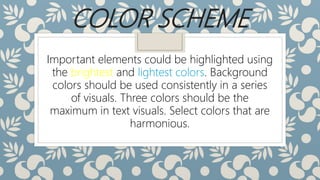
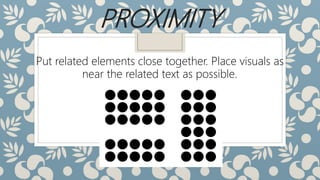
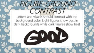
Alignment, shape, and balance are effective ways to establish visual relationships between elements. Styles should be age-appropriate, with simpler designs for young learners and more complex for adults. Important elements can be highlighted using bright colors on dull backgrounds, with a maximum of three colors. Related elements should be placed close together and visuals near related text, with directional devices to guide viewing sequence. Letters and visuals need contrast with backgrounds for readability. Consistency in layout and design is important across pages.