
Recommended
More Related Content
What's hot
What's hot (20)
Viewers also liked
Viewers also liked (20)
Similar to Film poster analysis of romance drama
Similar to Film poster analysis of romance drama (20)
More from Kayyah_Robun
More from Kayyah_Robun (20)
Recently uploaded
Recently uploaded (20)
Film poster analysis of romance drama
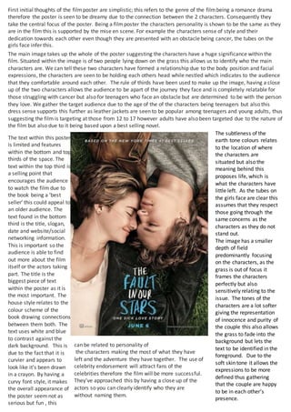
- 1. The text within this poster is limited and features within the bottom and top thirds of the space. The text within the top third is a selling point that encourages the audience to watch the film due to the book being a ‘best seller’ this could appeal to an older audience. The text found in the bottom third is the title, slogan, date and website/social networking information. This is important so the audience is able to find out more about the film itself or the actors taking part. The title is the biggest piece of text within the poster as it is the most important. The house style relates to the colour scheme of the book drawing connections between them both. The text uses white and blue to contrast against the dark background. This is due to the fact that it is curvier and appears to look like it’s been drawn in a crayon. By having a curvy font style, it makes the overall appearance of the poster seem not as serious but fun , this First initial thoughts of the filmposter are simplistic; this refers to the genre of the filmbeing a romance drama therefore the poster is seen to be dreamy due to the connection between the 2 characters. Consequently they take the central focus of the poster. Being a filmposter the characters personality is shown to be the same as they are in the film this is supported by the mise en scene. For example the characters sense of style and their dedication towards each other even though they are presented with an obstacle being cancer, the tubes on the girls face infer this. The main image takes up the whole of the poster suggesting the characters have a huge significance within the film. Situated within the image is of two people lying down on the grass this allows us to identify who the main characters are. We can tell these two characters have formed a relationship due to the body position and facial expressions, the characters are seen to be holding each others head while nestled which indicates to the audience that they comfortable around each other. The rule of thirds have been used to make up the image, having a close up of the two characters allows the audience to be apart of the journey they face and is completely relatable for those struggling with cancer but also for teenagers who face an obstacle but are determined to be with the person they love. We gather the target audience due to the age of the of the characters being teenagers but also this dress sense supports this further as leather jackets are seen to be popular among teenagers and young adults, thus suggesting the film is targeting at those from 12 to 17 however adults have also been targeted due to the nature of the film but also due to it being based upon a best selling novel. The subtleness of the earth tone colours relates to the location of where the characters are situated but also the meaning behind this proposes life, which is what the characters have little left. As the tubes on the girls face are clear this assumes that they respect those going through the same concerns as the characters as they do not stand out. The image has a smaller depth of field predominantly focusing on the characters, as the grass is out of focus it frames the characters perfectly but also sensitively relating to the issue. The tones of the characters are a lot softer giving the representation of innocence and purity of the couple this also allows the grass to fade into the background but lets the text to be identified in the foreground. Due to the soft skin tone it allows the expressions to be more defined thus gathering that the couple are happy to be in each other’s presence. can be related to personality of the characters making the most of what they have left and the adventure they have together. The use of celebrity endorsement will attract fans of the celebrities therefore the film will be more successful. They’ve approached this by having a close up of the actors so you can clearly identify who they are without naming them.