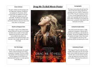
1. Colour Schemes
The girl’s clothes and the background
are really dark creating a dangerous
atmosphere for the poster, which
contrast with the paleness of the girl this makes her appear pure and
vulnerable. The flames are bright and
stark against the darkness of the film
and attract attention because they're the
only colour on the poster.
Drag Me To Hell Movie Poster
Iconography
The claws surrounding the girl give the
illusion that she's being captured by
monsters are iconic within a majority of
horror films. The girl screaming is terror
is iconic as she's playing the role of a
weak victim typically represented within
horror films. The flames surrounding her
are an iconic symbol for hell, which is the
namesake of the film.
Position of Images & Text
Institutional Information
The image is right in the middle which
attracts attention; the girl is surrounded
by claws which creates an eerie style
representing the horror genre. She's
surrounded by fire which has
connotations with hell and danger, and
the text in the middle stands out under
the image.
The institutional information is really
small and is engulfed in flames and is
very basic and blends in with the fire as
its yellow. The words COMING SOON are
in capitals and large so that they stand
out for people to see and so that
audiences will be anticipating the movie.
Film Title Design
Guttenberg Principle
The film title is pretty basic, the capital
letters create the illusion of it being
screamed or shouted. The font is white
and clashes with the background, and
the font appears to be broken and
distorted which gives it a ruined, generic
horror film title.
The image of the girl is directly in the
middle of the page near the main focal
point, which draws the attention to her.
The film title is at the bottom directly
under girl where the secondary focus
point will be, attracting the audience’s
attention.