Hybridoma Technology ( Production , Purification , and Application )
POSTER ANALYSIS - THE CONJURING
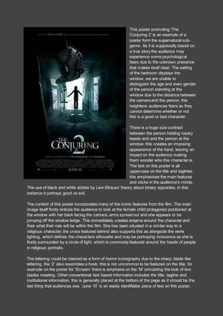
1. This poster promoting ‘The
Conjuring 2’ is an example of a
poster form the supernatural sub-
genre. As it is supposedly based on
a true story the audience may
experience some psychological
fears due to the unknown presence
that makes itself clear. The setting
of the bedroom displays the
window, we are unable to
distinguish the age and even gender
of the person standing at the
window due to the distance between
the camera and the person, this
heightens audiences fears as they
cannot determine whether or not
this is a good or bad character.
There is a huge size contrast
between the person holding rosary
beads and and the person at the
window; this creates an imposing
appearance of the hand, leaving an
impact on the audience making
them wonder who this character is.
The text on this poster is all
uppercase on the title and taglines,
this emphasises the main features
and sticks in the audience's minds.
The use of black and white abides by Levi-Strauss’ theory about binary opposites, in this
instance it portrays good vs evil.
The content of this poster incorporates many of the iconic features from the film. The main
image itself firstly entices the audience to look at the female child protagonist positioned at
the window with her back facing the camera, arms spread out and she appears to be
jumping off the window ledge. This immediately creates enigma around the character and
their what their role will be within the film. She has been situated in a similar way to a
religious character; the cross featured behind also supports this as alongside the eerie
lighting, which defines the characters silhouette and may be portraying innocence as she is
firstly surrounded by a circle of light, which is commonly featured around the heads of people
in religious portraits.
The lettering could be classed as a form of horror iconography due to the sharp, blade like
lettering, the ‘2’ also resembles a hook; this is not uncommon to be featured on the title, for
example on the poster for ‘Scream’ there is emphasis on the ‘M’ simulating the look of two
blades meeting. Other conventional text based information includes the title, tagline and
institutional information, this is generally placed at the bottom of the page as it should be the
last thing that audiences see. ‘June 10’ is an easily identifiable piece of text on this poster,
2. the font size is larger and the audience will most likely remember the date due to it being the
last thing that they will see.
The actors names have not been mentioned on this particular poster, usually in supernatural
horror movies well known actors are not used in order to maintain a sense of realism, the
fact that Vera Farmiga and Patrick Wilson are relatively well known helps to draw in a wide
range of people. As this is a sequel to the previous ‘Conjuring’ there is already excitement
and publicity about the film. Even if the audience has not seen the first film, the poster states
that it is ‘from the director of ‘Insidious’, which is another successful supernatural film, the
audience may see that there is an association between the two and want to watch the film.
The overall posters mise en scene depicts a setting where the characters partially dominate
the frame yet there is room for the rest of the setting to signify certain elements of the film.
The beams of light which are breaking through the window suggest that the child who is
possessed may be on her way to heaven or defeating the demon, another signifier of this is
the cross being held; the hand although belonging to Lorraine Warren, (paranormal
investigator) at first glance looks creepy and as if it may belong to a villain. The cross is
supposedly meant to ward off spirits, this is rather contradicting as in the image there are still
supernatural occurrences happening.
The lighting used within the frame is minimalistic and dark in order to represent the eerie and
supernatural setting. There is a strong source of light coming through the window, which
depicts the purity of the young girl despite the fact that she is not in conventional lightly
coloured clothes, but this also relates to the juxtaposition between good vs evil as she has
been corrupted by a demonic spirit. The light is almost completely non existent around the
frame; this entices audience to focus on the middle of the image, following the rule of thirds,
the audience is drawn to the main source of horror which in this example is the silhouette of
a little girl. The left side of the frame has very low key lighting displaying a scary looking
hand, this makes the audience feel uncomfortable they at this point do not know whose hand
this belongs to, the only indication that the person is good, is the fact that they are holding a
cross; conventionally in supernatural horrors the cross is able to equal a torture device for
demons or spirits.
A sense of vulnerability is signified due to the character being a child as in supernatural
Horror films, the child is usually the victim as they are the ones to encounters or be affected
by a supernatural presence first. From looking at this poster we know that the hand belongs
to a protagonist rather than an antagonist, it is also suggested that she is trying to help the
child as she is holding the cross almost like as weapon and the crucifix is a deterrent to the
supernatural. The fog is an icon of Horror due to its enigmatic association which may be
used throughout the film to show when something negative happens as fog clouds sight
therefore inflicting the fear of the unknown on viewers.
The image as a whole is conventional, especially the setting, as a house is one of the most
common conventional features within the supernatural sub-genre. Houses connote
confinement within a place of comfort, furtherly suggesting that this is an iconic location
throughout the narrative. The ambient lighting featured may give away certain elements of
the narrative, it may suggest the new equilibrium which is generally built up through the
duration of the film, for example it could be connoting the dangerous environment that the
3. child is in. On the right side of the poster a nun is lurking within the shadows, low key lighting
has been used to originally hide the nun, but when the audience take a glimpse of her, it is
extremely chilling and frightening. The nun is a lot closer to the child than the protagonist
possibly suggesting that she is controlling the child; alongside reinforcing the narrative as the
antagonist, this gives the audience an insight into where the evil source is coming from.