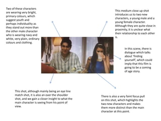
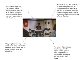
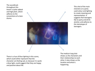
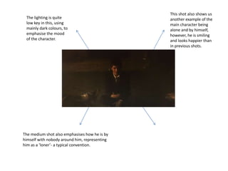
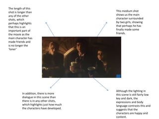
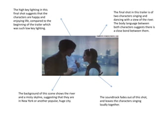
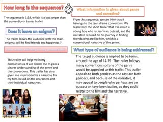
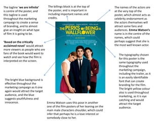
The low key lighting in
this opening scene
immediately
represents perhaps
how the character is
feeling. The contrast
between the light and
dark could imply that
the character is sad or
in a dark place.
The boy appears to be at a desk doing work, which
would suggest that he is of school age and is doing
homework. On a further level, it could suggest that
he is hard working and focus’ on his studies,
however, this is only the first scene so we cannot
infer too much about his character just yet.
The speaker on the desk could suggest
that he enjoys listening to music, which
is somewhat stereotypical of teenagers.
In this scene, we hear
this characters voice as a
voiceover, which is a
typical convention of the
teen drama genre, and it
suggests that he is going
to be the main character
of this film.
The medium shot is effective in
enabling us to create a
representation of this character
and what his interests are.
The second shot is of teenagers
heading into school, which shows
that the main location of this film is
going to be a high school, an
important convention of the teen
drama genre
The long shot, almost a high
angle, gives us a clear picture and
understanding of the main setting
and the characters that are going
to be in the film, also
emphasising that this is a teen
drama film.
Just from the second shot we can
establish that the editing of this trailer is
fast paced, and uses montage editing to
emphasise the key moments in the film.
Compared to the last shot, the
colouring of this shot is very
bright and colourful, with bright
reds and yellows, which often
implies youthfulness and
innocence.
This font is used
throughout the
marketing campaign
for this film, and is a
good use of branding
as it is an easily
recognisable choice of
typography.
This bright green colour is also
used as a way of branding, and it
fits the conventions of teen
drama as it is bright and youthful
and would attract a younger
audience.
This insert is used
throughout the trailer
when adding a message
or introducing a
character.
This medium close up shot
introduces us to two new
characters, a young male and a
young female character.
Although they are quite close in
proximity, it is unclear what
their relationship to each other
is.
This shot, although mainly being an eye line
match shot, it is also an over the shoulder
shot, and we gain a closer insight to what the
main character is seeing from his point of
view.
There is also a very faint focus pull
on this shot, which highlights the
two new characters and makes
them more distinct than the main
character at this point.
Two of these characters
are wearing very bright,
primary colours, which
suggest youth and
perhaps individuality as
they stand out more than
the other male character
who is wearing navy and
white, very plain, ordinary
colours and clothing.
In this scene, there is
dialogue which talks
about ‘finding
yourself’, which could
imply that this film is
going to be a coming
of age story.
This medium long shot is effective
in representing what kind of
character this main character is.
The shot of him sitting by himself
on an empty table adheres to the
convention of a teen drama having
a ‘loner’ character.
The young boy is reading a book
alone, which going back to the
first shot, could suggest that he
enjoys studying and is very
intellectual.
This shot would position
the audience to feel
empathy for the character
as he is alone eating his
lunch at school, and some
teenagers could relate to
this situation.
The colours of this shot are
fairly basic, mainly dull
colours such as grey and
black, suggesting that
perhaps he is feeling blue
and sad, and not very
happy.
This shot of the main
charcters at a party
used colour and lighting
to create meaning and
representation. It
suggests that teenagers
like to party and drink
alcohol, and adheres to
the stereotype of
teenagers.
There is a hue of blue lighting in this scene,
which could either represent that the
character are feeling sad, or, because it is quite
a blue light, could suggest that they are happy
and positive about life.
The soundtrack
throughout this
teaser is quite upbeat
and high pitch, which
adheres to the
conventions of a teen
drama.
The medium long shot
shows us the characters and
their relationships to each
other. It also shows us the
location and what is
happening.
This shot also shows us
another example of the
main character being
alone and by himself,
however, he is smiling
and looks happier than
in previous shots.
The medium shot also emphasises how he is by
himself with nobody around him, representing
him as a ‘loner’- a typical convention.
The lighting is quite
low key in this, using
mainly dark colours, to
emphasise the mood
of the character.
This medium shot
shows us the main
character surrounded
by two girls, showing
that perhaps he has
finally made some
friends.
Although the lighting in
this scene is still fairly low
key and dark, the
expressions and body
language contrasts this and
suggests that the
characters are happy and
content.
The length of this
shot is longer than
any of the other
shots, which
perhaps highlights
that this is an
important part of
the movie as the
main character has
made friends and
is no longer the
‘loner’
In addition, there is more
dialogue in this scene than
there is in any other shots,
which highlights just how much
the characters have developed.
The final shot in this trailer is of
two characters singing and
dancing with a view of the river.
The body language between
both characters suggests there is
a close bond between them.
The background of this scene shows the river
and a misty skyline, suggesting that they are
in New York or another popular, huge city.
The high key lighting in this
final shot suggests that the
characters are happy and
enjoying life, compared to the
beginning of the trailer which
was such low key lighting.
The soundtrack fades out of this shot,
and leaves the characters singing
loudly together.
The sequence is 1:38, which is a but longer than
the conventional teaser trailer.
From this sequence, we can infer that it
belongs to the teen drama convention. We
learn from the short trailer that it is about a
young boy who is clearly an outcast, and the
narrative is based on his journey in finding
friends who are like him, which is a
conventional narrative of the genre.
The trailer leaves the audience with the main
enigma, will he find friends and happiness ?
The target audience is implied to be teens,
around the age of 14-21. The trailer follows
many conventions so fans of the genre
would be appealed to this trailer. This trailer
appeals to both genders as the cast are both
genders, and because of the narrative, it
may appeal to people who perhaps are an
outcast or have been bullies, as they could
relate to the film and the narrative.
This trailer will help me in my
production as it will enable me to gain a
clearer understanding of the genre and
the conventions. This trailer has also
given me inspiration for a narrative for
my film, based on the characters and
their individual narratives.
The names of the actors are
at the very top of the
poster, which almost acts as
celebrity endorsement as
the actors themselves will
attract some fans and
audiences. Emma Watson’s
name is in the centre of the
names, which could
perhaps suggest that she is
the most well known actor.
‘Based on the critically
acclaimed novel’ would attract
more viewers as people who are
fans of the book would want to
watch and see how the film is
interpreted on the screen.
The tagline ‘we are infinite’
is centre of the poster, and
this tagline is used
throughout the marketing
campaign to create a sense
of branding, and to almost
give an insight on what type
of film it is going to be.
The typography chosen
for this poster is the
same typography used
throughout the
marketing campaign,
including the trailer, as it
is an easily identifiable
font that can create
branding for the film.
The bright yellow colour
also is used throughout
marketing, as it is eye
catching and would
attract the target
audience.
The bright blue background is
effective throughout the
marketing campaign as it one
again would attract the target
audience, and the blue
suggests youthfulness and
innocence. Emma Watson uses this pose in another
one of the film posters of her leaning on the
main male characters shoulder, which could
infer that perhaps he is a love interest or
somebody close to her.
The billings block is at the top of
the poster, and is important in
including important names and
credits.

Media key assessment

  • 2.
    The low keylighting in this opening scene immediately represents perhaps how the character is feeling. The contrast between the light and dark could imply that the character is sad or in a dark place. The boy appears to be at a desk doing work, which would suggest that he is of school age and is doing homework. On a further level, it could suggest that he is hard working and focus’ on his studies, however, this is only the first scene so we cannot infer too much about his character just yet. The speaker on the desk could suggest that he enjoys listening to music, which is somewhat stereotypical of teenagers. In this scene, we hear this characters voice as a voiceover, which is a typical convention of the teen drama genre, and it suggests that he is going to be the main character of this film. The medium shot is effective in enabling us to create a representation of this character and what his interests are.
  • 3.
    The second shotis of teenagers heading into school, which shows that the main location of this film is going to be a high school, an important convention of the teen drama genre The long shot, almost a high angle, gives us a clear picture and understanding of the main setting and the characters that are going to be in the film, also emphasising that this is a teen drama film. Just from the second shot we can establish that the editing of this trailer is fast paced, and uses montage editing to emphasise the key moments in the film. Compared to the last shot, the colouring of this shot is very bright and colourful, with bright reds and yellows, which often implies youthfulness and innocence.
  • 4.
    This font isused throughout the marketing campaign for this film, and is a good use of branding as it is an easily recognisable choice of typography. This bright green colour is also used as a way of branding, and it fits the conventions of teen drama as it is bright and youthful and would attract a younger audience. This insert is used throughout the trailer when adding a message or introducing a character.
  • 5.
    This medium closeup shot introduces us to two new characters, a young male and a young female character. Although they are quite close in proximity, it is unclear what their relationship to each other is. This shot, although mainly being an eye line match shot, it is also an over the shoulder shot, and we gain a closer insight to what the main character is seeing from his point of view. There is also a very faint focus pull on this shot, which highlights the two new characters and makes them more distinct than the main character at this point. Two of these characters are wearing very bright, primary colours, which suggest youth and perhaps individuality as they stand out more than the other male character who is wearing navy and white, very plain, ordinary colours and clothing. In this scene, there is dialogue which talks about ‘finding yourself’, which could imply that this film is going to be a coming of age story.
  • 6.
    This medium longshot is effective in representing what kind of character this main character is. The shot of him sitting by himself on an empty table adheres to the convention of a teen drama having a ‘loner’ character. The young boy is reading a book alone, which going back to the first shot, could suggest that he enjoys studying and is very intellectual. This shot would position the audience to feel empathy for the character as he is alone eating his lunch at school, and some teenagers could relate to this situation. The colours of this shot are fairly basic, mainly dull colours such as grey and black, suggesting that perhaps he is feeling blue and sad, and not very happy.
  • 7.
    This shot ofthe main charcters at a party used colour and lighting to create meaning and representation. It suggests that teenagers like to party and drink alcohol, and adheres to the stereotype of teenagers. There is a hue of blue lighting in this scene, which could either represent that the character are feeling sad, or, because it is quite a blue light, could suggest that they are happy and positive about life. The soundtrack throughout this teaser is quite upbeat and high pitch, which adheres to the conventions of a teen drama. The medium long shot shows us the characters and their relationships to each other. It also shows us the location and what is happening.
  • 8.
    This shot alsoshows us another example of the main character being alone and by himself, however, he is smiling and looks happier than in previous shots. The medium shot also emphasises how he is by himself with nobody around him, representing him as a ‘loner’- a typical convention. The lighting is quite low key in this, using mainly dark colours, to emphasise the mood of the character.
  • 9.
    This medium shot showsus the main character surrounded by two girls, showing that perhaps he has finally made some friends. Although the lighting in this scene is still fairly low key and dark, the expressions and body language contrasts this and suggests that the characters are happy and content. The length of this shot is longer than any of the other shots, which perhaps highlights that this is an important part of the movie as the main character has made friends and is no longer the ‘loner’ In addition, there is more dialogue in this scene than there is in any other shots, which highlights just how much the characters have developed.
  • 10.
    The final shotin this trailer is of two characters singing and dancing with a view of the river. The body language between both characters suggests there is a close bond between them. The background of this scene shows the river and a misty skyline, suggesting that they are in New York or another popular, huge city. The high key lighting in this final shot suggests that the characters are happy and enjoying life, compared to the beginning of the trailer which was such low key lighting. The soundtrack fades out of this shot, and leaves the characters singing loudly together.
  • 11.
    The sequence is1:38, which is a but longer than the conventional teaser trailer. From this sequence, we can infer that it belongs to the teen drama convention. We learn from the short trailer that it is about a young boy who is clearly an outcast, and the narrative is based on his journey in finding friends who are like him, which is a conventional narrative of the genre. The trailer leaves the audience with the main enigma, will he find friends and happiness ? The target audience is implied to be teens, around the age of 14-21. The trailer follows many conventions so fans of the genre would be appealed to this trailer. This trailer appeals to both genders as the cast are both genders, and because of the narrative, it may appeal to people who perhaps are an outcast or have been bullies, as they could relate to the film and the narrative. This trailer will help me in my production as it will enable me to gain a clearer understanding of the genre and the conventions. This trailer has also given me inspiration for a narrative for my film, based on the characters and their individual narratives.
  • 12.
    The names ofthe actors are at the very top of the poster, which almost acts as celebrity endorsement as the actors themselves will attract some fans and audiences. Emma Watson’s name is in the centre of the names, which could perhaps suggest that she is the most well known actor. ‘Based on the critically acclaimed novel’ would attract more viewers as people who are fans of the book would want to watch and see how the film is interpreted on the screen. The tagline ‘we are infinite’ is centre of the poster, and this tagline is used throughout the marketing campaign to create a sense of branding, and to almost give an insight on what type of film it is going to be. The typography chosen for this poster is the same typography used throughout the marketing campaign, including the trailer, as it is an easily identifiable font that can create branding for the film. The bright yellow colour also is used throughout marketing, as it is eye catching and would attract the target audience. The bright blue background is effective throughout the marketing campaign as it one again would attract the target audience, and the blue suggests youthfulness and innocence. Emma Watson uses this pose in another one of the film posters of her leaning on the main male characters shoulder, which could infer that perhaps he is a love interest or somebody close to her. The billings block is at the top of the poster, and is important in including important names and credits.