Kisan Call Centre - To harness potential of ICT in Agriculture by answer farm...
Twilight
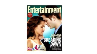
1.
2. The font used is sans serif which is an informal font relating to the informal
teenage romance in this romance film. It is conventional because the
teenage romance is usually less formal than the adult romance therefore the
sans serif is more conventional for this film. Also the story for the film uses
big font sizes to create attention and focus on the story. The title of the film
is in a larger font to make it more focused on than the information about the
film.
The image uses a mid shot showing the characters and their actions. This
shot type can see the couple being affectionate towards each other, this is
conventional because the couples show romance and intimacy in this genre
of film. The main characters are shown as in love and passionate, this
conveys their relationship to be loving and romantic which is conventional to
have the main characters of the film to be in love.
The colour blue stands out on this front cover. This colour signifies loyalty
and trust which is the key aspects of a relationship. This use of colours on
the page is conventional for the genre because the blue shows the trust and
love between the relationship and also is a calm positive colour.
3. The language used on this front cover is very typical and conventional for
this genre because using words such as “love” and “sex” relate to the genre
and their romantic relationship, making this film a typical love film. The
language also shows the stereotypical love film where there are conflicts
and bad parts of their relationship by using words such as “death” and
hinting the plot by saying “strange baby” this also engages the audience in
the film and shows the conventional love film where there are problems in
the relationship as well as the passion for one another.
The main image is focused on by being in the centre and the use of rule of
thirds makes it more structured. Also the use of the cover story about the
film being to the side of the image makes the audience focus on that as
well as the picture to create attention. The masthead is conventionally at
the top overlapping the picture to draw attention to the main image. Using
the “2-Part Twilight Finale” on the left third also makes the audience want
to read about the film and creates popularity.
This magazine cover is conventional because it shows that it is promoting a
romance film by the image where they are showing their love for each
other. Also the language used relates to the romance genre. The font sizes
are also creating attention on the story and making the audience want to
read more about it.