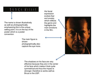
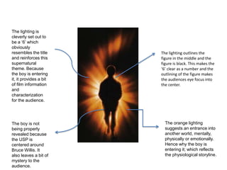
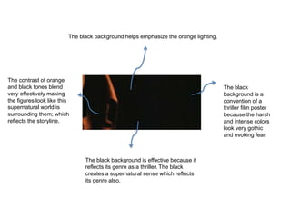
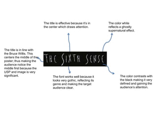
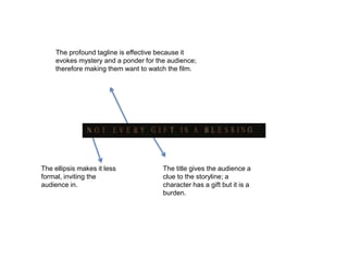
3. The name is shown illustratively
as well as photographically;
emphasizing this is the unique
selling point. It is on the top of the
poster which is a poster
convention.
The main figure is
shown
photographically also
capture the eye more.
The shadows on his face are very
effective because they are in the center
of his face which makes it look quite
symmetrical and thus the impact is
stronger; therefore is works well as
Bruce is the USP.
His facial
expression
evokes fear
and anxiety
which reflects
the genre and
highlights the
main emotions
in the film.
4. The orange lighting
suggests an entrance into
another world, mentally,
physically or emotionally.
Hence why the boy is
entering it; which reflects
the physiological storyline.
The lighting is
cleverly set out to
be a ‘6’ which
obviously
resembles the title
and reinforces this
supernatural
theme. Because
the boy is entering
it, it provides a bit
of film information
and
characterization
for the audience.
The lighting outlines the
figure in the middle and the
figure is black. This makes the
‘6’ clear as a number and the
outlining of the figure makes
the audiences eye focus into
the center.
The boy is not
being properly
revealed because
the USP is
centered around
Bruce Willis. It
also leaves a bit of
mystery to the
audience.
5. The black background helps emphasize the orange lighting.
The black background is effective because it
reflects its genre as a thriller. The black
creates a supernatural sense which reflects
its genre also.
The contrast of orange
and black tones blend
very effectively making
the figures look like this
supernatural world is
surrounding them; which
reflects the storyline.
The black
background is a
convention of a
thriller film poster
because the harsh
and intense colors
look very gothic
and evoking fear.
6. The title is effective because it’s in
the center which draws attention.
The font works well because it
looks very gothic, reflecting its
genre and making the target
audience clear.
The color white
reflects a ghostly
supernatural effect.
The color contrasts with
the black making it very
defined and gaining the
audience’s attention.
The title is in line with
the Bruce Willis. This
centers the middle of the
poster; thus making the
audience notice the
middle first because the
USP and image is very
significant.
7. The profound tagline is effective because it
evokes mystery and a ponder for the audience;
therefore making them want to watch the film.
The title gives the audience a
clue to the storyline; a
character has a gift but it is a
burden.
The ellipsis makes it less
formal, inviting the
audience in.