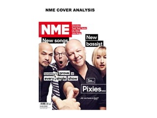
2. One typical cover convention which the NME cover adheres to is the inclusion of
a masthead displaying the magazine brand. As the screen shot shows, the
masthead is a large, bold font in white, layered on top of a bright red
background. This contrast between the red and white allows the text to stand
out vividly, but use of the colour red itself adds vibrancy to the cover, making it
stand out. This is important in terms of the context of reception, as all music
magazines will be displayed in stores together meaning NME will need to
instantly capture potential consumers’ attention stand out against the other
magazines to maintain sales. The actual brand name itself is an initialism,
standing for New Musical Express. By shortening it to an initialism, the name of
the magazine becomes more catchy due to it being shorter and physically
quicker to say. ‘NME’ also has an analogy with the word ‘enemy’, making it
quick to say as we’re already used to the phonetics and pronunciation of that
word. This ‘catchy-ness’ will help sell the magazine as consumers will remember
the name easily from advertisements and hearing other people talk about it.
The masthead is quite isolated and you can see the whole title of the magazine,
and this suggests that the magazine itself is important and holds the most iconic
power, rather than the band itself. IT may also suggest the music magazine is
less well known than others, meaning producers want the whole title to be seen
so consumers can become familiar with the branding and font of the magazine.
The colour scheme as a whole follows closely to conventions found in
market research, as it utilises 3 main colours- red, white and black. These
are the house style colours around the time this issue was published. The
use of white space around the main splash photo creates a more
sophisticated feel over all, as does the use of clean, rectangular boxes
around cover lines in black and white.
This gives the reader a distinct first impression about the type of magazine
and what they can expect from it.
This idea of sophistication follows through into the language used within the
sell lines, such as “Something to prove at every single show…do we have a
deal”. This is more sophisticated as it’s subtle in implying that the pixies have
been signed up for a record deal, rather than explicitly stating it on the cover
like some other music magazines do. This subtlety will appeal to a certain
band of potential consumers, and they will be intrigued and want to read
the rest of the magazine to find out more- a successful persuasive
technique.
3. The splash image is, like most music magazines, taken in a studio. The
backdrop used is plain white, creating a clean image and allowing the
band members to stand out in their darker clothing. This monochrome
colour scheme is very minimalist and draws attention to the actual
language used in the cover lines and the interesting content of the
magazine, rather than presenting the audience with a really busy,
loud magazine which may focus more on the band’s appearance and
the connotations which certain bands portray.
Once again, the medium shot of the band reflects this idea of subtlety
as the band member at the front is shaking hands with, presumably,
the “new bassist” highlighted in one of the few cover lines. The
expressions on the band members faces draw your focus as a reader
down toward the outstretched hands, and the excited expression of
the band member in the stripy top reflects the exciting prospect of a
record deal and new band member, again foreshadowing what the
article about them will hold. This reflection of the actual text within
the image shows a level of sophistication again.
The focus of the magazine, from what the cover displays, seems to be
very concentrated on music itself and what artists are doing and how
they’re doing it, as opposed to magazines like Kerrang which throw
posters, freebies, celebrity gossip and other persuasive techniques at
you in order to draw you in. This suggests that the target audience for
the magazine are those who are interested in the making of music and
stripping it down to the authenticity of the industry.
All of these aspects which focus on a sophisticated, musically natured
audience are almost a use of synthetic personalisation, as they will
make the receiver feel as though the magazine is perfectly suited to
them. The use of the inclusive pronoun ‘we’ also infers a sense that
the reader is being directly addressed, again persuading them to
purchase the magazine because they’re part of it.
As well as this, due to it being print based media, when we hold the
magazine we effectively become that outstretched hand, causing an
interaction between the reader and the magazine. This adds to the
sense of being part of the magazine.
5. The masthead of this contents page reads ‘Inside this
week’. Again, this implicit use of language shows
continuity from the cover as instead of simply stating
‘contents’ it suggests what the magazine contains with
the word ‘inside’. It also states that the magazine is
weekly, giving a date in smaller print underneath.
Similarly to Kerrang, NME utilises photographs in a
‘thumbnail ‘style to give a visual representation of what
each page contains. This seems to be a typical convention
of music magazines, helping readers pinpoint specific
articles they wish to read as pictures are easier to
recognise at a glance than words are. In this case there
are 6 smaller images and one slightly larger one,
suggesting that the larger one contains a more
entertaining story. The caption underneath the image for
page 21 continues to suggest this, asking readers a
rhetorical question and including somewhat ‘taboo’ or
suggestive language such as ‘fetishizing’ and ‘sex’. The
rhetorical question acts a persuasive technique making
readers want to read the article as it engages them
directly with the magazine. This is important as often
potential viewers will turn to the contents page to decide
whether the content of the magazine appeals to them
and makes it worth buying, as magazines are a luxury
good these days due to the plethora of media sources
online.
Once again, like in Kerrang, the clean layout of the page
and use of white space and pale grey lines separating the
different pages make the page visually very accessible,
allowing you to clearly see the information on the page
and not feel overwhelmed. All the images have a slightly
muted, unsaturated look to them as well, adding to the
sophisticated feeling that the magazine upholds.
7. Typical conventions of a double page spread
displayed here include a main image which is
dominant in size in comparison with the overall
article, smaller secondary images used as visual
reference to the textual part of the article and
enlarged quotations picking out specific quotes of
interest.
This enlarged quotation is what readers will look to first when skimming the page, due to
it’s size in comparison to text around it. Emboldening is used to emphasise key words
which the writer deems most important or interesting, and this again will make the
quotation stand out on the page. By including a quotation, this is effectively giving a
snapshot of the article which readers will use to gage what it’s about, what kind of style
it’s been written in and whether they’d like to read more based on whether it seems
interesting or not. In this example, the language such as ‘I’m like’ and the exaggerated use
of punctuation suggest a very colloquial, personal feel, which will most likely persuade
those who are fans of Pete’s to continue reading the article, as it suggests that it contains
personal detail and conversation which they may be interested in.
The masthead on this page reads ‘IN GOOD
HEALTH’ and is positioned over the image of Pete,
sitting over his chest area. The font itself is large
and printed with exaggerated spacing between
letters. This has the effect of making the title stand
out, and the spacing between the letters allows
them to line up in columns, creating a neat,
powerful image- again showing continuity
throughout the magazine of a sharp, sophisticated
look, helping to determine the audience of the
magazine. ‘IN’ and ‘health’ are written in white,
standing out well against the deeper autumnal
colour of Pete’s jumper. However, ‘good’ is written
in a brighter orange, and is framed by the two
white words. This difference in colour, again in a
rather subtle way, suggests an element of irony
because the brighter orange colour matches the
colour of the beer in his hand, and alcohol
consumption generally isn’t linked with the idea of
good health.
The rest of the colour scheme pulls together well,
using white and shades of orange and brown
throughout the spread, with the orange used in
initial cap and quotation on the opposite page,
showing a link between the two pages. Again this
use of a few select colours keeps it simple and
aesthetically pleasing.
8. The image itself is quite dark and ‘grungy’, showing him holding two alcohol drinks, one in each
hand. In terms of appearance he looks quite rough, but in a purposeful way, almost giving of a
‘bad boy’ persona. This links to the idea of ???, which suggests readers will engage in magazines
which surround a certain version of society which they’re interested in, in order to learn about
what they’re role models are wearing, how they’re behaving, where they’re going etc. As a
result, readers follow these examples . In this case, the image of a male celebrity looking a little
rough and drinking will signal to readers that these traits result in you being more highly valued
in society or around people of a similar ideology to you..
As a result, by stating in the stand first, written below masthead, that NME magazine were
intrigued by his personal life and ‘tracked him down’ in order to find out the gossip, readers who
aspire to mirror Pete’s version of masculinity will be inclined to read the article in order to find
out anything they can which might help them close the gap between him and themselves,
which this article suggests it can help them do. This is because anything that the magazine finds
intriguing must be worth reading, as the magazine holds an element of power in that particular
music genre (indie) which is built up through it’s house style and the type of bands and singers
featured.
In terms of the actual discourse structure of the piece, it’s written in three
columns with an initial cap marking the beginning of the article and a drop cap
showing a shift in topic area part way through. The quotation appears in the
centre of the middle common (again, it’s positioning making it more prominent),
and a smaller image in the bottom right hand side in the third column. This
layout shows conventions which we automatically associate with newspapers
and magazines. The use of columns allows a large piece of solid text to appear
less overwhelming and more reader friendly, and the use of white space
between columns breaks it up further and gives the reader ‘thinking space’,
intimidating them less and making them more inclined to read it through.