SlideShare a Scribd company logo
1 of 4
MOJO Magazine Analysis
By Najat Hachem
The masthead of the magazine is ‘MOJO’ which is in bold and white and has a 3D
effect behind it to make it look different and more superior to the rest of the
cover. Moreover, it is placed at the top of the cover page meaning it is following
conventions. The title is placed behind the main image at the top of the cover
page, this shows that the company is well known enough to hide their name but
also shows that they are aiming their magazine to present and trusted
customers. The title is large compared to the text and takes up a lot of space on
the front cover; also the masthead is placed across the width of the magazine
which is unlikely to see on most magazines, however this makes it more dominant
on the page and unique. This shows that the magazine is powerful as it takes up
most of the page on the page which makes it stand out to the readers. Moreover,
the title is in capitals, this suggests its importance and would be recognised by the
audience. The target audience of ‘MOJO’ is about 35 years old and over, so the
masthead is simple and dull which clearly relates to this age range. The white text
is on a grey background which is called a wob.
The Unique selling proposition (USP) is the 'Free CD' which is placed in the top corner of the
page and in a yellow box with black sans-serif writing. This font has been used so it stands out to
the audience and it attracts them and would want to make them buy the magazine. Moreover,
the 'free CD' that is advertised fits in the contents of the magazine and the genre. This is a puff
piece as they are usually located in the top corner of the front cover and stands out.
The centre of visual interest is the image of David Bowie which is a
famous celebrity and it is linked with the main cover line. It is a medium
close up shot which overlays the masthead which shows how significant
the celebrity is. Furthermore, the 'free CD' reinforces the genre to the
audience and the main story and the image has a link with the CD. The
image is placed in the centre of the page that attracts the audience and it
is the first thing they see. Also it is a common code and convention of
magazines to have an image in the centre of the front cover. The colour of
the image is the same as the background colour (grey).
The slogan for the magazine is 'The music magazine' which is half hidden by the image, this suggests
that the magazines slogan is well-known by the readers which shows that this magazine was created
for people that have been reading MOJO for a long period of time and they are very familiar with it
so they don't have to always show it. Also this slogan suggests that it is the only music magazine.
The sky line is the same font and colour as the masthead, however in a smaller
font which makes it look less significant that the masthead. In addition, as they
have used the same colour and font as the masthead this shows that it is as
important as the masthead.
The theme of the magazine is grey, white, black and red text. The white text is
used to create a wob effect for the masthead, the red is normally used to make
significant words to stand out and the most important parts of the text on the
page is in red for example, the word 'PLUS' which is in capital letters and in bold
red which gives the effect of it being important and the reader would want to
know what also will be in the magazine and what are the main stories. The
colour red is a powerful colour and makes words stand out and shows how
important they are.
The second centre of visual interest is the name of the artist, this is to
inform the readers that it is the main story and the 'Free CD' will be based
on him. Also it attracts the readers that are interested in him and will
make people aware of him if they don't know who the artist is, so this will
create some recognition. They will know what some features of the
magazine are about. Moreover, this is a form of code and convention as in
most magazines they will base the main story on the artists they have on
the front cover and the free CD.
The bar code is placed at the bottom right third of the page which is a
common code and convention of a magazine. Also the price is placed on
the bar code which is also is a code and convention in most magazines.
This price is placed next to the bar code is because when the reader wants
to buy the magazine they would of looked at all the features in the
magazine and then decide if they want to buy it or not so they just look at
where the bar code is placed to see the price. Also the date of the issue is
placed on the bar code so they know if it is the most recent issue or not.
The price is in pounds and dollars, so this shows that it is not only in the
UK.
The free CD is placed on the front cover and at
the bottom left third of the page which follows
codes and conventions. Also, MOJO magazines
includes a Free CD in all their monthly issues.
This puff piece is used to encourage the
consumer to buy the magazine and look at the
features inside issue. As it is in a yellow circle
with red writing which is the similar to the 'free
CD' so it will catch the readers attention and
would want to buy the magazine as they will
be interested.
The word ‘PLUS!’ which is all in capital letters in red and includes an
exclamation mark as well which indicates the variety of stories that are
covered within the issue, and makes the reader want to look inside.
The heading is the same font and colour as the
masthead, to show that they are linked together
however, the writing is smaller than the masthead.
Moreover, they placed the heading at the top of the
page and in the middle. The title of the magazine
wasn’t mentioned on the contents to show that the
masthead has already been branded and doesn’t have
to be reintroduced to the audience as they know it
well enough.
The issue number and issue date are located
below the heading and subheading. This
doesn’t follow codes and conventions like
other magazines as they are usually located on
the front cover. However, including the issue
number and issue date in a magazine is a
common code and convention. The purpose of
adding the issue number and issue date is to
address the readers what issue they are
reading and to know if it the latest issue. The
issue number is 255 which shows that it is a
successful magazine from the number of
issues they have.
The subheading is placed below the heading and it is
in the same font and colour as the heading, however
smaller font. The subheading are locations which is
common in all MOJO magazines.
Page numbers are in red and are in a large
sans-serif font which follows the colour
scheme and this follows common code and
convention of magazines as they want them to
stand out for the audience and also gives it a
professional look.
The contents titles are in a red box and the writing is
in white. This also makes it look professional as it
follows the colour scheme. Moreover, it makes it
easier for the audience to read which is a main code
and convention. Also the contents title is capital
letters which makes it stand out to the audience that
it is the contents title.
This technique where the words are stuck together and
separated by the colour difference. This shows
repetition throughout the magazine and follows a
particular scheme, which creates a sense of
professionalism in the magazine.
This sell is advertising the different covers of this
magazine, which shows they are self-promoting the
magazine. This is a common code and convention in
magazines as they usually self-promote.
The main image is a black and white long
shot a man playing the piano. He is dressed in
an old fashioned way (70s look). Due to the
use of black and white and the way they are
dressed, it links with the running head on the
front page “THE KINKS’ 70S KRACK-UP!”.
This suggests that it has a sense of
professionalism, which makes the
magazine successful.
The pull quote is placed at the bottom of the page this is emphasised in capital letters, in
a red rectangle shape box, one word is in white and the next word is in black which
catches the readers attention as it is a quote from the main artist. The colours used are
the main colours of the magazine which creates a sense of professionalism in the
magazine. Also it has a sense that it’s shouting at the audience and makes them read it in
a different way.
The main image is spread over two pages
which includes a medium shot and it is an
image of four men which two of them are
directly looking at the camera and the
other two are looking side ways. They are
the centre of visual interest and all four
men are wearing similar suits which
suggests that they are all in one band (Tin
Men). The suits show that they are
successful men and that they are serious.
Moreover, this also indicates to the
audience that the article will be about
them as they are the main focus on the
page. The denotation of the background
that it is a studio this connotes that they
were at a photo shoot or shooting a music
video at the time the picture was taken.
Beside the image there is a cut line where
they state who the men in the image are,
to inform the readers who they are if they
don’t know them. It is in white which
stands out on the black background. It
makes it effective as it provides the reader
some information.
The image of the artist that that is placed
between the text and it changes the way
the text is laid out.
The heading links with the
contents title, this shows that it
is important and the way it is
written makes it effective.
“100” and “Bowie” are both in
red which makes them stand
out from the rest of the text.
The article heading is located in a
black rectangle shape box which
includes the all the text in the
article and in bold serif font and it is
in white and red which follows the
colour scheme in the magazine. The
title is all one word where there is
no spaces, however it is separated
by making one words ‘THE’ and
‘ARTIST’ in white and the word
‘ESCAPE’ in red. This effect has been
used a few times in this magazine.
This effect is unique and specific
with this magazine.
They advertised four different CD
album covers by the band, which
makes the readers more
interested and they would want
to know more about it if they are
interested in a particular CD
album.
Double page spread

More Related Content

What's hot

Tasks 1 4 and hwk 1
Tasks 1 4 and hwk 1Tasks 1 4 and hwk 1
Tasks 1 4 and hwk 1charlie__1
 
Analysis of three magazines (3)
Analysis of three magazines (3)Analysis of three magazines (3)
Analysis of three magazines (3)domingochristal
 
Analysis of Magazines.
Analysis of Magazines.Analysis of Magazines.
Analysis of Magazines.beckyyoungs
 
Media studies xxl magazine analysis pdf
Media studies xxl magazine analysis pdfMedia studies xxl magazine analysis pdf
Media studies xxl magazine analysis pdfdebbiesmediawork
 
XXL magazine analysis
XXL magazine analysis XXL magazine analysis
XXL magazine analysis zombiejuicek
 
Unit 14 - LO1
Unit 14 - LO1Unit 14 - LO1
Unit 14 - LO1jbowers96
 
Nme analysis
Nme analysisNme analysis
Nme analysismagda rak
 
Media Evaluation
Media EvaluationMedia Evaluation
Media EvaluationEmLeeman1
 
Magazine Analysis
Magazine AnalysisMagazine Analysis
Magazine AnalysisJessDruett
 
Analysis of double page spread
Analysis of double page spreadAnalysis of double page spread
Analysis of double page spreadAlessia Teresko
 
Pop music magazine
Pop music magazinePop music magazine
Pop music magazineKlarasa098
 
Contents page analysis
Contents page analysisContents page analysis
Contents page analysisMina Yaqin
 
Music magazine analysis
Music magazine analysisMusic magazine analysis
Music magazine analysisDariusslide
 
Textual analysis
Textual analysisTextual analysis
Textual analysismeganmoody
 
Analysis of music magazine one nme
Analysis of music magazine one nmeAnalysis of music magazine one nme
Analysis of music magazine one nmealishalumsden
 

What's hot (20)

Tasks 1 4 and hwk 1
Tasks 1 4 and hwk 1Tasks 1 4 and hwk 1
Tasks 1 4 and hwk 1
 
Analysis of three magazines (3)
Analysis of three magazines (3)Analysis of three magazines (3)
Analysis of three magazines (3)
 
Xxl magazine analysis
Xxl magazine analysisXxl magazine analysis
Xxl magazine analysis
 
Analysis of Magazines.
Analysis of Magazines.Analysis of Magazines.
Analysis of Magazines.
 
Media studies xxl magazine analysis pdf
Media studies xxl magazine analysis pdfMedia studies xxl magazine analysis pdf
Media studies xxl magazine analysis pdf
 
XXL magazine analysis
XXL magazine analysis XXL magazine analysis
XXL magazine analysis
 
Unit 14 - LO1
Unit 14 - LO1Unit 14 - LO1
Unit 14 - LO1
 
Nme analysis
Nme analysisNme analysis
Nme analysis
 
Presentation
PresentationPresentation
Presentation
 
Media Evaluation
Media EvaluationMedia Evaluation
Media Evaluation
 
Front Cover Analysis
Front Cover AnalysisFront Cover Analysis
Front Cover Analysis
 
Magazine Analysis
Magazine AnalysisMagazine Analysis
Magazine Analysis
 
Analysis of double page spread
Analysis of double page spreadAnalysis of double page spread
Analysis of double page spread
 
Analysis Of NME
Analysis Of NMEAnalysis Of NME
Analysis Of NME
 
Pop music magazine
Pop music magazinePop music magazine
Pop music magazine
 
DPS
DPSDPS
DPS
 
Contents page analysis
Contents page analysisContents page analysis
Contents page analysis
 
Music magazine analysis
Music magazine analysisMusic magazine analysis
Music magazine analysis
 
Textual analysis
Textual analysisTextual analysis
Textual analysis
 
Analysis of music magazine one nme
Analysis of music magazine one nmeAnalysis of music magazine one nme
Analysis of music magazine one nme
 

Viewers also liked

大学生により使いやすいIT環境
大学生により使いやすいIT環境大学生により使いやすいIT環境
大学生により使いやすいIT環境WebRTCConferenceJapan
 
ЗАКОНОДАТЕЛЬНЫЕ ИЗМЕНЕНИЯ В РЕГУЛИРОВАНИИ ДЕЯТЕЛЬНОСТИ ПРОВАЙДЕРОВ ПРОГРАММНО...
ЗАКОНОДАТЕЛЬНЫЕ ИЗМЕНЕНИЯ В РЕГУЛИРОВАНИИ ДЕЯТЕЛЬНОСТИ ПРОВАЙДЕРОВ ПРОГРАММНО...ЗАКОНОДАТЕЛЬНЫЕ ИЗМЕНЕНИЯ В РЕГУЛИРОВАНИИ ДЕЯТЕЛЬНОСТИ ПРОВАЙДЕРОВ ПРОГРАММНО...
ЗАКОНОДАТЕЛЬНЫЕ ИЗМЕНЕНИЯ В РЕГУЛИРОВАНИИ ДЕЯТЕЛЬНОСТИ ПРОВАЙДЕРОВ ПРОГРАММНО...Darbal
 
presentations powerpoint
presentations powerpointpresentations powerpoint
presentations powerpointKan Kanchana
 
Epic research daily agri report 24 feb 2015
Epic research daily agri report  24 feb 2015Epic research daily agri report  24 feb 2015
Epic research daily agri report 24 feb 2015Epic Research Limited
 
Epic research daily agri report 26 feb 2015
Epic research daily agri report  26 feb 2015Epic research daily agri report  26 feb 2015
Epic research daily agri report 26 feb 2015Epic Research Limited
 
същност на счетоводството
същност на счетоводствотосъщност на счетоводството
същност на счетоводствотоpetromir
 
радість пізнання. коротков 2013
радість пізнання. коротков 2013радість пізнання. коротков 2013
радість пізнання. коротков 201319Lika74
 
A calender of mathematical dates by frederick rickey
A calender of mathematical dates by frederick rickeyA calender of mathematical dates by frederick rickey
A calender of mathematical dates by frederick rickeyPim Piepers
 
Giu am cho cay ca phe bang mang phu pe
Giu am cho cay ca phe bang mang phu peGiu am cho cay ca phe bang mang phu pe
Giu am cho cay ca phe bang mang phu peNhà Bè Agri
 
ข้อสอบ O net 51 ภาษาไทย
ข้อสอบ O net 51 ภาษาไทยข้อสอบ O net 51 ภาษาไทย
ข้อสอบ O net 51 ภาษาไทยmeanerimz97
 
Договор для юр. лиц
Договор для юр. лицДоговор для юр. лиц
Договор для юр. лицbiletprofi_ru
 

Viewers also liked (17)

大学生により使いやすいIT環境
大学生により使いやすいIT環境大学生により使いやすいIT環境
大学生により使いやすいIT環境
 
Lover, 19 febbraio 2015 - Protocollo d'intesa fra tre Unioni regionali
Lover, 19 febbraio 2015 - Protocollo d'intesa fra tre Unioni regionaliLover, 19 febbraio 2015 - Protocollo d'intesa fra tre Unioni regionali
Lover, 19 febbraio 2015 - Protocollo d'intesa fra tre Unioni regionali
 
ЗАКОНОДАТЕЛЬНЫЕ ИЗМЕНЕНИЯ В РЕГУЛИРОВАНИИ ДЕЯТЕЛЬНОСТИ ПРОВАЙДЕРОВ ПРОГРАММНО...
ЗАКОНОДАТЕЛЬНЫЕ ИЗМЕНЕНИЯ В РЕГУЛИРОВАНИИ ДЕЯТЕЛЬНОСТИ ПРОВАЙДЕРОВ ПРОГРАММНО...ЗАКОНОДАТЕЛЬНЫЕ ИЗМЕНЕНИЯ В РЕГУЛИРОВАНИИ ДЕЯТЕЛЬНОСТИ ПРОВАЙДЕРОВ ПРОГРАММНО...
ЗАКОНОДАТЕЛЬНЫЕ ИЗМЕНЕНИЯ В РЕГУЛИРОВАНИИ ДЕЯТЕЛЬНОСТИ ПРОВАЙДЕРОВ ПРОГРАММНО...
 
Державна служба
Державна службаДержавна служба
Державна служба
 
presentations powerpoint
presentations powerpointpresentations powerpoint
presentations powerpoint
 
Epic research daily agri report 24 feb 2015
Epic research daily agri report  24 feb 2015Epic research daily agri report  24 feb 2015
Epic research daily agri report 24 feb 2015
 
Folleto PDG
Folleto PDGFolleto PDG
Folleto PDG
 
Epic research daily agri report 26 feb 2015
Epic research daily agri report  26 feb 2015Epic research daily agri report  26 feb 2015
Epic research daily agri report 26 feb 2015
 
същност на счетоводството
същност на счетоводствотосъщност на счетоводството
същност на счетоводството
 
merged.pdf
merged.pdfmerged.pdf
merged.pdf
 
радість пізнання. коротков 2013
радість пізнання. коротков 2013радість пізнання. коротков 2013
радість пізнання. коротков 2013
 
A calender of mathematical dates by frederick rickey
A calender of mathematical dates by frederick rickeyA calender of mathematical dates by frederick rickey
A calender of mathematical dates by frederick rickey
 
Gradient
GradientGradient
Gradient
 
Giu am cho cay ca phe bang mang phu pe
Giu am cho cay ca phe bang mang phu peGiu am cho cay ca phe bang mang phu pe
Giu am cho cay ca phe bang mang phu pe
 
ข้อสอบ O net 51 ภาษาไทย
ข้อสอบ O net 51 ภาษาไทยข้อสอบ O net 51 ภาษาไทย
ข้อสอบ O net 51 ภาษาไทย
 
Договор для юр. лиц
Договор для юр. лицДоговор для юр. лиц
Договор для юр. лиц
 
543 1968-1-pb
543 1968-1-pb543 1968-1-pb
543 1968-1-pb
 

Similar to Mojo magazine analysis

NME magazine analysis
NME magazine analysisNME magazine analysis
NME magazine analysiskiera0white
 
contents page analysis
contents page analysiscontents page analysis
contents page analysisTee983
 
Analysis of music magazine covers/contents/doublepage
Analysis of music magazine covers/contents/doublepageAnalysis of music magazine covers/contents/doublepage
Analysis of music magazine covers/contents/doublepagejamsterdj
 
Music magazine analysis
Music magazine analysisMusic magazine analysis
Music magazine analysisRhysLadd
 
Analysis of general magazine front covers
Analysis of general magazine front coversAnalysis of general magazine front covers
Analysis of general magazine front coverssrelliott22
 
Magazine analysis
Magazine analysisMagazine analysis
Magazine analysismillerjess
 
Magazine analysis
Magazine analysisMagazine analysis
Magazine analysismillerjess
 
Music Magazine Analysis
Music Magazine AnalysisMusic Magazine Analysis
Music Magazine Analysislaurencowey
 
Task 3 research bmth
Task 3 research bmthTask 3 research bmth
Task 3 research bmthasmediae15
 
Critical approaches magazine.pptx
Critical approaches magazine.pptxCritical approaches magazine.pptx
Critical approaches magazine.pptxBHuyton10
 
Magazine analysis - Cover Pages
Magazine analysis - Cover PagesMagazine analysis - Cover Pages
Magazine analysis - Cover Pagesalexhooseman
 
Music Magazine Analysis
Music Magazine AnalysisMusic Magazine Analysis
Music Magazine Analysislaurencowey
 
Music Magazine Analysis
Music Magazine AnalysisMusic Magazine Analysis
Music Magazine Analysislaurencowey
 

Similar to Mojo magazine analysis (20)

MOJO
MOJOMOJO
MOJO
 
Analysis of magazines
Analysis of magazinesAnalysis of magazines
Analysis of magazines
 
Magazine analysis
Magazine analysis Magazine analysis
Magazine analysis
 
1b
1b1b
1b
 
NME magazine analysis
NME magazine analysisNME magazine analysis
NME magazine analysis
 
Magazine analysis
Magazine analysisMagazine analysis
Magazine analysis
 
contents page analysis
contents page analysiscontents page analysis
contents page analysis
 
Analysis of music magazine covers/contents/doublepage
Analysis of music magazine covers/contents/doublepageAnalysis of music magazine covers/contents/doublepage
Analysis of music magazine covers/contents/doublepage
 
Music magazine analysis
Music magazine analysisMusic magazine analysis
Music magazine analysis
 
Analysis of general magazine front covers
Analysis of general magazine front coversAnalysis of general magazine front covers
Analysis of general magazine front covers
 
Magazine analysis
Magazine analysisMagazine analysis
Magazine analysis
 
Magazine analysis
Magazine analysisMagazine analysis
Magazine analysis
 
Music Magazine Analysis
Music Magazine AnalysisMusic Magazine Analysis
Music Magazine Analysis
 
Task 3 research bmth
Task 3 research bmthTask 3 research bmth
Task 3 research bmth
 
Coursework
Coursework Coursework
Coursework
 
Coursework
Coursework Coursework
Coursework
 
Critical approaches magazine.pptx
Critical approaches magazine.pptxCritical approaches magazine.pptx
Critical approaches magazine.pptx
 
Magazine analysis - Cover Pages
Magazine analysis - Cover PagesMagazine analysis - Cover Pages
Magazine analysis - Cover Pages
 
Music Magazine Analysis
Music Magazine AnalysisMusic Magazine Analysis
Music Magazine Analysis
 
Music Magazine Analysis
Music Magazine AnalysisMusic Magazine Analysis
Music Magazine Analysis
 

Recently uploaded

Atmosphere science 7 quarter 4 .........
Atmosphere science 7 quarter 4 .........Atmosphere science 7 quarter 4 .........
Atmosphere science 7 quarter 4 .........LeaCamillePacle
 
AMERICAN LANGUAGE HUB_Level2_Student'sBook_Answerkey.pdf
AMERICAN LANGUAGE HUB_Level2_Student'sBook_Answerkey.pdfAMERICAN LANGUAGE HUB_Level2_Student'sBook_Answerkey.pdf
AMERICAN LANGUAGE HUB_Level2_Student'sBook_Answerkey.pdfphamnguyenenglishnb
 
ENGLISH 7_Q4_LESSON 2_ Employing a Variety of Strategies for Effective Interp...
ENGLISH 7_Q4_LESSON 2_ Employing a Variety of Strategies for Effective Interp...ENGLISH 7_Q4_LESSON 2_ Employing a Variety of Strategies for Effective Interp...
ENGLISH 7_Q4_LESSON 2_ Employing a Variety of Strategies for Effective Interp...JhezDiaz1
 
Framing an Appropriate Research Question 6b9b26d93da94caf993c038d9efcdedb.pdf
Framing an Appropriate Research Question 6b9b26d93da94caf993c038d9efcdedb.pdfFraming an Appropriate Research Question 6b9b26d93da94caf993c038d9efcdedb.pdf
Framing an Appropriate Research Question 6b9b26d93da94caf993c038d9efcdedb.pdfUjwalaBharambe
 
Alper Gobel In Media Res Media Component
Alper Gobel In Media Res Media ComponentAlper Gobel In Media Res Media Component
Alper Gobel In Media Res Media ComponentInMediaRes1
 
Keynote by Prof. Wurzer at Nordex about IP-design
Keynote by Prof. Wurzer at Nordex about IP-designKeynote by Prof. Wurzer at Nordex about IP-design
Keynote by Prof. Wurzer at Nordex about IP-designMIPLM
 
Hierarchy of management that covers different levels of management
Hierarchy of management that covers different levels of managementHierarchy of management that covers different levels of management
Hierarchy of management that covers different levels of managementmkooblal
 
Difference Between Search & Browse Methods in Odoo 17
Difference Between Search & Browse Methods in Odoo 17Difference Between Search & Browse Methods in Odoo 17
Difference Between Search & Browse Methods in Odoo 17Celine George
 
Like-prefer-love -hate+verb+ing & silent letters & citizenship text.pdf
Like-prefer-love -hate+verb+ing & silent letters & citizenship text.pdfLike-prefer-love -hate+verb+ing & silent letters & citizenship text.pdf
Like-prefer-love -hate+verb+ing & silent letters & citizenship text.pdfMr Bounab Samir
 
Earth Day Presentation wow hello nice great
Earth Day Presentation wow hello nice greatEarth Day Presentation wow hello nice great
Earth Day Presentation wow hello nice greatYousafMalik24
 
Introduction to AI in Higher Education_draft.pptx
Introduction to AI in Higher Education_draft.pptxIntroduction to AI in Higher Education_draft.pptx
Introduction to AI in Higher Education_draft.pptxpboyjonauth
 
Grade 9 Q4-MELC1-Active and Passive Voice.pptx
Grade 9 Q4-MELC1-Active and Passive Voice.pptxGrade 9 Q4-MELC1-Active and Passive Voice.pptx
Grade 9 Q4-MELC1-Active and Passive Voice.pptxChelloAnnAsuncion2
 
MULTIDISCIPLINRY NATURE OF THE ENVIRONMENTAL STUDIES.pptx
MULTIDISCIPLINRY NATURE OF THE ENVIRONMENTAL STUDIES.pptxMULTIDISCIPLINRY NATURE OF THE ENVIRONMENTAL STUDIES.pptx
MULTIDISCIPLINRY NATURE OF THE ENVIRONMENTAL STUDIES.pptxAnupkumar Sharma
 
EPANDING THE CONTENT OF AN OUTLINE using notes.pptx
EPANDING THE CONTENT OF AN OUTLINE using notes.pptxEPANDING THE CONTENT OF AN OUTLINE using notes.pptx
EPANDING THE CONTENT OF AN OUTLINE using notes.pptxRaymartEstabillo3
 
ENGLISH6-Q4-W3.pptxqurter our high choom
ENGLISH6-Q4-W3.pptxqurter our high choomENGLISH6-Q4-W3.pptxqurter our high choom
ENGLISH6-Q4-W3.pptxqurter our high choomnelietumpap1
 
ECONOMIC CONTEXT - LONG FORM TV DRAMA - PPT
ECONOMIC CONTEXT - LONG FORM TV DRAMA - PPTECONOMIC CONTEXT - LONG FORM TV DRAMA - PPT
ECONOMIC CONTEXT - LONG FORM TV DRAMA - PPTiammrhaywood
 
DATA STRUCTURE AND ALGORITHM for beginners
DATA STRUCTURE AND ALGORITHM for beginnersDATA STRUCTURE AND ALGORITHM for beginners
DATA STRUCTURE AND ALGORITHM for beginnersSabitha Banu
 
Full Stack Web Development Course for Beginners
Full Stack Web Development Course  for BeginnersFull Stack Web Development Course  for Beginners
Full Stack Web Development Course for BeginnersSabitha Banu
 
Planning a health career 4th Quarter.pptx
Planning a health career 4th Quarter.pptxPlanning a health career 4th Quarter.pptx
Planning a health career 4th Quarter.pptxLigayaBacuel1
 

Recently uploaded (20)

Atmosphere science 7 quarter 4 .........
Atmosphere science 7 quarter 4 .........Atmosphere science 7 quarter 4 .........
Atmosphere science 7 quarter 4 .........
 
AMERICAN LANGUAGE HUB_Level2_Student'sBook_Answerkey.pdf
AMERICAN LANGUAGE HUB_Level2_Student'sBook_Answerkey.pdfAMERICAN LANGUAGE HUB_Level2_Student'sBook_Answerkey.pdf
AMERICAN LANGUAGE HUB_Level2_Student'sBook_Answerkey.pdf
 
TataKelola dan KamSiber Kecerdasan Buatan v022.pdf
TataKelola dan KamSiber Kecerdasan Buatan v022.pdfTataKelola dan KamSiber Kecerdasan Buatan v022.pdf
TataKelola dan KamSiber Kecerdasan Buatan v022.pdf
 
ENGLISH 7_Q4_LESSON 2_ Employing a Variety of Strategies for Effective Interp...
ENGLISH 7_Q4_LESSON 2_ Employing a Variety of Strategies for Effective Interp...ENGLISH 7_Q4_LESSON 2_ Employing a Variety of Strategies for Effective Interp...
ENGLISH 7_Q4_LESSON 2_ Employing a Variety of Strategies for Effective Interp...
 
Framing an Appropriate Research Question 6b9b26d93da94caf993c038d9efcdedb.pdf
Framing an Appropriate Research Question 6b9b26d93da94caf993c038d9efcdedb.pdfFraming an Appropriate Research Question 6b9b26d93da94caf993c038d9efcdedb.pdf
Framing an Appropriate Research Question 6b9b26d93da94caf993c038d9efcdedb.pdf
 
Alper Gobel In Media Res Media Component
Alper Gobel In Media Res Media ComponentAlper Gobel In Media Res Media Component
Alper Gobel In Media Res Media Component
 
Keynote by Prof. Wurzer at Nordex about IP-design
Keynote by Prof. Wurzer at Nordex about IP-designKeynote by Prof. Wurzer at Nordex about IP-design
Keynote by Prof. Wurzer at Nordex about IP-design
 
Hierarchy of management that covers different levels of management
Hierarchy of management that covers different levels of managementHierarchy of management that covers different levels of management
Hierarchy of management that covers different levels of management
 
Difference Between Search & Browse Methods in Odoo 17
Difference Between Search & Browse Methods in Odoo 17Difference Between Search & Browse Methods in Odoo 17
Difference Between Search & Browse Methods in Odoo 17
 
Like-prefer-love -hate+verb+ing & silent letters & citizenship text.pdf
Like-prefer-love -hate+verb+ing & silent letters & citizenship text.pdfLike-prefer-love -hate+verb+ing & silent letters & citizenship text.pdf
Like-prefer-love -hate+verb+ing & silent letters & citizenship text.pdf
 
Earth Day Presentation wow hello nice great
Earth Day Presentation wow hello nice greatEarth Day Presentation wow hello nice great
Earth Day Presentation wow hello nice great
 
Introduction to AI in Higher Education_draft.pptx
Introduction to AI in Higher Education_draft.pptxIntroduction to AI in Higher Education_draft.pptx
Introduction to AI in Higher Education_draft.pptx
 
Grade 9 Q4-MELC1-Active and Passive Voice.pptx
Grade 9 Q4-MELC1-Active and Passive Voice.pptxGrade 9 Q4-MELC1-Active and Passive Voice.pptx
Grade 9 Q4-MELC1-Active and Passive Voice.pptx
 
MULTIDISCIPLINRY NATURE OF THE ENVIRONMENTAL STUDIES.pptx
MULTIDISCIPLINRY NATURE OF THE ENVIRONMENTAL STUDIES.pptxMULTIDISCIPLINRY NATURE OF THE ENVIRONMENTAL STUDIES.pptx
MULTIDISCIPLINRY NATURE OF THE ENVIRONMENTAL STUDIES.pptx
 
EPANDING THE CONTENT OF AN OUTLINE using notes.pptx
EPANDING THE CONTENT OF AN OUTLINE using notes.pptxEPANDING THE CONTENT OF AN OUTLINE using notes.pptx
EPANDING THE CONTENT OF AN OUTLINE using notes.pptx
 
ENGLISH6-Q4-W3.pptxqurter our high choom
ENGLISH6-Q4-W3.pptxqurter our high choomENGLISH6-Q4-W3.pptxqurter our high choom
ENGLISH6-Q4-W3.pptxqurter our high choom
 
ECONOMIC CONTEXT - LONG FORM TV DRAMA - PPT
ECONOMIC CONTEXT - LONG FORM TV DRAMA - PPTECONOMIC CONTEXT - LONG FORM TV DRAMA - PPT
ECONOMIC CONTEXT - LONG FORM TV DRAMA - PPT
 
DATA STRUCTURE AND ALGORITHM for beginners
DATA STRUCTURE AND ALGORITHM for beginnersDATA STRUCTURE AND ALGORITHM for beginners
DATA STRUCTURE AND ALGORITHM for beginners
 
Full Stack Web Development Course for Beginners
Full Stack Web Development Course  for BeginnersFull Stack Web Development Course  for Beginners
Full Stack Web Development Course for Beginners
 
Planning a health career 4th Quarter.pptx
Planning a health career 4th Quarter.pptxPlanning a health career 4th Quarter.pptx
Planning a health career 4th Quarter.pptx
 

Mojo magazine analysis

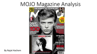
  • 2. The masthead of the magazine is ‘MOJO’ which is in bold and white and has a 3D effect behind it to make it look different and more superior to the rest of the cover. Moreover, it is placed at the top of the cover page meaning it is following conventions. The title is placed behind the main image at the top of the cover page, this shows that the company is well known enough to hide their name but also shows that they are aiming their magazine to present and trusted customers. The title is large compared to the text and takes up a lot of space on the front cover; also the masthead is placed across the width of the magazine which is unlikely to see on most magazines, however this makes it more dominant on the page and unique. This shows that the magazine is powerful as it takes up most of the page on the page which makes it stand out to the readers. Moreover, the title is in capitals, this suggests its importance and would be recognised by the audience. The target audience of ‘MOJO’ is about 35 years old and over, so the masthead is simple and dull which clearly relates to this age range. The white text is on a grey background which is called a wob. The Unique selling proposition (USP) is the 'Free CD' which is placed in the top corner of the page and in a yellow box with black sans-serif writing. This font has been used so it stands out to the audience and it attracts them and would want to make them buy the magazine. Moreover, the 'free CD' that is advertised fits in the contents of the magazine and the genre. This is a puff piece as they are usually located in the top corner of the front cover and stands out. The centre of visual interest is the image of David Bowie which is a famous celebrity and it is linked with the main cover line. It is a medium close up shot which overlays the masthead which shows how significant the celebrity is. Furthermore, the 'free CD' reinforces the genre to the audience and the main story and the image has a link with the CD. The image is placed in the centre of the page that attracts the audience and it is the first thing they see. Also it is a common code and convention of magazines to have an image in the centre of the front cover. The colour of the image is the same as the background colour (grey). The slogan for the magazine is 'The music magazine' which is half hidden by the image, this suggests that the magazines slogan is well-known by the readers which shows that this magazine was created for people that have been reading MOJO for a long period of time and they are very familiar with it so they don't have to always show it. Also this slogan suggests that it is the only music magazine. The sky line is the same font and colour as the masthead, however in a smaller font which makes it look less significant that the masthead. In addition, as they have used the same colour and font as the masthead this shows that it is as important as the masthead. The theme of the magazine is grey, white, black and red text. The white text is used to create a wob effect for the masthead, the red is normally used to make significant words to stand out and the most important parts of the text on the page is in red for example, the word 'PLUS' which is in capital letters and in bold red which gives the effect of it being important and the reader would want to know what also will be in the magazine and what are the main stories. The colour red is a powerful colour and makes words stand out and shows how important they are. The second centre of visual interest is the name of the artist, this is to inform the readers that it is the main story and the 'Free CD' will be based on him. Also it attracts the readers that are interested in him and will make people aware of him if they don't know who the artist is, so this will create some recognition. They will know what some features of the magazine are about. Moreover, this is a form of code and convention as in most magazines they will base the main story on the artists they have on the front cover and the free CD. The bar code is placed at the bottom right third of the page which is a common code and convention of a magazine. Also the price is placed on the bar code which is also is a code and convention in most magazines. This price is placed next to the bar code is because when the reader wants to buy the magazine they would of looked at all the features in the magazine and then decide if they want to buy it or not so they just look at where the bar code is placed to see the price. Also the date of the issue is placed on the bar code so they know if it is the most recent issue or not. The price is in pounds and dollars, so this shows that it is not only in the UK. The free CD is placed on the front cover and at the bottom left third of the page which follows codes and conventions. Also, MOJO magazines includes a Free CD in all their monthly issues. This puff piece is used to encourage the consumer to buy the magazine and look at the features inside issue. As it is in a yellow circle with red writing which is the similar to the 'free CD' so it will catch the readers attention and would want to buy the magazine as they will be interested. The word ‘PLUS!’ which is all in capital letters in red and includes an exclamation mark as well which indicates the variety of stories that are covered within the issue, and makes the reader want to look inside.
  • 3. The heading is the same font and colour as the masthead, to show that they are linked together however, the writing is smaller than the masthead. Moreover, they placed the heading at the top of the page and in the middle. The title of the magazine wasn’t mentioned on the contents to show that the masthead has already been branded and doesn’t have to be reintroduced to the audience as they know it well enough. The issue number and issue date are located below the heading and subheading. This doesn’t follow codes and conventions like other magazines as they are usually located on the front cover. However, including the issue number and issue date in a magazine is a common code and convention. The purpose of adding the issue number and issue date is to address the readers what issue they are reading and to know if it the latest issue. The issue number is 255 which shows that it is a successful magazine from the number of issues they have. The subheading is placed below the heading and it is in the same font and colour as the heading, however smaller font. The subheading are locations which is common in all MOJO magazines. Page numbers are in red and are in a large sans-serif font which follows the colour scheme and this follows common code and convention of magazines as they want them to stand out for the audience and also gives it a professional look. The contents titles are in a red box and the writing is in white. This also makes it look professional as it follows the colour scheme. Moreover, it makes it easier for the audience to read which is a main code and convention. Also the contents title is capital letters which makes it stand out to the audience that it is the contents title. This technique where the words are stuck together and separated by the colour difference. This shows repetition throughout the magazine and follows a particular scheme, which creates a sense of professionalism in the magazine. This sell is advertising the different covers of this magazine, which shows they are self-promoting the magazine. This is a common code and convention in magazines as they usually self-promote. The main image is a black and white long shot a man playing the piano. He is dressed in an old fashioned way (70s look). Due to the use of black and white and the way they are dressed, it links with the running head on the front page “THE KINKS’ 70S KRACK-UP!”. This suggests that it has a sense of professionalism, which makes the magazine successful.
  • 4. The pull quote is placed at the bottom of the page this is emphasised in capital letters, in a red rectangle shape box, one word is in white and the next word is in black which catches the readers attention as it is a quote from the main artist. The colours used are the main colours of the magazine which creates a sense of professionalism in the magazine. Also it has a sense that it’s shouting at the audience and makes them read it in a different way. The main image is spread over two pages which includes a medium shot and it is an image of four men which two of them are directly looking at the camera and the other two are looking side ways. They are the centre of visual interest and all four men are wearing similar suits which suggests that they are all in one band (Tin Men). The suits show that they are successful men and that they are serious. Moreover, this also indicates to the audience that the article will be about them as they are the main focus on the page. The denotation of the background that it is a studio this connotes that they were at a photo shoot or shooting a music video at the time the picture was taken. Beside the image there is a cut line where they state who the men in the image are, to inform the readers who they are if they don’t know them. It is in white which stands out on the black background. It makes it effective as it provides the reader some information. The image of the artist that that is placed between the text and it changes the way the text is laid out. The heading links with the contents title, this shows that it is important and the way it is written makes it effective. “100” and “Bowie” are both in red which makes them stand out from the rest of the text. The article heading is located in a black rectangle shape box which includes the all the text in the article and in bold serif font and it is in white and red which follows the colour scheme in the magazine. The title is all one word where there is no spaces, however it is separated by making one words ‘THE’ and ‘ARTIST’ in white and the word ‘ESCAPE’ in red. This effect has been used a few times in this magazine. This effect is unique and specific with this magazine. They advertised four different CD album covers by the band, which makes the readers more interested and they would want to know more about it if they are interested in a particular CD album. Double page spread