Analysis of music magazine covers/contents/doublepage
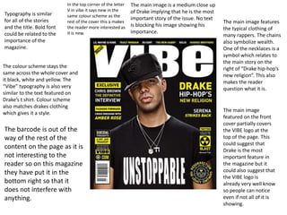
1. Typography is similar
for all of the stories
and the title. Bold font
could be related to the
importance of the
magazine.
In the top corner of the letter
V in vibe it says new in the
same colour scheme as the
rest of the cover this a makes
the reader more interested as
it is new.
The colour scheme stays the
same across the whole cover and
it black, white and yellow. The
“Vibe” typography is also very
similar to the text featured on
Drake’s t shirt. Colour scheme
also matches drakes clothing
which gives it a style.
The main image is a medium close up
of Drake implying that he is the most
important story of the issue. No text
is blocking his image showing his
importance.
The main image features
the typical clothing of
many rappers. The chains
also symbolize wealth.
One of the necklaces is a
symbol which relates to
the main story on the
right of “Drake hip-hop’s
new religion”. This also
makes the reader
question what it is.
The main image
featured on the front
cover partially covers
the VIBE logo at the
top of the page. This
could suggest that
Drake is the most
important feature in
the magazine but it
could also suggest that
the VIBE logo is
already very well know
so people can notice
even if not all of it is
showing.
The barcode is out of the
way of the rest of the
content on the page as it is
not interesting to the
reader so on this magazine
they have put it in the
bottom right so that it
does not interfere with
anything.
2. In this magazine cover
the keep a less
consistent colour
scheme. There a four
main colours red,
black, white, and
navy. The colour
scheme like many of
the other covers from
the same company
resembles the outfit
of the artist on the
cover.
T.I is also featured
wearing a suit showing
his wealth. This also
differs from what a lot of
other rappers featured
in the magazine and
could also represent
how he has changed
since he started rapping.
The trend of covering
the masthead is also on
this cover which shows
that the VIBE logo is
noticeable without all of
the letters showing.
In the bottom right
the puff follows the
same colour scheme
however it is made
more interesting to
the reader by giving it
depth. The
typography is slightly
warped to make the
text look curved
resembling a baseball
thus relating to the
story in the puff. This
makes it aesthetically
pleasing and making
it stand out from the
white suit behind it.
There are two puffs
on the magazine but
they are presented
differently. The one
on the left has a
different colour
scheme compared to
the rest of the cover
which draws attention
to it and also
separates it from the
other main stories.
The story about TI is
also the largest text
on the cover besides
the masthead which
further suggests that
TI is the most
important feature of
the issue of the
magazine.
3. The main image is of Dr
Dre and Kendrick Lamar. By
using these two iconic
rapp3ers they could be
showing the old and new
generation of rappers. This
means that it appeals to a
wide audience as it will
appeal to a wider audience
being old school rap and
modern rap.
The strap line is “exclusive interview”.
This entices the reader to buy the
magazine as the interview can only
be found in it so it makes the reader
feel as though they need to buy it
especially if they are fans of Dr Dre.
The typography of Exclusive interview
is different from the rest of the cover
which draws attraction to it.
The 2 main stories on the
magazine relate to the
main image as well as
they are about Kendrick
Lamar and Dr Dre. The
colours also resemble the
outfits of the two so it
makes it easy to identify
who the story is related to
without reading it.
The stories are also
positioned around the main
image which shows that the
main image takes
precedence over the rest of
the cover.
The Mast Head is a
visualisation of the
name of the
magazine. The mast
head is one of the
largest features of the
cover which relates to
the name XXL. The
use of the red and
white also makes it
contrast thus making
it more eye catching.
The secondary stories are
also following the same
colour scheme and do not
interfere with the main
image
There is another strap line in the top right. This strap line
further incentivises people to pick up and buy the
magazine. The use of the word special makes people
looking at the magazine think that it is worth buying. Also
by saying “collectors issue” it targets people who are
collecting the magazine and makes them feel as if they need
to buy it.
4. The necklaces and cap
are typical features of
rappers and are
recognisable as being
related to the genre.
This also shows the
wealth of the rapper
and makes him seem
important due to the
size of the chains and
rings etc. Diamonds
also symbolize wealth
and a lot of these are
present. The main
image also relates to
what the genre
represents.
The typography stays
consistent
throughout the
contents page with
the main heading
being the largest
text, the sub
headings being in a
serif font and the
stories being in a
sans serif font. All of
the text is white
apart from the VIBE
logo which is black
with a white outline.
Enticing
phrases make
the reader
interested and
wanting to find
out more.
The layout of the
contents is very
simple and easy to
read. There is not a
lot of text thus not
making it
complicated.
5. Mainly Black and
white colour
scheme gives a
minimalistic look.
The clothing of the
artist featured on
the page matches
with the background
making it look as if
she is part of the
background. Her
clothing is also quite
revealing which will
attract a male
audience.
Using a well known
artists makes people
want to buy the
magazine if they are a
fan of the artist as they
want to know why they
are featured in the
magazine.
Typography is the
same as it is for
other issues and
stays consistent
across the page
with the heading
be the largest
text.
The outline of the V
behind contents keeps
branding consistent
throughout the
magazine
The artist’s legs also
resemble the shape of
the v and are inline with
the V in the background
resembling the v from
the name of the
magazine which is
“Vibe”
The main feature of the
contents page is the
woman showing that the
creators of the magazine
believe that she is the
selling point
6. Main image is of a
popular band with the
main member of the
band standing at the
front to attract
readers.
Logo present in top
right constantly
reminding the
reader of the brand.
The colour scheme
is white red and
black giving it a
simplistic look.
Categories located
on the left make it
much easier for the
reader to read as
they are in small
chunks which
makes the magazine
more appealing.
The small
description
under each story
gives the reader
a small insight
into what the
article will be
about.
The every month
section makes the
reader feel as if they
are getting good value
for money thus
encouraging them to
buy the magazine and
buy more in the future
as it says “Every
month” meaning they
will not want to miss
out.
The typography used is very
simple with most of it being
sans serif which gives the
contents page a professional
look. The “Oasis Special” text
is in a different font and
colour which means that the
readers attention is drawn to
it and because it is a popular
band the reader will want to
buy it.
7. Mark Ronson has a whole
page dedicated to him which
shows that the article is very
important and it entirely
focused around him. The
broken trumpets also make
the reader question why they
are broken and intrigues them
about the content of the
article.
The typography is block capitals for the mast
head which instantly informs the reader about
who the artist is. The all black colour scheme
gives the article a sleek look which matches the
clothing and sunglasses that Mark Ronson is
wearing. The first letter of the article is in a very
large font which shows the reader where the
article starts.
The quote
from Mark
Ronson is in
bold which
makes the
reader look at
it first. This
could also
make the
reader want to
read the article
as they may
want to know
what made
him say this/
Mark Ronson is
holding a hammer
which could relate to
the mast head which
says “the revenge”.
This makes the reader
question what the
revenge is.
The
description
in the top
right gives
the reader
some
information
about the
image
8. T.I has a page dedicated to his image showing his
importance. His stance also takes up a lot of room
on the page suggesting that he has a large presence
in the magazine. He also looks as if he is flying
which could be linked to his success, thus linking to
the article about his success in July.
The colour scheme used in the
double page is consistent and
the image and the shapes
compliment each other as they
are very similar covers.
The title of the article also uses a
pun which adds humour to the
magazine. In says summer T.I.ME and
this contains T.I which links the
article to the artist.
The Typography
of the title has
rounded edges
which give the
article a more
informal look.
This also relates
to content of the
article which is
summer which is
supposed to be a
relaxing time.
The colours used are vibrant which gets the
reader’s attention, but they are not too bright
so it gives the page a professional but
colourful look. The bright colours could also
be linked to the content of the article which is
summer time success for T.I so they are
positive colours and summery colours (e.g
green representing plants)
9. The colour scheme is very noticeable in this double page. It is
red white and back. The lighting on Jay-Z is red along with
some of the important text and the large J. the colour scheme
is also very simplistic as it is mainly comprised of 3 colours
which gives the double page a proffesional look.
The RapRadar
name does
not follow the
same colour
scheme of the
two pages
which makes it
stand out to
the reader and
reminds them
if the name.
The large red J covering the text shows that it is
Jay-Z’s article. Its size and colour also draws
your attention straight to the article. It covers
the text but it is transparent allowing the reader
to read the article.
The quote from Jay-Z is with his picture so you
can instantly associate the quote with Jay-Z
without reading it.
The title of the article entices the reader as it
uses the word “exciting”. Also by using such a
well known person to write the article it
makes the reader want to find out about his
opinion.