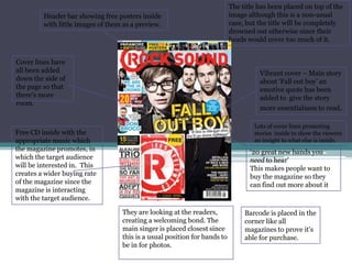
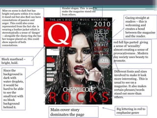
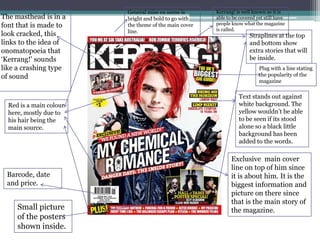
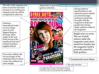
Magazine cover analysis.
Header bar showing free posters inside
with little images of them as a preview.

Cover lines have
all been added
down the side of
the page so that
there's more
room.

The title has been placed on top of the
image although this is a non-usual
case, but the title will be completely
drowned out otherwise since their
heads would cover too much of it.

Vibrant cover – Main story
about ‘Fall out boy’ an
emotive quote has been
added to give the story
more essentialness to read.
Lots of cover lines promoting
stories inside to show the viewers
an insight to what else is inside.

Free CD inside with the
appropriate music which
the magazine promotes, in
which the target audience
will be interested in. This
creates a wider buying rate
of the magazine since the
magazine is interacting
with the target audience.

‘20 great new bands you
need to hear’
This makes people want to
buy the magazine so they
can find out more about it

They are looking at the readers,
creating a welcoming bond. The
main singer is placed closest since
this is a usual position for bands to
be in for photos.

Barcode is placed in the
corner like all
magazines to prove it’s
able for purchase.
Mise en scene is dark but has
bright red parts within it to make
it stand out but also Red can have
connotations of passion and
anger. This could also come
represented from the fact she is
wearing a leather jacket which is
stereotypically a sense of ‘danger’
– alongside the sharp ring she has
her tongue placed on; this could
show aspects of both
connotations.

Header slogan. This is used to
make the magazine stand out
from others.

Gazing straight at
readers – this is
welcoming and
creates a bond
between the magazine
and the reader.
red full lips parted giving
a sense of ‘sexuality’
almost creating a sense of
provocativeness . Modern
day society uses beauty to
promote.

Block masthead –
bright, bold.
Since the
background is
dark with
water droplets,
it would be
hard to be able
to see the
small text with
no block
background
behind it.

Different fonts and sizes
involved to make it look
more interesting . This is
usual to see on a
magazine. It also makes
certain phrases/words
stand out more than
others.

Main cover story
dominates the page

Big lettering in red to
emphasise genre
The masthead is in a
font that is made to
look cracked, this
links to the idea of
onomatopoeia that
‘Kerrang!' sounds
like a crashing type
of sound

Red is a main colour
here, mostly due to
his hair being the
main source.

Barcode, date
and price.

Small picture
of the posters
shown inside.

General mise en scene is
bright and bold to go with
the theme of the main cover
line.

Kerrang! is well known so it is
able to be covered yet still have
people know what the magazine
is called.

Straplines at the top
and bottom show
extra stories that will
be inside.
Plug with a line stating
the popularity of the
magazine

Text stands out against
white background. The
yellow wouldn’t be able
to be seen if its stood
alone so a black little
background has been
added to the words.

Exclusive main cover
line on top of him since
it is about him. It is the
biggest information and
picture on there since
that is the main story of
the magazine.
The title of the magazine has
been covered by her head
because it is a well known
magazine and can still be
recognised as what it is.

Big header to grab the
viewers attention.

Giving audience
opportunities to win
expensive prizes (which
are aimed at target
audience) and giving
free gifts with the
magazine to help lure
people into buying.
Helps audience relate to
the magazine.

Audience
immediately looks
at cover image
since it is the
biggest thing on
the page. Main
singer at the very
front on top of the
masthead and rest
of band members
slightly behind.

Cover lines added with
cut out images of the
celebrities they’re about
to give the audience an
extra insight.

Bright mise en scene.
The use of pink
colours make the
magazine seem more
aimed for females but
the magazine itself is
generally aimed for
both genders.

Countered cover lines.
Bar code and price.
Usually there is text on the footer banner
but there isn’t on this particular magazine.

Magazine Cover Analysis

  • 1.
  • 2.
    Header bar showingfree posters inside with little images of them as a preview. Cover lines have all been added down the side of the page so that there's more room. The title has been placed on top of the image although this is a non-usual case, but the title will be completely drowned out otherwise since their heads would cover too much of it. Vibrant cover – Main story about ‘Fall out boy’ an emotive quote has been added to give the story more essentialness to read. Lots of cover lines promoting stories inside to show the viewers an insight to what else is inside. Free CD inside with the appropriate music which the magazine promotes, in which the target audience will be interested in. This creates a wider buying rate of the magazine since the magazine is interacting with the target audience. ‘20 great new bands you need to hear’ This makes people want to buy the magazine so they can find out more about it They are looking at the readers, creating a welcoming bond. The main singer is placed closest since this is a usual position for bands to be in for photos. Barcode is placed in the corner like all magazines to prove it’s able for purchase.
  • 3.
    Mise en sceneis dark but has bright red parts within it to make it stand out but also Red can have connotations of passion and anger. This could also come represented from the fact she is wearing a leather jacket which is stereotypically a sense of ‘danger’ – alongside the sharp ring she has her tongue placed on; this could show aspects of both connotations. Header slogan. This is used to make the magazine stand out from others. Gazing straight at readers – this is welcoming and creates a bond between the magazine and the reader. red full lips parted giving a sense of ‘sexuality’ almost creating a sense of provocativeness . Modern day society uses beauty to promote. Block masthead – bright, bold. Since the background is dark with water droplets, it would be hard to be able to see the small text with no block background behind it. Different fonts and sizes involved to make it look more interesting . This is usual to see on a magazine. It also makes certain phrases/words stand out more than others. Main cover story dominates the page Big lettering in red to emphasise genre
  • 4.
    The masthead isin a font that is made to look cracked, this links to the idea of onomatopoeia that ‘Kerrang!' sounds like a crashing type of sound Red is a main colour here, mostly due to his hair being the main source. Barcode, date and price. Small picture of the posters shown inside. General mise en scene is bright and bold to go with the theme of the main cover line. Kerrang! is well known so it is able to be covered yet still have people know what the magazine is called. Straplines at the top and bottom show extra stories that will be inside. Plug with a line stating the popularity of the magazine Text stands out against white background. The yellow wouldn’t be able to be seen if its stood alone so a black little background has been added to the words. Exclusive main cover line on top of him since it is about him. It is the biggest information and picture on there since that is the main story of the magazine.
  • 5.
    The title ofthe magazine has been covered by her head because it is a well known magazine and can still be recognised as what it is. Big header to grab the viewers attention. Giving audience opportunities to win expensive prizes (which are aimed at target audience) and giving free gifts with the magazine to help lure people into buying. Helps audience relate to the magazine. Audience immediately looks at cover image since it is the biggest thing on the page. Main singer at the very front on top of the masthead and rest of band members slightly behind. Cover lines added with cut out images of the celebrities they’re about to give the audience an extra insight. Bright mise en scene. The use of pink colours make the magazine seem more aimed for females but the magazine itself is generally aimed for both genders. Countered cover lines. Bar code and price. Usually there is text on the footer banner but there isn’t on this particular magazine.