Downloaded 362 times
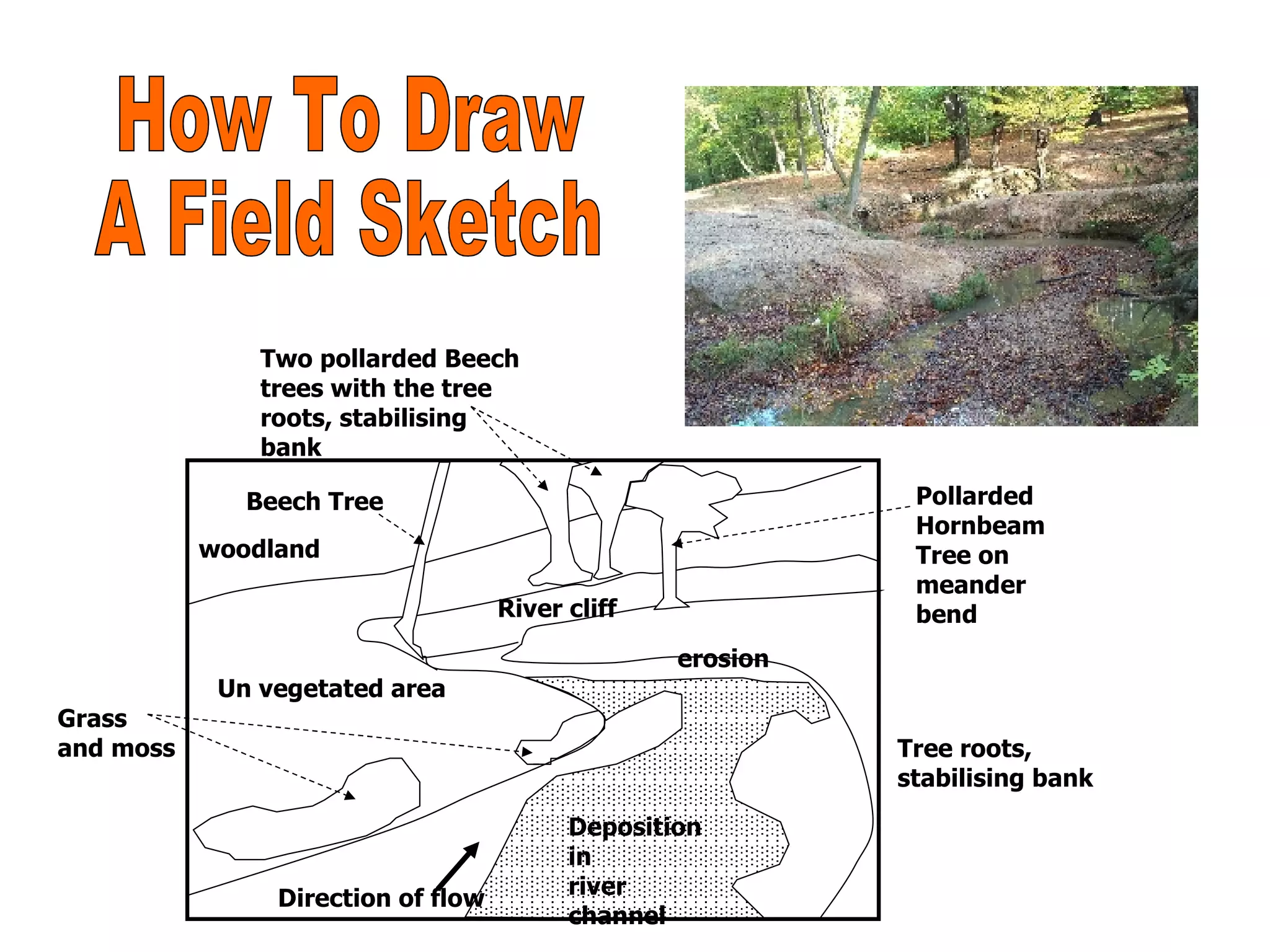
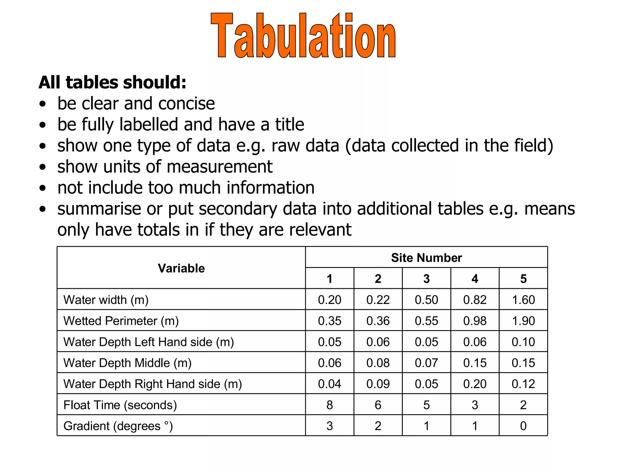
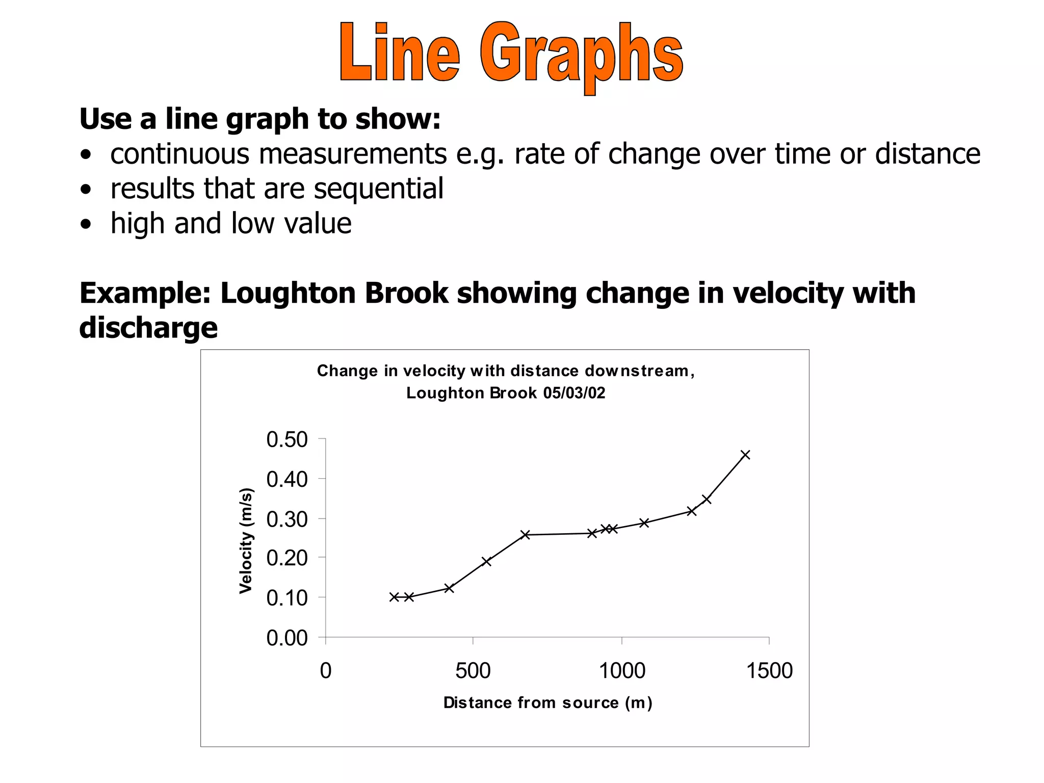
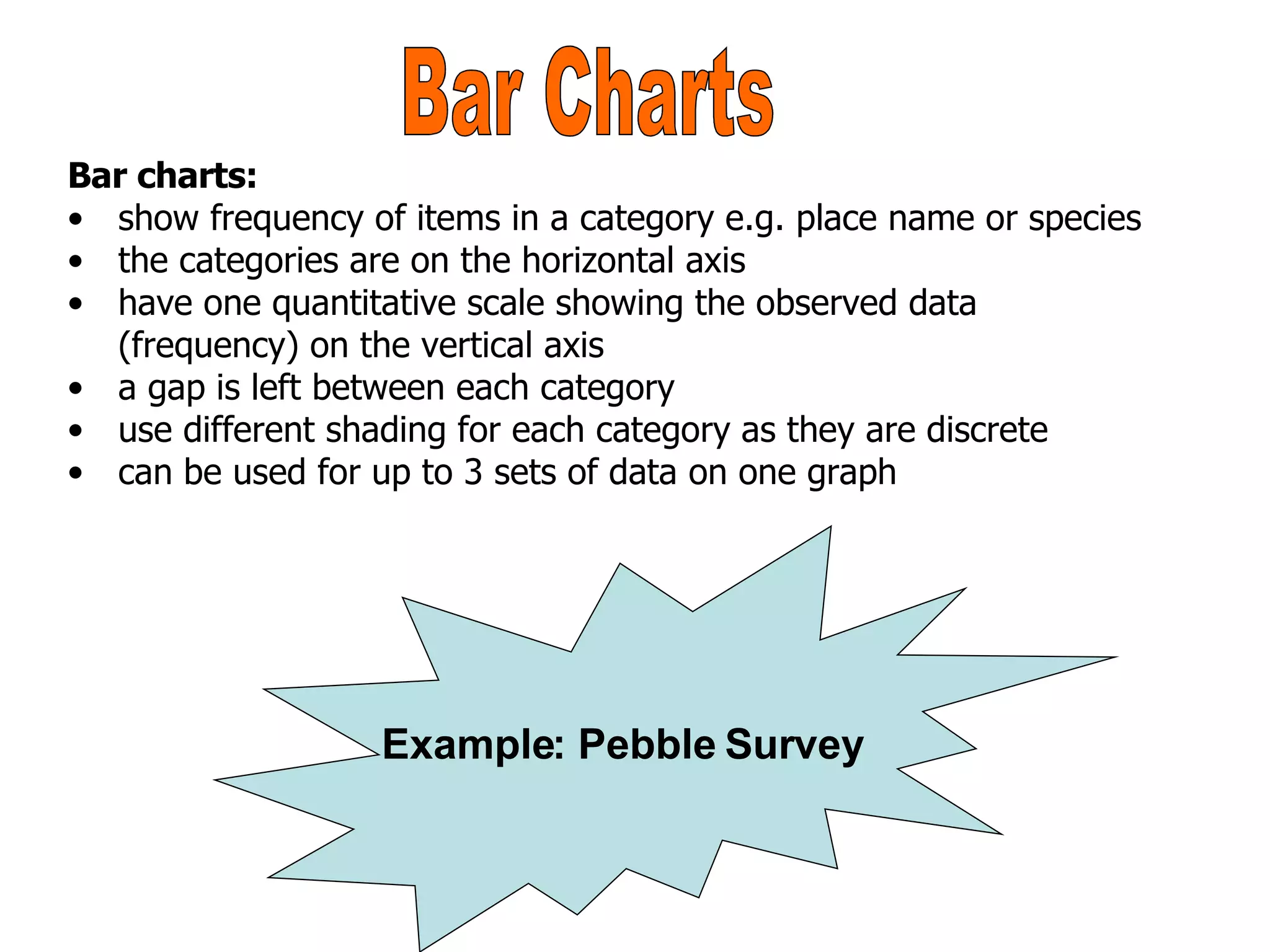
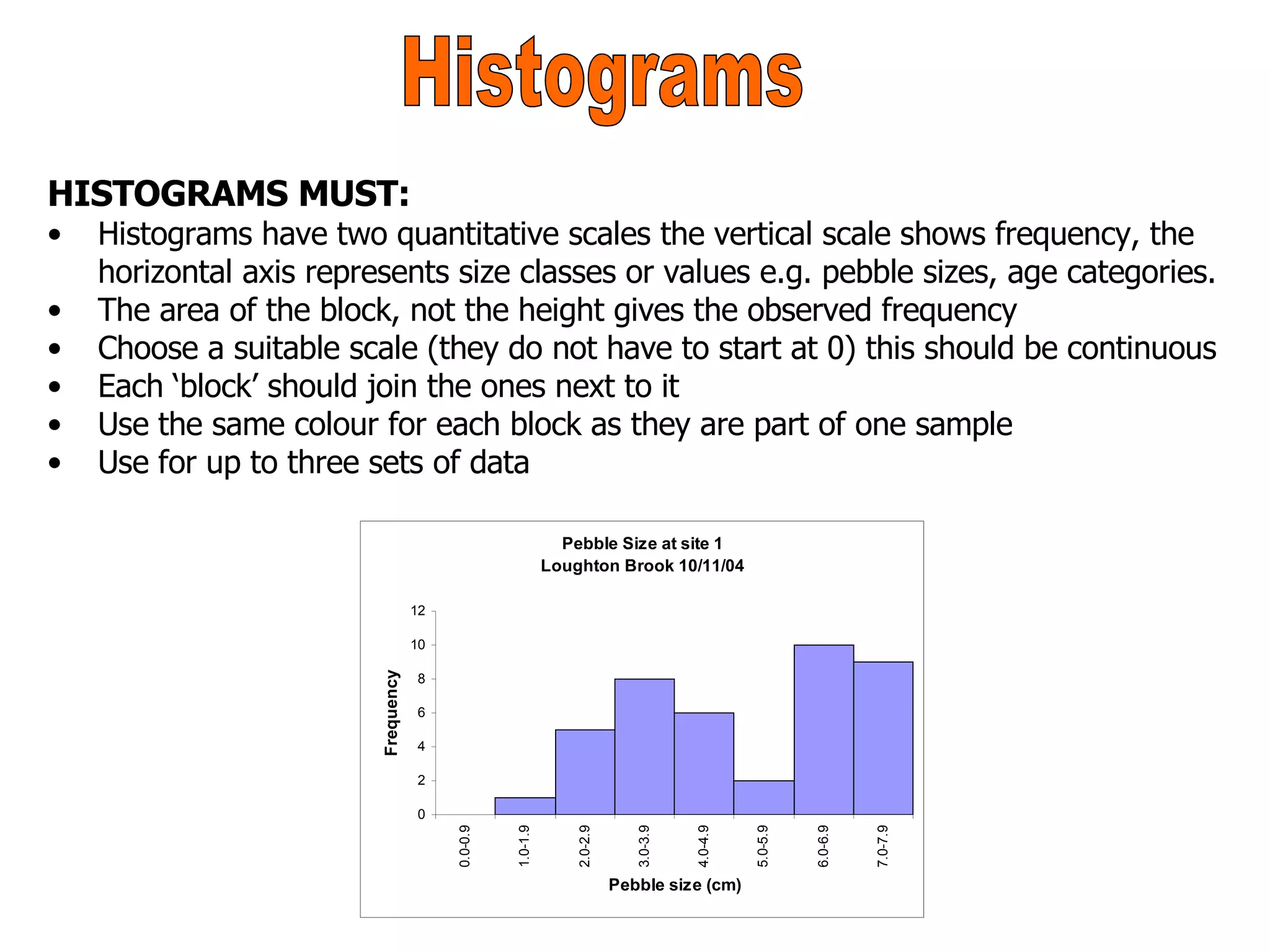
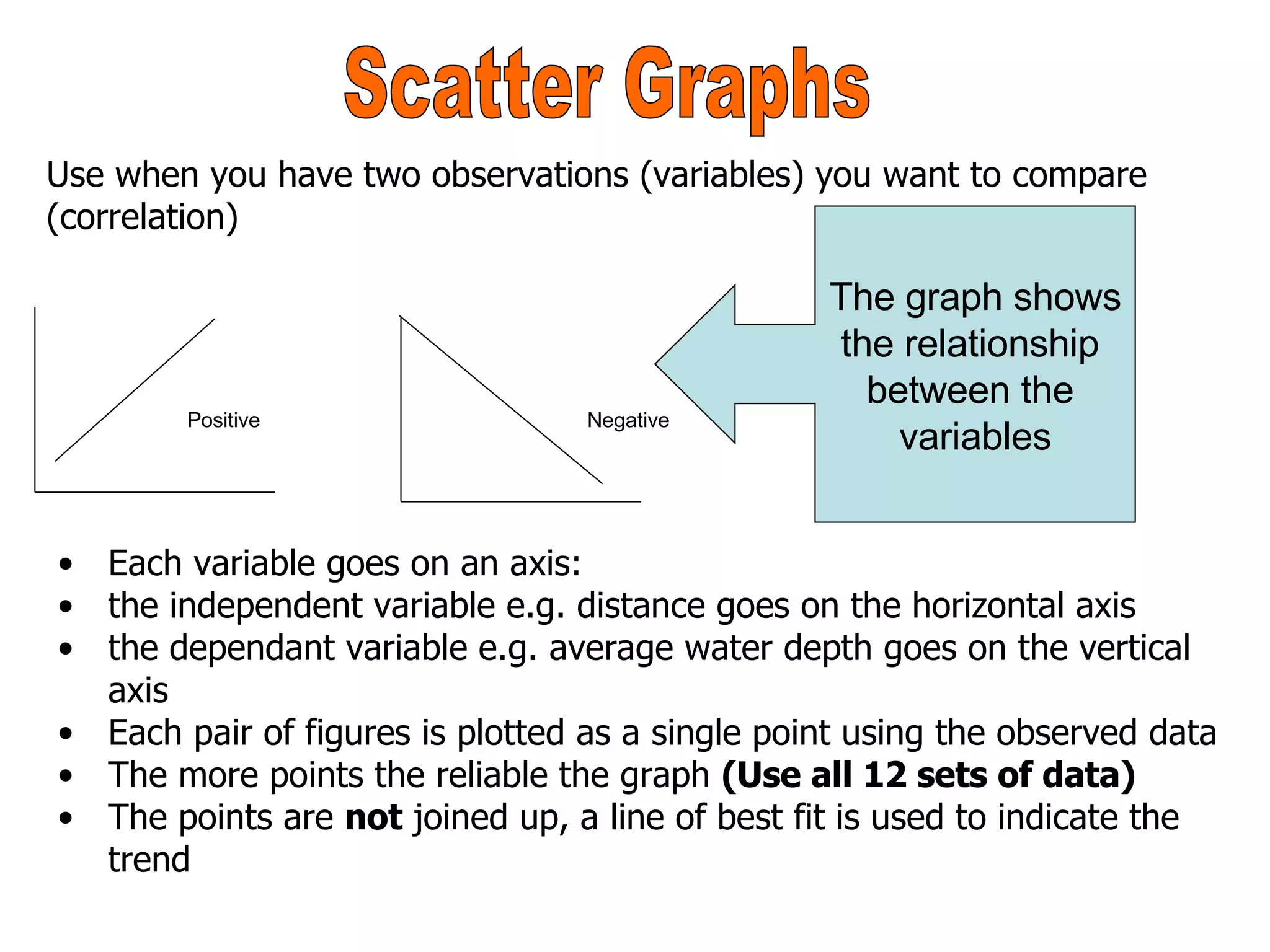
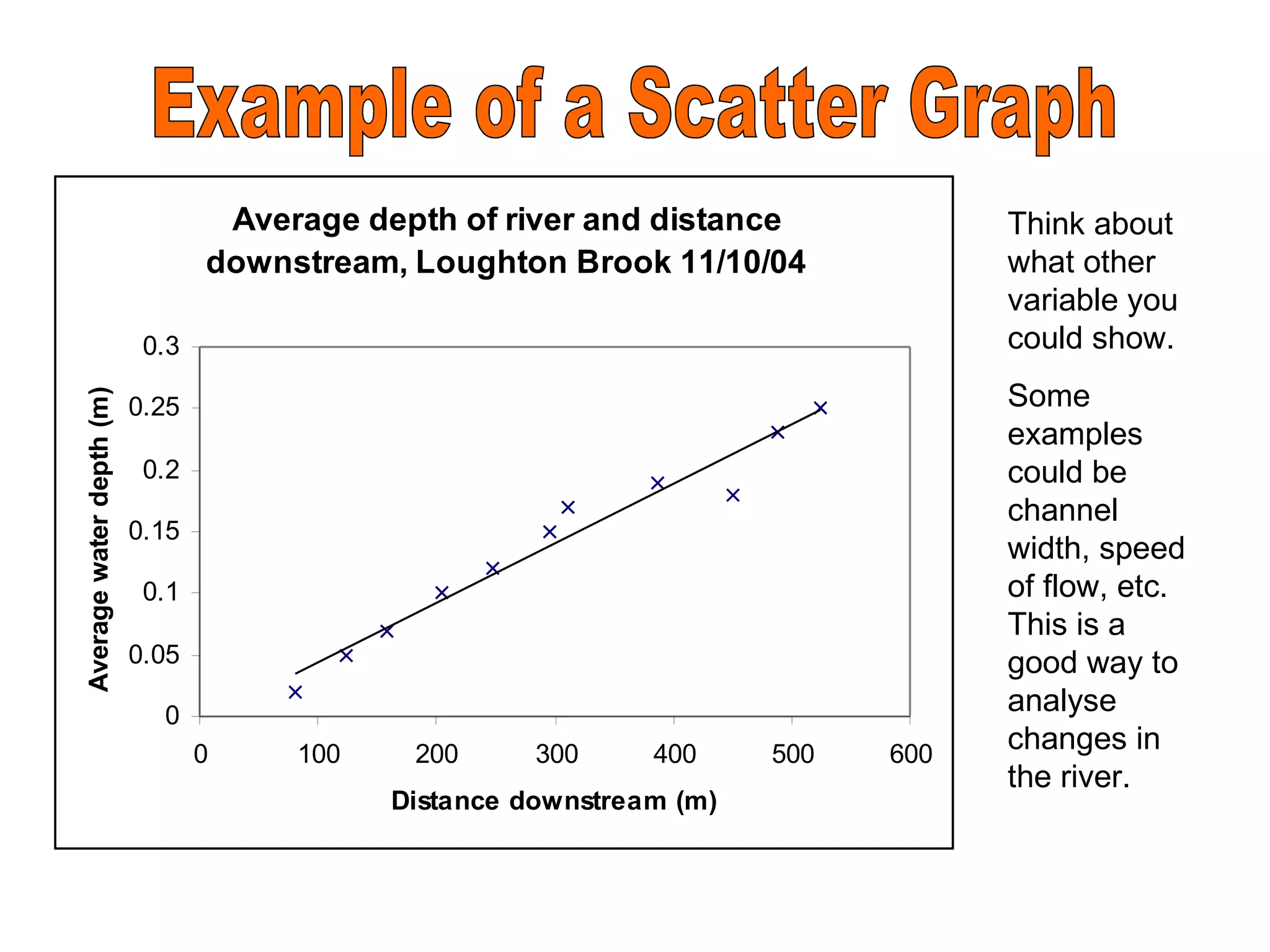
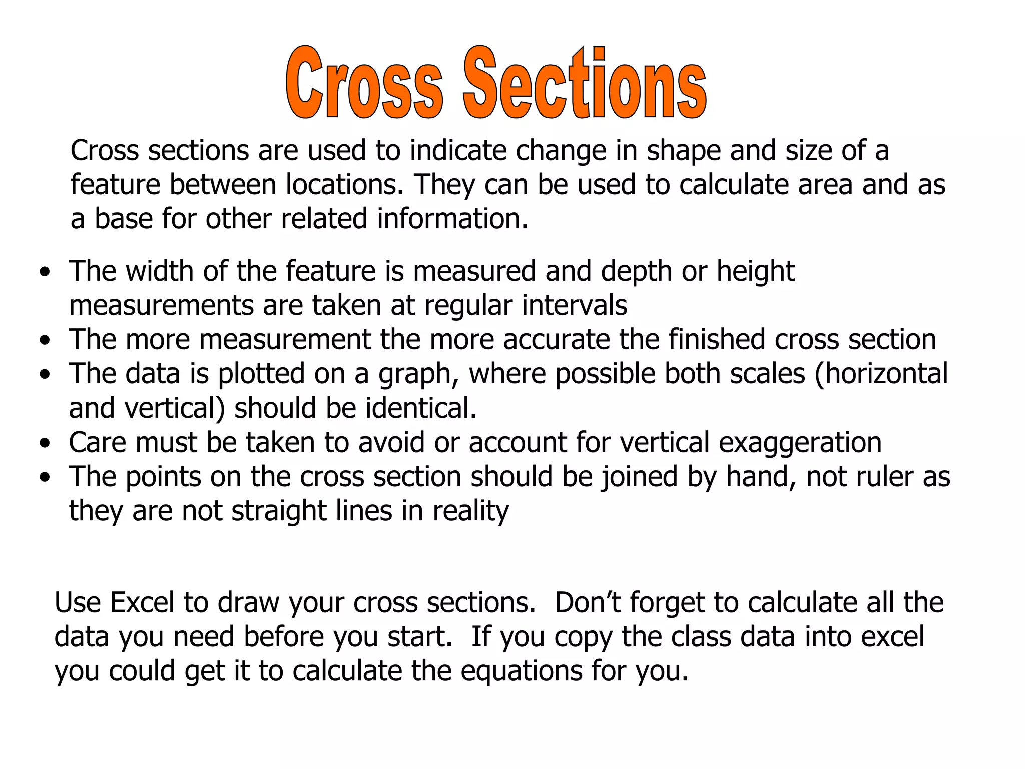
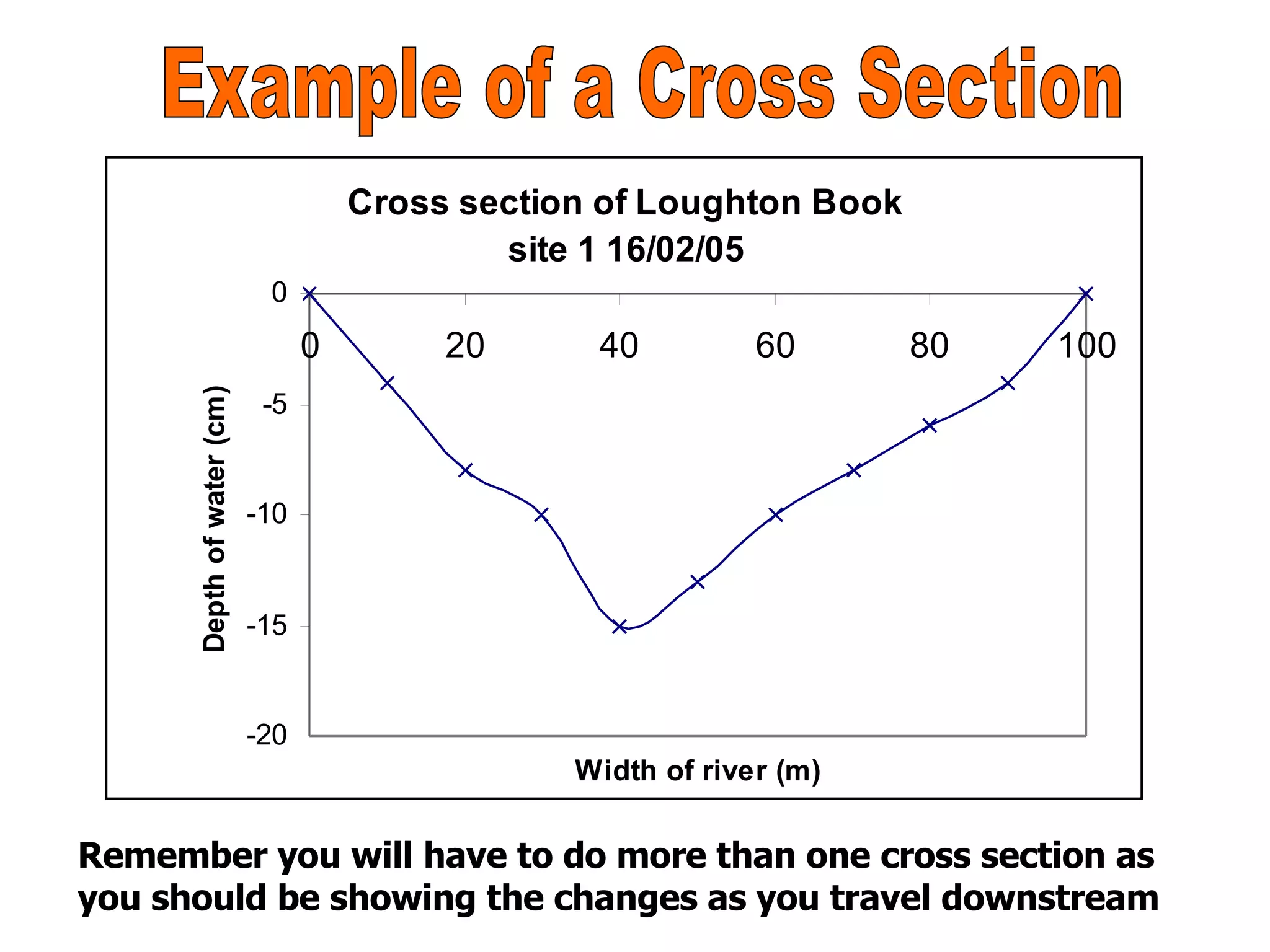

This document provides guidance for students on how to analyze and present field data collected for a GCSE geography class. It explains how to create tables, line graphs, bar charts, histograms, scatter plots, and cross-sections from field measurements. Specific instructions are given for properly labeling, scaling, and formatting each type of graph or chart. Examples are also provided to illustrate the various data visualization techniques.