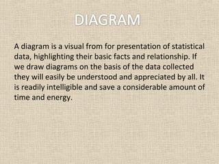
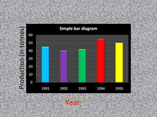
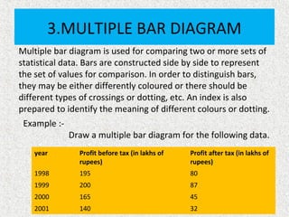
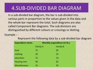
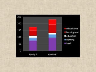
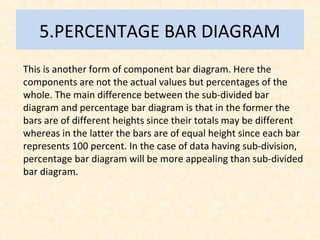
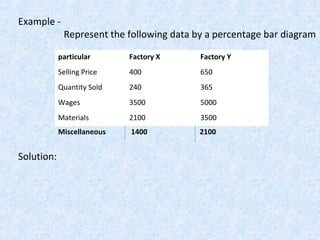
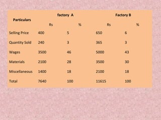
1. Diagrams are a visual way to present statistical data in a simple and easy to understand manner. They make comparisons possible and save time over written reports.
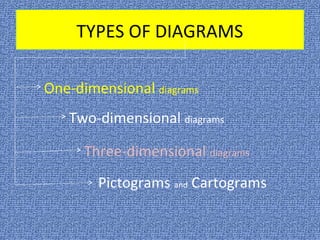
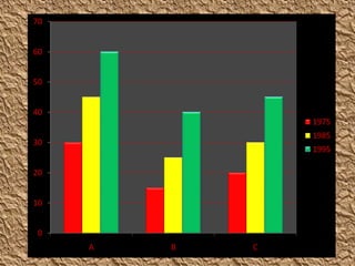
2. There are different types of one-dimensional diagrams including line diagrams, simple bar diagrams, multiple bar diagrams, sub-divided bar diagrams, and percentage bar diagrams. Each diagram type is suited for presenting certain types of data.
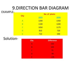
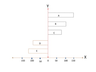
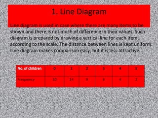
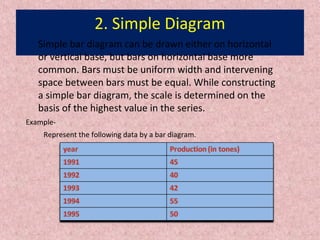
3. Examples of each diagram type are provided to illustrate how different data can be visually depicted in a clear and concise manner using bar lengths, colors, patterns and other visual elements.


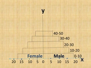
![7.PYRAMID BAR DIAGRAM
Example-
Age [ in year]
Population [in crore]
Male Female
0-10 19 17
10-20 16 14.5
20-30 12.5 11
30-40 10 8
40-50 7 5.5](https://image.slidesharecdn.com/diagrams-171110152909/85/statistics-Diagrams-20-320.jpg)
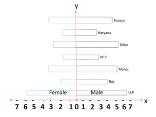
![8.DIRECTIONAL BAR DIAGRAM
States
Persons [in lakhs]
Male Female
U.P 6.5 6
Raj. 4 2
Maha. 5 3.5
M.P 2.9 2.1
Bihar 5 3
Haryana 2.5 2
Punjab 4.5 3.5](https://image.slidesharecdn.com/diagrams-171110152909/85/statistics-Diagrams-22-320.jpg)