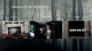
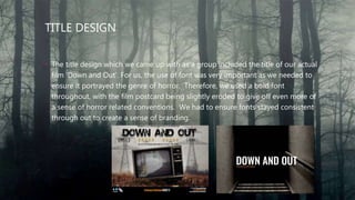
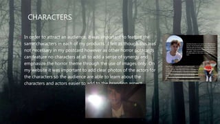
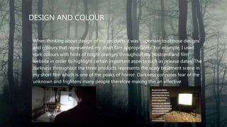
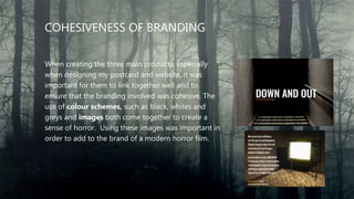
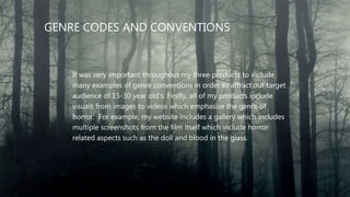
HOW DO ELEMENTS OF YOUR
PRODUCTION WORK
TOGETHER TO CREATE A
SENSE OF BRANDING?
MAX RAGAN
PRODUCTS INTRO
My group and I have created three
main products. Firstly we created the
main product – the short film itself.
Secondly, we each made our own film
postcard (back and front) in order to
market our film. Finally, we all made our
own film website.
IMAGES OF MY PRODUCTS
Postcard Short Film Website
PROMOTIONAL PACKAGE
By creating these three products of a short film, film postcard and
film website, I therefore created my very own promotional package.
A promotional package is a collection of media products and
contents that are created to attract and sell to a target audience.
KEY CONVENTIONS OF A PROMOTIONAL PACKAGE
• The title design of the film should be consistent across the short film, postcard
and website.
• Characters from the film should feature in all three products.
• The design and colour choices being a key representations of the brand.
• Cohesiveness of design branding e.g. fonts
• Clear information about release dates.
TITLE DESIGN
• The title design which we came up with as a group included the title of our actual
film ‘Down and Out’. For us, the use of font was very important as we needed to
ensure it portrayed the genre of horror. Therefore, we used a bold font
throughout, with the film postcard being slightly eroded to give off even more of
a sense of horror related conventions. We had to ensure fonts stayed consistent
through out to create a sense of branding.
CHARACTERS
• In order to attract an audience, it was important to feature the
same characters in each of my products. I felt as though this was
not necessary in my postcard however as other horror postcards
can feature no characters at all to add a sense of synergy and
emphasize the horror theme through the use of images only. On
my website it was important to add clear photos of the actors for
the characters so the audience are able to learn about the
characters and actors easier to add to the branding aspect.
DESIGN AND COLOUR
• When thinking about design of my products it was important to choose designs
and colours that represented my short film appropriately. For example, I used
dark colours with hints of bright oranges throughout my postcard and film
website in order to highlight certain important aspects such as release dates. The
darkness throughout the three products represents the scary basement scene in
my short film which is one of the peaks of horror. Darkness connotes fear of the
unknown and frightens many people therefore making this an effective
convention of my products.
COHESIVENESS OF BRANDING
When creating the three main products, especially
when designing my postcard and website, it was
important for them to link together well and to
ensure that the branding involved was cohesive. The
use of colour schemes, such as black, whites and
greys and images both come together to create a
sense of horror. Using these images was important in
order to add to the brand of a modern horror film.
GENRE CODES AND CONVENTIONS
It was very important throughout my three products to include
many examples of genre conventions in order to attract our target
audience of 15-30 year old's. Firstly, all of my products include
visuals from images to videos which emphasize the genre of
horror. For example, my website includes a gallery which includes
multiple screenshots from the film itself which include horror
related aspects such as the doll and blood in the glass.

Creative Critical Reflection 2

  • 1.
    HOW DO ELEMENTSOF YOUR PRODUCTION WORK TOGETHER TO CREATE A SENSE OF BRANDING? MAX RAGAN
  • 2.
    PRODUCTS INTRO My groupand I have created three main products. Firstly we created the main product – the short film itself. Secondly, we each made our own film postcard (back and front) in order to market our film. Finally, we all made our own film website.
  • 3.
    IMAGES OF MYPRODUCTS Postcard Short Film Website
  • 4.
    PROMOTIONAL PACKAGE By creatingthese three products of a short film, film postcard and film website, I therefore created my very own promotional package. A promotional package is a collection of media products and contents that are created to attract and sell to a target audience.
  • 5.
    KEY CONVENTIONS OFA PROMOTIONAL PACKAGE • The title design of the film should be consistent across the short film, postcard and website. • Characters from the film should feature in all three products. • The design and colour choices being a key representations of the brand. • Cohesiveness of design branding e.g. fonts • Clear information about release dates.
  • 6.
    TITLE DESIGN • Thetitle design which we came up with as a group included the title of our actual film ‘Down and Out’. For us, the use of font was very important as we needed to ensure it portrayed the genre of horror. Therefore, we used a bold font throughout, with the film postcard being slightly eroded to give off even more of a sense of horror related conventions. We had to ensure fonts stayed consistent through out to create a sense of branding.
  • 7.
    CHARACTERS • In orderto attract an audience, it was important to feature the same characters in each of my products. I felt as though this was not necessary in my postcard however as other horror postcards can feature no characters at all to add a sense of synergy and emphasize the horror theme through the use of images only. On my website it was important to add clear photos of the actors for the characters so the audience are able to learn about the characters and actors easier to add to the branding aspect.
  • 8.
    DESIGN AND COLOUR •When thinking about design of my products it was important to choose designs and colours that represented my short film appropriately. For example, I used dark colours with hints of bright oranges throughout my postcard and film website in order to highlight certain important aspects such as release dates. The darkness throughout the three products represents the scary basement scene in my short film which is one of the peaks of horror. Darkness connotes fear of the unknown and frightens many people therefore making this an effective convention of my products.
  • 9.
    COHESIVENESS OF BRANDING Whencreating the three main products, especially when designing my postcard and website, it was important for them to link together well and to ensure that the branding involved was cohesive. The use of colour schemes, such as black, whites and greys and images both come together to create a sense of horror. Using these images was important in order to add to the brand of a modern horror film.
  • 10.
    GENRE CODES ANDCONVENTIONS It was very important throughout my three products to include many examples of genre conventions in order to attract our target audience of 15-30 year old's. Firstly, all of my products include visuals from images to videos which emphasize the genre of horror. For example, my website includes a gallery which includes multiple screenshots from the film itself which include horror related aspects such as the doll and blood in the glass.