Download to read offline

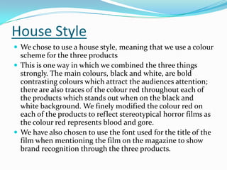
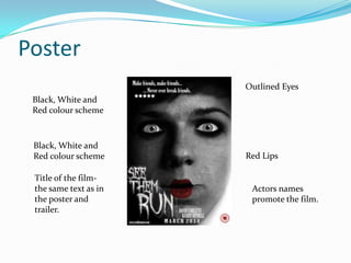
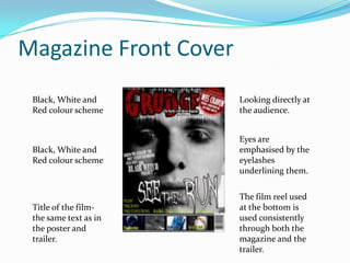
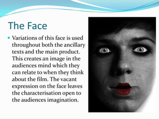

The document discusses how a poster, trailer, and magazine were designed to promote a horror film in an effective and cohesive way. Key elements like a black, white, and red color scheme, the film's title and a recurring quote were used consistently across all three products to create brand recognition. Character faces and eyes were also emphasized in similar ways in the poster and magazine cover to tie the pieces together visually. The combination of repetition of these design elements and imagery helps generate audience intrigue and promotes the film in an integrated marketing strategy.


