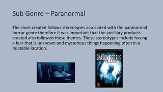
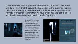
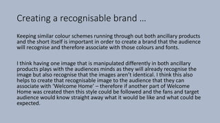
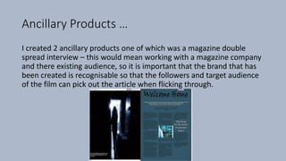
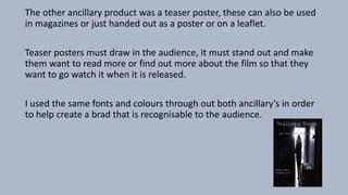
How effective is the
combination of your main
product and ancillary tasks ?
Sub Genre – Paranormal
The short created follows stereotypes associated with the paranormal
horror genre therefore it was important that the ancillary products
created also followed these themes. These stereotypes include having
a fear that is unknown and mysterious things happening often in a
relatable location.
Colour schemes used in paranormal horrors are often very blue toned
and dark. I think that this gives the impression to the audience that the
characters are being watched through a different set of eyes – which is
very appropriate for the film that we have created as the fear is hidden
and the character is trying to work out what’s going on.
On the LEFT is an image
from the paranormal
horror series. On the
RIGHT is an image fro the
film I have created that
was used in my ancillary
product – this shows how
we have followed the
conventions of the
paranormal horror and
how effective the blue
tones are.
Creating a recognisable brand …
Keeping similar colour schemes running through out both ancillary products
and the short itself is important in order to create a brand that the audience
will recognise and therefore associate with those colours and fonts.
I think having one image that is manipulated differently in both ancillary
products plays with the audiences minds as they will already recognise the
image but also recognise that the images aren’t identical. I think this also
helps to create that recognisable image to the audience that they can
associate with ‘Welcome Home’ – therefore if another part of Welcome
Home was created then this style could be followed and the fans and target
audience would know straight away what it would be like and what could be
expected.
Synergy …
The brand that we have created could now work with another company
for example work with a clothing brand in order to create something
such as limited edition merchandise that could be sold along side the
main film itself.
Convergence allows for brands to work together and go further with
the products that they create. An example of a very strong synergy
would be Disney’s Lucas Film With Star Wars, they worked with brands
such as Kellogg's when the latest film was released.
Disney’s Lucas Film and Star Wars …
Working with an everyday brand such as Kellogg's helped them to
advertise and market their new films release. Kellogg’s cereals put light
- saber spoons into there cereal boxes in different colours making them
collectable for the audience, this helps to build up the hype ready for
the release of the film.
This has been done with many films before, an is a good way to draw
the audience in and help to create and build up the excitement before
the new films release.
Ancillary Products …
I created 2 ancillary products one of which was a magazine double
spread interview – this would mean working with a magazine company
and there existing audience, so it is important that the brand that has
been created is recognisable so that the followers and target audience
of the film can pick out the article when flicking through.
The other ancillary product was a teaser poster, these can also be used
in magazines or just handed out as a poster or on a leaflet.
Teaser posters must draw in the audience, it must stand out and make
them want to read more or find out more about the film so that they
want to go watch it when it is released.
I used the same fonts and colours through out both ancillary's in order
to help create a brad that is recognisable to the audience.
What Went well …
• I made sure that I kept with and followed the themes associated with
the paranormal genre that we chose to go with in the main short its
self and then put these conventions into the ancillary products.
• I made links between the ancillary's so that the audience could
associate them with each other as well as linking them with the film
its self.
• Started to create a brand that could continue to be used if a series
was to be created and this brand is now recognisable to the target
audience.
Even Better If …
• The colours use fit with the theme and conventions however the font
isn’t always as clear as I would like because of it. I could look into how
I could change this with out effecting the brand that I would like to
create or changing the colour scheme that fits with the stereotypes.
• I could have used a wider variety of images with in the magazine
article for example behind the scenes images that would have been
an exclusive so the audience would want to read more because it was
information and images that couldn’t be seen anywhere else.

Evaluation question 2

  • 1.
    How effective isthe combination of your main product and ancillary tasks ?
  • 2.
    Sub Genre –Paranormal The short created follows stereotypes associated with the paranormal horror genre therefore it was important that the ancillary products created also followed these themes. These stereotypes include having a fear that is unknown and mysterious things happening often in a relatable location.
  • 3.
    Colour schemes usedin paranormal horrors are often very blue toned and dark. I think that this gives the impression to the audience that the characters are being watched through a different set of eyes – which is very appropriate for the film that we have created as the fear is hidden and the character is trying to work out what’s going on. On the LEFT is an image from the paranormal horror series. On the RIGHT is an image fro the film I have created that was used in my ancillary product – this shows how we have followed the conventions of the paranormal horror and how effective the blue tones are.
  • 4.
    Creating a recognisablebrand … Keeping similar colour schemes running through out both ancillary products and the short itself is important in order to create a brand that the audience will recognise and therefore associate with those colours and fonts. I think having one image that is manipulated differently in both ancillary products plays with the audiences minds as they will already recognise the image but also recognise that the images aren’t identical. I think this also helps to create that recognisable image to the audience that they can associate with ‘Welcome Home’ – therefore if another part of Welcome Home was created then this style could be followed and the fans and target audience would know straight away what it would be like and what could be expected.
  • 5.
    Synergy … The brandthat we have created could now work with another company for example work with a clothing brand in order to create something such as limited edition merchandise that could be sold along side the main film itself. Convergence allows for brands to work together and go further with the products that they create. An example of a very strong synergy would be Disney’s Lucas Film With Star Wars, they worked with brands such as Kellogg's when the latest film was released.
  • 6.
    Disney’s Lucas Filmand Star Wars … Working with an everyday brand such as Kellogg's helped them to advertise and market their new films release. Kellogg’s cereals put light - saber spoons into there cereal boxes in different colours making them collectable for the audience, this helps to build up the hype ready for the release of the film. This has been done with many films before, an is a good way to draw the audience in and help to create and build up the excitement before the new films release.
  • 7.
    Ancillary Products … Icreated 2 ancillary products one of which was a magazine double spread interview – this would mean working with a magazine company and there existing audience, so it is important that the brand that has been created is recognisable so that the followers and target audience of the film can pick out the article when flicking through.
  • 8.
    The other ancillaryproduct was a teaser poster, these can also be used in magazines or just handed out as a poster or on a leaflet. Teaser posters must draw in the audience, it must stand out and make them want to read more or find out more about the film so that they want to go watch it when it is released. I used the same fonts and colours through out both ancillary's in order to help create a brad that is recognisable to the audience.
  • 9.
    What Went well… • I made sure that I kept with and followed the themes associated with the paranormal genre that we chose to go with in the main short its self and then put these conventions into the ancillary products. • I made links between the ancillary's so that the audience could associate them with each other as well as linking them with the film its self. • Started to create a brand that could continue to be used if a series was to be created and this brand is now recognisable to the target audience.
  • 10.
    Even Better If… • The colours use fit with the theme and conventions however the font isn’t always as clear as I would like because of it. I could look into how I could change this with out effecting the brand that I would like to create or changing the colour scheme that fits with the stereotypes. • I could have used a wider variety of images with in the magazine article for example behind the scenes images that would have been an exclusive so the audience would want to read more because it was information and images that couldn’t be seen anywhere else.