Download to read offline
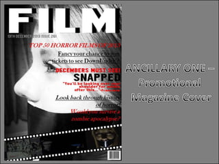
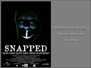
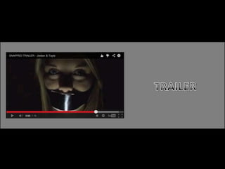
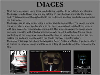
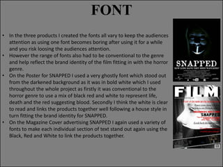
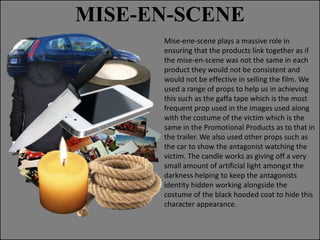
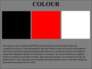
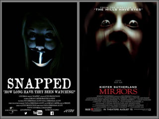
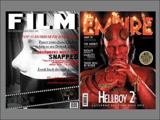
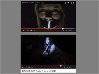

The document discusses how the creator developed ancillary products including a magazine cover and poster to promote their horror film titled "SNAPPED". These ancillary products were designed to have a consistent style and theme that tied them together with the film's trailer. Specifically, the images, fonts, mise-en-scene, and colors used were all designed to be low-key, dark, and focus on the film's victim to create a cohesive brand identity across the different promotional materials. The goal was to appeal to the target horror genre audience and effectively sell the film by linking all the promotional products together through their shared visual elements and themes.


