By Thomas Parr
 My movie poster follows many of the usual codes and
conventions of real media products. The first way in which my
poster follows these forms and conventions is with arguably the
most important factor to any media product and that is with the
title. I believe that an emphasis should be placed upon the title
of any film product as this shall be the core of your brand
identity and so should be a key aspect in drawing attention on
the film poster. The first way in which our film title was similar
to real media products is by the shortness of the title ‘Asylum’.
We believed as a group that a short title would be best as
through our research we discovered that this makes it easily
memorable and also more iconic following the direction of films
such as Psycho, Scream, Saw which are some of the most
successful horror films/ franchises in history. Also once we
decided on what font we were going to use for our title we then
had to choose what colour/colours we were going to use for it.
After reviewing our research we decided to use red as this is a
common convention of horror films due its association and
connotation with blood, danger and violence. This coupled with
the black background of the poster creates an extremely sinister
feel to the poster which links to my original plan to create a
product similar to that of the ‘Smiley’ poster as this was an
independent film created by you tuber Michael Gallagher and so
the success of his film was by and large due to his marketing
scheme and advertising so i felt it would be appropriate to do a
movie poster in a similar fashion. Additionally i decided to
centre the title of the film to draw maximum attention to it and
create this brand identity similarly to successful horror films like
Dead silence and Nightmare on Elm Street.
 The second convention used in real media products I
incorporated in my media product is a tag line. Through my
research I discovered that nearly all horror films use a tag line
and so it seemed the logical response to do so as well. When
deciding on what our tagline should be we again wanted to
make an easily memorable line that is also easily associable to
our film. Following the Marxist theory of the hypodermic
syringe we also wanted our tagline to ‘inject’ the audience with
a sense of fear and mystery to generate interest in our film.
After much discussion we decided that our tag line should be
‘Do you know what the mind does with fear’, this is because
the focus on the mind makes its easily relatable to our film as
it is based in a mental asylum also it us an open ended
question which creates this mystery that we aware aiming for.
However a way in which my media product has challenged
typical forms and conventions of media products is by the
nature of the tagline. Most horror films opt to use a bold
statement as their tagline whereas we chose to use a question.
We done this as mentioned before to create an atmosphere of
mystery surrounding our film.
 Another convention used by real media
products I have used in my media product
is the image. The way in which I have
followed these conventions is by having a
centred image of a character looking
directly into the camera. This has been
seen in horror films such as Dead Silence,
The devil inside and Smiley which was my
main inspiration. I decided this would be
the most effective use of an image as it is
a direct mode of address that is more eye
catching and unnerving to the audience. I
used a slightly low angle shot of the
character to create a more powerful
presence of the character yet edited the
image in photoshop to black and white as
this coupled with the masked villain is
used to further create this mysterious
atmosphere.
 The last few conventions I used in my poster was
information of the film such as the release date and
the official website where they can research
additional content about the film. Also I included
the billing block of the film as this was used in
every horror poster I researched and in similar
fashion made in small in the poster so it does not
draw too much attention away from the other
features.
 My movie magazine I created also follows
many of the forms and conventions of real
media products. First of all I wanted to make
it seem as though Asylum is to be one of the
blockbuster films of the year and so wanted
to use a real magazine out there to create a
sense of reality. Through my research I
found that there come no bigger film
magazines than Empire and so opted to use
the formatting of their magazine as well as
following the majority of their brand identity
ie Masthead.
 Some of the more obvious conventions that
I used in my media product is the barcode
which is a necessity and following the
theme of Empire had the issue date and
price inserted into the space of the M as
seen by Empire magazines in circulation
today. However my magazine was not
designed completely around Empire as I still
wanted it to look like a true horror
magazine to do this I inserted a completely
black background as can be seen in horror
magazines like Fangoria. With black being
associated by fear, menacing and evil.
 More conventions I had used on my
product is cover lines. This is to show
additional content to be found within the
magazine. I made sure that these were
easily noticeable and readable with was
easy enough thank to the dark
background. In addition I found that most
film magazines use at least 3 colours on
their covers so I also used gold on top of
my original black and red from my poster
to secure a brand identity whilst
conforming to real media products. So this
third colour did not look tacky and out of
place I used it on the log line talking about
the Oscars as they are relatable and make
sense being incorporated together.
Additionally following the theme and
formatting of empire I edited my image
through photoshop to slightly cover the
masthead this is a common convention
within Empire as it is an established
company and people can tell by the font
alone who created the magazine and so
more focus can be placed on the image.
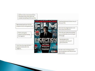
 Film Magazine
As you will see on the next slide of my analysis of the Inception
edition of Empire the main point of the front cover is to sell
the film and draw near all attention to the main film on
display.
Use of a tagline:
this is done to give
a little more of an
insight into the film
to gain attention
This almost acts a
lure in itself as it
draw attention
and interest for
the audience
Issue date and price
included
Loglines
showing
additional
articles in the
magazine
Barcode a
necessary
feature for any
product
Puff: used to entice
the audience
Film title done in
posters font to
establish the brand
identity
Sell line used to draw
interest but also be
relevant to the front
page film
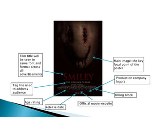
 Film poster
 As you will see on the next slide of my research of the Smiley
movie poster the purpose of the poster is to aid establishing
a brand identity, raise interest in the film and also provide
information about the film.
Official movie website
Release date
Production company
logo’s
Main image: the key
focal point of the
poster
Tag line used
to address
audience
Film title will
be seen in
same font and
format across
all
advertisements
Age rating
Billing block
Main image: the key
focal point of the
poster
Film title
Tag line
Age rating Release date
Official movie website
Production company
logo’sBilling block
 Trailer
 Overall our trailer was very similar to those trailer which we
had researched into. We followed all of the codes and
conventions of normal horror trailer with heavy use of fast
cuts, flashes and fades to black to add emphasis on dramtic
moments. Also similarly to trailers we researched we
established our films theme characters and added to our
brand identity.
 From our initial questionnaire results we
established a target audience, genre of
film that can maximise attention and
income and the focus that is placed on
certain aspects of trailers so we knew
what to emphasise upon and so from
these results we came up with our idea
of Asylum being a psychological horror
that is heavily story orientated aimed at
the late teens as this is what will
generate the most interest for a new
film
5-10 13%
11-15 0%
16-20 38%
21-25 19%
26-30 13%
31-35 0%
36+ 19%
Actors/Actress
es
13%
Special Effects 13%
Plot 50%
Music 13%
Locations 13%
Action 6%
Comedy 0%
Romance 0%
Western 13%
Horror 38%
Thiller 19%
Sport 13%
Drama 0%
Independant 0%
Animated 13%
Age?
Favourite aspect of film?
Favourite genre of film?
 Group feedback
 One of our favourite ways of receiving audience feedback was
by showing groups of students within our target audience our
trailer multiple times and then asked them a series of
questions such as do you follow the narrative? Does anything
not make sense? What do you like/dislike of the trailer? From
this we received lots of helpful feedback and as a result cuts
out and replaced several pieces of film as well as adding our
title slides that can be seen throughout the trailer as this
helps the audience to follow the trailers narrative.
 Research
One of the main technologies I had used in the research of
my products was You tube. You tube was vital for me as it is
the worlds largest video library and so I had an abundance
of horror trailers available to watch so that I could find the
codes and conventions necessary to create a successful
trailer.
Google images was another technology that I had used in
the research of my media products. This was also useful for
me as it allowed me to have unlimited insight into what real
media products such as magazines and posters look like
which provided the inspiration for my products.
Another technology I used in my research stages was Google
Docs. Google docs enabled me to create a questionnaire to
help me establish what I should place emphasis on in my
trailer as well as who my target audience I done this by
Turing each result into a statistic and so created percentages
of each answer as seen earlier in this presentation.
The final technology I used within the research stages was
Blogger. Blogger allowed me to put all of my research into
one area. Also Blogger allows for comments so that on each
research post I cam receive additional feedback which I
found useful.
Planning
During my planning the main technology I used was
Microsoft publisher. I used this to create the layout of how I
was going to create my magazine and poster.
Construction
-For the construction of my movie trailer I used IMovie.
IMovie allowed me to compile and edit all of my film that I
had shot of the course of a couple of weeks at Glenburn
school in Skemsdale. Some of the editing I done in this
program was changing the lighting and contrast of shots
as well as placing effects on them to give a more sinister
feel If they were too bright. As well as this I had to edit the
sound of the trailer in it were too quiet in places as well as
adding non diegetic sound to add emphasis in areas that
required it.
-Another technology I used in the construction of my
products was Adobe Photoshop cs5. This allowed me to
alter and enhance my images as well as fade colours add
shading and text. This was a vital part to the construction
of my poster and magazine as without these they both
would of looked bland and basic.
-Blogger was also a useful part of my construction as it
enabled me to post drafts and receive feedback as too
what to further alter once I went back into Photoshop as
well as this it allowed me to keep all of my work in one
place so I could look back on them if I was not happy how
they turned out.
-The final technology I used during the construction of my
products was You tube. This allowed me once completing
my film trailer to post it online where it can be seen by
anyone and also receive feedback through the comments
section and the thumbs up/down feature.

Media evaluation

  • 1.
  • 2.
     My movieposter follows many of the usual codes and conventions of real media products. The first way in which my poster follows these forms and conventions is with arguably the most important factor to any media product and that is with the title. I believe that an emphasis should be placed upon the title of any film product as this shall be the core of your brand identity and so should be a key aspect in drawing attention on the film poster. The first way in which our film title was similar to real media products is by the shortness of the title ‘Asylum’. We believed as a group that a short title would be best as through our research we discovered that this makes it easily memorable and also more iconic following the direction of films such as Psycho, Scream, Saw which are some of the most successful horror films/ franchises in history. Also once we decided on what font we were going to use for our title we then had to choose what colour/colours we were going to use for it. After reviewing our research we decided to use red as this is a common convention of horror films due its association and connotation with blood, danger and violence. This coupled with the black background of the poster creates an extremely sinister feel to the poster which links to my original plan to create a product similar to that of the ‘Smiley’ poster as this was an independent film created by you tuber Michael Gallagher and so the success of his film was by and large due to his marketing scheme and advertising so i felt it would be appropriate to do a movie poster in a similar fashion. Additionally i decided to centre the title of the film to draw maximum attention to it and create this brand identity similarly to successful horror films like Dead silence and Nightmare on Elm Street.
  • 3.
     The secondconvention used in real media products I incorporated in my media product is a tag line. Through my research I discovered that nearly all horror films use a tag line and so it seemed the logical response to do so as well. When deciding on what our tagline should be we again wanted to make an easily memorable line that is also easily associable to our film. Following the Marxist theory of the hypodermic syringe we also wanted our tagline to ‘inject’ the audience with a sense of fear and mystery to generate interest in our film. After much discussion we decided that our tag line should be ‘Do you know what the mind does with fear’, this is because the focus on the mind makes its easily relatable to our film as it is based in a mental asylum also it us an open ended question which creates this mystery that we aware aiming for. However a way in which my media product has challenged typical forms and conventions of media products is by the nature of the tagline. Most horror films opt to use a bold statement as their tagline whereas we chose to use a question. We done this as mentioned before to create an atmosphere of mystery surrounding our film.
  • 4.
     Another conventionused by real media products I have used in my media product is the image. The way in which I have followed these conventions is by having a centred image of a character looking directly into the camera. This has been seen in horror films such as Dead Silence, The devil inside and Smiley which was my main inspiration. I decided this would be the most effective use of an image as it is a direct mode of address that is more eye catching and unnerving to the audience. I used a slightly low angle shot of the character to create a more powerful presence of the character yet edited the image in photoshop to black and white as this coupled with the masked villain is used to further create this mysterious atmosphere.
  • 5.
     The lastfew conventions I used in my poster was information of the film such as the release date and the official website where they can research additional content about the film. Also I included the billing block of the film as this was used in every horror poster I researched and in similar fashion made in small in the poster so it does not draw too much attention away from the other features.
  • 6.
     My moviemagazine I created also follows many of the forms and conventions of real media products. First of all I wanted to make it seem as though Asylum is to be one of the blockbuster films of the year and so wanted to use a real magazine out there to create a sense of reality. Through my research I found that there come no bigger film magazines than Empire and so opted to use the formatting of their magazine as well as following the majority of their brand identity ie Masthead.
  • 7.
     Some ofthe more obvious conventions that I used in my media product is the barcode which is a necessity and following the theme of Empire had the issue date and price inserted into the space of the M as seen by Empire magazines in circulation today. However my magazine was not designed completely around Empire as I still wanted it to look like a true horror magazine to do this I inserted a completely black background as can be seen in horror magazines like Fangoria. With black being associated by fear, menacing and evil.
  • 8.
     More conventionsI had used on my product is cover lines. This is to show additional content to be found within the magazine. I made sure that these were easily noticeable and readable with was easy enough thank to the dark background. In addition I found that most film magazines use at least 3 colours on their covers so I also used gold on top of my original black and red from my poster to secure a brand identity whilst conforming to real media products. So this third colour did not look tacky and out of place I used it on the log line talking about the Oscars as they are relatable and make sense being incorporated together. Additionally following the theme and formatting of empire I edited my image through photoshop to slightly cover the masthead this is a common convention within Empire as it is an established company and people can tell by the font alone who created the magazine and so more focus can be placed on the image.
  • 9.
     Film Magazine Asyou will see on the next slide of my analysis of the Inception edition of Empire the main point of the front cover is to sell the film and draw near all attention to the main film on display.
  • 11.
    Use of atagline: this is done to give a little more of an insight into the film to gain attention This almost acts a lure in itself as it draw attention and interest for the audience Issue date and price included Loglines showing additional articles in the magazine Barcode a necessary feature for any product Puff: used to entice the audience Film title done in posters font to establish the brand identity Sell line used to draw interest but also be relevant to the front page film
  • 12.
     Film poster As you will see on the next slide of my research of the Smiley movie poster the purpose of the poster is to aid establishing a brand identity, raise interest in the film and also provide information about the film.
  • 13.
    Official movie website Releasedate Production company logo’s Main image: the key focal point of the poster Tag line used to address audience Film title will be seen in same font and format across all advertisements Age rating Billing block
  • 14.
    Main image: thekey focal point of the poster Film title Tag line Age rating Release date Official movie website Production company logo’sBilling block
  • 15.
     Trailer  Overallour trailer was very similar to those trailer which we had researched into. We followed all of the codes and conventions of normal horror trailer with heavy use of fast cuts, flashes and fades to black to add emphasis on dramtic moments. Also similarly to trailers we researched we established our films theme characters and added to our brand identity.
  • 16.
     From ourinitial questionnaire results we established a target audience, genre of film that can maximise attention and income and the focus that is placed on certain aspects of trailers so we knew what to emphasise upon and so from these results we came up with our idea of Asylum being a psychological horror that is heavily story orientated aimed at the late teens as this is what will generate the most interest for a new film 5-10 13% 11-15 0% 16-20 38% 21-25 19% 26-30 13% 31-35 0% 36+ 19% Actors/Actress es 13% Special Effects 13% Plot 50% Music 13% Locations 13% Action 6% Comedy 0% Romance 0% Western 13% Horror 38% Thiller 19% Sport 13% Drama 0% Independant 0% Animated 13% Age? Favourite aspect of film? Favourite genre of film?
  • 17.
     Group feedback One of our favourite ways of receiving audience feedback was by showing groups of students within our target audience our trailer multiple times and then asked them a series of questions such as do you follow the narrative? Does anything not make sense? What do you like/dislike of the trailer? From this we received lots of helpful feedback and as a result cuts out and replaced several pieces of film as well as adding our title slides that can be seen throughout the trailer as this helps the audience to follow the trailers narrative.
  • 18.
     Research One ofthe main technologies I had used in the research of my products was You tube. You tube was vital for me as it is the worlds largest video library and so I had an abundance of horror trailers available to watch so that I could find the codes and conventions necessary to create a successful trailer. Google images was another technology that I had used in the research of my media products. This was also useful for me as it allowed me to have unlimited insight into what real media products such as magazines and posters look like which provided the inspiration for my products. Another technology I used in my research stages was Google Docs. Google docs enabled me to create a questionnaire to help me establish what I should place emphasis on in my trailer as well as who my target audience I done this by Turing each result into a statistic and so created percentages of each answer as seen earlier in this presentation. The final technology I used within the research stages was Blogger. Blogger allowed me to put all of my research into one area. Also Blogger allows for comments so that on each research post I cam receive additional feedback which I found useful. Planning During my planning the main technology I used was Microsoft publisher. I used this to create the layout of how I was going to create my magazine and poster.
  • 19.
    Construction -For the constructionof my movie trailer I used IMovie. IMovie allowed me to compile and edit all of my film that I had shot of the course of a couple of weeks at Glenburn school in Skemsdale. Some of the editing I done in this program was changing the lighting and contrast of shots as well as placing effects on them to give a more sinister feel If they were too bright. As well as this I had to edit the sound of the trailer in it were too quiet in places as well as adding non diegetic sound to add emphasis in areas that required it. -Another technology I used in the construction of my products was Adobe Photoshop cs5. This allowed me to alter and enhance my images as well as fade colours add shading and text. This was a vital part to the construction of my poster and magazine as without these they both would of looked bland and basic. -Blogger was also a useful part of my construction as it enabled me to post drafts and receive feedback as too what to further alter once I went back into Photoshop as well as this it allowed me to keep all of my work in one place so I could look back on them if I was not happy how they turned out. -The final technology I used during the construction of my products was You tube. This allowed me once completing my film trailer to post it online where it can be seen by anyone and also receive feedback through the comments section and the thumbs up/down feature.