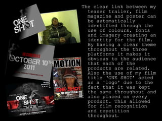
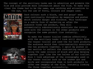
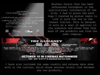
The teaser trailer, film magazine cover, and film poster for the project "ONE SHOT" were effectively combined through consistent use of colors, fonts, imagery, and the film title to create a clear identity and promote recognition across platforms. Dark colors like black, red, and gray were used throughout to connote danger and violence associated with the film's narrative. Still shots from the trailer were also featured on the magazine cover and poster to interconnect the projects. Placement of the same logos and credits further strengthened the direct links between the works.