
More Related Content
What's hot
What's hot (20)
Viewers also liked
Similar to Question 2
Similar to Question 2 (20)
More from EllisHackett
Recently uploaded
Recently uploaded (20)
Question 2
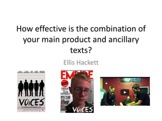
- 1. How effective is the combination of your main product and ancillary texts? Ellis Hackett
- 2. To give our audiences instant recognition we used the same actors across all of our products, although they cannot be seen on the poster as we have used silhouettes. We chose one of the main actors in the trailer to be on our front cover which emphasises how important his role is in the development of the film. This creates a continuity across our products so that they can be recognised as fitting together. ACTORS
- 3. SETTING Across our magazine and in our trailer we tried to use backgrounds or settings which properly reflected the genre. The establishing shot in our trailer is of a bleak/grey scene of flats where the majority of the film would take place and so we also used the same colourings and a similar city landscape on our magazine so that it showed how the magazine had been altered to suit our particularly film.
- 4. COLOUR On all of the shots in our trailer we added a filter layer so that the shots were made darker, the colours becoming more dull so that they all blended together in the shot. We used this across all of our products, having the majority of the colours being used as grey, white and black. This helps to emphasise the crime/thriller aspect of our trailer as it presents our film as altogether being quite dark and full of mystery, leaving the actors as the only particularly eye catching figures across the products.
- 5. FONTS Across all of our products we used the same font ‘Crimes Times Six’ as it was the font we chose to use for the title of the film. Using the same font across all three products helps to make our products successful as a marketing campaign as it can be recognised by everyone who sees it and will create a general image of the film by linking all of the information which is being presented across a variety of products. The only fault that could be found is the use of different colours for the title, as it may be hard for people to recognise them as belonging to the same product.
- 6. SHOTS We used the same shot in our poster and trailer. We used the last shot of our group from the end of the trailer for our poster. Even though we used silhouette’s on our poster it can easily be recognised as being the same shot from our trailer as it is the only clip in the trailer where all of the group are standing together in a line. By using the same shot it helped us to develop an array of skills and because we were able to use the same image for two products it means that the key points of our film are addressed: there are five friends involved in criminal activity, yet there is something more dangerous that is about to come.
- 7. PRODUCTION AND DISTRIBUTION COMPANIES In order for us to show continuity we used the logos of our production company and distribution company (Castle Rock and Warner Bros.) on both our trailer and poster. These symbols already have instant recognition by people, and so by including them on two of our products we are actively improving the opinion of our work as it is showing our work to be something worthy of companies with an already good reputation. It is expected for the companies to be marketed across a product they have put money towards and so this is creating a professional look to our work and making both our poster and our trailer look as it should.