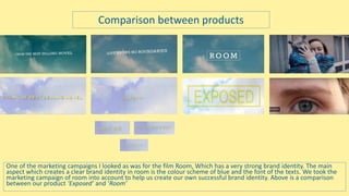
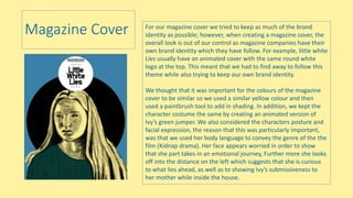
How effective is the combination of your
main product and ancillary texts?
By Amy Keen
Importance of Brand Identity in Film Marketing
• Brand identity helps establish the product, It helps to the make the product
recognizable and easy to find. Brand identity has various features such as colours,
text, cast, title and tagline which link all marketing strategies together.
• In addition, Brand identity gives information on the product such as the genre of
the film, the narrative, the representation characters and the overall way the
producers wants to address the audience. It is very important that the brand
identity is kept consistent, as otherwise the audience may become confused
about the narrative of the story which will reduce how successful the film will be.
• When marketing a film the 3 main marketing tools used are Teaser trailers,
Posters and magazine covers.
One of the marketing campaigns I looked as was for the film Room, Which has a very strong brand identity. The main
aspect which creates a clear brand identity in room is the colour scheme of blue and the font of the texts. We took the
marketing campaign of room into account to help us create our own successful brand identity. Above is a comparison
between our product ‘Exposed’ and ‘Room’
Comparison between products
Room Brand Identity: Poster and teaser trailer
The room marketing campaign has
many features that link all of the
products together. One of these
features are the title used on the
poster and in the teaser trailer. Both
products use the same font and the
same graphic style. Despite the colours
being different this strongly links the
two products together.
The Graphics used on the titles in
room ae one of the main aspects that
link the products together. The
narrative of the story is shown
through the graphics as the corner
represents the room and the sky
represents their freedom. The Film
products are also linked to the book
as both the poster and the trailer say
‘From the best selling novel’.
The tagline is used in both
products.
Lastly, the character and
costume remain consistent. The
character are hugging in both
products Which suggest the
narrative of the story by
showing the relationship of the
characters. They are also
wearing the same costume
which shows the Identity of the
characters
Our Brand identity: Exposed
The main aspect that we wanted to keep consistent
was text colour. We have been consistent with the
colour yellow to help build a clear brand identity.
We have also used the same text throughout so
that the audience can quickly identify the film. In
both the trailer and the poster we have said that
the film from the best selling novel which not only
builds identity but also acts as a selling point and
connects with the already existing audience.
A key part of the narrative is that the character Ivy
has been locked away in her house her whole life.
We decided to show this by using the idea of the
key hole. We have done this by putting an image of
a keyhole in Ivy’s eye. This is also shown in the
teaser trailer as we have a clip of Ivy being locked
inside her room. In addition, the poster has images
of autumn trees to show Ivy’s freedom and covey
how the story is about her escape. Once again this
links to the trailer where Ivy looks over the outside
world
In order for the identity of the teaser trailer and the
poster to remain consistent, we decided to use an
image of ivy’s eye in both products. This was done
to show the genre and narrative of the films, as it
portrays to the audience that the story is shown
through ivy’s point of view, and introduces the
audience to her character.
Much like Room we have used the same font and
graphics style In both of our products. We decided
to do the as the name is a very important aspect in
the marketing campaign. The title needs to stand
out and be recognizable to that the audience know
how to find the film.
We have used the tagline in both product to
give the audience information about the
narrative and the genre of the film being a
Kidnap drama.
Magazine Cover For our magazine cover we tried to keep as much of the brand
identity as possible; however, when creating a magazine cover, the
overall look is out of our control as magazine companies have their
own brand identity which they have follow. For example, little white
Lies usually have an animated cover with the same round white
logo at the top. This meant that we had to find away to follow this
theme while also trying to keep our own brand identity.
We thought that it was important for the colours of the magazine
cover to be similar so we used a similar yellow colour and then
used a paintbrush tool to add in shading. In addition, we kept the
character costume the same by creating an animated version of
Ivy’s green jumper. We also considered the characters posture and
facial expression, the reason that this was particularly important,
was that we used her body language to convey the genre of the the
film (Kidnap drama). Her face appears worried in order to show
that she part takes in an emotional journey, Further more she looks
off into the distance on the left which suggests that she is curious
to what lies ahead, as well as to showing Ivy’s submissiveness to
her mother while inside the house.
Clear message across products
• Our main target audience is Females 15-24 this meant that we
needed to create a brand identity that would appeal to people of
those ages.
• Across products, we also needed to convey that the film was a kidnap
drama, some of the characteristics of Ivy’s character as well as
suggest the narrative of the story.
• I think that we successfully achieved this by using the relevant
features of the colours, the text, the cast, the titles and the tagline.

Question 2 (amy keen) (1)

  • 1.
    How effective isthe combination of your main product and ancillary texts? By Amy Keen
  • 2.
    Importance of BrandIdentity in Film Marketing • Brand identity helps establish the product, It helps to the make the product recognizable and easy to find. Brand identity has various features such as colours, text, cast, title and tagline which link all marketing strategies together. • In addition, Brand identity gives information on the product such as the genre of the film, the narrative, the representation characters and the overall way the producers wants to address the audience. It is very important that the brand identity is kept consistent, as otherwise the audience may become confused about the narrative of the story which will reduce how successful the film will be. • When marketing a film the 3 main marketing tools used are Teaser trailers, Posters and magazine covers.
  • 3.
    One of themarketing campaigns I looked as was for the film Room, Which has a very strong brand identity. The main aspect which creates a clear brand identity in room is the colour scheme of blue and the font of the texts. We took the marketing campaign of room into account to help us create our own successful brand identity. Above is a comparison between our product ‘Exposed’ and ‘Room’ Comparison between products
  • 4.
    Room Brand Identity:Poster and teaser trailer The room marketing campaign has many features that link all of the products together. One of these features are the title used on the poster and in the teaser trailer. Both products use the same font and the same graphic style. Despite the colours being different this strongly links the two products together. The Graphics used on the titles in room ae one of the main aspects that link the products together. The narrative of the story is shown through the graphics as the corner represents the room and the sky represents their freedom. The Film products are also linked to the book as both the poster and the trailer say ‘From the best selling novel’. The tagline is used in both products. Lastly, the character and costume remain consistent. The character are hugging in both products Which suggest the narrative of the story by showing the relationship of the characters. They are also wearing the same costume which shows the Identity of the characters
  • 5.
    Our Brand identity:Exposed The main aspect that we wanted to keep consistent was text colour. We have been consistent with the colour yellow to help build a clear brand identity. We have also used the same text throughout so that the audience can quickly identify the film. In both the trailer and the poster we have said that the film from the best selling novel which not only builds identity but also acts as a selling point and connects with the already existing audience. A key part of the narrative is that the character Ivy has been locked away in her house her whole life. We decided to show this by using the idea of the key hole. We have done this by putting an image of a keyhole in Ivy’s eye. This is also shown in the teaser trailer as we have a clip of Ivy being locked inside her room. In addition, the poster has images of autumn trees to show Ivy’s freedom and covey how the story is about her escape. Once again this links to the trailer where Ivy looks over the outside world In order for the identity of the teaser trailer and the poster to remain consistent, we decided to use an image of ivy’s eye in both products. This was done to show the genre and narrative of the films, as it portrays to the audience that the story is shown through ivy’s point of view, and introduces the audience to her character. Much like Room we have used the same font and graphics style In both of our products. We decided to do the as the name is a very important aspect in the marketing campaign. The title needs to stand out and be recognizable to that the audience know how to find the film. We have used the tagline in both product to give the audience information about the narrative and the genre of the film being a Kidnap drama.
  • 6.
    Magazine Cover Forour magazine cover we tried to keep as much of the brand identity as possible; however, when creating a magazine cover, the overall look is out of our control as magazine companies have their own brand identity which they have follow. For example, little white Lies usually have an animated cover with the same round white logo at the top. This meant that we had to find away to follow this theme while also trying to keep our own brand identity. We thought that it was important for the colours of the magazine cover to be similar so we used a similar yellow colour and then used a paintbrush tool to add in shading. In addition, we kept the character costume the same by creating an animated version of Ivy’s green jumper. We also considered the characters posture and facial expression, the reason that this was particularly important, was that we used her body language to convey the genre of the the film (Kidnap drama). Her face appears worried in order to show that she part takes in an emotional journey, Further more she looks off into the distance on the left which suggests that she is curious to what lies ahead, as well as to showing Ivy’s submissiveness to her mother while inside the house.
  • 7.
    Clear message acrossproducts • Our main target audience is Females 15-24 this meant that we needed to create a brand identity that would appeal to people of those ages. • Across products, we also needed to convey that the film was a kidnap drama, some of the characteristics of Ivy’s character as well as suggest the narrative of the story. • I think that we successfully achieved this by using the relevant features of the colours, the text, the cast, the titles and the tagline.